Prompt 1 : Gift
Hello reader, with the start of this semester came the opportunity of exploring a new skill and some new materials with it. I started off the prompt with that as a base thought knowing nothing about where it’s gonna go.
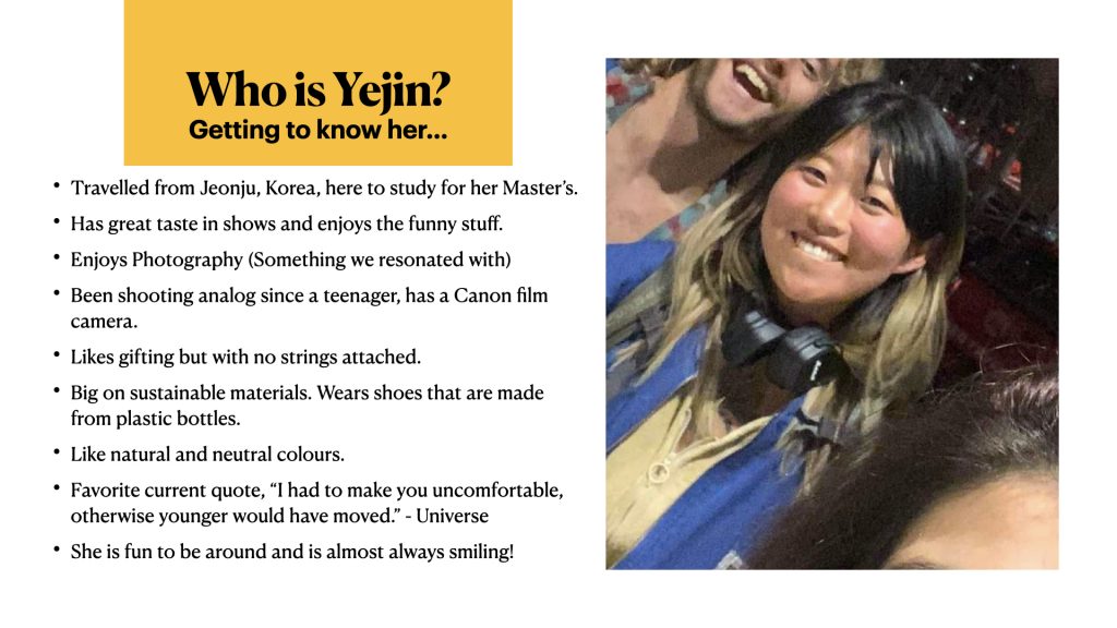
I was paired with a Yejin, who also goes by “Yej” (for those who cannot pronounce her name). She is super fun and we spent some of our time getting to know a little about each other. Not enough though since we were all settling in at the moment. But from what I got to know about her we had a bunch of things where we found a common ground on. A love for analog photography being one of the prominent ones. This kickstarted the ideas in my brain and made me think of what I could make for her as a gift.
I am the kind of person who loves gifting functional things.
Things that people will find useful.
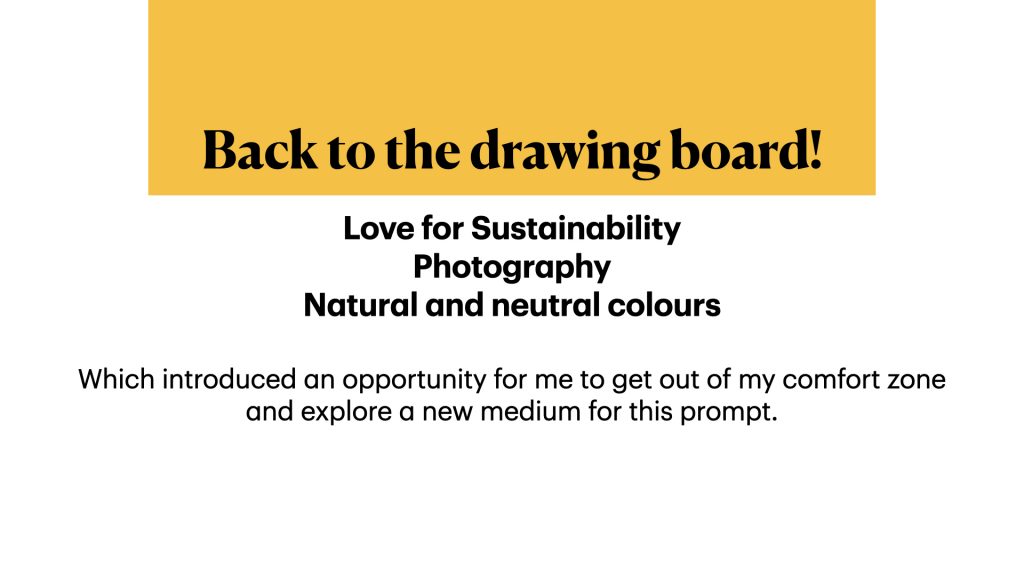
Another thing I got to know about her is that she is on a quest of living sustainably and has been practicing how to live sustainably in her life on a daily basis. It is something that immensely interests her and she mentioned that her shoes are made our of recycled plastic bottles. That, really stuck with me.
Taking cues from all the conversations we had and aligning them with my initial thought, I dove into uncharted territories and decided to make a camera strap for her.
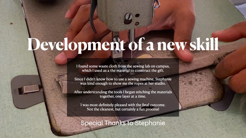
Not just any camera strap, a strap made with waste cloth.
Stoked with the idea, I started off with sourcing the right materials as my first task. I had a brief conversation with Stephanie from our cohort who runs her own business in the clothing space and has some crazy experience in the clothing and sewing space. Talking to her was super helpful and she also agreed to help me out by letting me use her studio space and machines to make the camera strap!
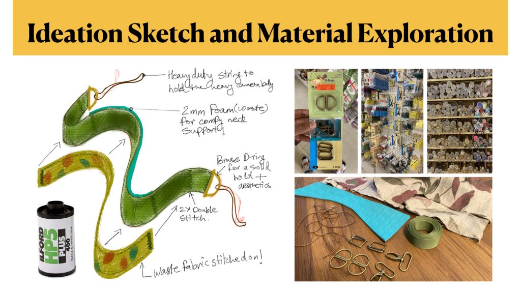
While exploring the labs on campus and a stumbled upon a box full of waste cloth in the sewing lab and got almost all my materials there. The next task was to get the attachments for the strap and a bunch of D-Rings and holders. I went to a store called “Dressew” on Hastings street that was a gold mine filled with all the supplies I needed to make this project work.
Now that I had everything I needed in place, I stared sketching out my plan for the strap and how to make it functional. After that I went over to Stephanie’s studio and familiarized myself with the equipment. After a few practice runs and getting my hand a set to some extent on the machine, I got cracking on the final product.
It was a great fun putting all the layers together. A couple of hiccups along the way where my lines weren’t as straight as I wanted and I did end up stitching some parts the other way around, but it was all a part of the process!
If you want to succeed you must fail first.
Kevin Ashton, the man who dreamt up the Internet of Things.
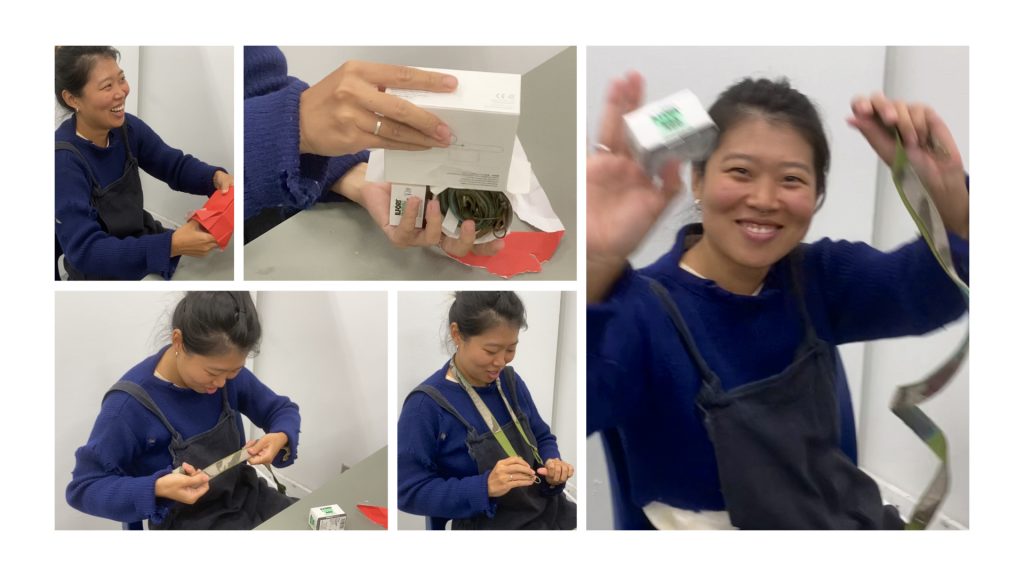
To add some more value, I threw in an Ilford BW Film roll and gift wrapped everything with one of the apple boxes I had and some waste paper I from the Comm D. Lab.
Yejin was pleased with the gift and I was super stoked with the output, also I got to explore a new skill that I immensely enjoyed! Watch the video below to see some of the process!
Prompt 2 : Daily Making Practice
This prompt made enabled me to explore a part of design that I am super interested in from a different lens. Literally. That was the lens of my polaroid camera. While being on a house hunt in canada, I used how/where I was situated to work on my idea of daily making.
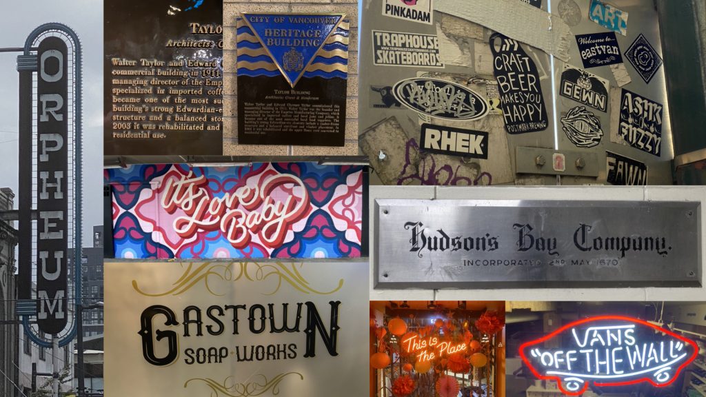
So where did it all start? I wanted to use photography and typography in some interesting form to begin with, I started observing my surroundings as I used the transit systems all day to go and check out potential apartments. While doing so, I noticed a lot of interesting typography around me. Mostly graffiti, but a bunch of gothic and script too. That’s how it all started.
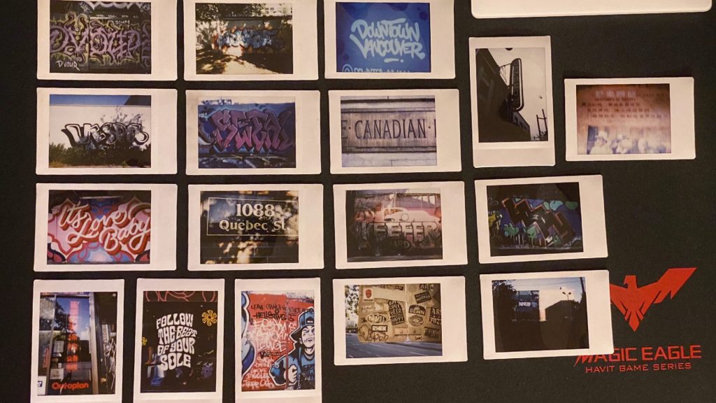
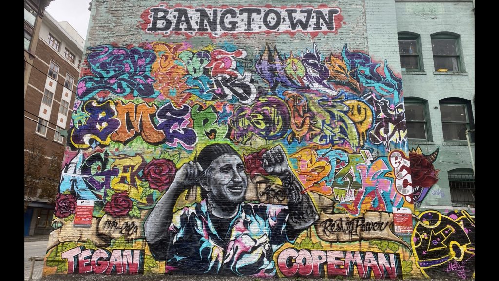
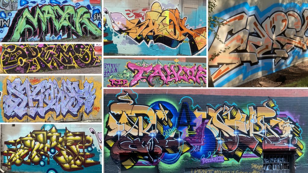
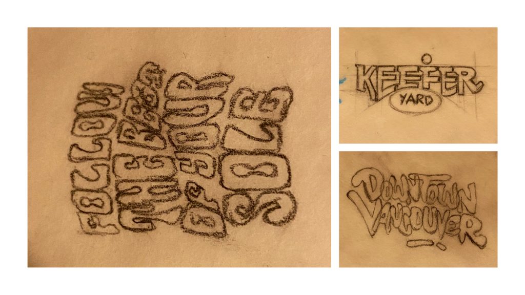
As I took these photos, I noticed how some brilliant typographic work is hidden in plain sight as we walk pass them every day. Due to limited knowledge in type, I wanted to keep exploring the medium and after some feedback on my making practice from Cameron, I reached a way to work with these photos as a way to trace back to a point of origin, the polaroid being the first physical element after the original and working upwards from there. It was a method of layering to put it in simpler terms. I started then tracing these polaroids out to take the making practice to a new dimension trying to understand these forms and the way they work together.
In terms of origin, I went back to 2016 where my friend Yash worked on a small college assignment that spoke directly to the issue of how he always used existing fonts for everything he worked on at that time & how he wanted to use more expressive forms of type.
Looking at all the graffiti and all those old gothic styles of typography used around the city got me thinking about that project. It made me face the fact that I have become too comfortable with type in my design practice. So I started asking more questions to broaden my knowledge of Typography and understand why fonts are designed the way they are. Some of these questions were:
Origins of various typefaces? Styles? Usecases?
Notions and Perceptions about various fonts/styles?
Why can’t I use comic sans to say something that’s said in Bodoni?
How are letters constructed? And Why?
Why are so many brands shifting to San Serifs?
Why did the Hudson Bay remove the “B”?
Eventually this daily making practice evolves to the following:
- Keeping the exploration of type alive wherever I go. (Noticing Fun Type Around)
- Tracing out typographic pieces I find interesting.
- Learning Pro-create (Already a WIP)
- Trying to create an expressive typographic piece a day, or a part of a piece atleast.
- Adopting a daily research practice on typography. Looking up designers and their work related to type exploration – (Herb Lubalin, Stefan Sagmiester, etc.)

Prompt 3 : Discourse
After a major deep-dive into typography and getting super overwhelmed with all the multiple tabs of research, I decided to take a step back and let the type-storm settle in for a while. Eventually turning my attention towards another area of research that has always fascinated me. I have been drawn towards the realm of automation since I started using the virtual assistants on our smartphones. The possibilities of the way we integrate these technologies using platforms like AI, IOT and IFTTT always intrigued me and this was an opportunity to direct my design research in that direction. So I started mapping it all out.
Making this chart made me realize how deep a topic this is, so I decided to start small. I asked my self where my interaction with these platforms is at and started expanding on that topic based on what I already know, keeping in mind that my research is eventually going to get into the other related parts of this subject.
I use my AI assistant to assist me for numerous tasks through my day, but another related platform I interact with all the time are RGB smart lights. Here are some examples of how I use my lights:
- Convenience – They turn off when I leave the house and tuen on when I’m about to reach home.
- Visual cues – They turn warm and start dimming at a time I set so it’s a cue for me to go to bed. They slowly brighten up in the morning too which is way better than an alarm.
- Voice control – I don’t use switches.
- They set the tone and they mood for tasks I intend to do (Because of the RGB)
- MAJOR VIBES!!!
Upon more research on this little piece of tech, I leaned that they have a lot more advantages beyond simply looking pretty. This website ties it together pretty well.
Smart lights are easy to set up, program, and integrate into existing smart home systems. While some users find their initial cost prohibitive, smart light bulbs offer significant savings in energy bills long-term. Honestly, it’s also just fun to change the colors of your light bulbs on a whim or to turn off all the lights in your house while snuggled in bed!
Smart lighting isn’t just fun — it turns out that smart lighting systems can also be good for your health. Several scientific studies have indicated many influences of lighting on our mental and physical health.
https://www.makeuseof.com/tag/smart-lighting-affects-health-according-science/
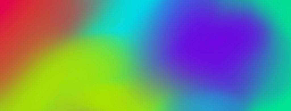
While understanding how smart lights impact our everyday living, I started researching about how colour theory and colour psychology play a role in these impacts. I started by looking at the work of artists and their artworks from the perspective of colours and searched for how people have reacted to some of these works. Some of the artists I looked at were, Mark Rothko, Josef Albers and Barnett Newman.
In 1986, allegedly distressed by the work’s abstract nature, a confused man slashed with a box cutter Who’s Afraid of Red, Yellow and Blue III, installed in its gallery of honor at the Stedelijk Museum. It was not the first time a Newman work was vandalized. In 1982, for similar reasons, a student attacked Who’s Afraid of Red, Yellow and Blue IV in the national gallery of Berlin. Nine years later, the man who had damaged Who’s Afraid of Red, Yellow and Blue III returned to inflict five long knife cuts on Newman’s Cathedra. Who’s Afraid of Red, Yellow and Blue III goes on view for the first time in the reopened Stedelijk on April 24.
https://www.stedelijk.nl/en/exhibitions/63824
Looking for something more relevant to my research, I was told about the work of James Turell. He works directly with light and space to create artworks that engage viewers with the limits and wonder of human perception. I was completely blown away by his work and started watching some of his videos to understand his process. Something very interesting he mentions in one of his interviews that really stuck with me was about the way people perceive.
“The sky is no longer out there, but it is right on the edge of the space you are in. The sense of colour is generated inside you. If you then go outside you will see a different coloured sky. You colour the sky.”
This lead me to crafting my question that transitions into the fourth prompt.
How may we integrate RGB Smart lights into our lives by understanding and applying colour psychology to them?