Visualizing Data
Since the last action, my research took a new direction. After meeting with my supervisor, I started following Giorgia Lupi’s work on Data Visualization. I wanted to explore it and see where it could take my research. I have already been reading a lot about data and ethics, but never really figured out how to work with it. This action is my first exploration in data visualization. I wanted to start simple, so picking up where I left off in the last action, I decided to visualize the distance I had travelled so far in the city since I got out of quarantine.
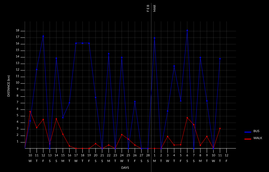
Using Google Map’s location history feature, I was able to take out this information for each day I had been out in the city. Travelling around the city I had either taken a bus or walked on foot.
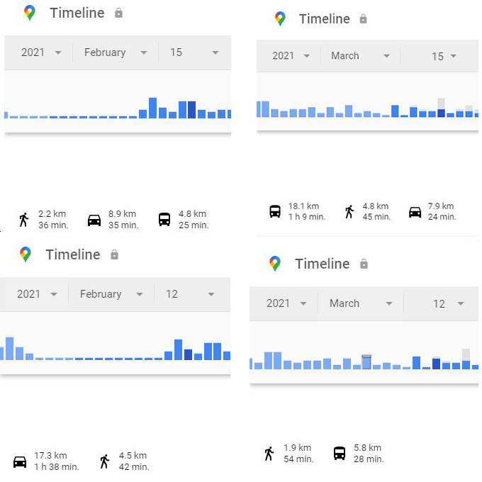
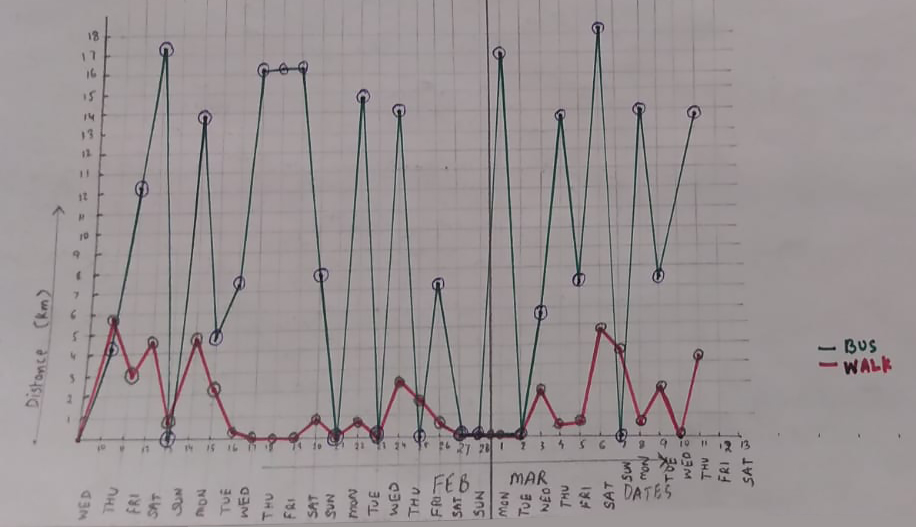
I decided to plot this information on a line chart. Using the horizontal axis for the days and the vertical axis for the distance travelled it was easy to visualize the data, which also became like a comparative analysis. Looking at the chart, I could pick out the days on which I travelled a lot and days on which I stayed at home. There is a certain pattern that emerges when I look at this chart. Also, it gives me a bird-eye view of a lot of data which otherwise would not have been so engaging.
Inspired from Giorgia Lupi’s work I would like to explore how data visualization and design can invite people to spend time with data?