Project 2: Part 1:City versus Nature
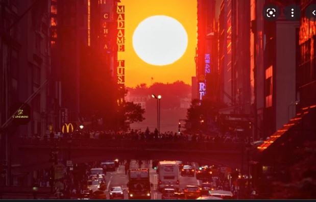
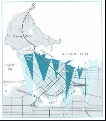
I am will return to clothing and garments later, but for the moment I am focussing on the idea of connections between city and nature. One of my preoccupations at the moment is finding ways to connect myself with nature, whilst in the middle of the city. It centres me, reminds me of where I am from (a rural island in Scotland) and gives me a second to catch my breath. I started looking at View Corridors here in Vancouver and that led me to Manhattenhenge… I had considered doing a range of pictures of Mount Baker but it’s very frequently foggy around my apartment and it would more often than not be shrouded in mist. And I wanted to get outside and find my own way of connecting to nature.
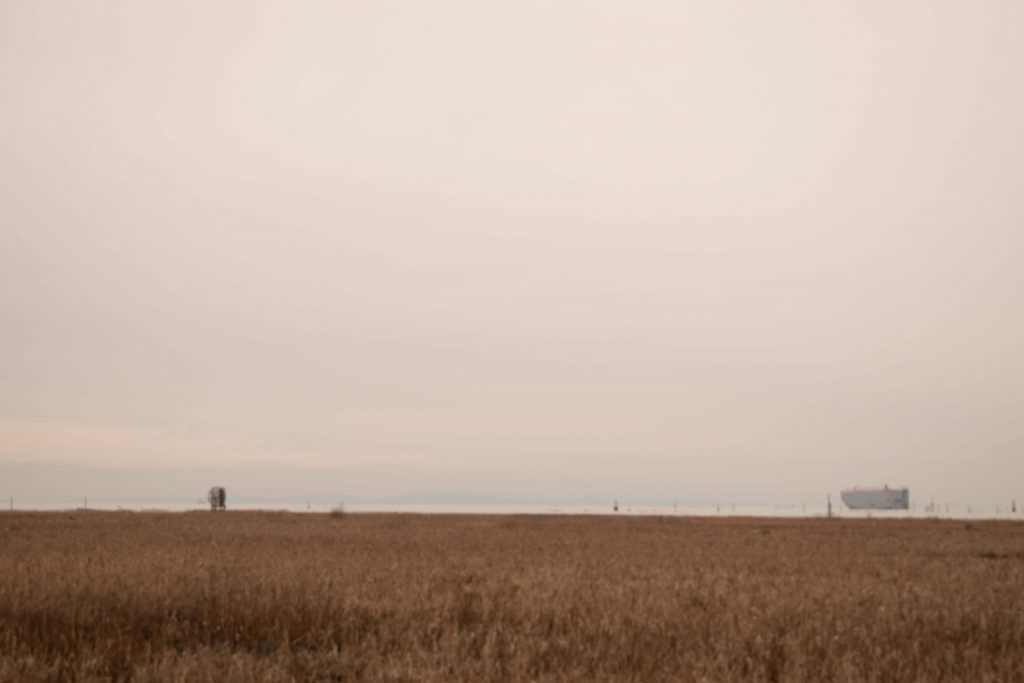
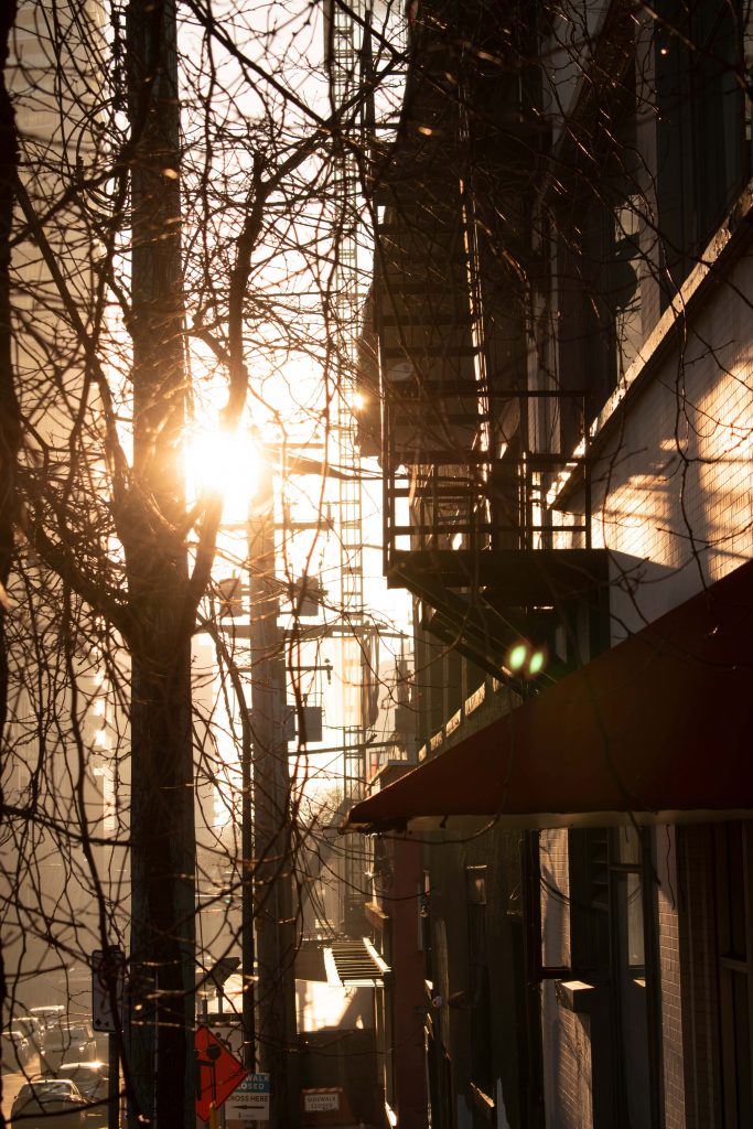
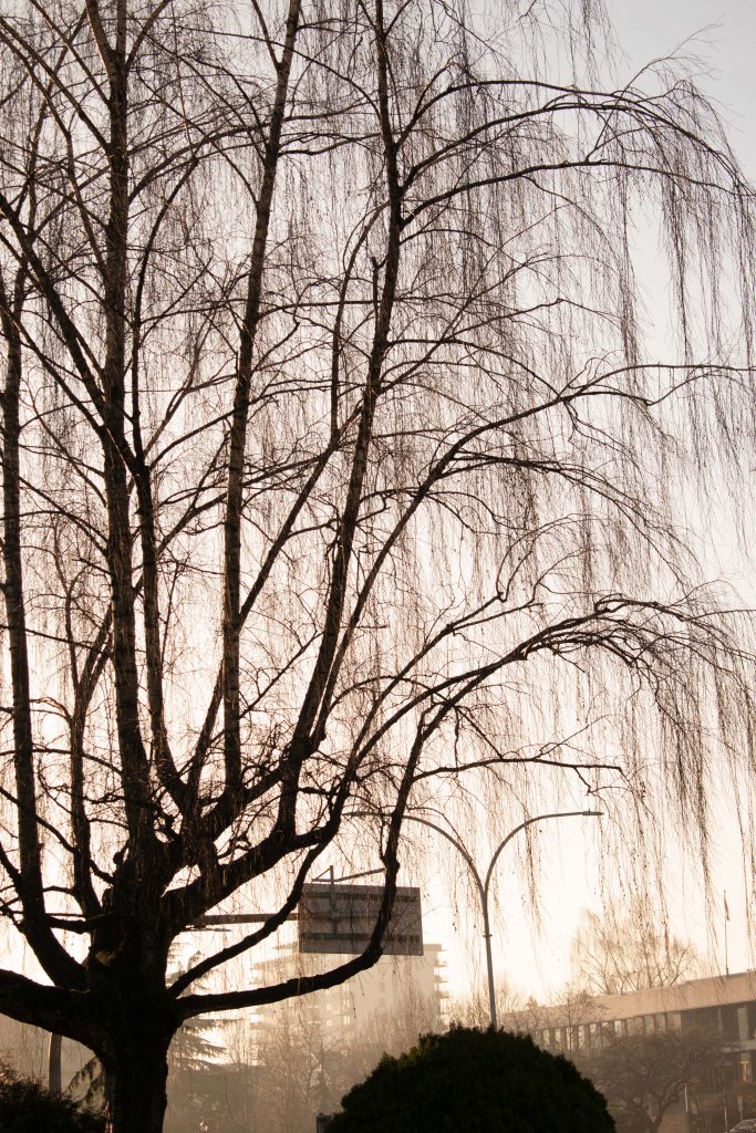
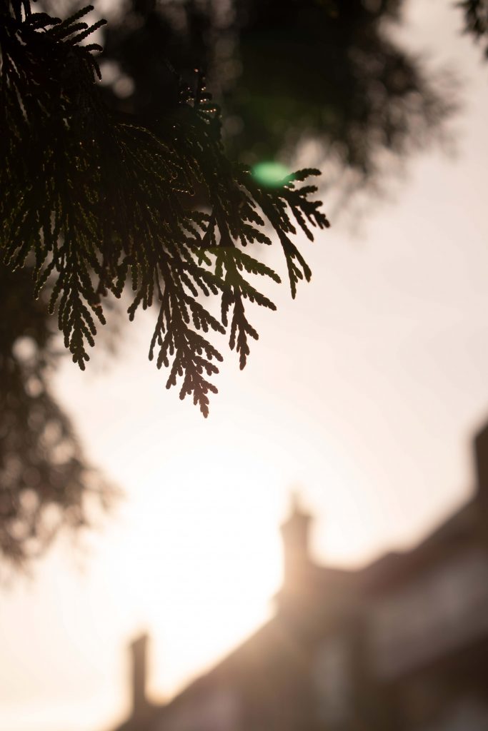
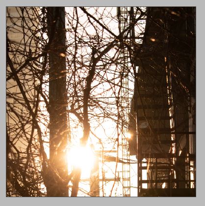
I started this week out with the camera. I’ve walked lots of city streets looking for pictures but this time I wanted it to be a little different. And the sun was high and bright that day so I took the camera and faced it right into nature to see what happened. It meant that the light became the dominant thing – not so much the city. So I then went around, looking for compositions that would capture nature/the sun/light etc as the dominant subject in the picture. For me, this captures a fleeting sense of space. Nature equals a sense of space. I also liked how you could again play with compositions so that the sun and the trees – often just seen as necessary inclusions in cityscape planning – are the dominant form in the photo.
Part 2: Disruptive Books
Well maybe we need to clarify that. We want to shake the reader gently from passively inhaling content from every angle and remind them of the moments of stillness possible in the city. For me the city is a necessary creative stimulant. I love it for the independent creatives and international cultures fostered. For the publishing and magazines and any forms of books. Collections of knowledge.
I read Patricia Alvarez Astacio’s Tactile Analytics: Touching as a Collective Act, and her use of carefully chosen artefact, interacted with in a considered sequence, made an impact on me. It made me realise that I am interested in sensory experiences, because this is a lot to do with how we process the impact of specific experiences and how we build memory and attachments. I also appreciated that she felt that she needed to develop her sensory literacy – I myself feel that too.
I’ve been keen to take communication design off the page and I began thinking about the possibility of designing an exhition, designed around artefact or textured surface or graphic design visual…a set of sensory experiences that would take the participant on a rich journey, from their place of being in the heart of the city, back to the quiet of nature.
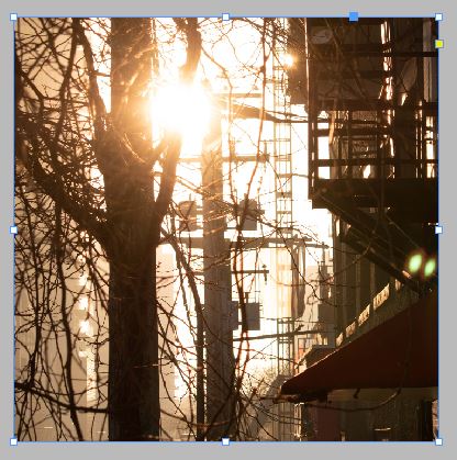
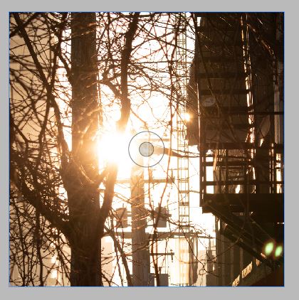
I started this off by looking at the above picture and while looking at where the sun should be in terms of where it was that day and where it should be on my square lay out, I realised that I was feeling more relaxed when I looked at the image where the sun was indicating it was mid-afternoon in winter (the middle one above) and I realised how many ques we take from our surroundings and wondered could that be played with in terms of using graphic design for good? I felt more relaxed with the late afternoon sun, as opposed to earlier or later, because for me I feel I have done my work by mid-afternoon or at least my brain certainly thinks this!, before I get a second wind later. I wondered if something like composition could cause is to relax more, is there scope there?
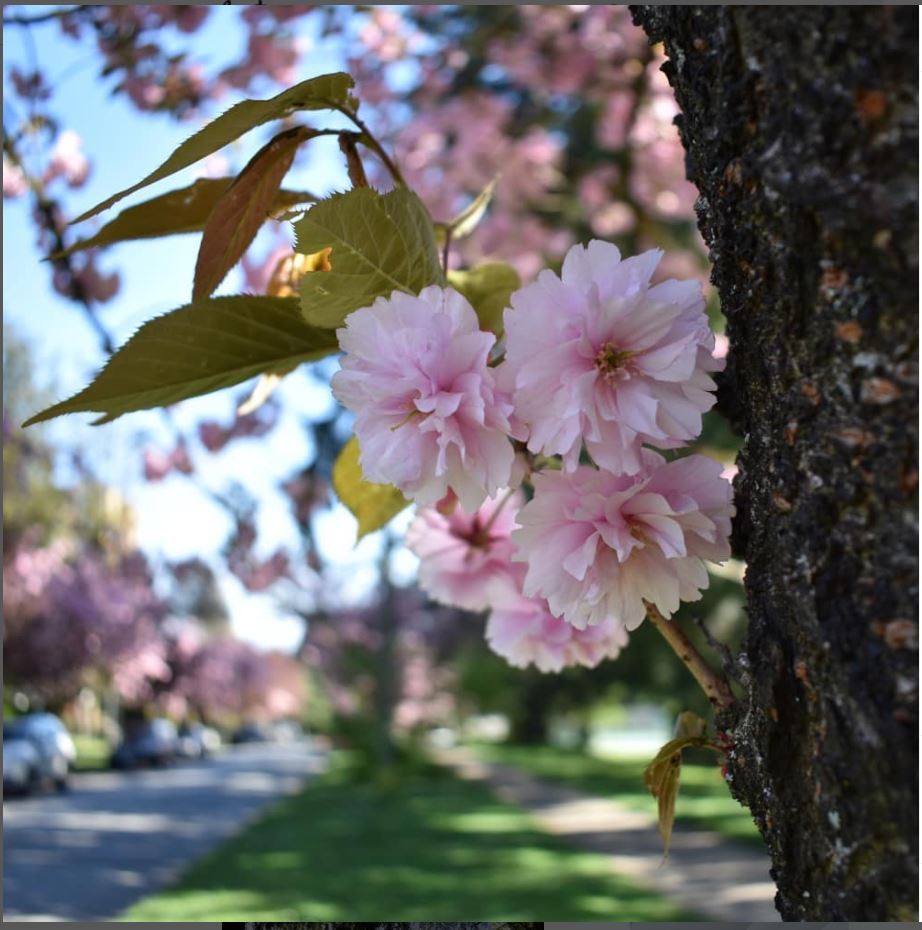
I took this photo last Spring/Summer, when these beauties come out. For the next ‘sensory object’ I had been planning on creating a 3d surface design that would – when interacted with – feel like a flower pattern. I wanted to have an element of subtlety to it, I didn’t just want the artifical feeling of a cartoon daisy, and I was considering this blossom shape. But then I realised a few things. Firstly you would be better using an actual blossom and inviting blind folded participants to touch it. And through the soft blossom and fragrance they’d likely realise what plant it was. But then I thought actually I am wanting to connect participants with a feeling of nature outside the city, and so blossom isn’t right. So I would need to consider what kind of plants I used, and whether it was quite right to remove them from their natural surrounds in order to feature in my exhibition. TBC….
Sensory Object 3
This would be for the wall of the exhibition, not sure yet what the overall order of the ‘publication’ (i.e. the exhibition as exploded design publication)would be but for now the focus is on that wall.
So there is a pleasing sensory experience when you view a well set out bit of typography. So if you had a simple word or phrase, likely something like ‘breathe out’ or ‘deep in the brightest shades of green’….something evocative…the former might be a little ubiqutous as a short hand for meditation and, as such, not work to relax, outside of actual meditation. This could perhaps be where other’s stories come in, those stories that talk about loved places, preferably outdoor places in this instance. ( I think I am seeing now where you can use one methodology for lots of experiments like Alvarez Astacio). Perhaps if you think about ethnographic or investigative design, you can use one methodology to explore different facets of cultural life.