“Live in each season as it passes—breathe the air, drink the drink, taste the fruit, & resign yourself to the influence of each.” Henry David Thoreau, Journal, 23 August 1853
Starting my first studio project regarding my research question with the Korean lunisolar calendar generated much self-awareness. The most significant lesson was learned by realizing that being in contact with nature meant so much to my ancestors. As part of the multispecies seasonal cycles, humans had to notice changes in wind, trees, air and earth and translate them to live within nature instead of with nature. I became aware that although I am far away from the land I was raised in, I now stand in a different land that I need to learn and understand. Speaking of land, I have been buying and eating almost the same produce since I was in Korea after moving to a different continent across the Pacific ocean. I already have lists of meals that I cook in rotation; my main focus was mostly on what ingredients I can find here. In fact, since I could get a multitude of spices and a wide variety of rice and tropical fruit anytime, I didn’t need to adjust my habitual cooking. There was no need to learn new recipes and locally and seasonally grown fruits and vegetables. To continue my journey of experiencing different times for sustainable living, I decided to make a calendar for in-season fruit and vegetables in South West British Columbia.
How should I make it?
I knew I wanted to make a calendar that I can share the design with other people but I wasn’t sure about what method and medium to use. I didn’t want the information to be just printed on flat paper by a machine, looking nice on the wall but not being used.
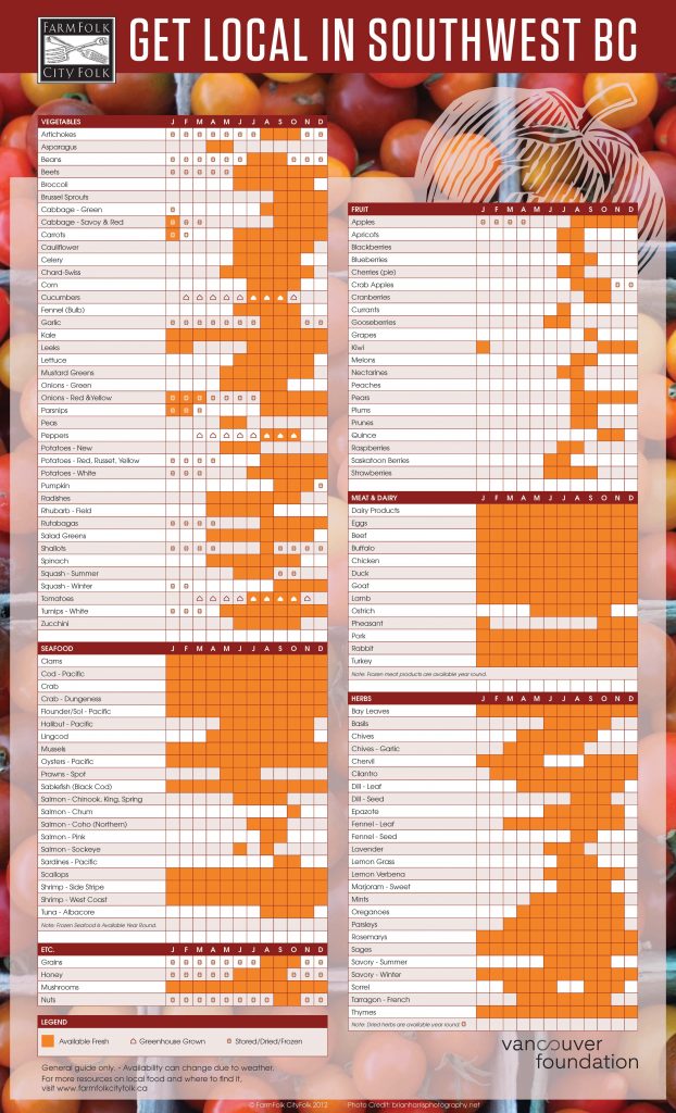
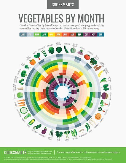
As a first step, I started gathering information about seasonal vegetables from online resources like 👩🌾 BC Farmers Market, Buy BC, and Farm Folk City Folk. The information was already accessible to the public, however, the way the data was visualized appeared challenging to digest. I realize now this was the moment I started slipping into a conventional problem-solving-oriented graphic design approach. I noticed the information was represented overwhelmingly and confusingly so I impatiently started visualizing the calendar into something more consumable. What does it mean to design this calendar that already exists on multiple platforms? How can I create the calendar so that seasonal shopping and eating become easier? What will be the most effective way of achieving a
a behavioural shift in my mundane grocery shopping which often becomes a burden?
What if it’s on my grocery bag?
I once bought way too many groceries from a supermarket chain and purchased their branded groceries bag. I don’t particularly like how corporate the bag looks with their well-designed brand identity, however, it is a handy size bag for heavy and bulky groceries. I started imagining a calendar that could be printed on groceries bags, not only mine but others so that people how are also interested in the idea can try to shop accordingly.
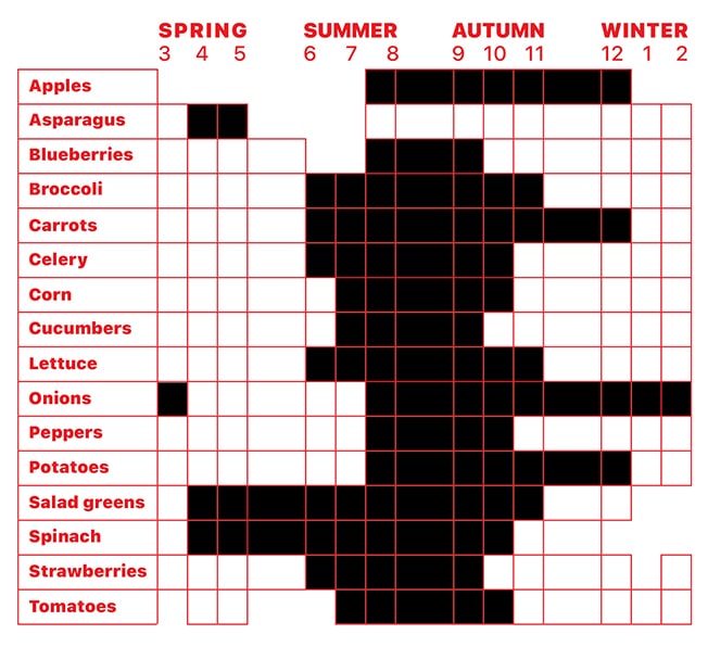
Visualizing the seasonal fruit and vegetable data
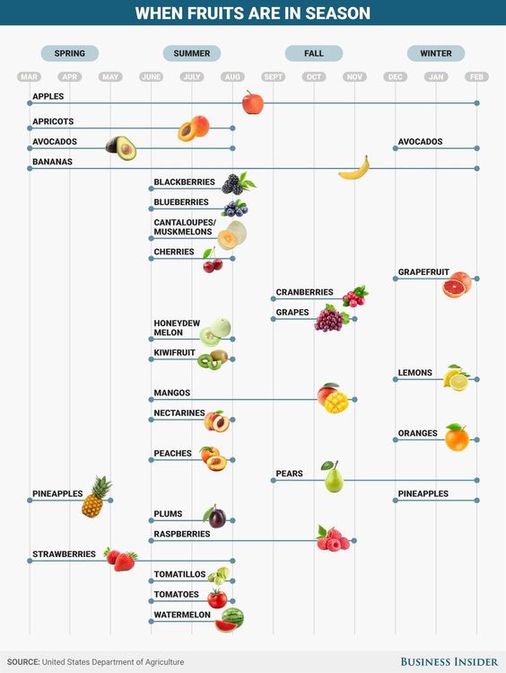
🥗 Top 20 Fruits and Vegetables Sold in the U.S.
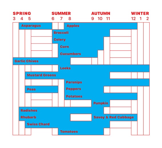
Before I explain the images above, I want to emphasize that I was under many time constraint obligations while working on this project. In the inescapable cycle of exchanging time and labour for money and achievements, I felt internally and externally obligated
to show evidence of my progress. I rushed to wrap up my visual exploration to present the project to the class. I transferred my graph to a nicely polished mock-up image that I always depend on when I’m not happy with the outcome. I decided to spend another two weeks reflecting on my design process and the result by reminding myself why I had started this project. The main purpose was to motivate me, hopefully, others too, to eat more seasonally and locally and be more physically connected to the land I live in
now. I began to realize I barely made myself remember any of the vegetable information while designing the layout more practical and less time-consuming to comprehend.
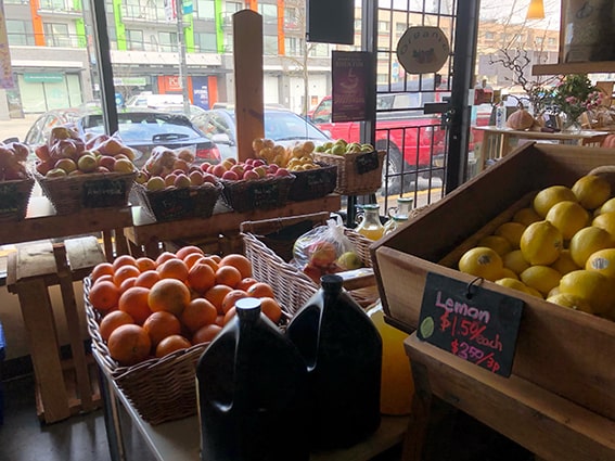
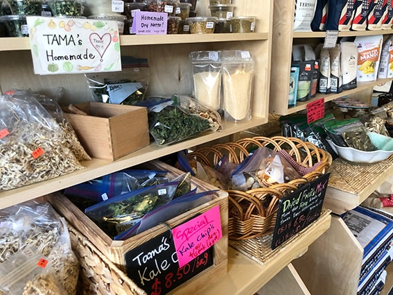
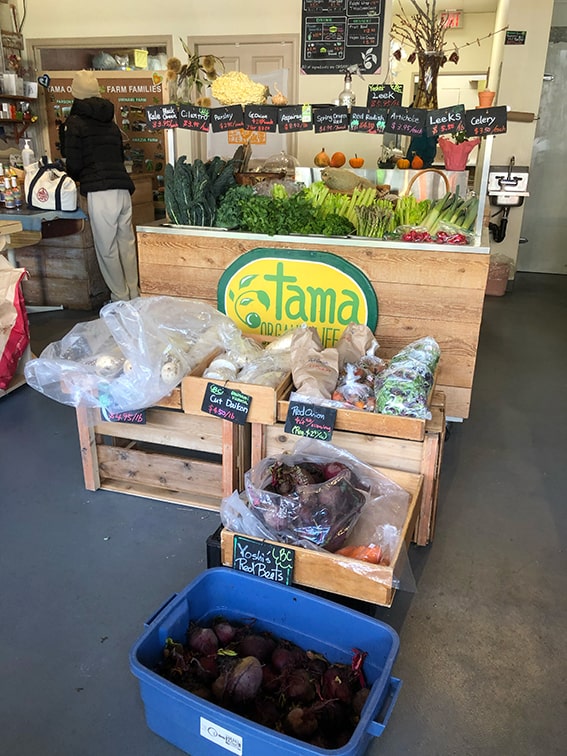
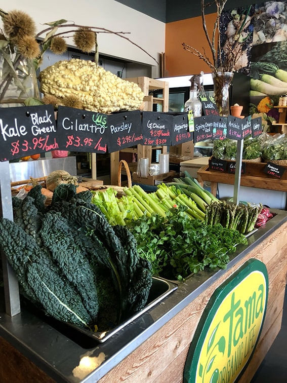
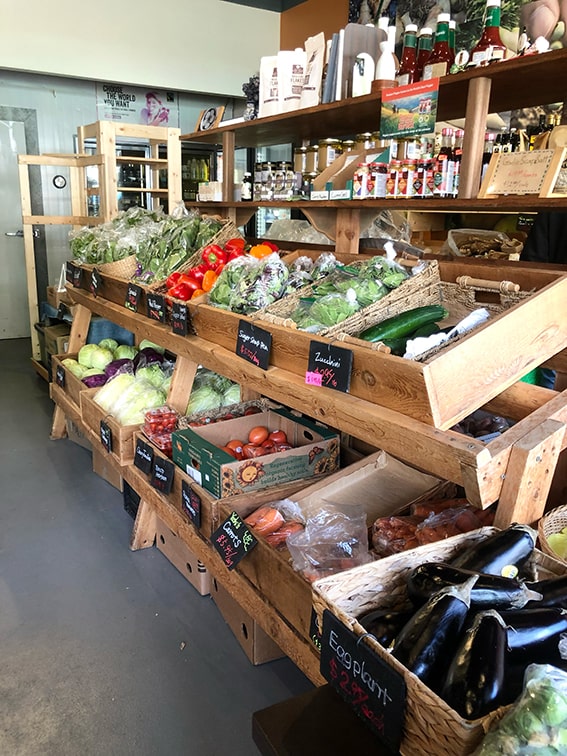
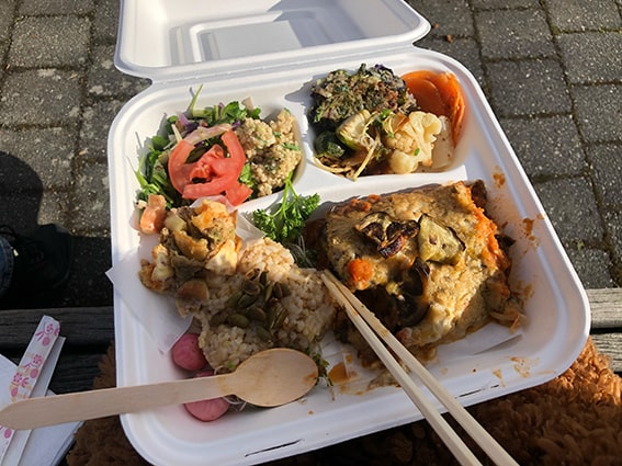
I visited farmers markets and organic local grocery shops which also serve seasonal food. For the first time during the project, I felt seasonal changes through eating freshly made nutritional meals, smelling flowers and vegetables, and drinking locally grown
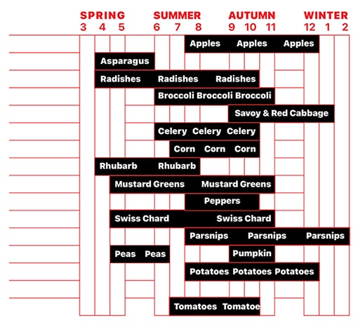
crisp apple cider. It wasn’t the most student-friendly priced experience, however, it granted me an opportunity to reconsider what other ways of exploring this mission are possible. The linear, rigid, and structured table chart didn’t contain the circularity
of seasonal vegetables and each seasons’ inter-connectedness. The more I thought of the seasons and time, my body wanted to grab needles and threads again, further away from convenient and efficient design methods I am familiar with. I decided to change
my method from screen to fabric, mouse to hand.
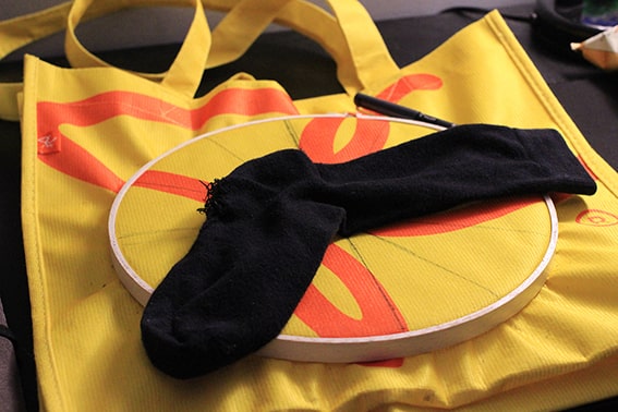
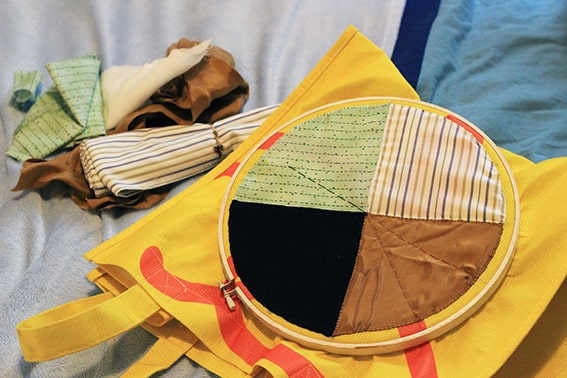
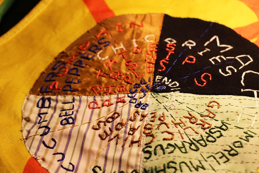
I bought secondhand scraps of fabrics which remind me of each season. Touching and cutting my winter sock that had a hole in it, feeling each of the stitched letters of vegetables with my fingers, I was able to slow down and immerse myself in what I was making.
Other questions naturally began to appear: I’m not familiar with a lot of vegetables on this chart, how can I expand my recipes to practice seasonal eating? Are the vegetables I’m stitching actually from this part of the world? They are locally growable vegetables you can purchase seasonally, yet what other plants, roots and fungi have been used in indigenous cuisines?
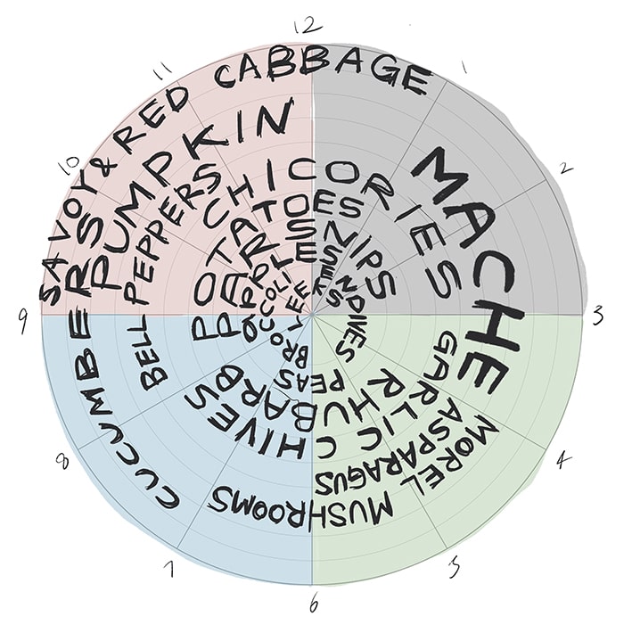
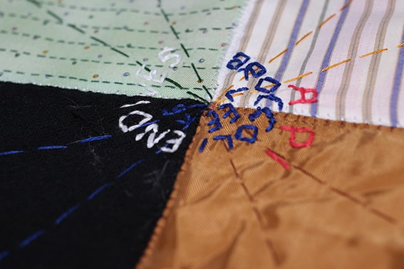
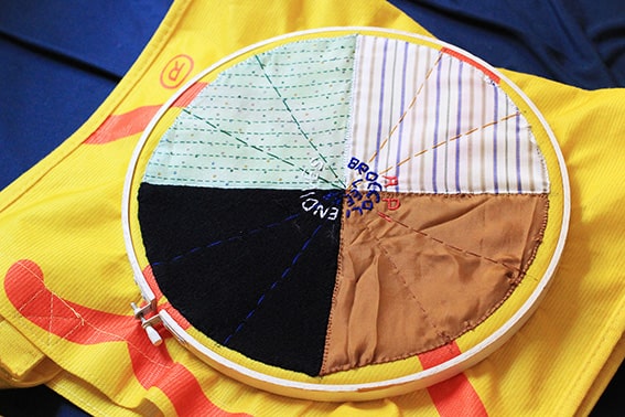
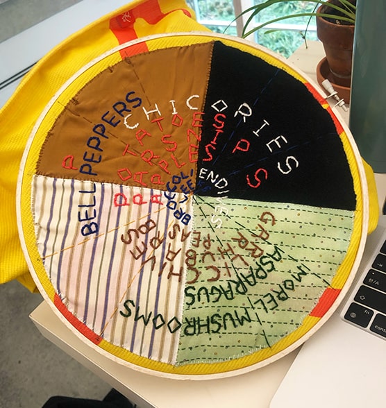
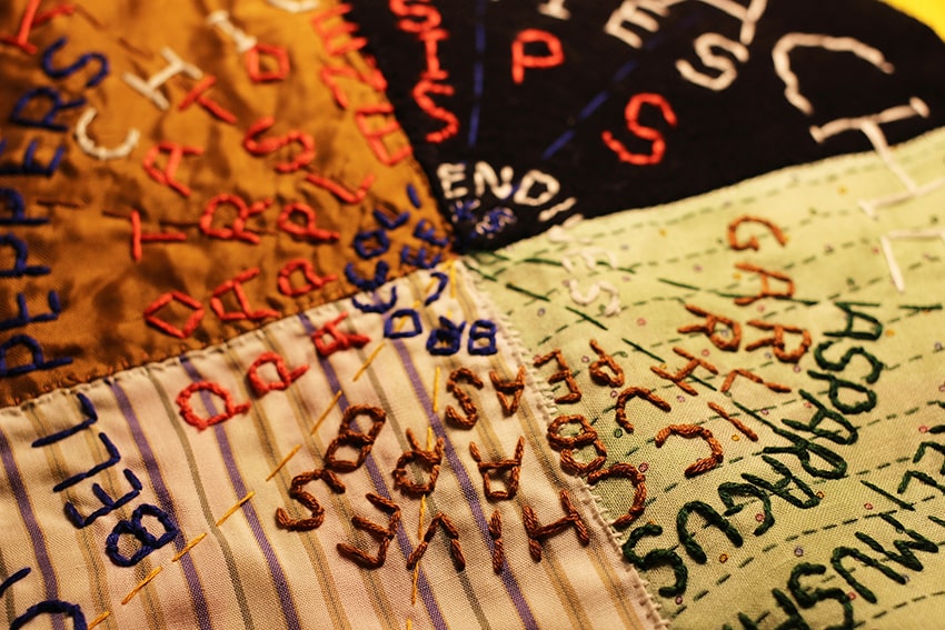
By having a glimpse of seasonal living, and using my hands to embody the knowledge, I started to see what I wasn’t able to see through screens. When stitching the calendar, I intentionally chose thread colours for legibility. For instance, I chose the pink thread for vegetables that are widely available throughout summer, fall and winter, and the white thread for black winter fabric. While trying my best to prioritize legibility, letters that are stitched in the same colours still require more attention to interpret. Irregular spaces and text sizes make the diagram difficult to read as well. However, choosing a slow and unpolished making method to visualize data opened a different internal discussion around the practicality of my graphic design practice. Through these unified colours of hand stitched words, the vegetables reveal their possible relations between
each of them to the potentiality of transforming one’s meal. By making people take more time to understand a design outcome, it allows both designer and design-consumer to slow down, and open a space for hidden dialogues. If information contains so much depth
of knowledge, is it the right thing to make it easy to read? Does every graphic design language have to be clear, coherent and precise? The focal question is whether we can afford the time to understand this unevenly hand stitched seasonal vegetable calendar.