Action 7: Mapping the Focus
Often when we are surfing the internet, we come across random pop-ups on our screens, and to get rid of them quickly, sometimes we end up subscribing to notifications and newsletters.

I would consider this as an unethical practice, as this involves making the user do something outside of their choice and at a point when they are most vulnerable.
To test this, I decided to make an action where I could map my user’s attention areas while they are interacting with a system. I chose 4 participants for this action. Let’s call them A,B,C,D. I started by asking them to choose between symmetry and asymmetry. These were the responses that I got:
A: Asymmetry
B: Symmetry
C: Symmetry
D: Symmetry
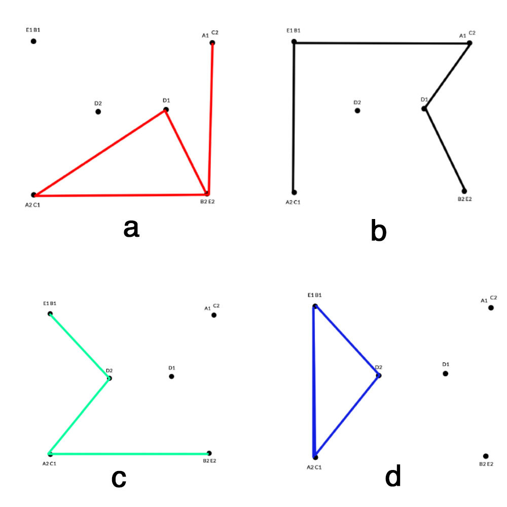
Now that I had the responses, I wanted to design an action where I could map their focus on the screen with a sense of time crunch. I made a quick 6 second video with 5 slides. Each slide had a symmetrical and an asymmetrical shape and they had to choose shapes which corresponded to their choice of symmetry and asymmetry.
The results I got were as expected, only participant D was able to choose all symmetrical shapes, but all the others had chosen a shape which was not part of their initial choice of symmetry or asymmetry.
I mapped out the responses for each participant with a different colored lines and I could see that under a time constraint the user cannot interact with the entire screen but just with parts of it.

This action was completed with a very small sample size, but it did prove the point that design can be used to divert the user’s attention and manipulate their choices which is unethical. I would like to investigate this further and come up with actions where I can create methods to counter this practice.