Making Data Meaningful
From the last action, the data visualization I did, brought out a certain pattern in my location history. So for this action I wanted to explore if these patterns can help make data inviting and engaging.
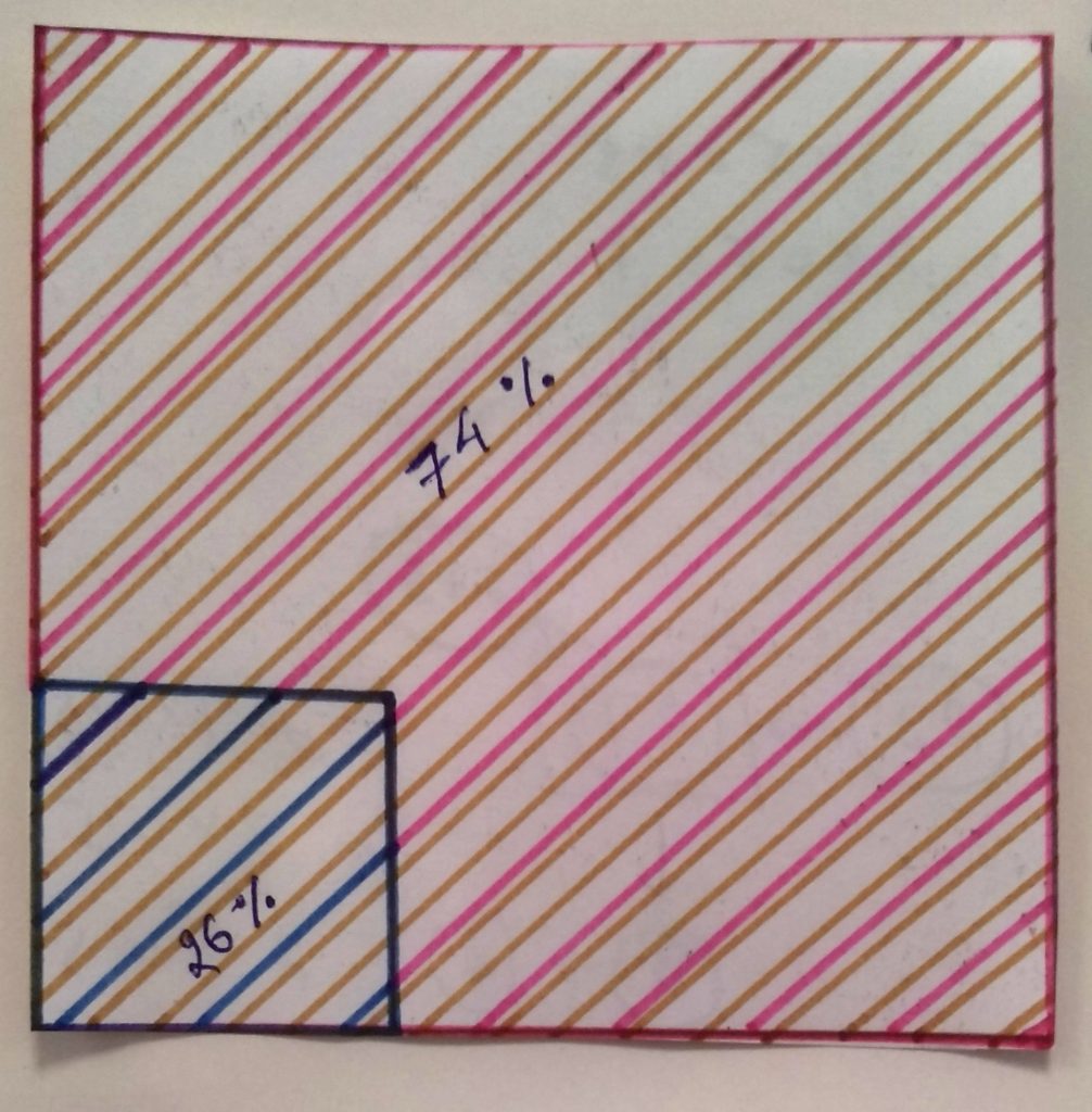
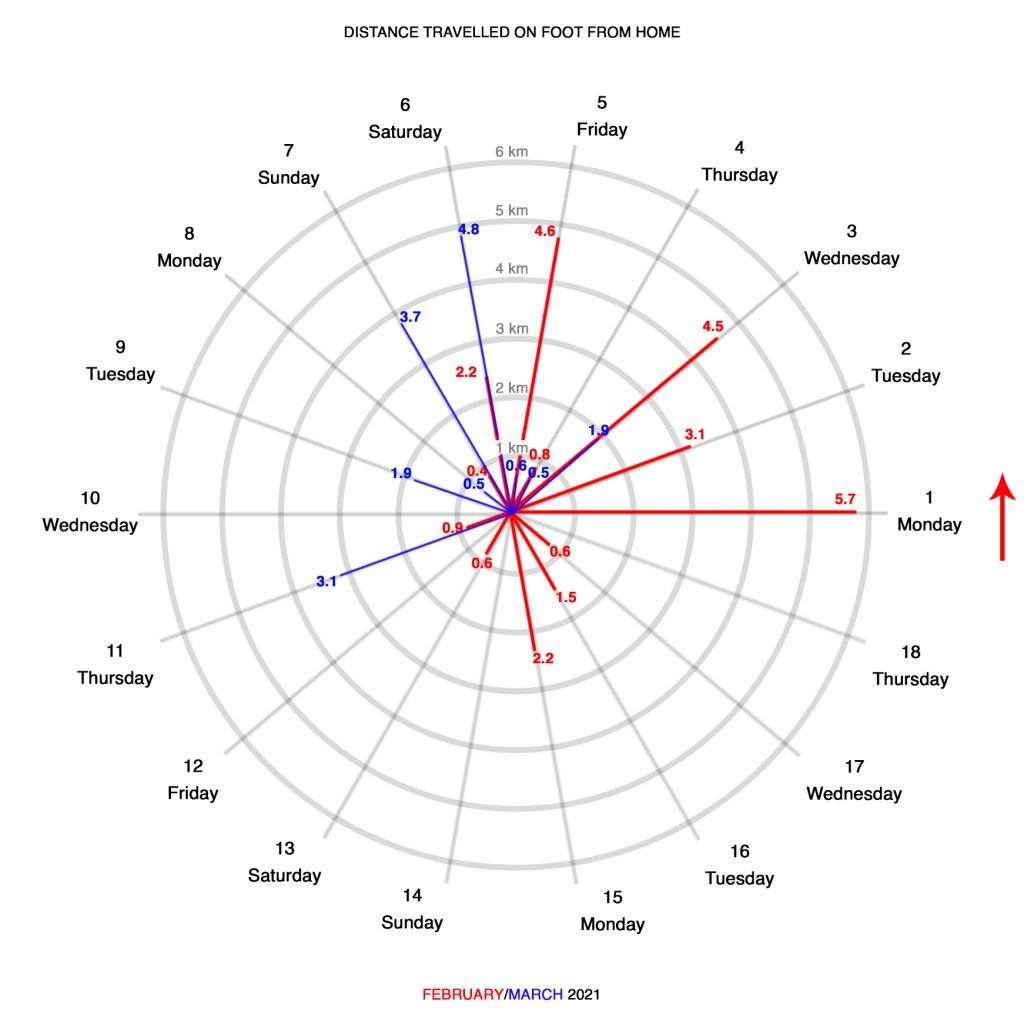
For this action I did two different visualizations; the percentage of males and females in my cohort and distance travelled on foot from home.
For the first part, I did a simple square that showed the percentage of males and females in my cohort.
For the second part, I decided to use a radial chart to visualize and compare the distance I had travelled on foot from home for the months of February and March. The radial chart allowed me to overlap the data and compare it easily.
Keeping my house at the center, I started drawing concentric circles outwards. Each circle representing a distance of one kilometer from the house. Using the same data from my Google map’s location history I plotted the distances for both the months. (February in Red and March in Blue). Overlapping the two charts, I was able to easily compare the data in a much easier way.
Having completed 2 data visualizations, I would like to explore how can the same method be used to represent complex data and make it engaging?