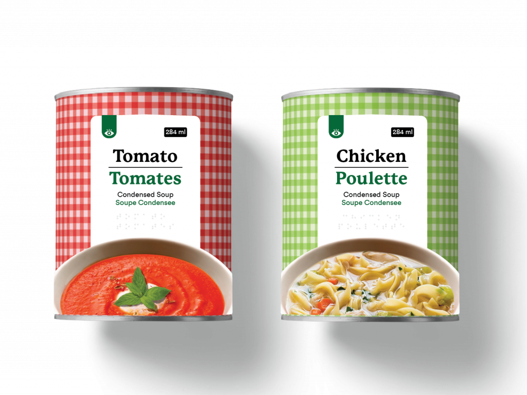
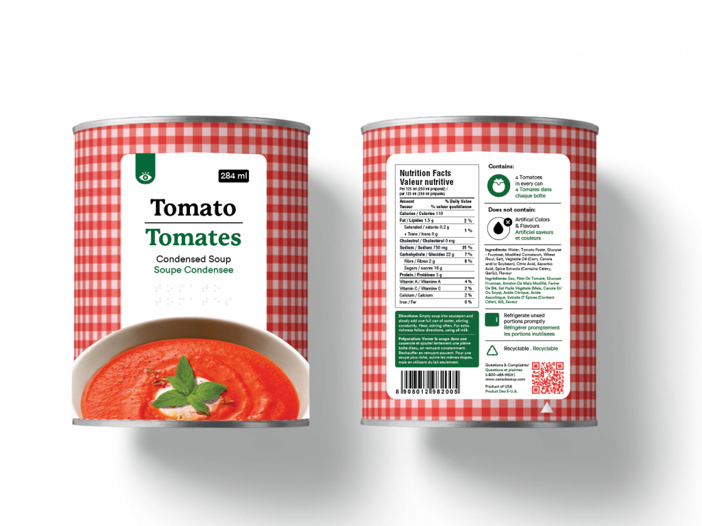
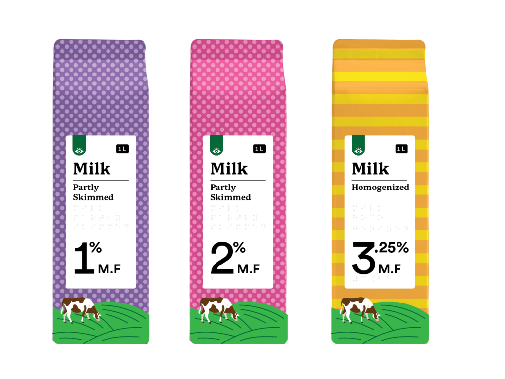
Food packaging design can quite be challenging. When it comes to food packaging there are varied categories and multiple variants within each category. For instance, cheese comes in different formats – slab, slice, shredded, etc. Within each format there are multiple variants/flavors like Mozzarella, Colby Jack and Cheddar.
Accessible packaging concepts need to work well with such a complex range of food products. Hence my current endeavor is to develop a sample accessible grocery food products spanning across various categories and variants. The packaging should not only be functional but also look aesthetic enough to sell in major grocery retail stores.
To begin with, I studied major grocery retailer brands like Great Value (Walmart), President’s Choice, Western Family (Save on Foods) and identified common visual themes as well as areas of improvement.
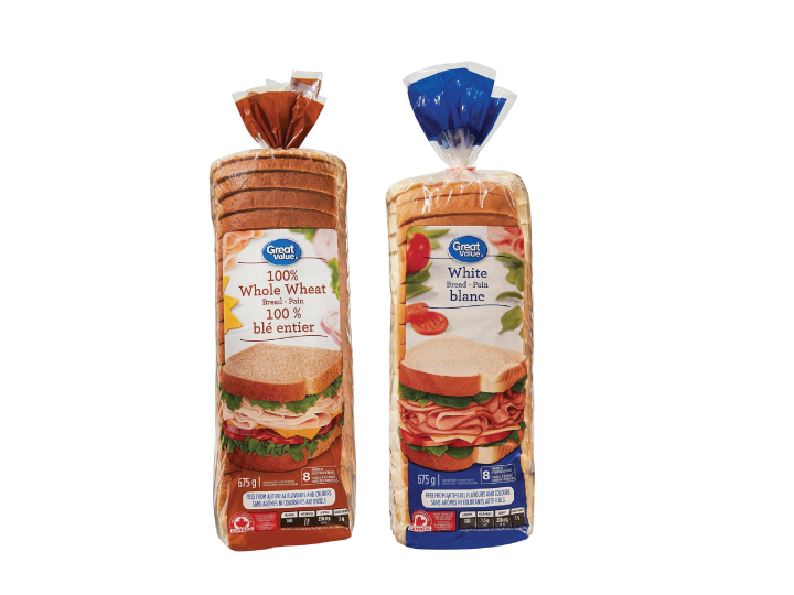
I decided to work with items that I have easy access to and bread packaging was the obvious choice. Current bread packaging uses color to differentiate between the variants. Important information is dumped at the bottom. The images of the bread do not add any value to the packs.
The numerous stages of design involved choosing the appropriate typeface and adding other visual elements to the packaging.
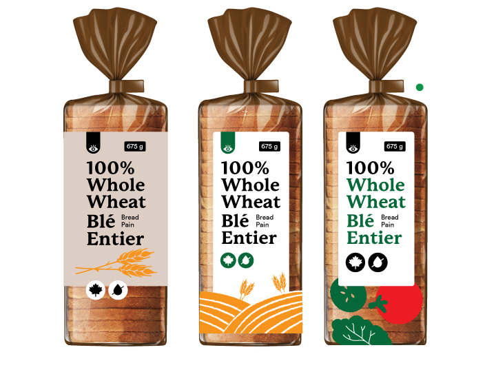
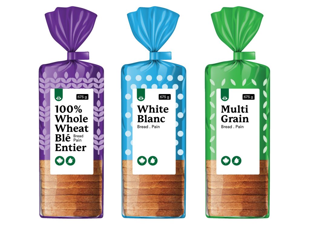
The final design outcome included a set of see through packaging. Different colors and patterns were used for different varieties of bread. The image of the bread was removed to make room for more see through space.
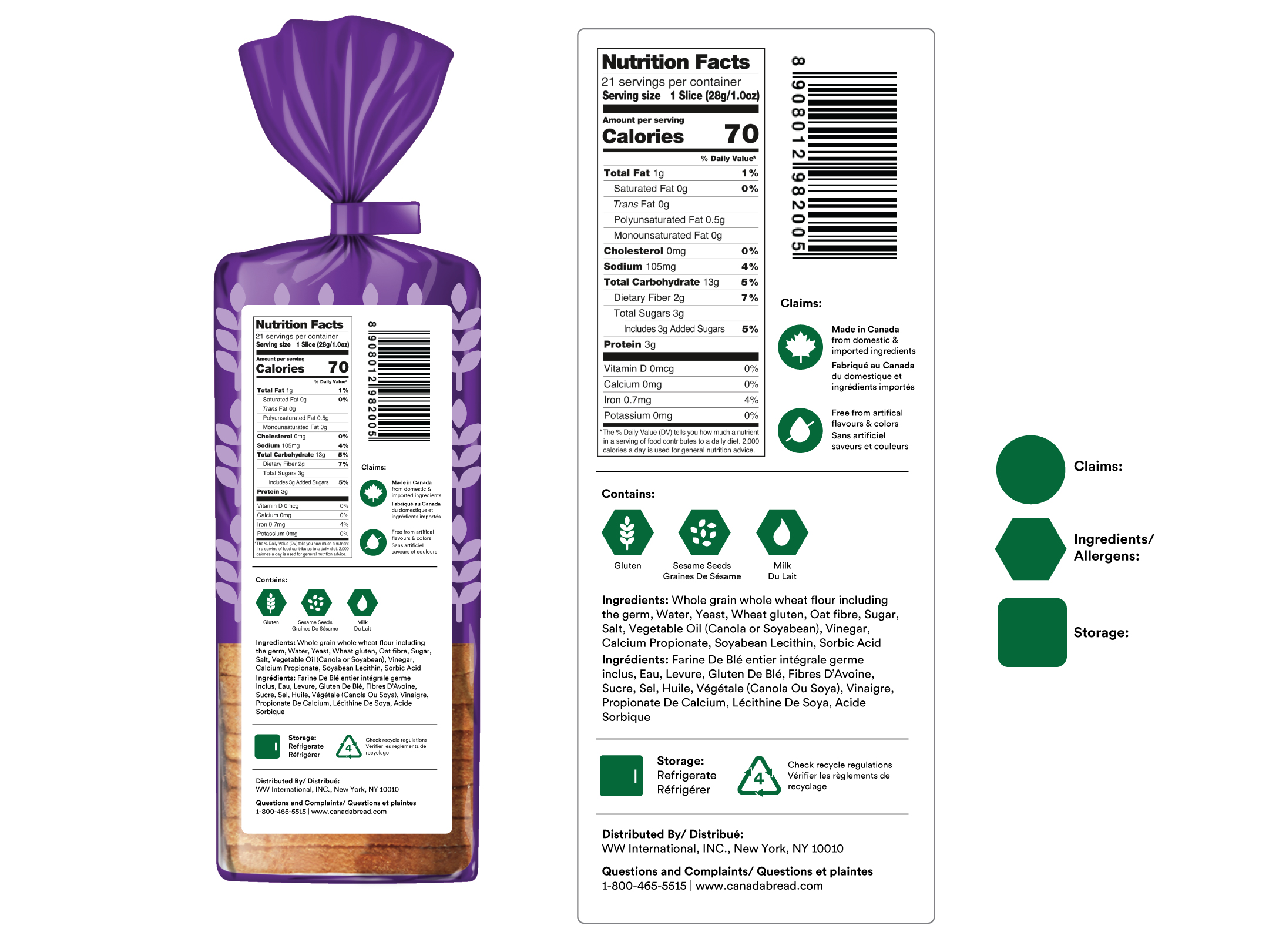
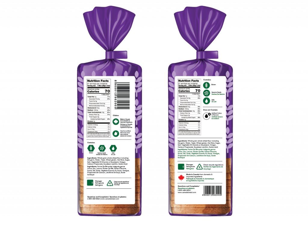
For the back, I used different shapes/symbols to organize different kinds of information. Circles were used for claims, hexagon for allergens and squares for storage instructions.
I have almost no vision, so the graphics on the packaging do not matter to me. But a QR code or Braille on the packaging will be super useful to me.
– Research Participant
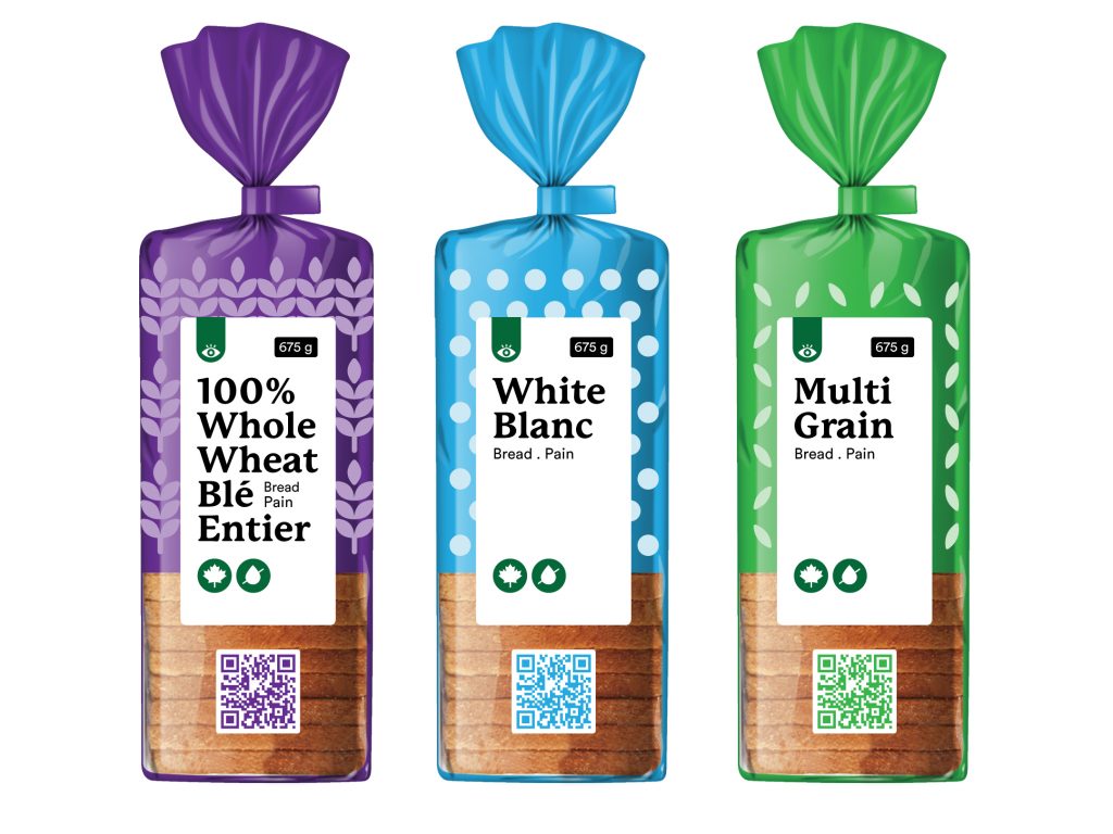
I knew I had to add some sort of an element to the pack that didn’t make it necessary only on vision to access the information on the pack. QR codes are quite popular now due to the COVID pandemic. Many people with little to no vision also find QR codes very helpful. Hence I decided to add one on the packaging.
Currently a lot of apps like Microsoft’s Seeing AI, allow people with vision impairments to convert text to audio simply by holding their phone in front of the product/text. However the app reads the text line by line almost like a audio book. When it comes to food packaging people often want to access specific information like ingredients, cooking instructions and nutritional information instead of going through each line of text. I identified this as an opportunity.
Upon scanning the QR code, people will be able to chose what information they want to access. They can even chose the language in which they want to access the information. This method can be useful to people with any level of impairment. It could even benefit someone who doesn’t understand English or French, which are printed on the packs in Canada.

Next I tried to include braille on the packaging and also create better differentiation between the English and French names.
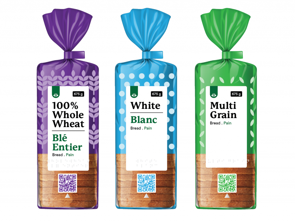
I also revisited the back of the packaging and created a simple pictorial representation of ingredients the product contains and does not contain.
Similarly I worked on soup packaging and Milk packaging.
