
Studio 2
Project II
Visualizations that depict natural elements are significant in our knowledge formation surrounding these topics. Nature is inherently quite complex, so nature’s data is complex as well. Although nature’s data could be quantitative and made up of numbers and degrees and variables, it could also be qualitative, personal, subjective, and open to more interpretations.
For this project, I wanted to explore different ways of looking at and visualizing nature’s data. Ways that do not rely only on documenting numbers, and creating charts, and graphs but are more personal and intuitive.
To have a more solid framework for my experiment, I wanted to have two stable elements and a fixed time frame. So, I chose to document the data from:
1- My new plant 2- Weather
I also chose a 1 week time period and the time of 8 am for the weather and 5 pm for my plant.
How does nature communicate?
Everyone has a personal relationship with nature, and everyone communicates with it differently. That is probably because nature itself offers many ways of interaction. It doesn’t solely rely on color, sound, shape, or movement. It is a collection of all those things combined. So, forming relationships with nature is very subjective, and so is collecting and visualizing its data. We create these relationships based on the data we see, hear, feel and experience from nature. The way I observe and experience nature is completely different than the next person.
Moreover, we also know about climate change through the data that is collected about natural elements. We can speculate how much the temperature will rise, how deep our oceans are going to be, and how tree colors are going to shift.
So, even though we all communicate with nature in our way, when it comes to phenomena such as climate change, we don’t do that in the same way.
We see climate change in the form of generalized numbers and graphs. We see them as non-personal entities that stick to the rules of objectivity in scientific data. We wee a specific visual language that was drawn for us. A language that doesn’t allow us to form deeper and more meaningful relationships to it.
consequently, the images about nature that circulate in the public follow a representation according to the prevailing technical-scientific objectivity paradigm and have lost a lot of important information and value (Thierfelder, 2019).
Plant:
I got this plant recently. This is the first plant I have gotten since I moved here. When it comes to caring for plants, I am not inherently green-fingered. I have never been good at monitoring my plants and realizing when they need to be watered or taken care of. So I thought this activity was a great way of getting to know my plant more and establishing a fresh (!) relationship with them in general.
In her essay called “Thick description through visualizations towards new representations of nature”, Thierfelder talks about early artifacts of biological fieldwork as an interesting opportunity for designers to investigate design visuals. She mentions that those early hand-drawn sketches that documented researchers’ observations of nature could perhaps offer more insight into how we perceive nature rather than later finalized data that is created through the lens of objective scientific data.
Having that in mind, I started to document the data of my plant daily around 5 pm. I roughly sketched out the shape of the leaves, their pattern, and the height and width of new-comer leaves.
Here is how my plant changed/grew throughout the week.
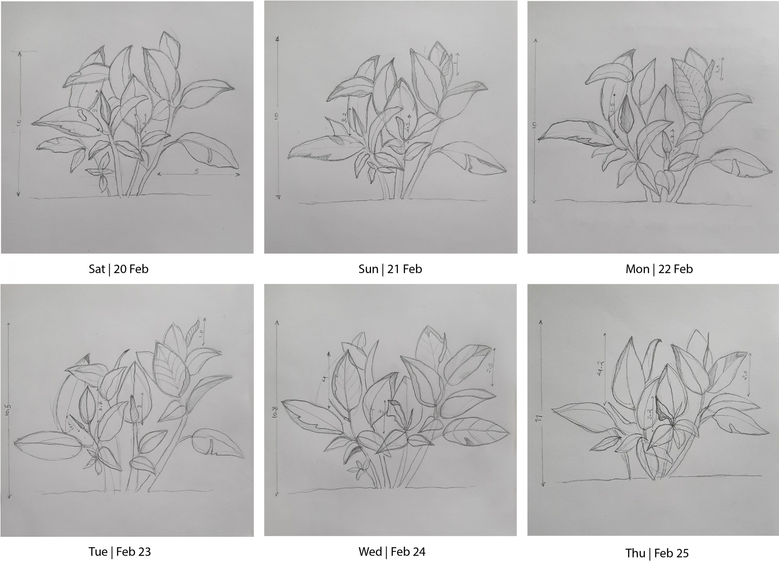
After this exercise, I was actually quite surprised at how my plant had changed and grown. My visualization showed a lot more than just the layout and spacing of leaves and certainly conveys more information than what I would have gotten if I were to read a table of number associated with it. These could also reveal the human elements behind these data and the conditions in which I had gathered them. Some days, the light revealed more details about the plant, some days I felt more rushed and had to stick to more general variables.
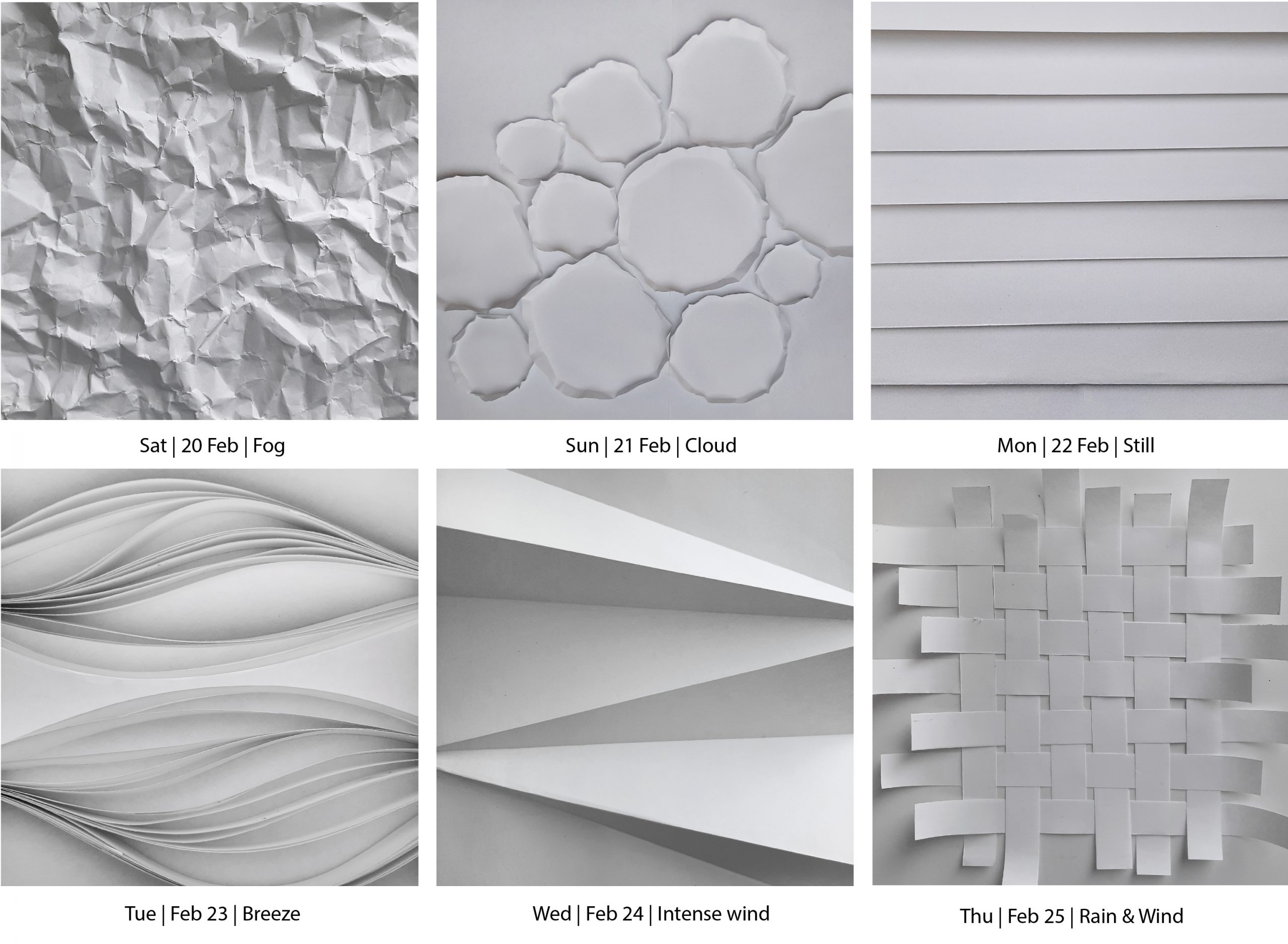
Weather:
Weather is probably one of the most talked-about elements when it comes to climate change. How much is it going to get warmer? How much more wind are we going to have? How much rain are we going to have?
So, I decided to monitor and collect the data of weather from my bedroom window every day at 8 am.
The method I chose to document was rough paper sculpture. I wanted my visualizations to be intuitive and raw representations of how I experienced weather on that day.
I thought this raw data might give more insights into the process and the conditions of data collection and it could convey more emotions as they are more vivid and expressive. Here is the series:
Reflections
When we talk about nature, everyone has their own unique connection to plants, trees, oceans, and animals. But when we talk about climate change, which is directly related to nature and our relationship with it, no one has a personal relationship with it. People’s connection with climate change is generic, distant, and somewhat vague. This is certainly understandable. We don’t know and even don’t want to form a relationship with it, maybe because it seems too daunting and unappealing. But can we let that connection stay distant and impersonal forever?
Data and visualizations are a significant step of our knowledge generation on topics relating to nature. In science, a specific visual language is created that represents nature to its audience. (Thierfelder, 2019). These visuals then define how we perceive and understand nature. So how can we create alternate ways of visualizing that can shift the way we perceive nature from our dominant paradigms? How we see nature’s visual representation directly influences our behavior towards nature.