
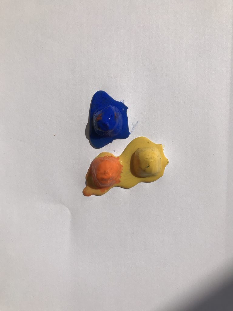
The egg is for decoration.
“… EMBROIDERY IS ANONYMOUS WORK.”
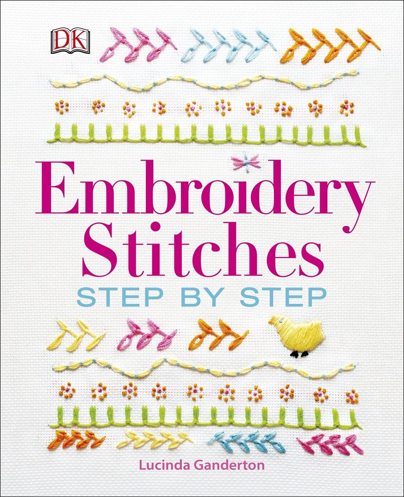
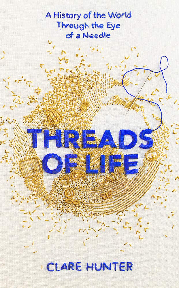
This investigation deals with learning about embroidery and the stories told by embroidery through a practice of embroidery. This is new territory for me so how do I do this? I read two books. One, embroidery stitches: step by step, a book on embroidery techniques and two, threads of life, which tells the stories told by embroidery.
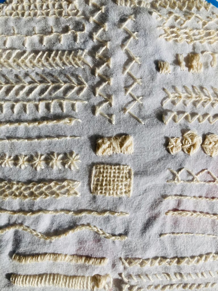
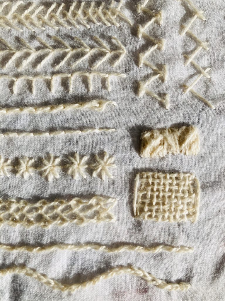
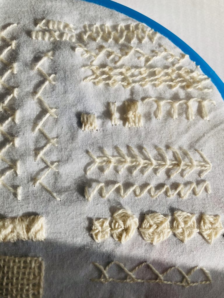
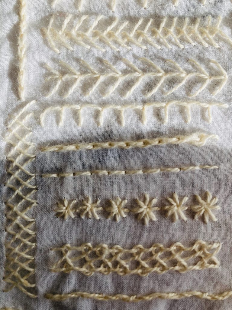
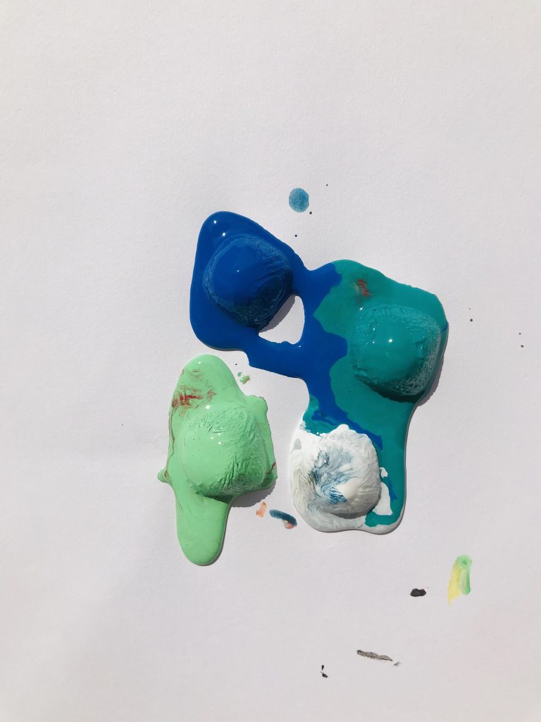
At first, I was learning the different embroidery techniques. I really liked the aesthetic of using white thread on white cloth. It’s simultaneously simple yet intricate? This really tested my patience which was great as one of my new years resolution is to be more patient. I had to redo some of the stitches because I stitched in the wrong direction or did the loop wrong or just totally messed up the technique. Whenever I was stitching, I’ve always remarked to my parents, how did people even figure out these techniques?
I liked some stitches more than others. I loved doing the stitches that look like fish bones (herringbone stitches) the most and didn’t really love anything involving loops. I didn’t even do a lot of stitching but it took up a lot of my time. This really made me appreciate the precise, intricate embroidery that I have seen on tapestry and clothing. I am not at that point where I can even fathom doing that level of work but I find so much beauty in it; not at just in the final outcome of work but also the making. The time. The precision. The patience. The artistry.
I continued learning different techniques and reading on embroidery; trying to navigate this new world.
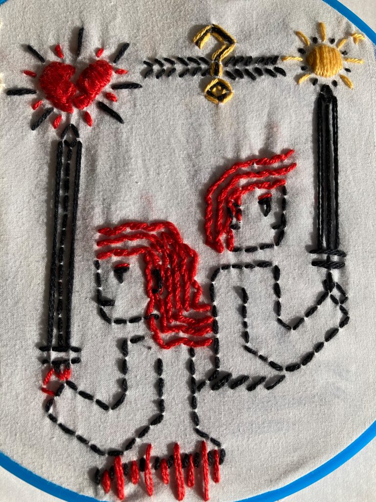
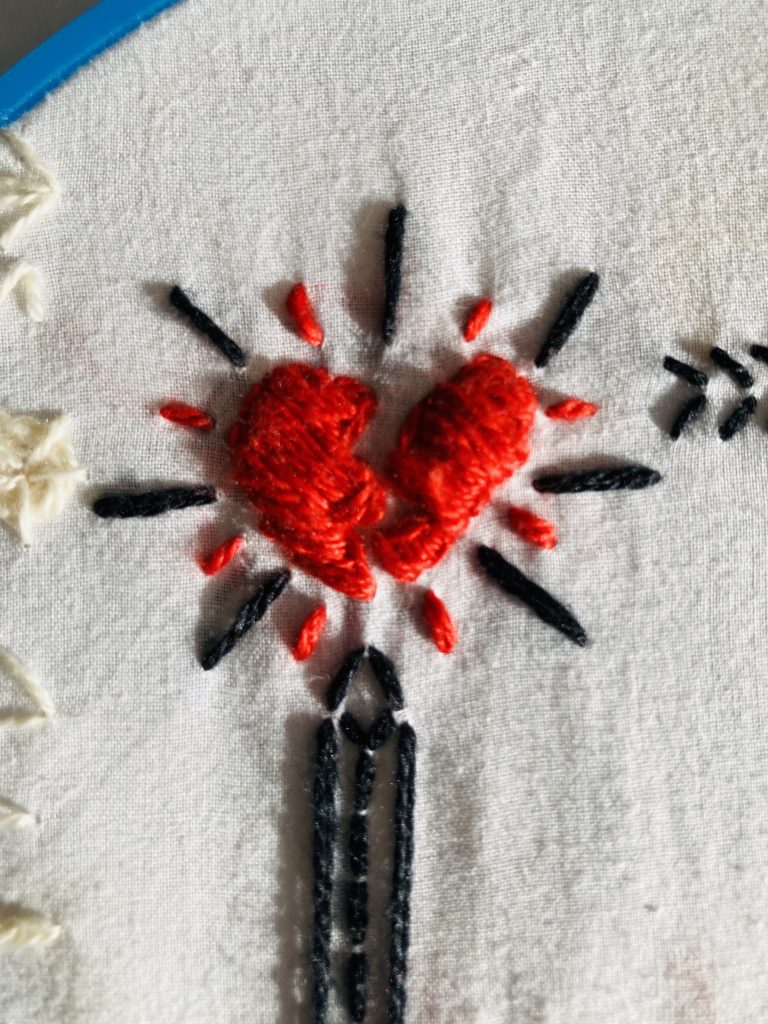
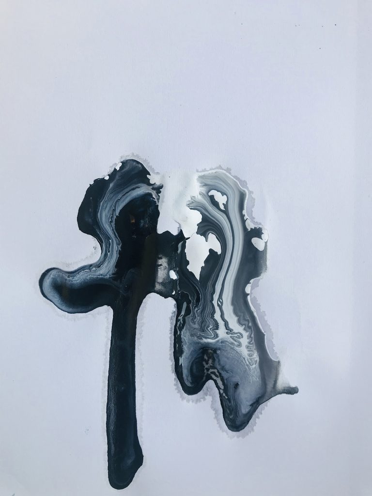
I came to point where I decided that I won’t look at the embroidery technique book anymore and just freestyle stitch. I decided to put down my thoughts and feelings on embroidery through embroidery. I always felt like stitching felt a lot like stabbing with a little sword hence why people are hold swords in the work. When I was reading, there was a general perception that embroidery is historically and presently considered women’s work.
In a lot of cultures, women did embroidery to create textiles for their trousseau. In the West, historically, women learnt how to embroider as part of their household duties (not sure if that’s the right word). But how about embroidery as an industry? In America, the sewing industry is female dominated; around 75% of people in the industry are women ( Source: https://www.zippia.com/sewing-jobs/demographics/). In contrast, in India, sewing is a male dominated industry (https://ncert.nic.in/ncerts/l/kehc108.pdf).
When I asked my parents about gender and embroidery in India, they told me that the general perception is that embroidery is generally done by women. I don’t have any statistics for this though. This is speculation. That perception is such a contrast to the reality of the sewing industry in India. Hmmmmmmmmm.
My father was telling me he associates embroidery with his aunts and grandmother sewing at home; sometimes for mending and other times for creative expression. I suppose this perception on embroidery is the same perception people have with cooking. Cooking is generally an activity perceived as women’s work but if you look at it from an industry standpoint, it’s male dominated. So. It is only considered women’s work until money is involved. Hmmmmmm.
Another point that I found interesting during my reading is that embroidery is anonymous work. Who are the people doing this art? In the reading, the author was talking the women who stitched Bayeux tapestry. We don’t know their names. We can only speculate on how they live. Now my question is do I take advantage of the anonymity associated with embroidery or do I take away the anonymity associated with embroidery work?
When I looked at the final outcome, I noticed how the style change. The white on white work is delicate and more intricate but the freestyle is simple and bold and I was just like yeah, that’s just how think visually. How do I go forward with this? I feel like I’ve not even scratched the surface of where this could go. How does my own practice fall in line with embroidery? Mixing my communication design practice with my new embroidery practice? Where do I go from here? Let’s see.
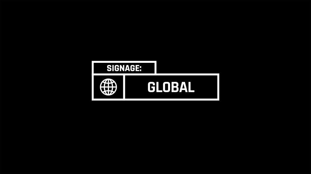
“…LOCAL AND GLOBAL.“
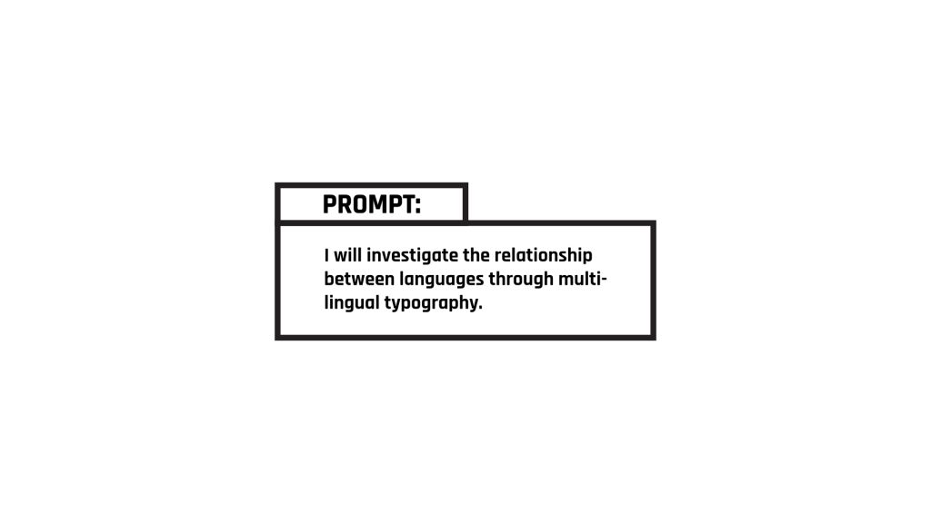
How to begin investigating this prompt? I decided to look to my own environment. When I was in Mumbai, I took some pictures of signage in my neighbourhood. I only have a few pictures as it’s not a hobby I frequently did.
Signage is made differently according to different context. I looked at it in two different contexts; local and global. At the local level, I looked at signages for stores, local government and elections. At the global level, I looked at store signages only.
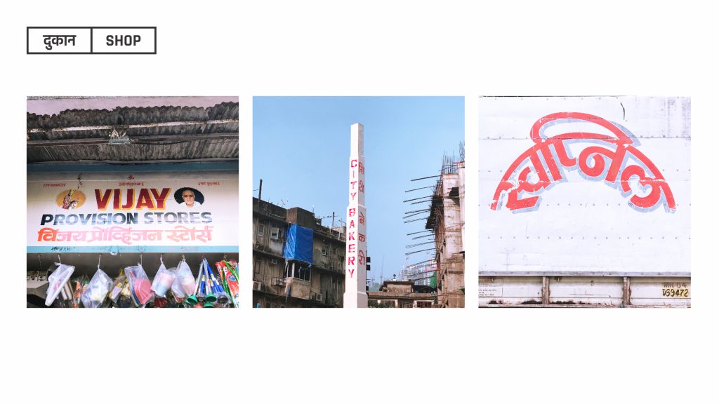
In the shops in my neighbourhood, signages can very. It could be in only the local language, only in English, or they would use both the languages. If the signage uses both English and language, both language is given equal importance or one is given more importance to the other in terms of care given to the typography.
Signages could either be hand-painted or digitally printed but they are increasingly becoming digitally printed as it’s a fast and cost-effective solution though it doesn’t last as long as a hand painted signage as you have to change it more frequently.
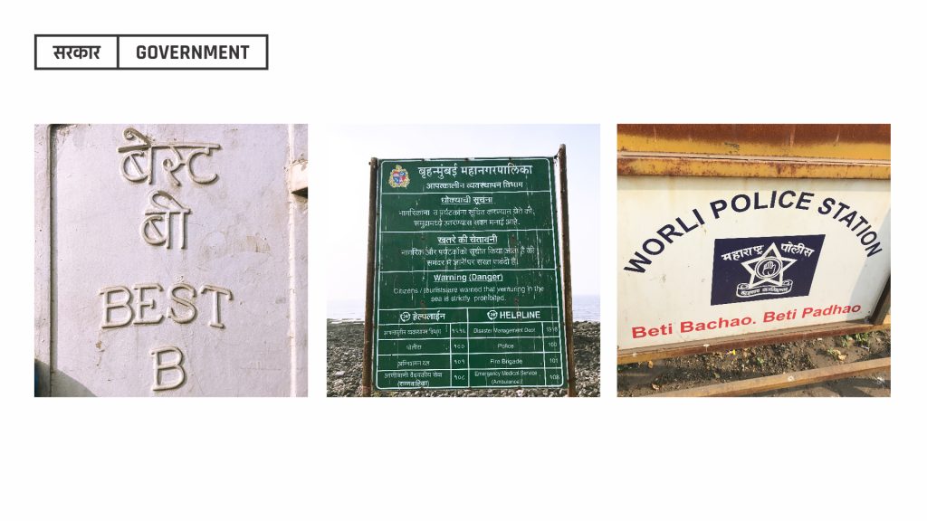
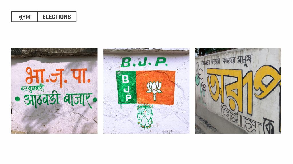
Signage at the local government level is used with both in the local language and English, both given equal importance typographically. Understandable as this information has to available and understood by everyone. Same could be said for signage made for elections. As it has to understood by the general population, both English and the local language are both implemented though I have seen cases where it’s one or the other.
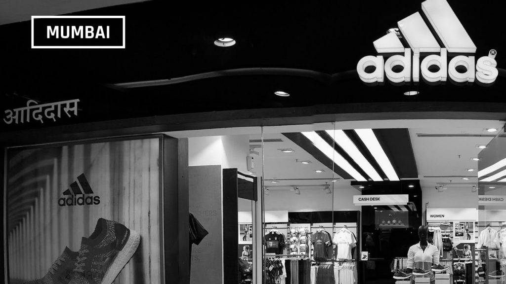
http://www.highstreetphoenix.com/store/adidas 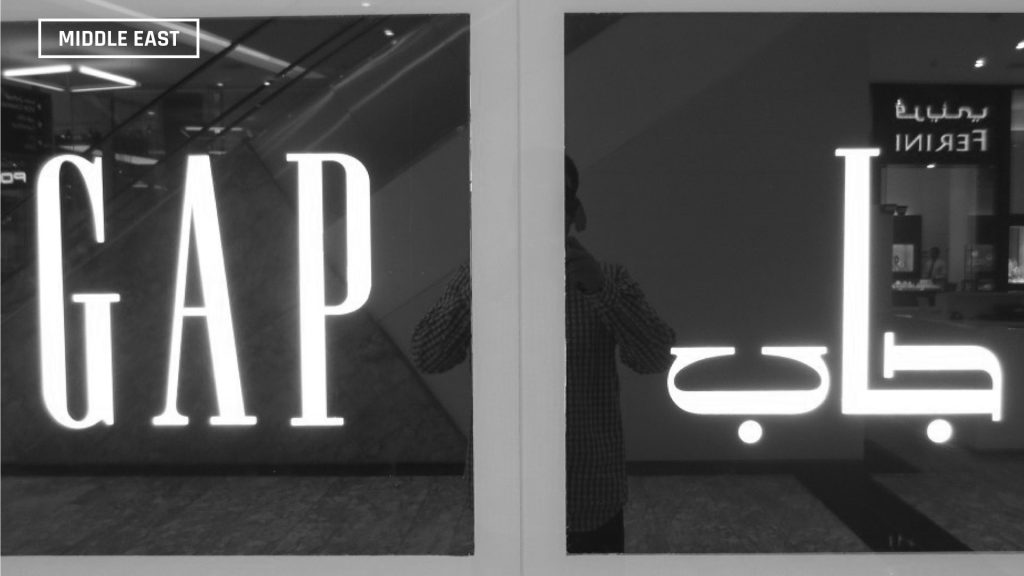
http://istizada.com/blog/arabic-logos-of-big-global-brands/
Next, I looked at store signages for international brands in two different cultural contexts. Mumbai, India and the Middle East. In the examples above, even though the brands are two different ones, you can see how typography is treated. In Mumbai, the Devanagari type signage is made with a default Devanagari font and then put off to the side. In contrast, in the Middle East, the signage in Arabic is treated with equal care to the English.
Of course, the difference in the both of cultural contexts has to be considered. In the Middle East, the dominant language is Arabic. In India, there is no one dominating local language since there are so many and just picking one as a dominant language would be favouring one culture over another. A lot of people say Hindi is a dominant local language but Hindi is not a language commonly used in the southern or eastern regions of India. As a result, English becomes default.
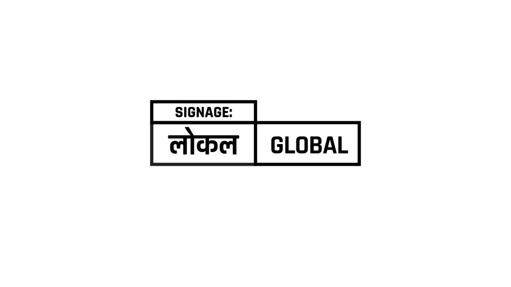
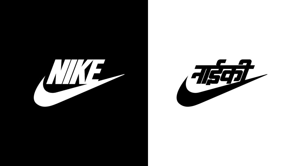
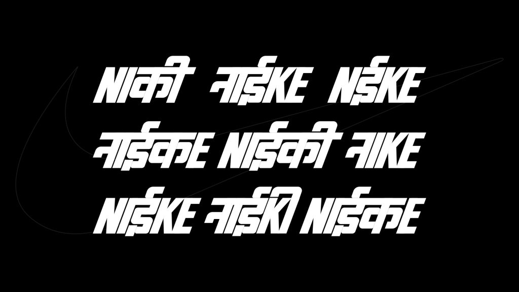
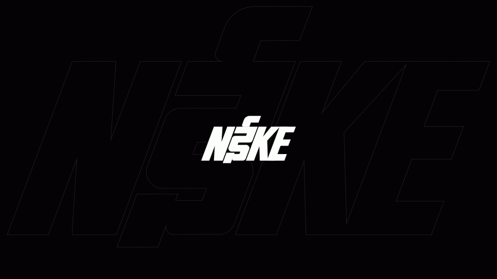
I decided to create signage for an international brand in India and treat like how they would in the Middle East. The brand I decided on was Nike and the place I chose for their store was Mumbai where the dominant local language is Hindi and Marathi; both which use the Devanagari script. It is mandated by law that you need to have local language spelling of stores in India so why not do it in style instead of having it off to the side.
As I was making the Devanagari version, I realized all the typographical errors I was making. My Devanagari version is not as vertical as the English one. There are also problems with spacing within each letter which I found frustrating. I also don’t think some of the letters look like it’s the same font as the english one. I also gave myself two days to make this so I have to give myself some leeway for this exercise. In the end, I made a Devanagari Nike logo, not wholly satisfied with it but it’s a start.
I was also not completely happy with the binary between languages; that it has to either Hindi or English. That’s not how language works in India. We sprinkle in Hindi into English and English into our Hindi. I wanted the logo to be more reflective of that behaviour so I just mixed both the scripts into the logo. Honestly I don’t think the logo is legible to people who speak either language but creative liberties. It could be a campaign ¯\_(ツ)_/¯
We had an interesting discussion in Studio this week. Shankar mentioned that if someone from India were to wear a Nike t-shirt, they would prefer the English one to the Hindi one because that’s the one they would want to be associated with and it’s true. There is a certain cachet (I don’t know if that’s the right word) to knowing English. It’s considered a sign of education and money.
TO MY FUTURE SELF…
Dear Meghna,
What a weird, weird year. The Plague happend. You quit your job. You started university again. You moved about 3 times. So many, many, many zoom calls. And you’re going to move, again. You’re probably in Vancouver by now and I hope you are doing great. When you started out your actions, you definitely had no idea what you were doing. Action 1 was great as it helped you to introduce yourself. You were introducing your present and past environment to everyone. By showing Kimia around your neighbourhood, you were able to look at your neighbourhood in a new light as you became a tour guide designing their experience. From this experience, the lesson learnt is to involve other people in your process. They may offer a completely different perspective that could take your work in new directions. You witnessed this in Action 4 as well. After the peer review, your classmate’s thoughts influenced your making of the newspaper plate. Essentially, what I am saying is continue to have peer reviews.
Action 3 had some pivotal moments. There were elements of generative design with the survey posters and critical design by challenging helvetica. Don’t be too hard on yourself. In Action 4, you were looking at the specific and looking broader. Contextual inquiry, critical design and cultural probes were definitely involved. You definitely shied away from nature as it is an uncomfortable space for you and went to a space more familiar but later in the action, you were inspired by nature. I would sincerely urge you rethink your relationship with nature. You also had a personal history with work that made it all the more compelling to you. You were also breaking down certain practices such as the vada pav stall, the elements of a vada pav and its packaging. Continue breaking things down so you observe how the individual parts work in the context of the whole. This is what led you to your making.
In Action 5, you were again approaching certain systems and practices through a critical lens. There seems to be a theme of critique so far. During your peer review, someone commented that your work was like a protest. Protest is a type of critique so it’s an apt descriptor. Critiquing border systems, your own name and your perceptions of nature. Action 5 was another uncomfortable area for you. You were in an unfamiliar environment using a fairly unfamiliar medium and I do believe that showed in the video sketches. Just a word of advice, when you hit unfamiliar territory, try to revel in that unfamiliarity. These could be new exciting spaces for you to work in. Who knows but it’s great to just explore without expecting perfection. Perfection is the enemy of exploration.
For Action 6, you were quarantined so you didn’t make anything but you had time to think. This is where you took stock of your not new but still unfamiliar surroundings in Saudi Arabia. This is what led to your exploration for action 7 + 8. A lesson learnt from this action is to take personal inventory, You may stumble upon something that you wouldn’t have noticed otherwise. From action 7 onwards, you had two lines of inquiry; one relating to borders and passports and another to nature. You were dealing with your personal relationship with passports and your ancestral relationship with borders. This is again a mode of critical design as you were questioning the underlying systems of these spaces and artefacts.
You also use the method of interview to gain information and directed storytelling in your making. Though the making was ultimately dissatisfying for this action, I think storytelling should be a part of your process. You were never good at telling stories but showing the story is your strong suit. Your experiments with sun and frozen paint were fun. You also gave it a fancy name, ~ ecological experimentation ~. There was no serious inquiry behind this. You were just seeing what would happen so this is a reminder to have fun in your practice. Keeps you sane. For action 8, you made paper. There was material exploration involved here. This was an interesting process and I hope you keep making paper.
For action 9 + 10, you revisited your making in action 7. The trouble you had with that action was how were you going to tell your great grandparent’s story? By action 9, you realised this was not your story to tell. You did not personally know your great grandparents but people like your aunts and parent do. Sometimes, as designers, maybe we should probably step back and ask ourselves, “Who gets to tell these stories?” It was inquiry through some level of design ethnography. This also led you to an interesting inquiry regarding using craft + communication design to tell a story. Till now, you have seen little example of craft + communication design though that would probably change by the time you’re seeing this. I hope you continue this line of inquiry. Action 11 was a visual summary of your previous actions. “Hieroglyphs” were used to tell the story of your actions. It was essentially a form of storyboarding that was interpretive. Throughout all your actions, there was a story you wanted to tell through your making. If there is any advice I would give, it’s to tell the story you want to tell.
Just a few more words of advice. Please walk. Don’t just sit. You’ve never been able to think well while sitting. Pacing helps you think. There’s probably some science behind this. Don’t procrastinate. Just don’t do it though you did procrastinate this letter. Please be more patient with yourself and others. The impatience is something that has increased incrementally throughout the years. Slow down, friend. Be kind to yourself. This time is for you. I have given you enough gyan. I am sure you’re doing well for yourself; you always have. This was a hard year for you and for everyone but you got through it. You’re going to hate that I posted this letter publicly but I hope if anybody else reads this, it helps them too.
If I had to end this letter in any way, I must quote Rumi as I know how you love his words to the point of tears.
“What you seek is seeking you.”
Rumi
You should verify if this is really his quote though.
Yours,
Meghna
“THE LAST ACTION. FOR NOW.“
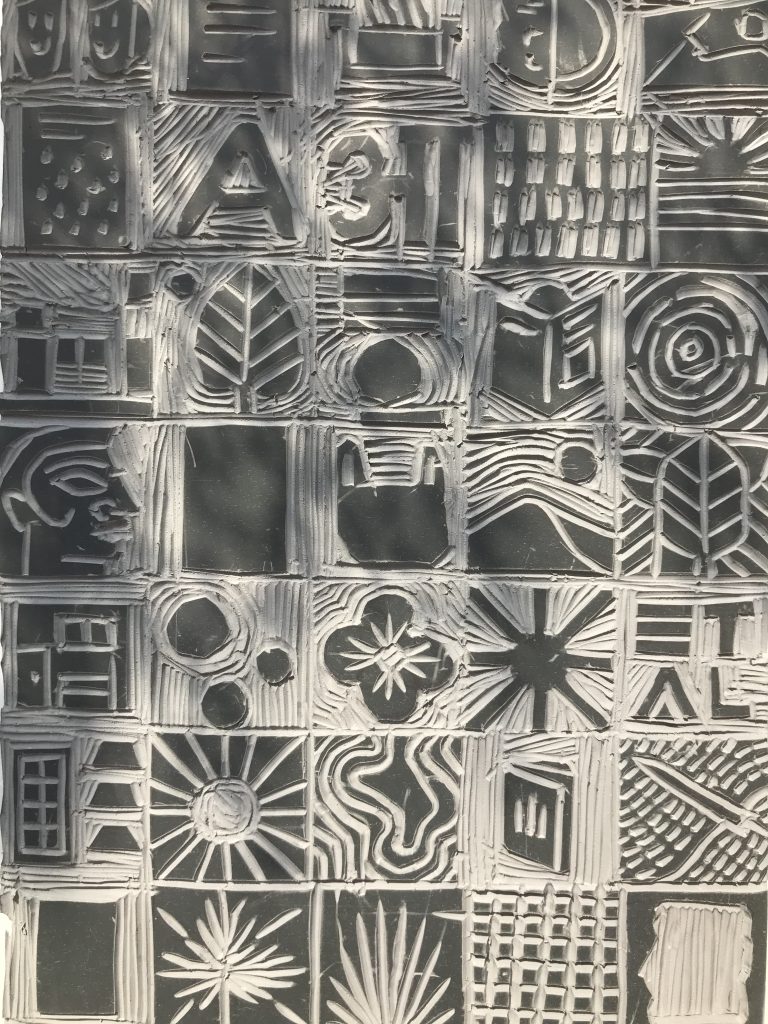
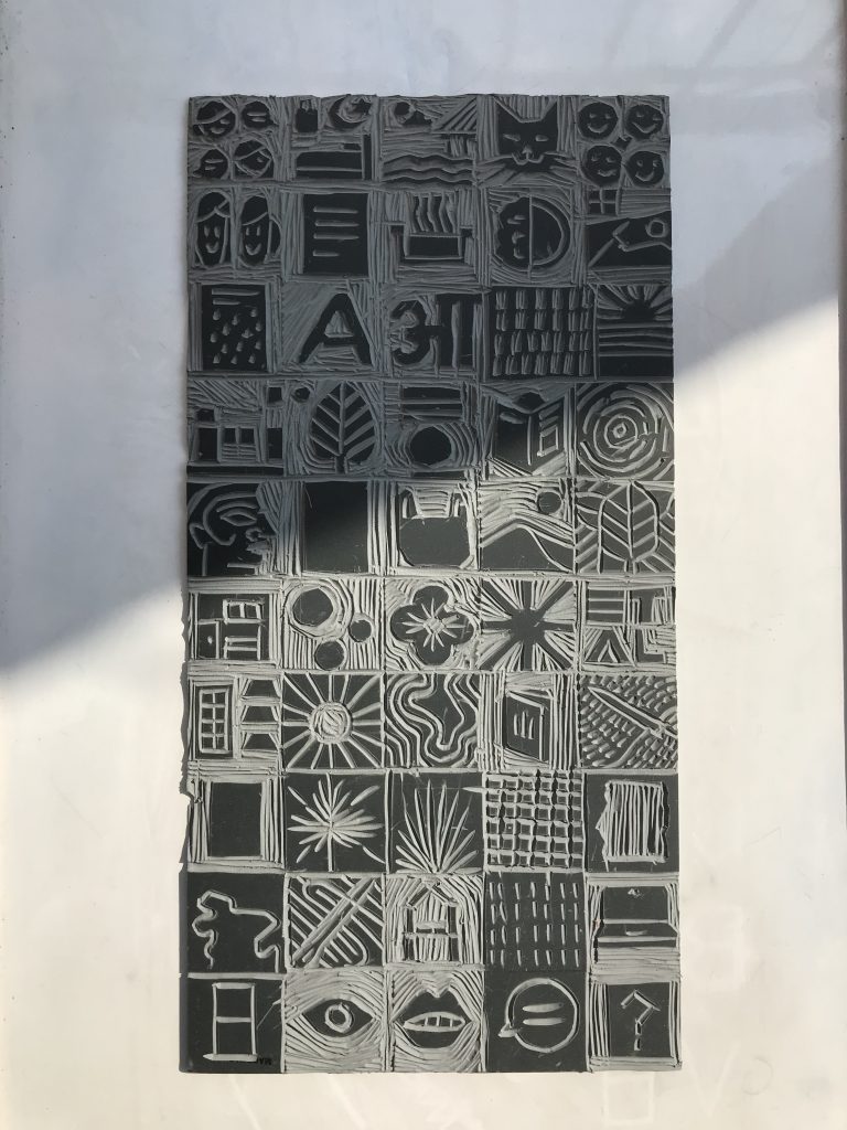
The last action. For now. I definitely felt some pressure since it was the last. I spent an entire week thinking about what to do instead of actually doing anything. In my case, too much pressure leads to inaction apparently. What I ended up doing was a creating a visual summary of my previous 10 actions.
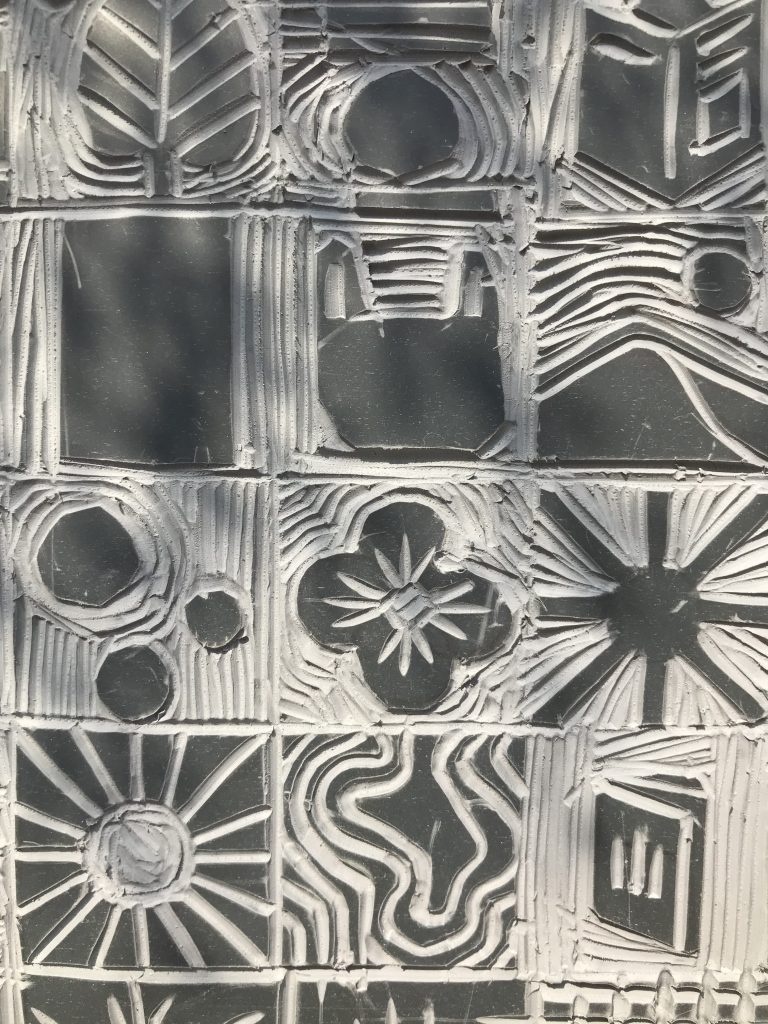
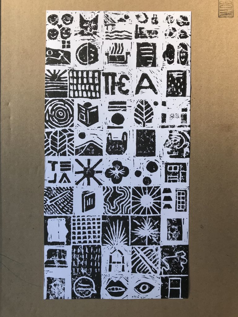
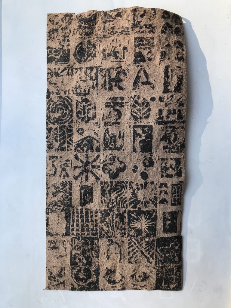
We were asked to write a letter to our future selves and this my interpretation of that as a visual story. I remembered watching a documentary on ancient Egypt when I was younger and I was like, “Oh, hieroglyphs.” so I made “hieroglyphs” of my actions. I didn’t have stone but I did have a lino block. Close enough. Carved the symbols. Printed on some printer paper (pictured above) and the paper I made in one of actions (pictured below: didn’t work out so well). After I did the block print, I realized I should have carved the mirror image of certain symbols but too late.
I was definitely carving in the moments of my actions rather than any method or methodology. Things that clearly stood out in my memory. It’s so imperfect but so is my practice so this imperfection is actually quite perfect. I would explain each visual but I created this so it could be open to interpretation so dear reader, interpret it however you like.
As for any future actions, I have no clue but I will definitely want this process of reflection to be part of my practice as it has lead me to some unexpected routes. Thank you readers, if there are any, for being part of this journey. It’s been interesting.
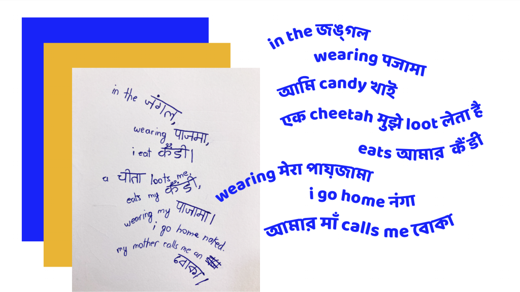
“HOW AM I GOING TO DO THIS?”
This action is a continuation from my last one. I was wondering how to get the typeface I made on to the handkerchief so I could follow the outline for stitching. I asked Maleeka for advice as she has printed on fabric before and she uses a digital fabric printer which I do not have access to. A lot of the week went into figuring this situation out with the tools I had. How am I going to do this???
After asking my dad if it’s possible to print on fabric on an inkjet printer (bad, bad idea), it occurred to me that there is a way to transfer the artwork to the fabric without directly printing on it. Heat transfer paper. Just iron it on. Had to knock myself on the head for this. It seems like such a “oh, duh” solution.
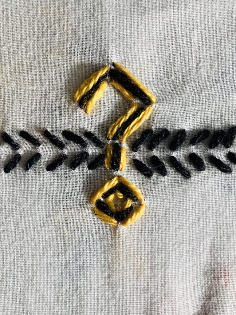
Got my heat transfer paper. Printed on it (pictured above). Ironed it on to my fabric and then started embroidering. That’s when I realized that the characters were printed to small. Oof. I knew when I created the typeface, each character either was going to be four stitches long and two stitches wide or 2 stitches long and 2 stitches wide but I did not take into account how long each stitch would be. But then everything was already on the fabric so I decided to go ahead with it.
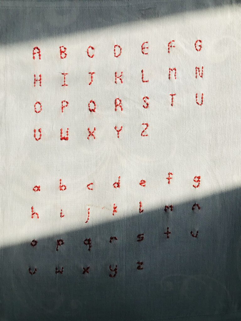
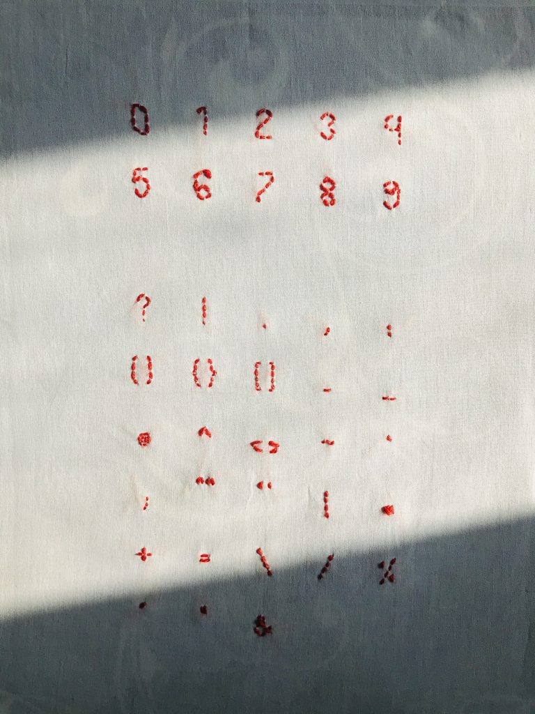
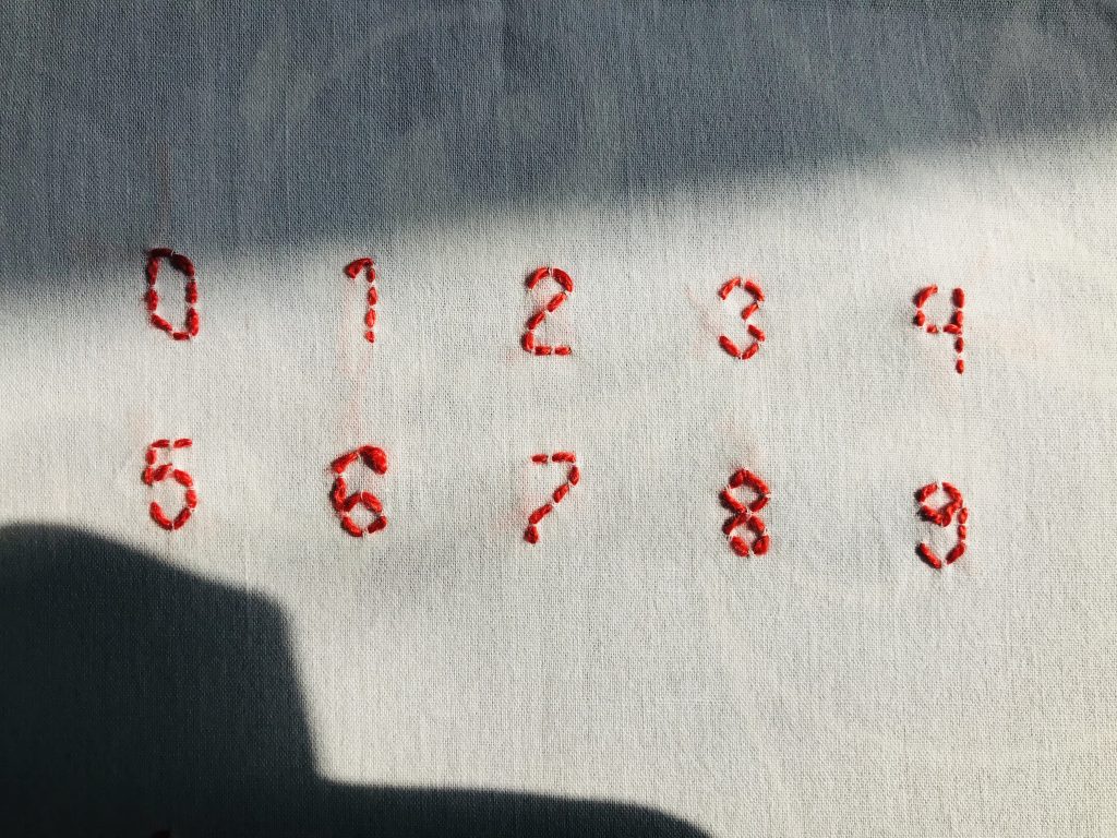
Embroidery is truly a practice of patience. I’ve stabbed myself multiple times, screamed (internally) when I didn’t do the stitch quite right and required time and intense concentration. In the end, I made it. The embroidered typeface (pictured above) is a little different from what I imagined. It’s a little wonky. A little less perfect than imagined but that’s okay. Imperfection is its own aesthetic and I am an amateur at embroidery and I also didn’t give myself enough time. Though I really liked the “2”, it’s a nice “2”.
What next? I wanted to name the typeface but I also wanted it to be a usable typeface before I name it. As I stated in my last action, this typeface was created to be used to tell the story of my great grandparents by those close to them. I decided to actually create the embroidered typeface digitally in the break. I don’t know if you could use images to make a typeface. I still want the texture of the stitch to be retained. I asked my friend who’s made a font before if that’s possible and even she’s not sure. I’ll figure it out.
“… AM I ONCE AGAIN REINFORCING COLONIAL PERSPECTIVES?”
I had a lot of conflicting feelings for this action. Pictured below is my earlier attempt at understanding my great grandparent’s journey from present day Bangladesh to present day India during the Partition era. To read more on it, go back two posts earlier.
To summarize my feelings about that action, I was really bothered by the fact that generation by generation, my great grandparent’s stories were fading away as there no records of them except by memory. I was attempting to tell their story through Kantha, a method of embroidery that uses recycled fabrics. What struck me about Kantha was that the stitching could be handed down through generations, with grandmother,mother and daughter working on the same Kantha which I felt was appropriate for such a generational journey of memories of my great grandparents. Though I attempted it, I couldn’t help feel that I was erasing their story by stitching the very border they escaped from.
At the beginning of this reflection, I mentioned conflicting feelings. This is the story of my grandparents’ journey and many others but do I have any right to tell these stories? This knowledge was not imparted to me, I only know because I asked. Maybe I shouldn’t be telling these stories at all but the people who were close to them; people like my aunts and my parents. Most of the people from the Partition generation aren’t alive but the knowledge of their stories has been passed down through generations as memory.
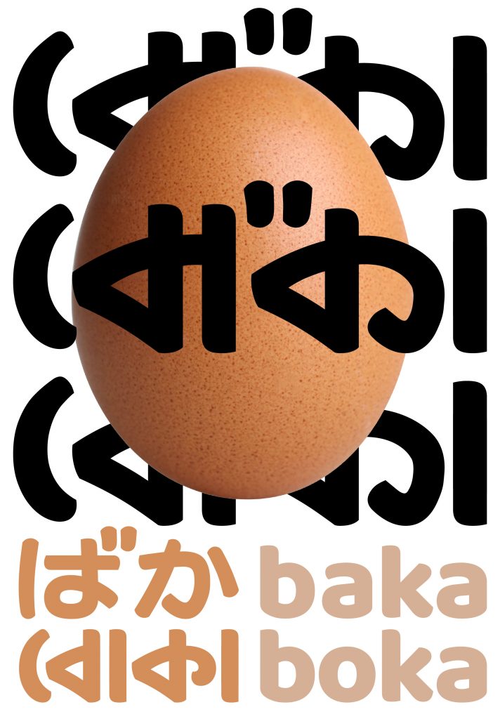
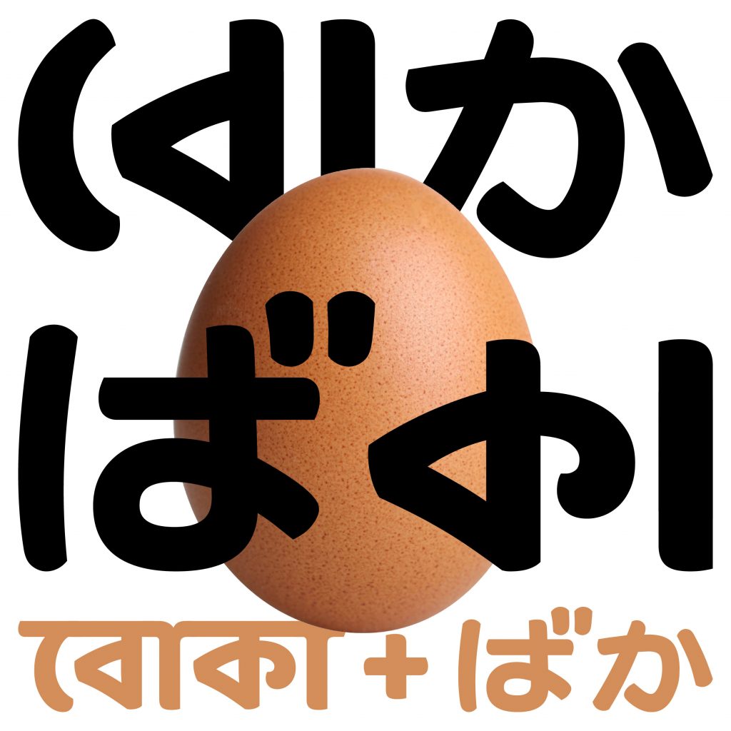
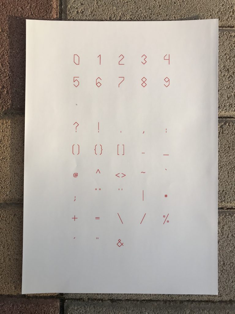
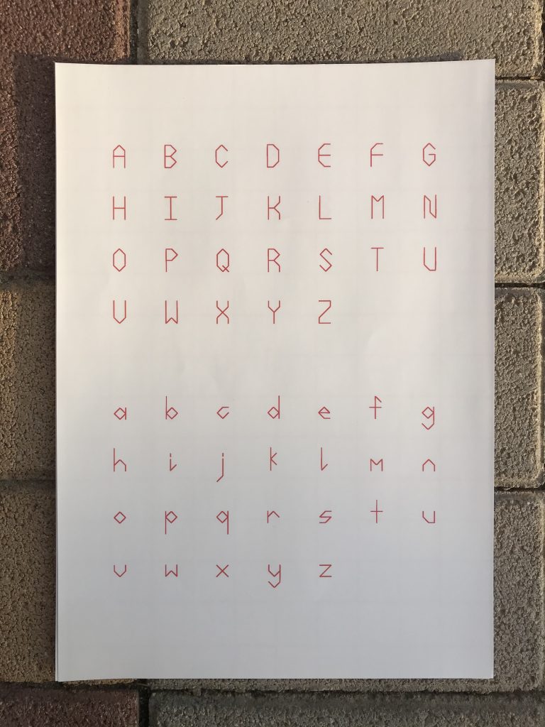
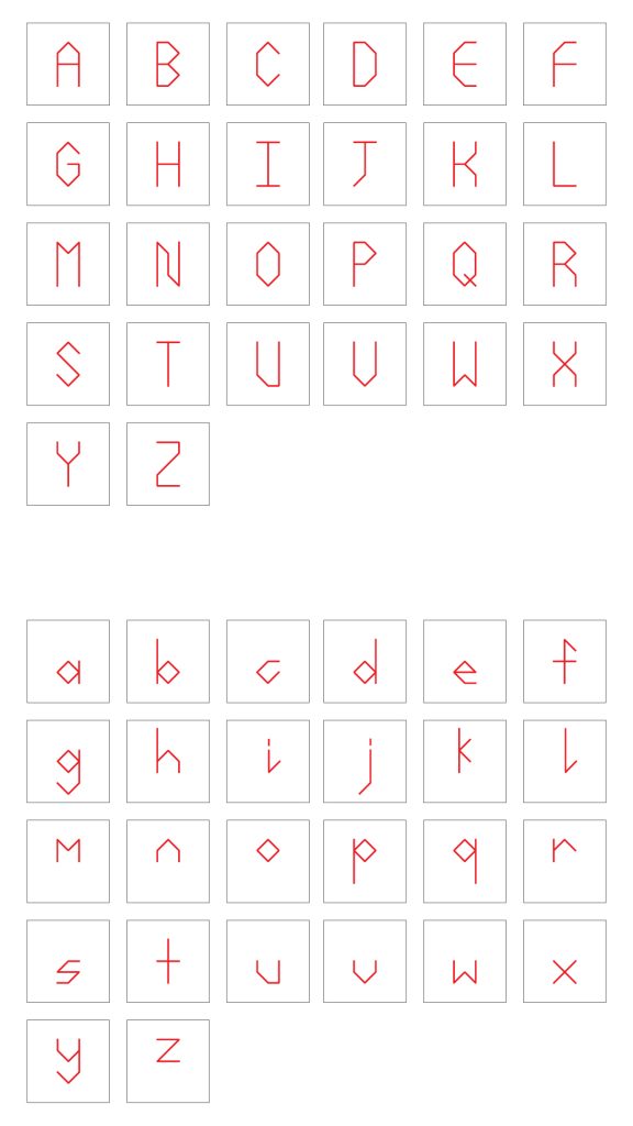
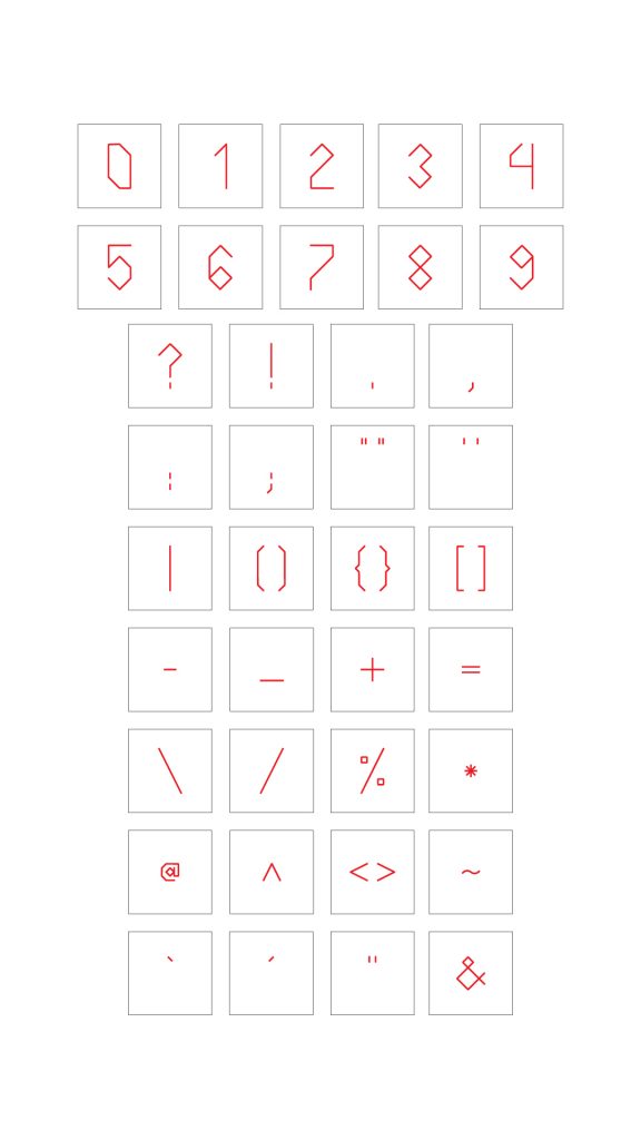
I decided to take a step back and let others tell this story but I provide tools. Kantha is the medium of storytelling that I believe was appropriate for these generational stories but how can Kantha be used by everyone to tell their ancestor’s stories? I decided to embroider a typeface in Kantha’s running stitch style. Pictured below is the base typeface that I created. I made the typeface so it would be easy to apply a running stitch. Angular. No curves.
To be honest, I am not completely satisfied with the typeface but I promised myself I won’t be so perfectionist about it as this is more about the making and less about results. This is where I had another bout of conflicting feelings. The written word is a colonial perspective. Kantha is a purely graphical form; based on patterns and images. By making a typeface out of Kantha, am I once again reinforcing colonial perspectives?
I think, at this point, I was trying to renconcile this fact. Huge internal debate ensued. Though the written word is a colonial perpsective of records, written literature makes up a big part of Bengali culture as a result of the Bengal Renaissance (19th century to early 20th century). I don’t think this debate was ever resolved so I just decided to go ahead with making the typeface.
I still have to embroider and name the typeface. That will probably continue on to action 10. I was also considering making the font in Bengali but decided against it for now as my brain would melt from the sheer amount of work I would have to do. All in all, despite all the conflicting feelings this action, it was fun making a typeface. I was back in my element with making through the screen which was something I avoided in my earlier actions. I am also interested to see how the digital typeface would translate into the embroidered typeface. This would also be a first for me; mixing craft with design. Let’s see how this goes. Till the next action.
“… LABOUR INTENSIVE BUT… SATISFYING.“
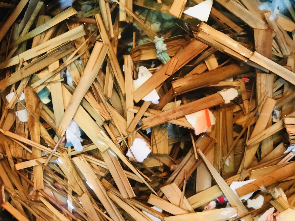
When reflecting on all my earlier actions, I realize I use paper as a medium most of the times. A4 white printer paper. They come in bulk stacks of a few hundred pages. My use of these papers are mostly single use. I might look back on it for reference but otherwise they sit there on my desk, piling up. The pulp and paper industry contributes to a fairly major part of global warming pollution, water pollution and deforestation. One of my investigations in my actions is how can ecology inform my practice to create design that sustains. How could I explore sustainability if the medium I use to explore it is in itself unsustainable by design? How could I change this? I decided that I was going to make my own paper.

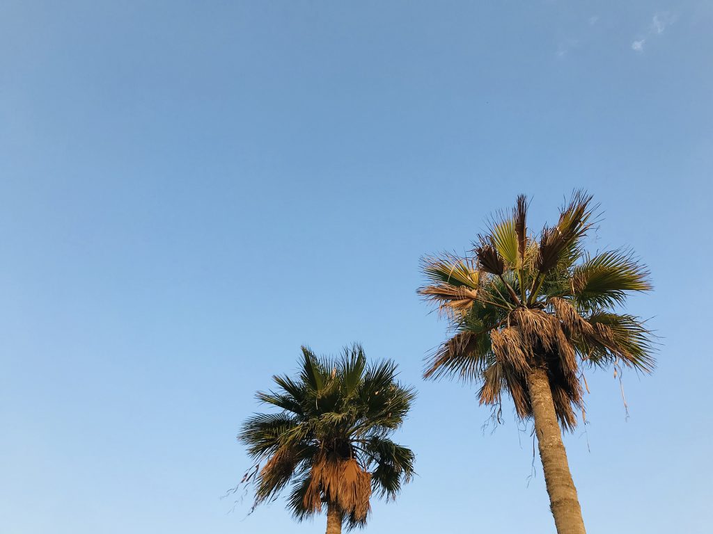
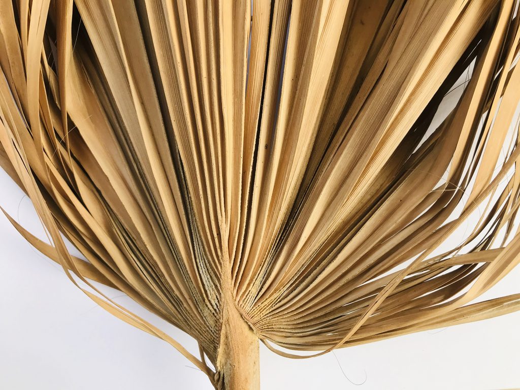
I took a walk through my neighbourhood, trying to decide what resource I could use to make my paper. I happend upon these palm trees pictured above. They are fairly common in Saudi Arabia but I don’t believe they are of a local variety. If my research is correct, this is either sabal palmetto (Southern U.S.A, Cuba) or windmill palm tree (China, Japan, Myanmar, India) or I could be completely wrong. This is just speculation. But these trees grow well despite the harsh climate. There were some dead palm leaves the gardener hacked off and were left on the ground so I picked it up and took it home. The stem is prickly and leaves are hard and extremely fibrous.
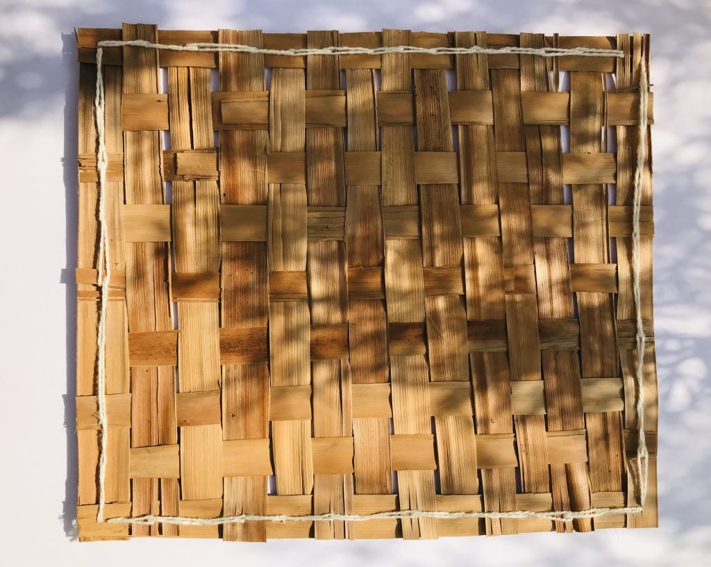
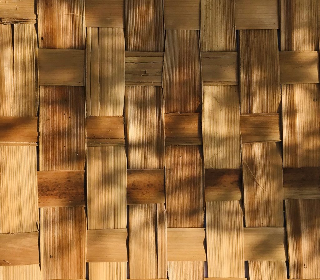
For my first paper making method, I decided to weave the leaves. I didn’t have the materials to make a mold and deckle yet and I had a lot of leaves so I did what I could with what I had. Leaves weaved together isn’t the best of paper admittedly. The leaves I used were waxy so the color would run off the surface (ink would work better probably). I like how the weave has a grid pattern so it’s probably good to record information in a table format. Maybe. Since pigments don’t hold very well on the weave, I decided to make another weave but this time soak it in bleach solution so it would turn white and make it easier for pigments to hold. That’s not the most sustainable solution but it works. It takes quite a while for the bleach to turn the weave white. It might take a few days after this action. We’ll see how that goes later.
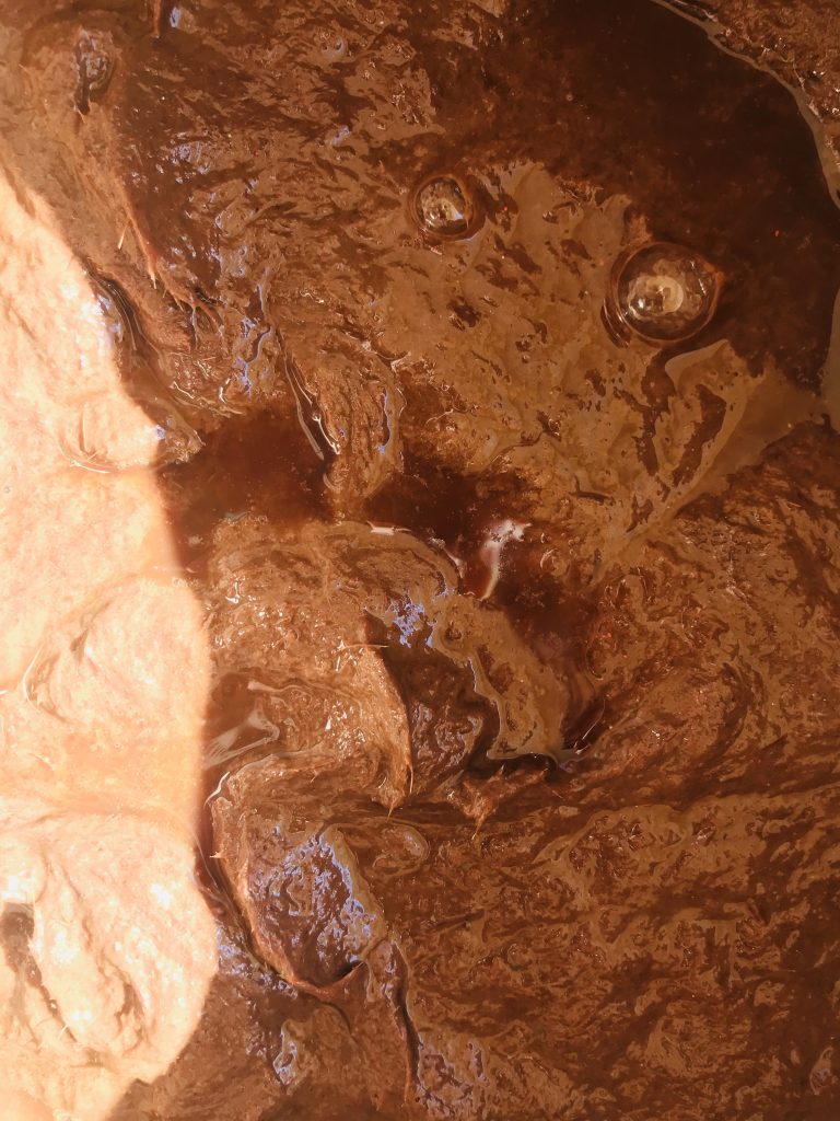
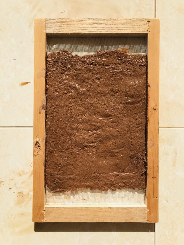
I got my mold (no deckle). Time to prep the leaves. I cut the leaves into small pieces, placed in large pot of water with baking soda and set it to simmer. This process is used to soften the leaves. The palm leaves I used were extremely hard and fibrous. I left it to soak and simmer for about 2 days before I turned it into pulp. Paper making is messy. I scooped the pulp into the mold and flattened and evened it out using a spatula. It’s a different method from all the YouTube tutorials I watched but I didn’t have a bucket/ tub big enough to fit my mold so I improvised. Once I had the pulp evened out in the mold, I transferred the molded pulp onto cloth and let it dry with some weight pressed on to it to keep the paper from curling.
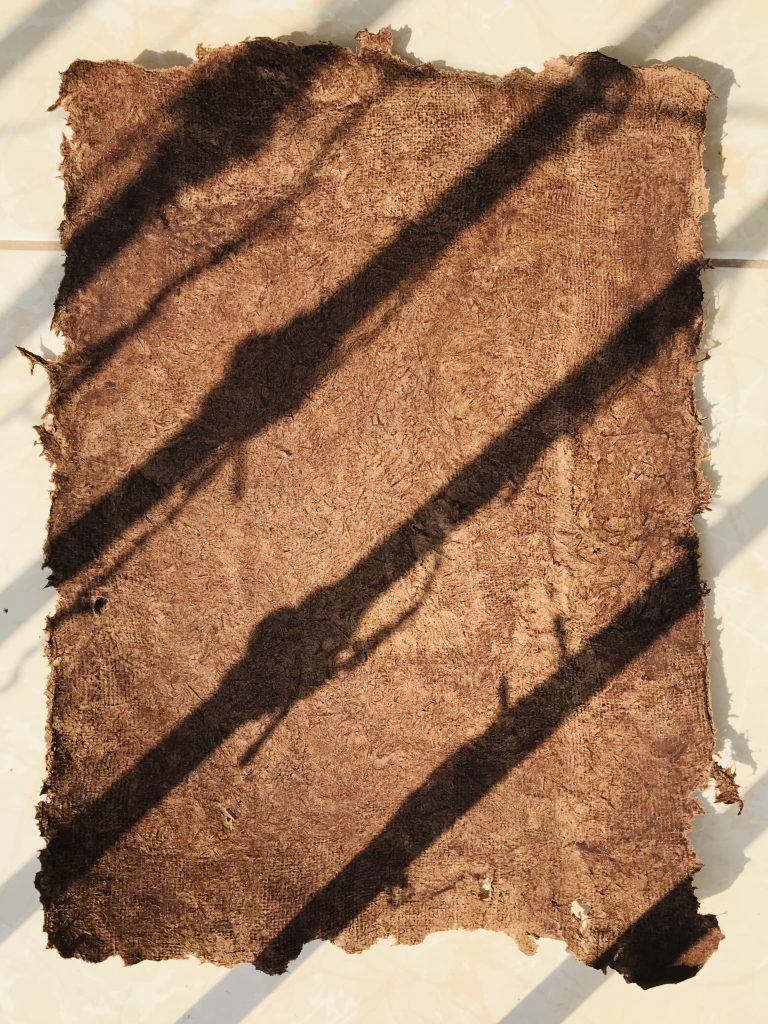
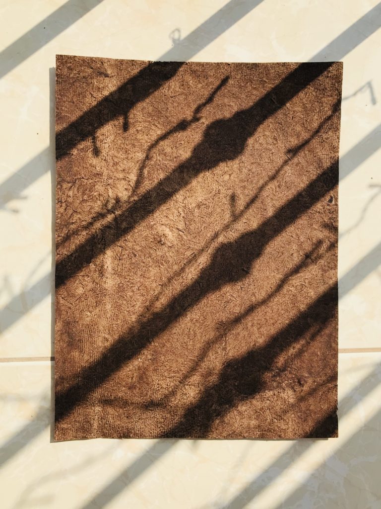
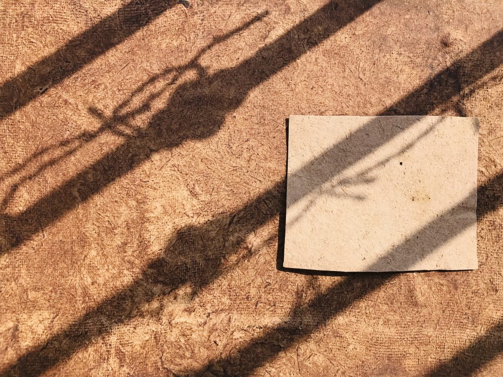
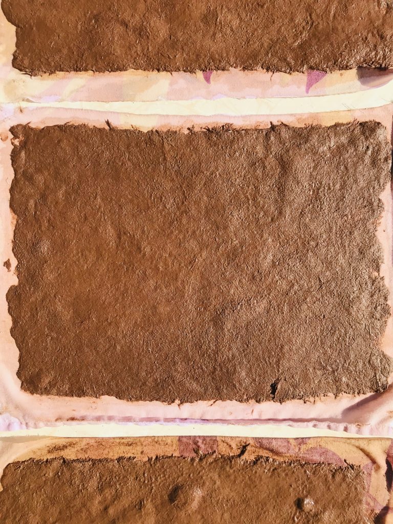
All in all, this worked out pretty well. The paper is thick, pliable and I could write on it. The back turned out a lighter brown from the front. I trimmed the edges since they were quite sharp after drying. Later I will trim it to an A4 size and see if the printer would except this paper. I want to know if printing is even feasible with handmade paper so I could make prints more sustainably. I hope the printer doesn’t get jammed. Fingers crossed.
I enjoyed the papermaking process immensely. It was pretty labour intensive but overall satisfying. If the printer experiment works, I am excited to create more custom paper for myself.
“… IT TOTALLY FAILED.”
I will investigate border histories and ecology through making and experimenting with my environment.
In my earlier action, I was contemplating how the environment around me collaborate in my making? Saudi Arabia. Miles upon miles of sand, stone and sun. It got me to thinking what is the most readily available resource where I now live? Sun. Heat.
In a place where temperatures can soar upto 55 degrees celsius, heat has always been a deterrent for many activities in my daily life. I rarely step out during hot days and eagerly wait for winter months for more pleasant weather. I want to challenge that my way of thinking about the sun. Instead of disregarding it, I wanted to embrace it so I decided to experiment with the sun’s heat for my making.
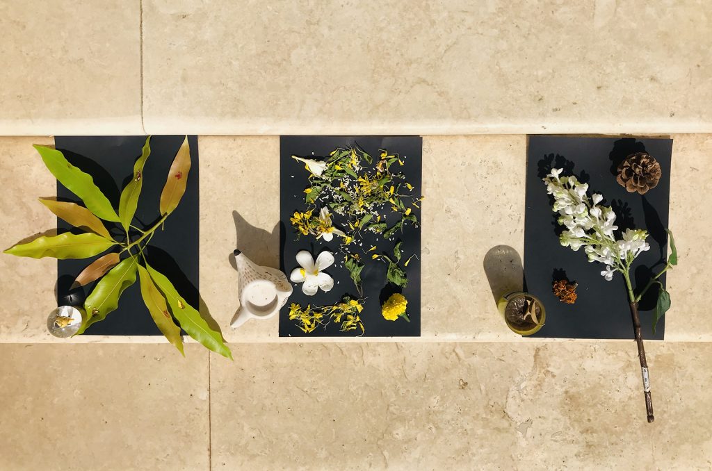
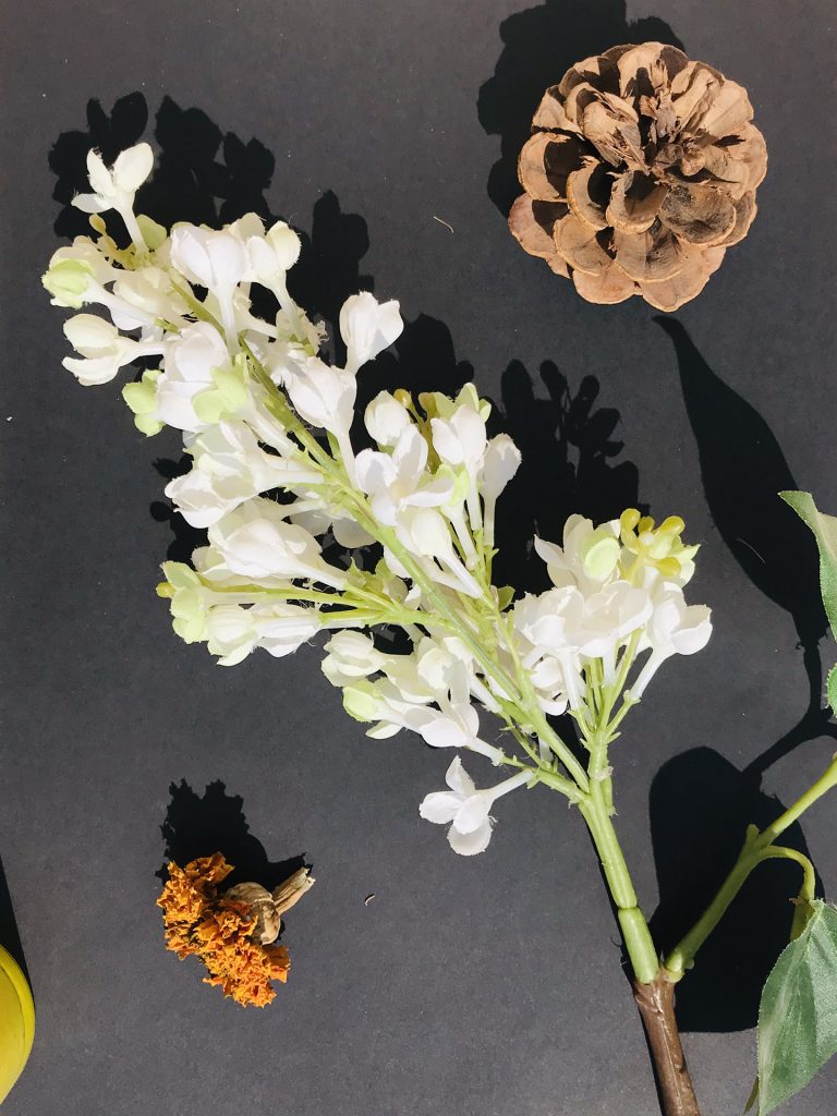
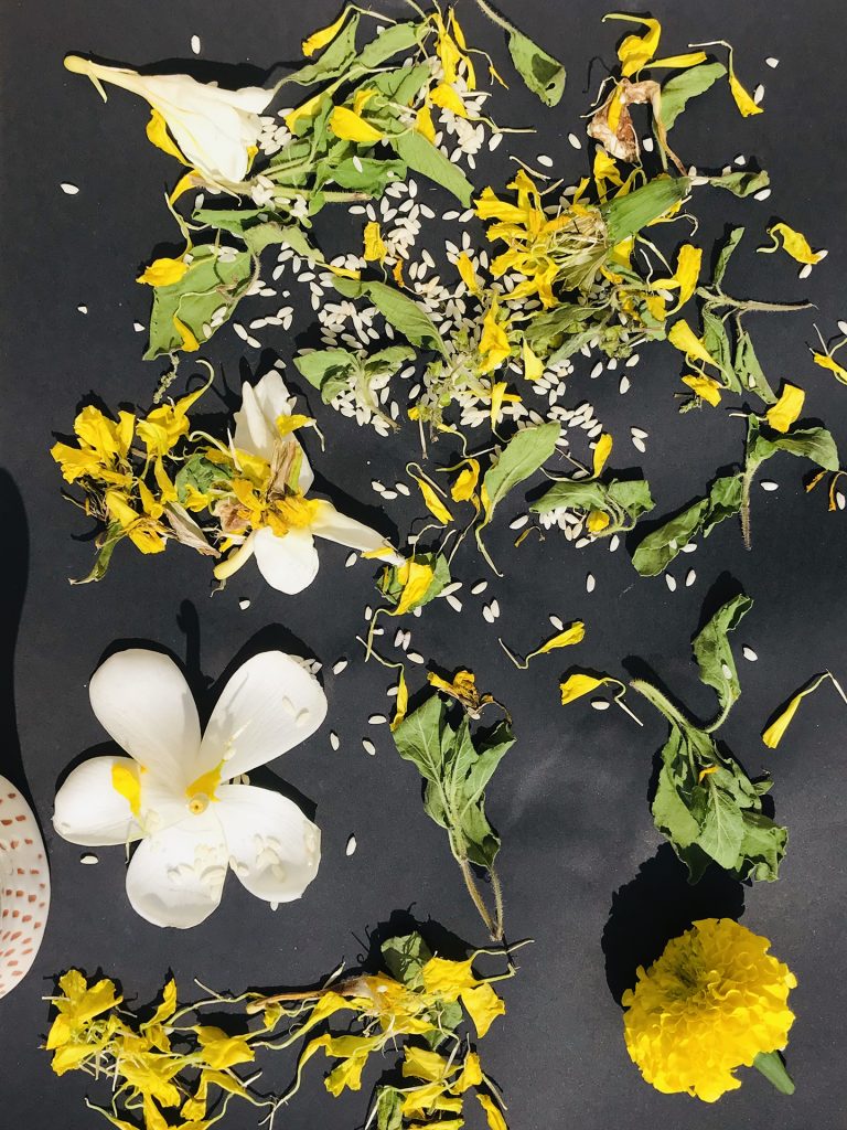
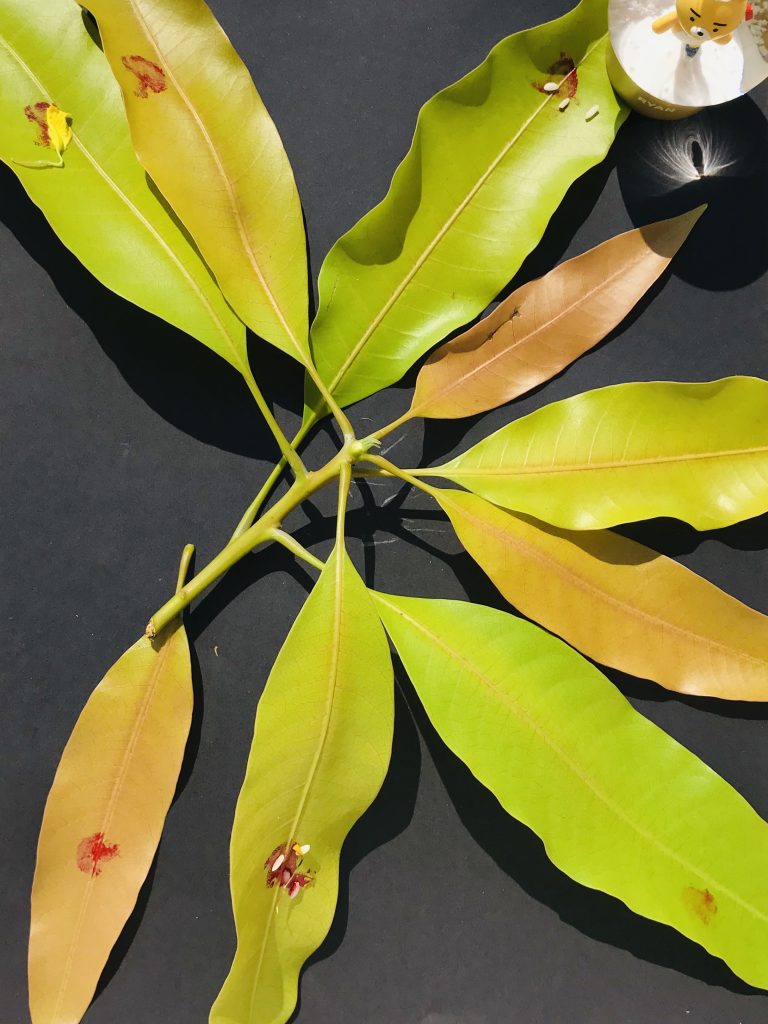
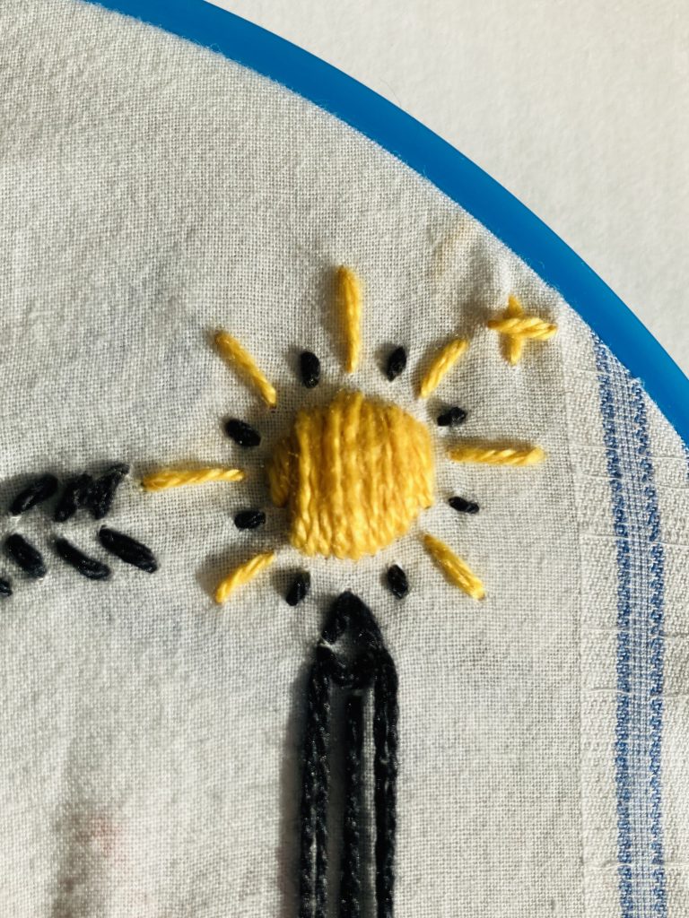
For my first attempt in using sun’s heat in my making, I decided to make some sun prints using construction black paper (pictured above). The idea was that when I place objects on the construction paper and leave it out on direct sunlight for a few hours, a “tanline” of the object should be left on the paper. So I just placed whatever I had around the house. Flowers and leaves. Pinecones. Rice. I left it out in the morning and waited until the sun set to check on it and it totally failed. No “tanline” was left behind on the paper. So it was back to square one. How do I use the sun’s heat in my making?
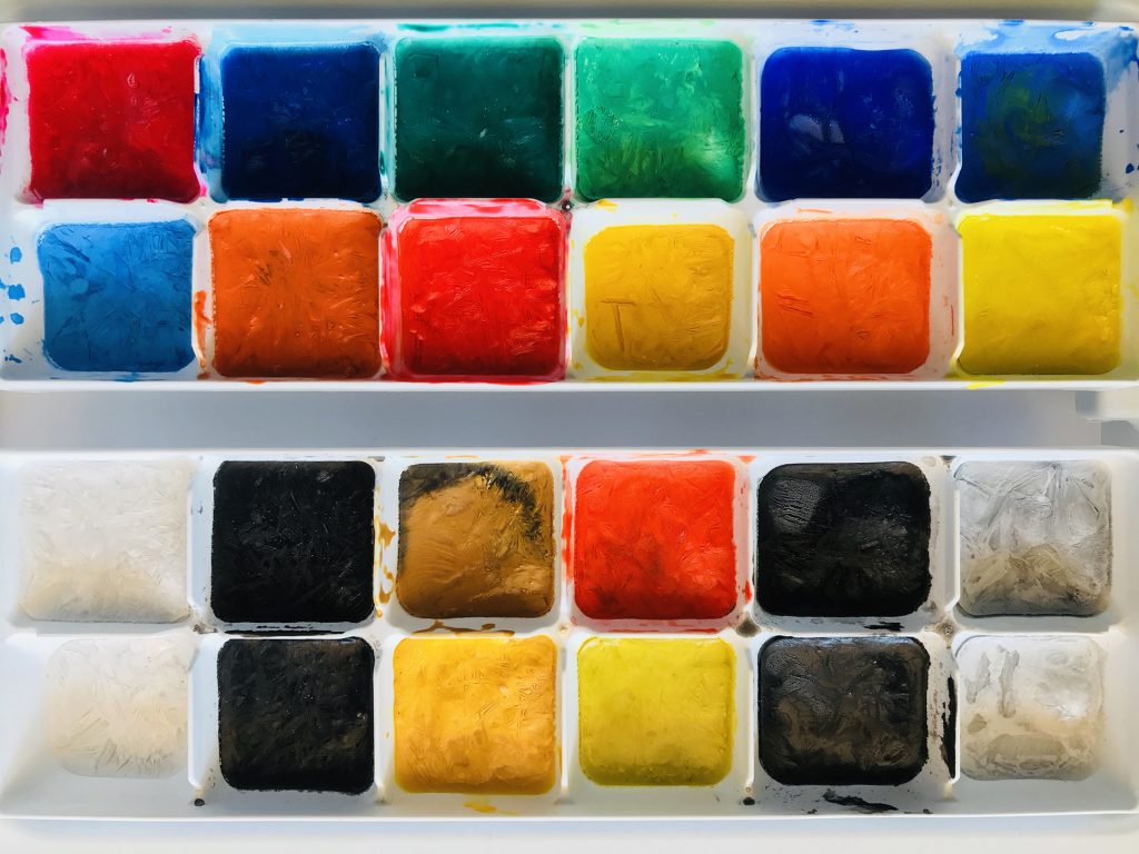
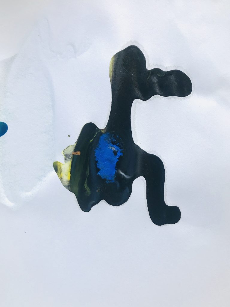
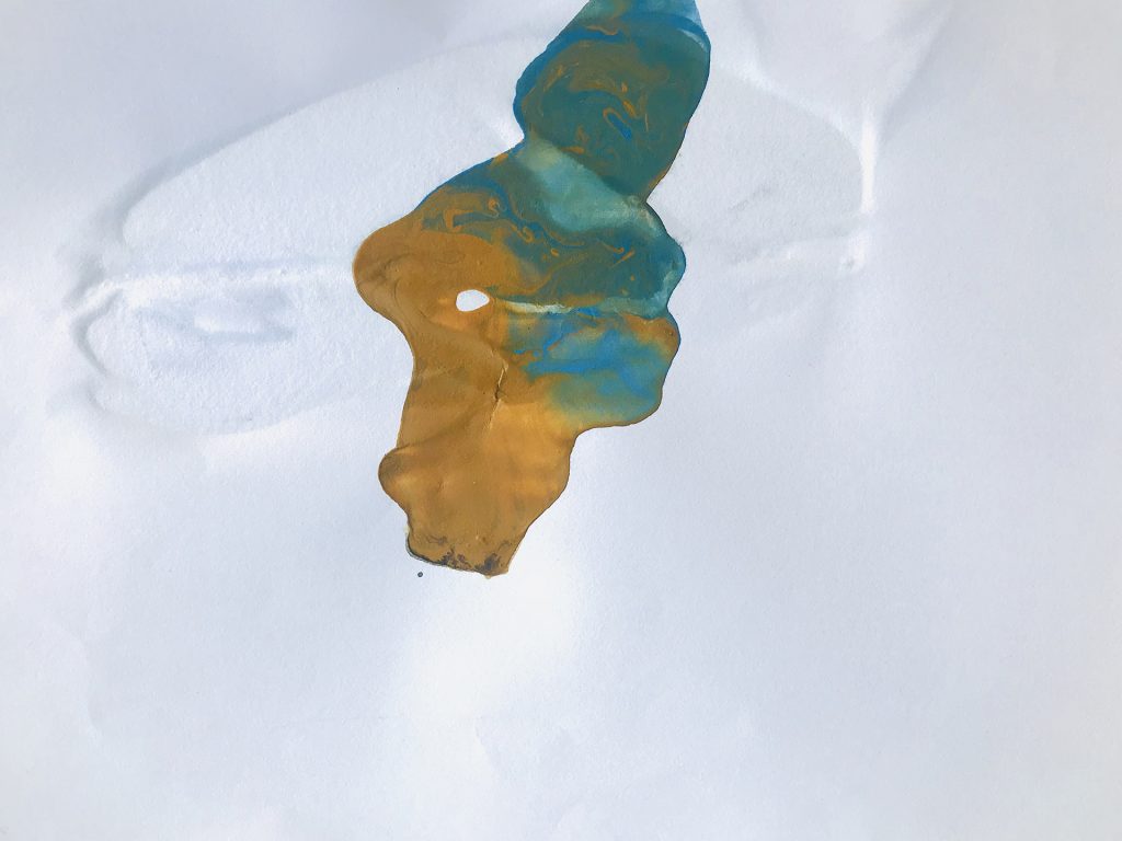
For my second attempt at experiment with the sun’s heat, I realized I may have to think a bit more about this. I realized I was using the sun’s heat as a tool but maybe it should be a collaborator. I should give the sun some tools and let the sun make what it wants. So I decided to offer the sun some paint and paper. I mixed the paint in some water and froze it. Then I placed the ice cubes on the paper which was placed outside and let the sun do its thing and below are the results of the sun’s makings. The results (pictured below) were pretty interesting. There was also a surprise collaboration by the wind that resulted in some of the paper flying off and paint dripping. Shoutout to wind ~
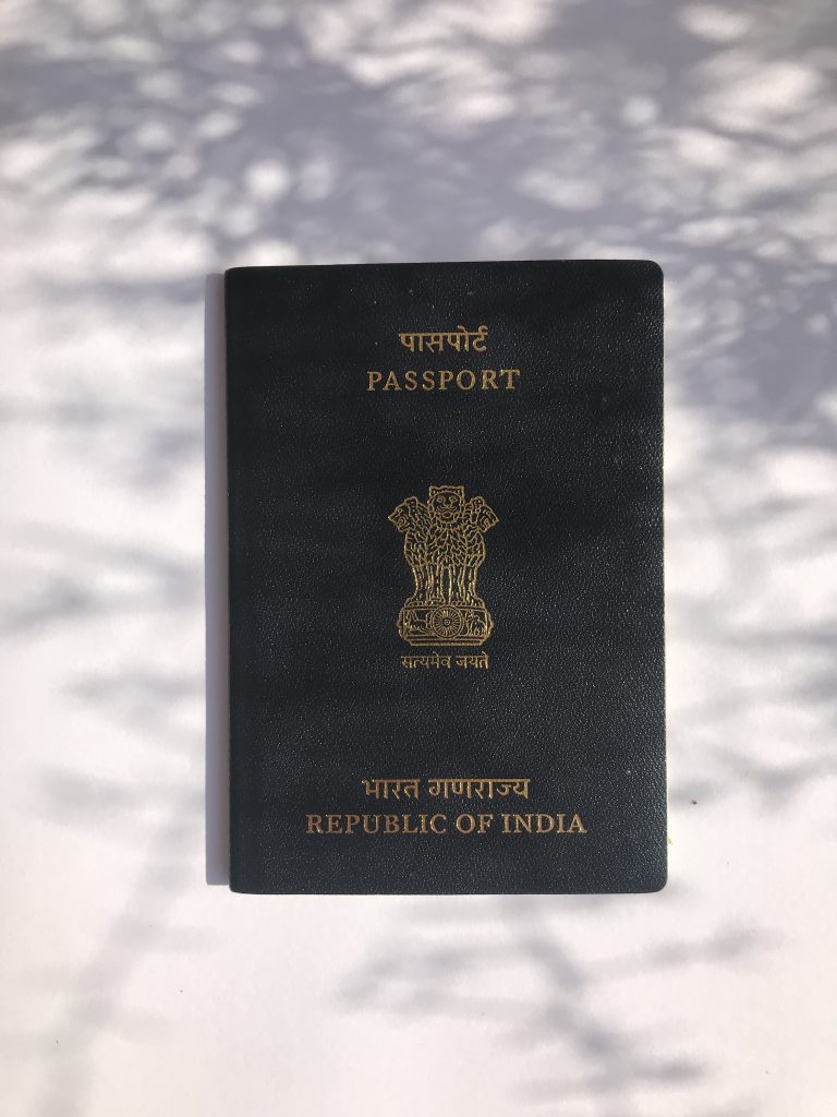
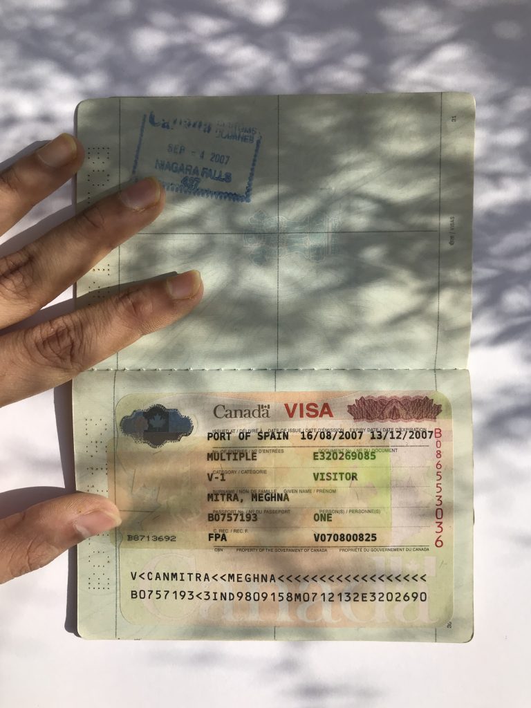
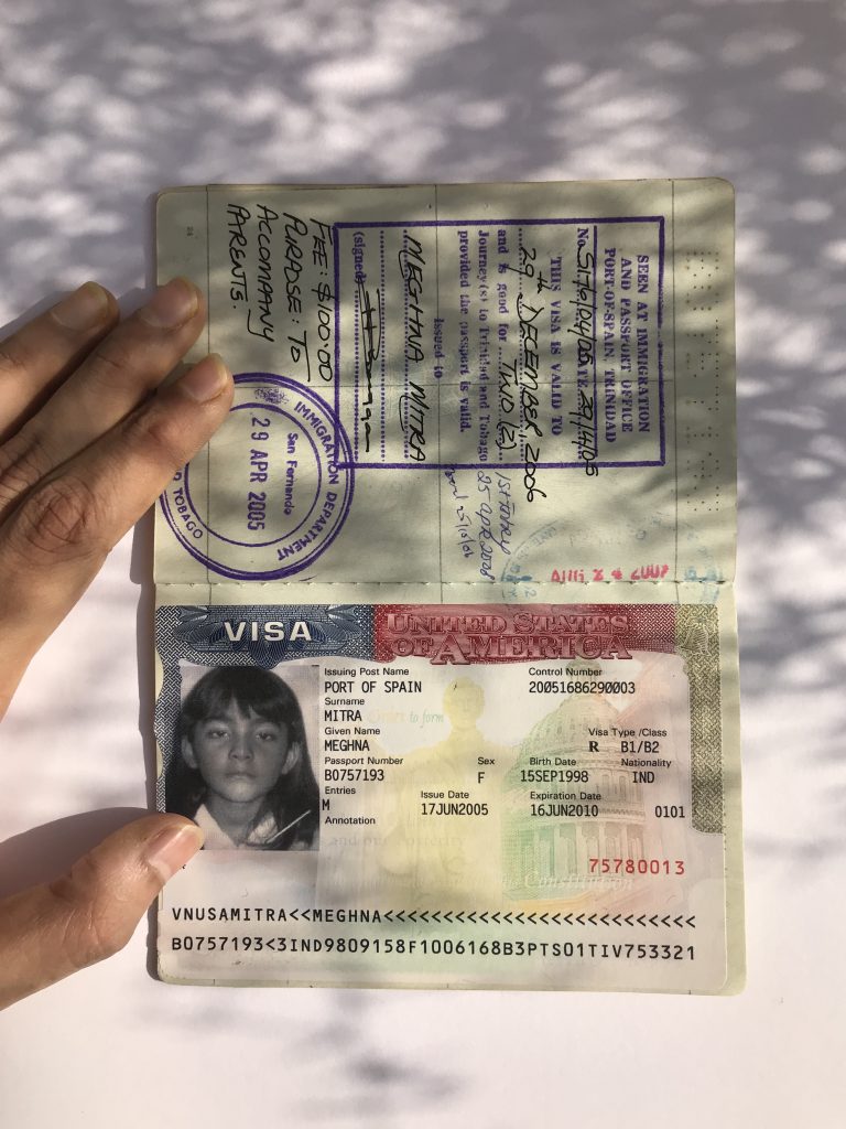
My other line of investigation is into border histories. I started from my personal history with borders by looking at my passports, old and new. Every page. Every stamp. Every visa. A record of my border history. Which borders I had permission to cross? What type of permission do I have to enter these borders? For how long could I stay within those borders? From which country these permissions were issued? The design of each visa and stamp is also reflective of each country. Pictured below are my indian passport, a 2007 Canada visa and a 2005 U.S.A. visa.
On the cover of the Indian passport is the Ashoka pillar, an icon from Buddhist and Hindu faith, which symbolizes the axis mundi (the axis on which the world spins). Lots of maple leaves in the Canadian Visa and a person on a horse holding a flag?? I tried finding out what the person on a horse signifies but couldn’t find anything. Red and Blue patterns and the White House (built by enslaved African Americans) with Abraham Lincoln (16th U.S. president, abolished slavery) in the background of the sticker.
After looking through my passports, I decided to explore the broader contexts of border histories; from the personal to the ancestral. I decided to talk to my parents about it. Turns out, my grandfathers had history of travel since they both worked for the Indian military. My grandfather from my mother’s side was a mechanical engineer for the air force. He travelled to many of the places that I have been to. A few years ago, he showed me a picture of him in Bahrain when it was just a desert vs the pictures of Bahrain that I showed him which were mostly skyscapers. My grandfather from my father’s side worked for the Indian army and he travelled a lot within India till he finally settled in Kolkata to work in a steel plant. He died before I could meet him.
When I went even further back into ancestral border histories, I reached stories of Partition, when the subcontinent was divided into India and Pakistan in 1947. The partition involved the division of two provinces, Bengal and Punjab based on religion. Hindus and Muslims. The idea was for Hindus to go to the Indian side of the border and Muslims to the Pakistan side. These border of religious divide were designed by a British man by the name of Sir Cyril Radcliffe. He made that border in 5 weeks. Partition was a violent era that led to the displacement of 10-12 million people and with several hundred thousands to 2 million lives assumed to be lost. Partition affects people to this day with tense relations between India and Pakistan.
My great grandparents and their children (my grandparents) were a few of the 10-12 millions that were forced to move from their original lands in Bangladesh (formerly East Pakistan) to India due to tensions between Hindus and Muslims. Unlike me, they have no records of their border histories; in fact, they have no records at all. No birth certificates. No photographs. No I.D. There was no concepts of documents back then. What’s left of them is the memories and stories of them told by the future generations. But as I talked to my parents about my great grand parents, they couldn’t tell me much. They have very faded memories of my great grandparents. I couldn’t help but feel that the story of my great grandparents, grandparents and the millions of others that they were displaced with were fading away generation after generation.
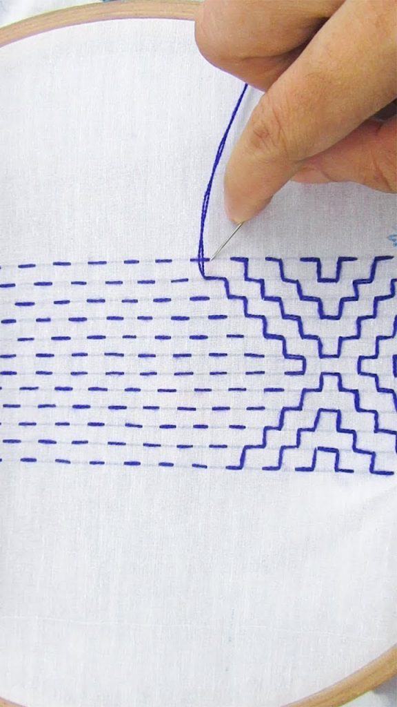
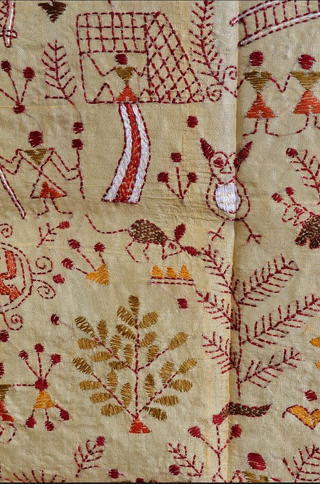

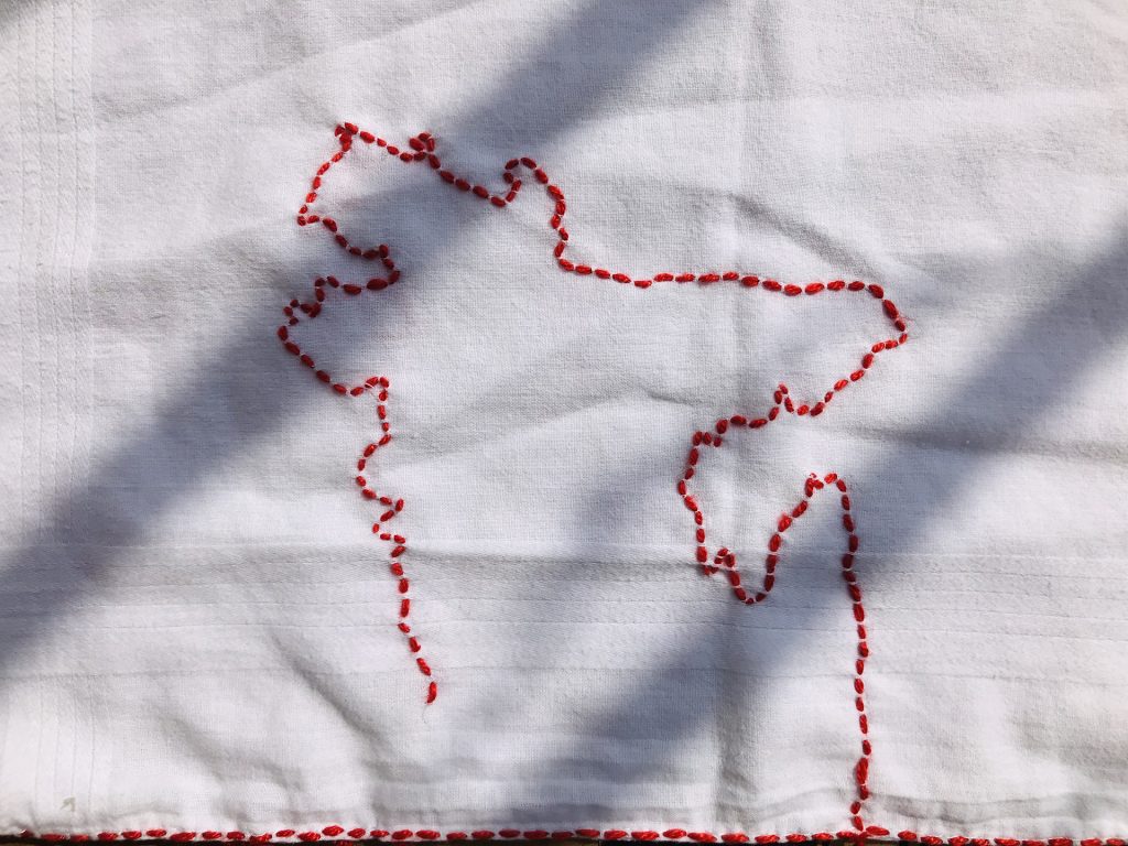
As an attempt to record this history, I decided to embroider the India/ Bangladesh border (where my great grandparents fled from) using my dad’s old handkerchief in the Kantha style. Kantha is a form of embroidery that is practiced by the rural women of Bengal from both India and Bangladesh. Kantha refers both to the style of the running stitch and the finished cloth. Kantha means rags. The women recycled the well used cloth that turned to rags and give it new life through the stitch. Fabrics were layered together and the stitch would cover the entire cloth to provide strength. The stitching could be handed down through generations, with grandmother,mother and daughter working on the same Kantha.
Kanthas are repositories of memories of particular makers, givers, recipients, and owner.
Wandering Silk
As I was try to record and preserve the stories of my great grandparents during Partition, I thought Kantha a fitting medium. It’s a medium that lends itself to expression and story telling. But what was the story that I was telling when I stitched the Bangladesh border through Kantha? Am I taking away my great grandparent’s stories by once again creating those borders? Am I doing any justice to this medium of expression and storytelling? Am I doing any justice to my ancestor’s stories? Am I universalizing this history by stitching these borders? Am I reinforcing those borders that caused so many people pain? Am I even telling a story? I was left feeling dissatisfied with my making this week.
After my one on one with Louise, I decided to rethink my approach to to ancestral border histories. I needed to learn about my great grandparents more. As I mentioned earlier, my parents had very faded memories of them but my aunts lived with my great grandparents for many years and my parents advised me that they would definitely know more. If they are willing, perhaps, I would love to discuss with them ancestral histories and have them involved in the process of making. I don’t know how to achieve that since they live in India and I live all the way in Saudi Arabia but we’ll see about that later. Till next week!