Project 2
Based on learnings from my previous project, I set out to design packaging that is both accessible as well as aesthetically pleasing.
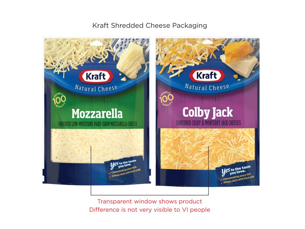
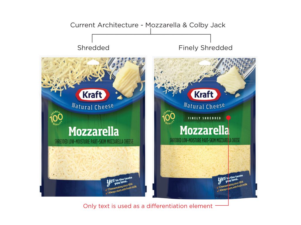
I picked the Kraft Shredded packaging range which currently uses a see through window to differentiate between the variants. Each variant also has a shredded and finely shredded version, which is only denoted by tiny text.
I decided to use different patterns for different variants. A denser version of the same pattern was used for the finely shredded version.
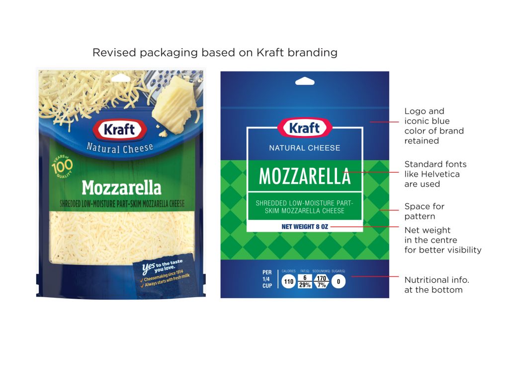
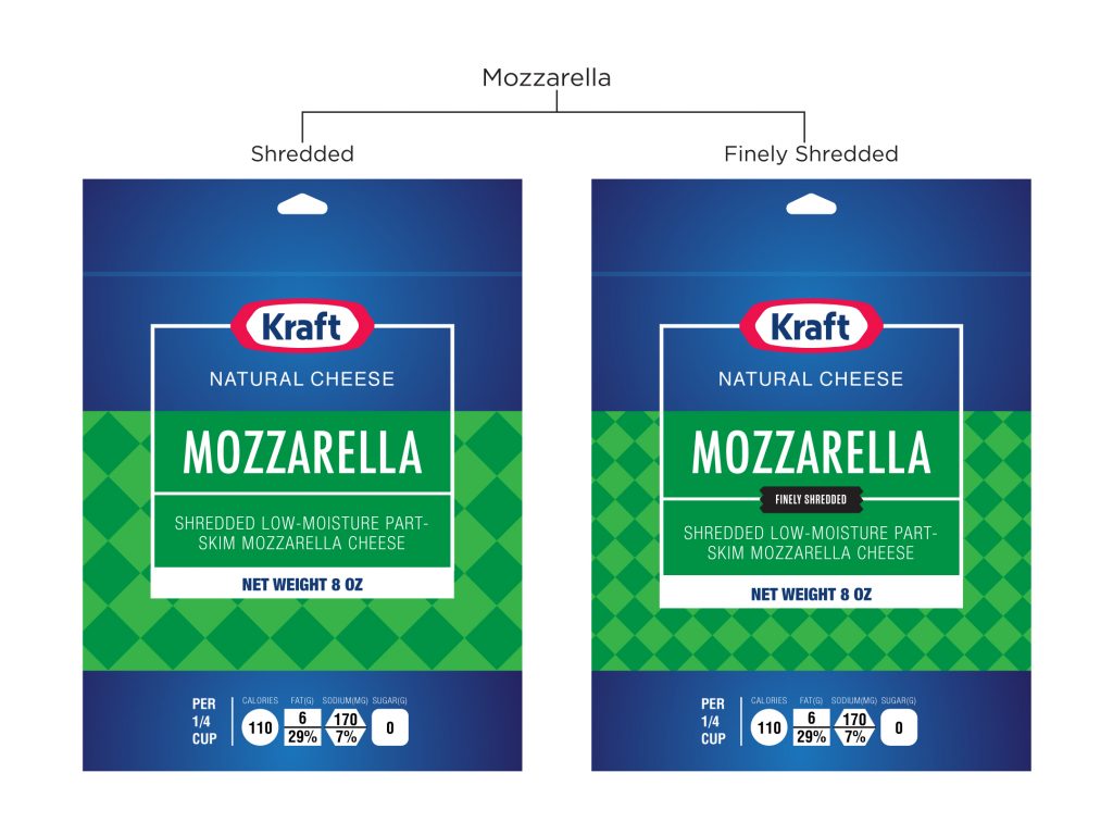
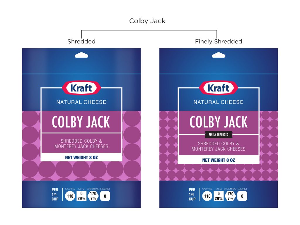
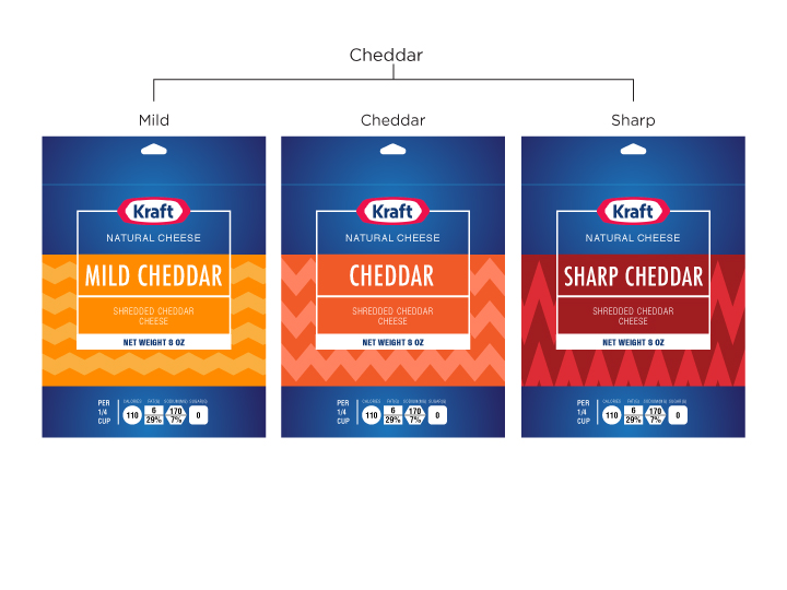
Even though this pack was functional and a little aesthetically pleasing due to the patterns, it still lacked the appetite value of the original pack, brought in by the picture or the see through window.
Go to Project 3.