How can materials of city act as vehicle for narrative and how can this build connection to the city? How do we tell and record the stories of the folks traversing our city? What can we glean about the cultures that make up the city from gathering a wide range of interviews, and how can we develop these into designed objects that give us pause to appreciate, comment or see the city anew.

Introduction: Material Storytelling
This project started for me very broadly looking at what might Vancouver’s material be if it had one? My first instinct with cities is always metal due to my associations with industrialisation. Would Douglas Coupland with his City of Glass agree?
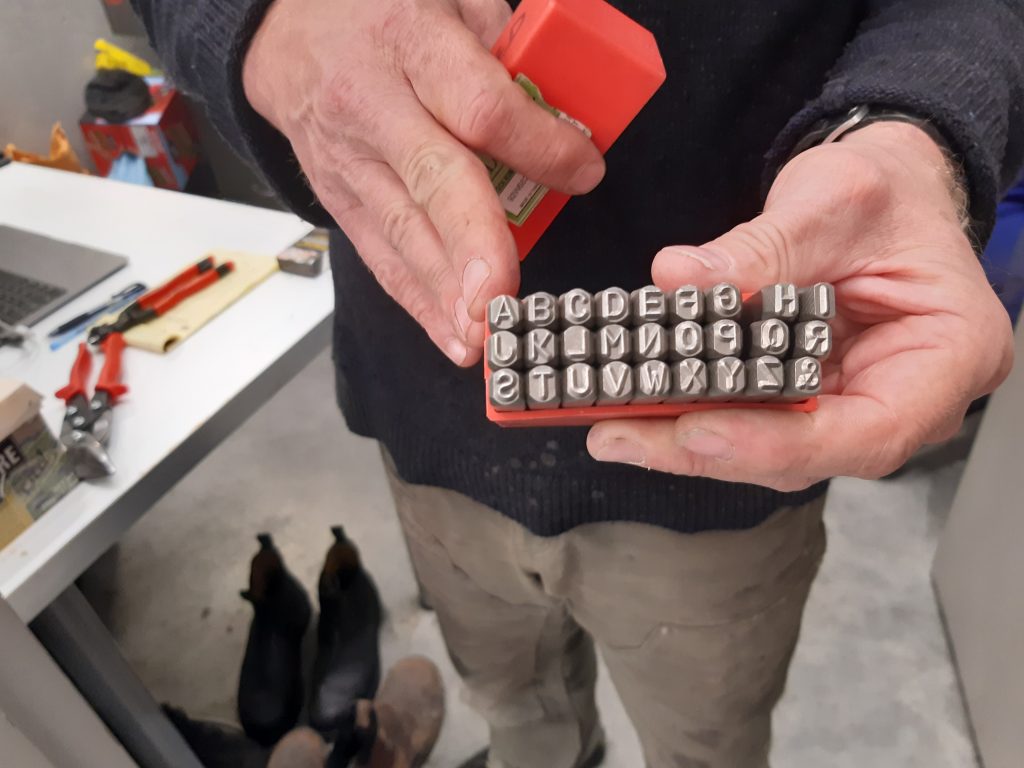
I caught up with Ian Rhodes at the Metal Shop and we talked about various metals, where to get scrap metal, and how to transfer type onto it.
Gathering Stories
I decided to pause in my material search briefly because I knew from experience that the material choice usually comes about once I’d gathered my stories to tell. So I researched those who gathered stories with the aim of finding out the best ways to gather a large number…the aim being that through this number of narratives certain characteristics of the people in the city would emerge.
I had heard a little about Humans of New York when it started but hadn’t realised it was still going, and had taken place in other cities. I loved his everyman approach to the city, asking contributors to name someone who deserved to be featured, for example.
What could we learn from this hugely successful series to get to know the city of Vancouver? What can we learn from StoryCorp, from Craft of Use, from The Pattern Project? What can we learn separately from Douglas Coupland and City of Glass and Italo Calvino’s Invisible Cities…I’ve emailed Brandon Stanton to see if he would be up for an interview so maybe one day!…
Local Stories
In the meantime I thought I’d look at my local area of New West, the local tourist board has investigated all the small ways that locals are trying to stay connected, especially in the pandemic. This felt a little surface for me. I am very influenced by Anthony Bourdain but unsure how to bring this into my own practice. Bourdain worked by asking notable people to sit and have dinner with him, somewhere interesting.

At this point the research, although interesting, was moving further away from making and as I was keen to get back into that I took a step back and looked instead at those designers whose work I am interested in.
Material / Making Research
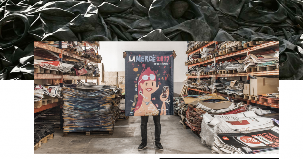
Nukuk, based in Spain, they create products out of old PVC signage- advertising banners. I love that they find a new use for gorgeously designed original banners that otherwise would be thrown out. That seems like such a waste of the original design and an opportuntiy to produce something new from it.
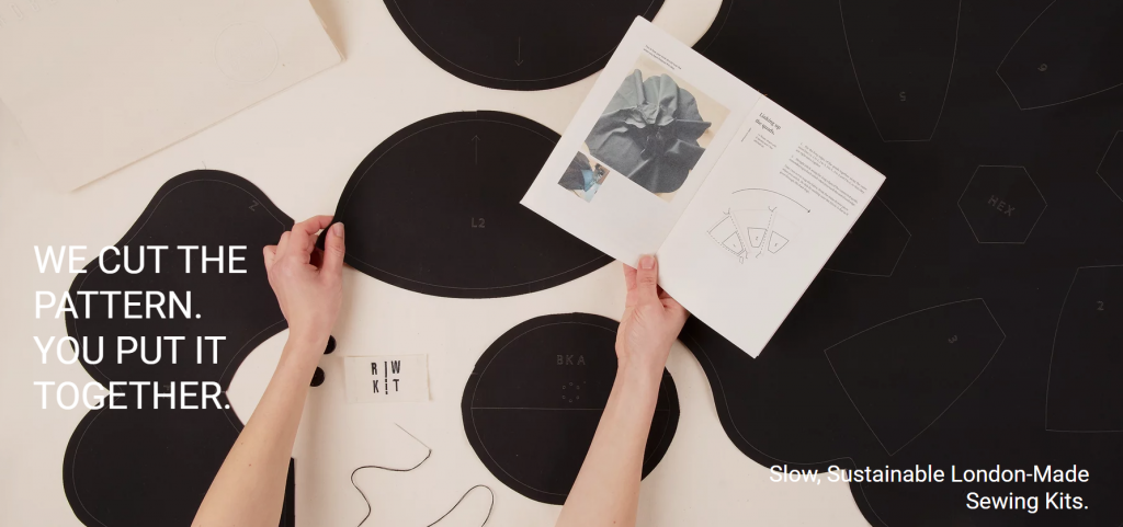
The Pattern Project, based in London(UK), they sell garment /accessory kits that include the fabric cut into the rights pieces with a guide on constructing the finished item. I love the DIY aspect of this, the drive to get people more involved in the making of the garments they wear so close to their skin.
Part of Vanish (a UK cleaning organisation) x the British Fashion Council’s collaboration shining a light on a range of clothing designers who take alternative approaches to fashion design. What’s interesting to me is their take on finding and reusing imaterials: the clothes are interesting and aesthetically pleasing and have a story behind them.
Reworked Graphic Design Surplus
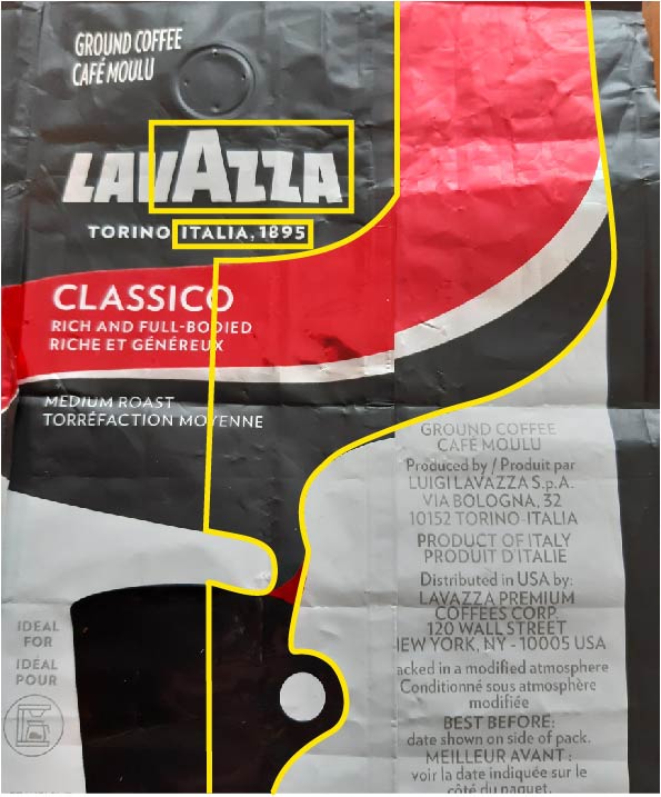
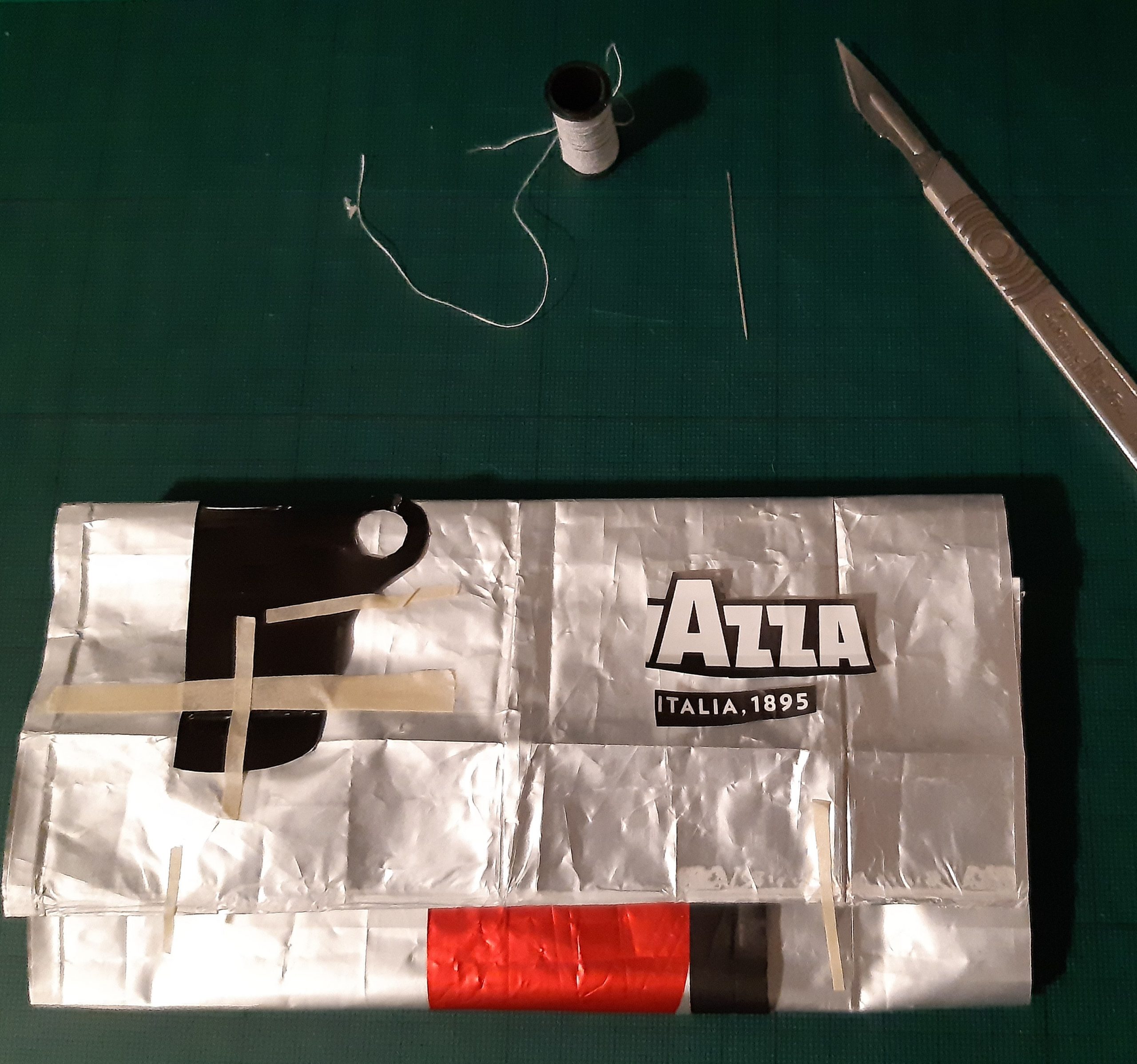
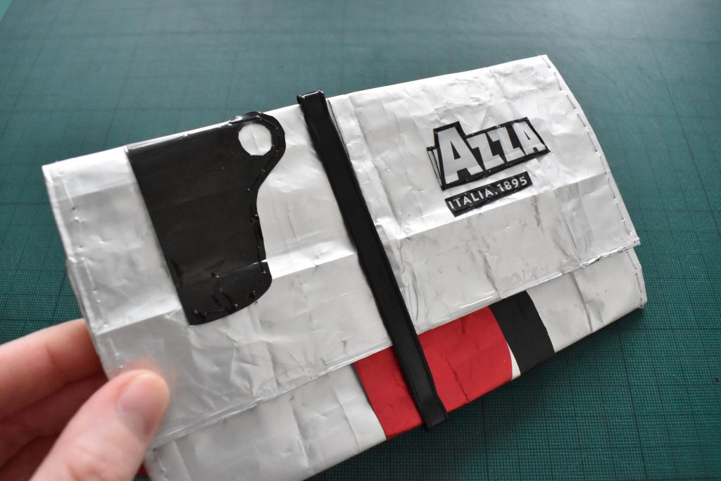
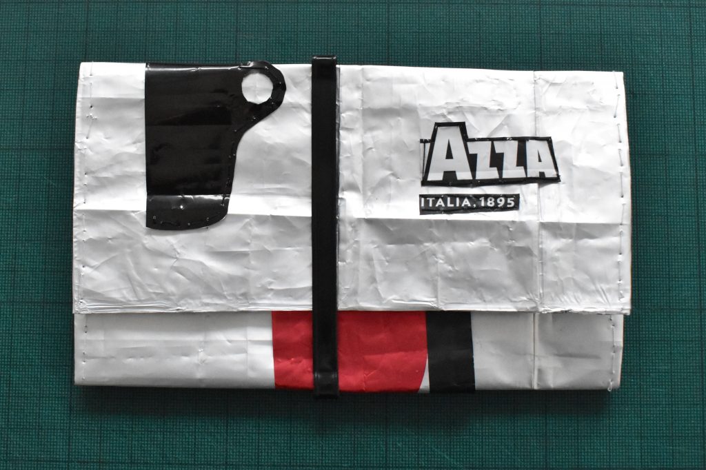
With all of this in mind, and getting back to making, I decided to set myself the challenge of making something that I could use (potentially) with the materials I had in the house, in one afternoon. I love good packaging design, especially event materials or coffee packaging, and so I found this coffee wrapper I had saved and decided that the simplest thing I could try and create would be a version of a Nukak wallet. A simplified version.
I had no pattern to follow and so I proceeded to form the shapes required intuitively, this would be a 3D sketch of what was possible. The making, the pushing through, eyeballing the proportions based on the material and graphic elements that I had to work with, as well as seeing what design elements are needed to make a wallet from was my priority. Usually what you make sparks off more creativity, you surprise yourself, and it breaks the inertia that theoretical research can at times bring on.
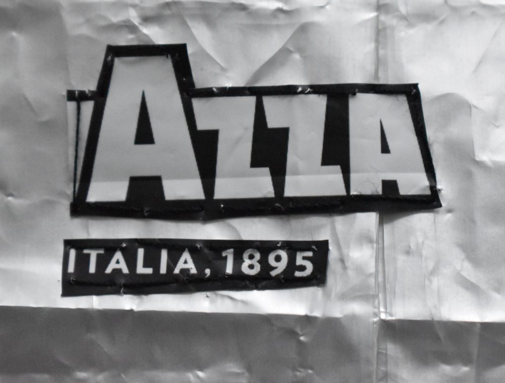
I wanted my wallet to look like a designed piece, with distinctive graphic marks and logo type. Bearing this in mind I’ve outlined in yellow below what I thought might work, part of the overall design swoosh and some of the brand name and location as they looked interesting and graphic in themselves.
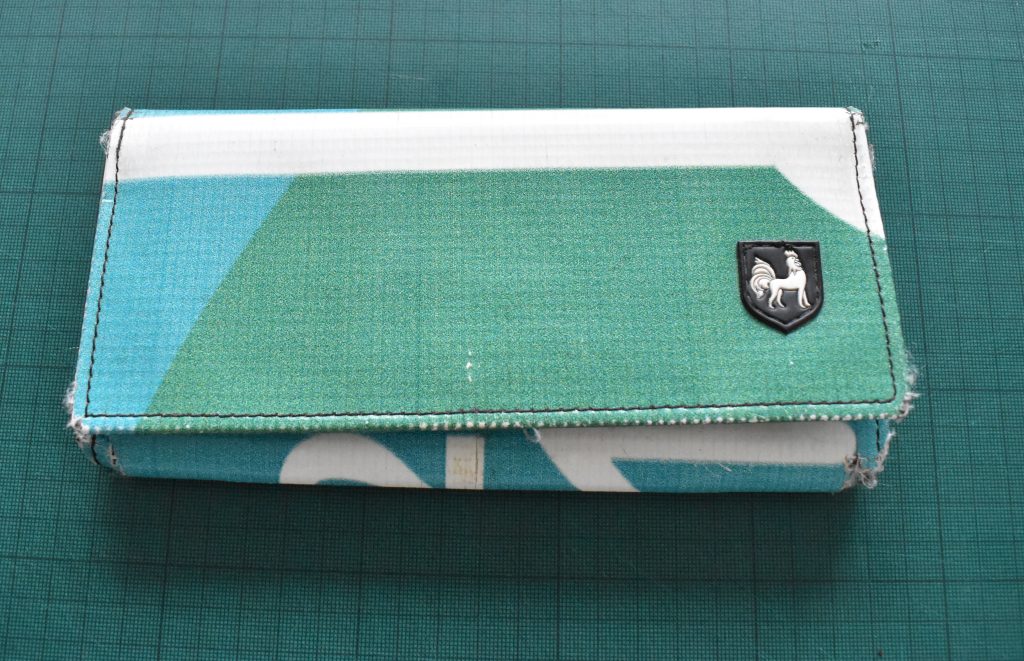
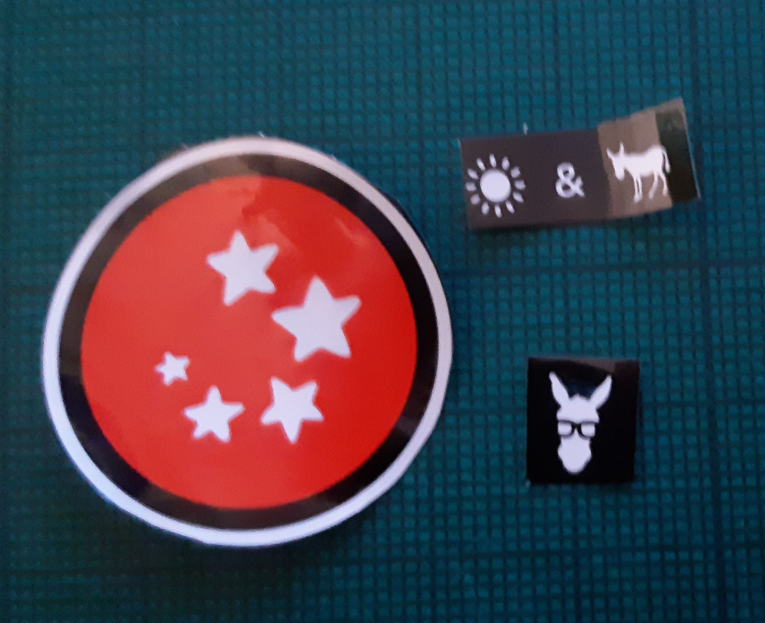
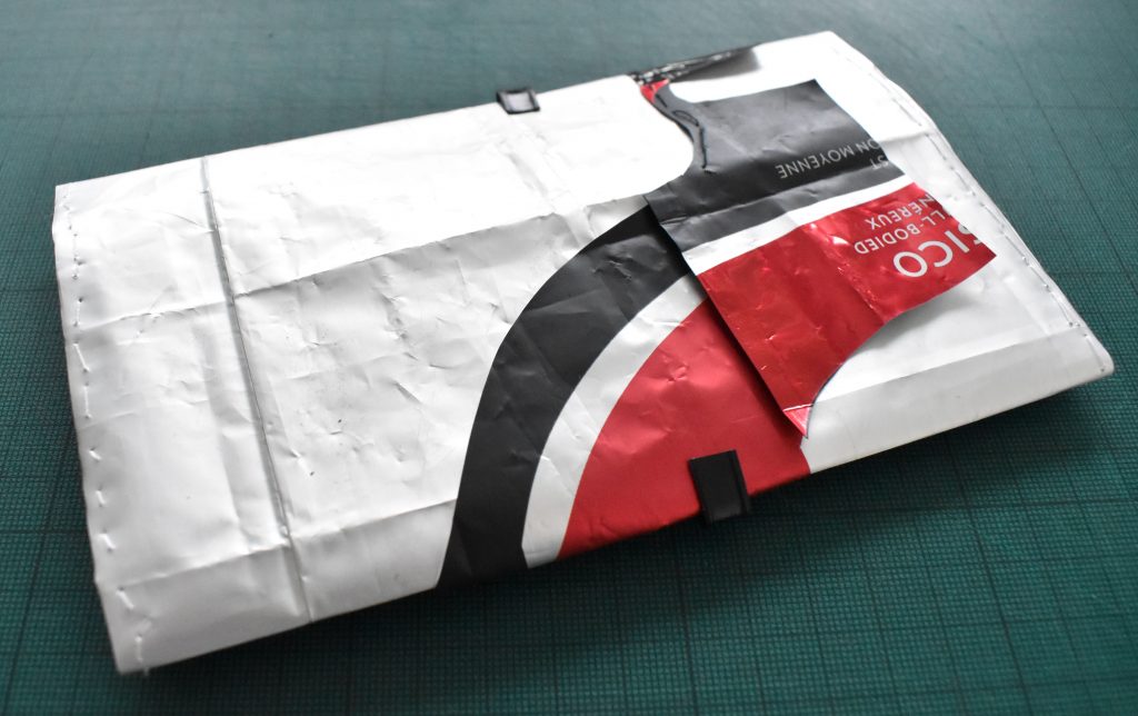
This was the prototype half way done, with everything ‘tacked’ in place with masking tape. I also found another coffee containor in the house which is where the metal ‘clip-fastening’ in the main picture below came from….it works well as a closing mechanism for the wallet. I trialled a few of the graphic elements of the original packaging in the reworked wallet but found that less was more in the final design.
One of the main ideas for my thesis was to ask a group of creative makers to use a similar methodology: use materials of the city to create an aesthetically pleasing garment or wallet that you will use, journal into and then pass onto the next person to do the same. In their case they would have vintage or surplus fabrics as well as graphic design surplus.
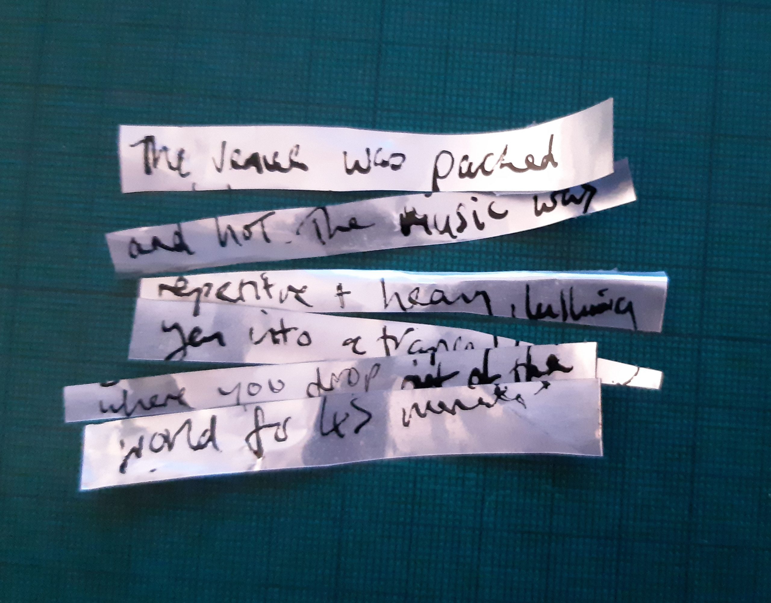
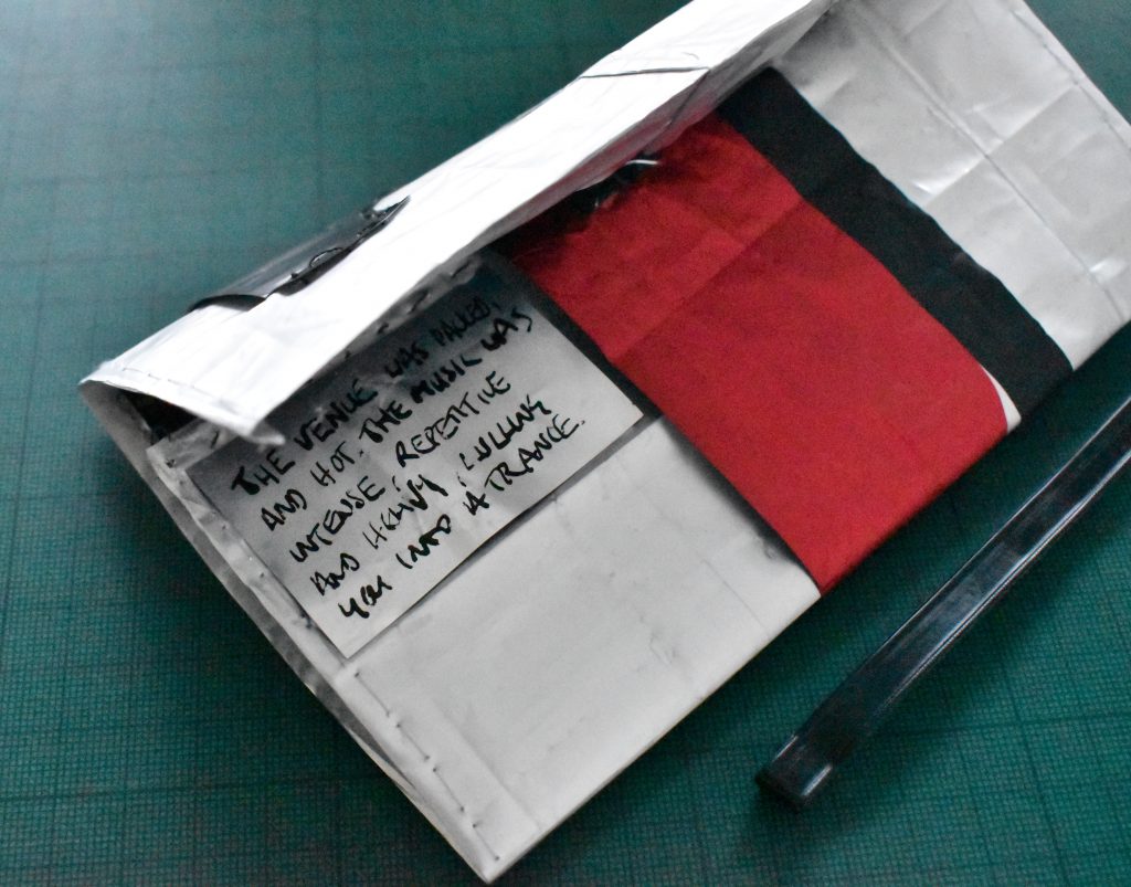
To complete the process on my wallet I edited down the metal gig quote and trialled this on the wallet, where you would only see it by opening it. The text reads, “The venue was packed and hot, the music was loud, intense, repetitive and heavy, lulling you into a trance.”
Rendering this by hand makes it look like a note written down so there is a journalling aspect to this but I think I would need to take time to consider what the best methods of journalling would be if this project were to be developed. Is it better that the writing is hand written or would a more typographic solution be more effective, would it look more like a graphically designed part of the whole wallet if it were in a specific typeface? But then how do participants transfer this type onto their garment or wallet? (Screenprinting isn’t usually an option at home.)Especially if the garment or wallet has already been constructed…it adds space and layout constraints, particularly if others have already filled the available space with their journal entries.
Reflections
In a bid to see what was available as materials in the city of Vancouver I have contacted the Museum of Vancouver to see if they ever had any surplus. They have suggested that we chat over zoom as although they don’t have anything at present they are due a refresh in Q1 of 2022 so there maybe some materials to play with there. I had wondered what they did with specific exhibition materials once the event was over and imagined that the MOV would have a high standard of aesthetic output and this would provide for well designed graphic design surplus to rework as I have done with the coffee container above.
I have also contacted The Pattern Project as I would love to see why they chose the patterns they did for their customers to construct at home. I think this would better inform my own choice of pattern if I was asking participants in my thesis to create something themselves.
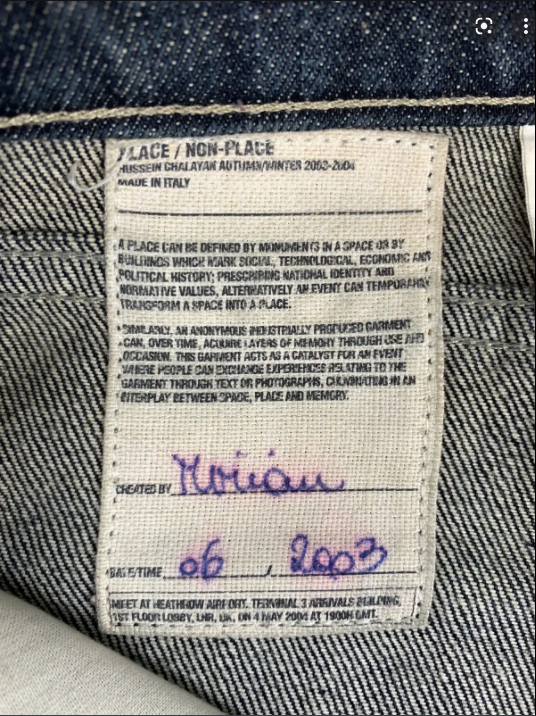
I wanted to attempt to make something usable from a material of the city and I did this. I do however feel that there are aspects of my Design Storytelling project that I would like to revisit and bring somehow into my thesis, perhaps comment on the materials of the city in a more subtle way, like with the reframed shirt and the graphic design comment on the t-shirt as holder of memory. I would like to learn the art of garment construction as I feel there is pontential for this kind of work in this space, whilst still communicating a narraitve. I have learned to trust my instinct, not to let my difficulty in articulating a research question hold me back from intuitvely making. I admire Hussein Chalayan for his approach, with his oversized labels encouraging the wearer to appreciate the garments they own. This is the type of subtle graphic design comment that I would like to look into in my own work.
