This is all part of orienting or placing ourselves in a city, helping create or find a sense of place in a busy industrial environment. I need the stimulation of city life (the culture/media etc) but also need the space nature provides. This is an exploration of both threads.
Edit: It’s only after hearing Yej talk about the ways of working the land and the associated calendar of time that her family has used for generations that I have realised and acknowledged how much my own island upbringing has affected my way of looking at life. I miss that connection to the land and sea, weather and animals. I am often looking for that quiet in small moments in city life. I am always striving for a balance between the needed inspiration of the city and the respite of nature underneath or behind that city environment. I also loved the phrasing she used to translate from Chinese or Korean (she referred to both). It was different to English and wonderful for that. It reminded me very much of when someone like my father would translate from Gaelic (spoken on the island). It made me want to ask him about how he and his father grew up, what were the ways of the land, and what did he watch out for in the weather etc.
Inspiration- Olubiyi Thomas/Vivienne Westwood
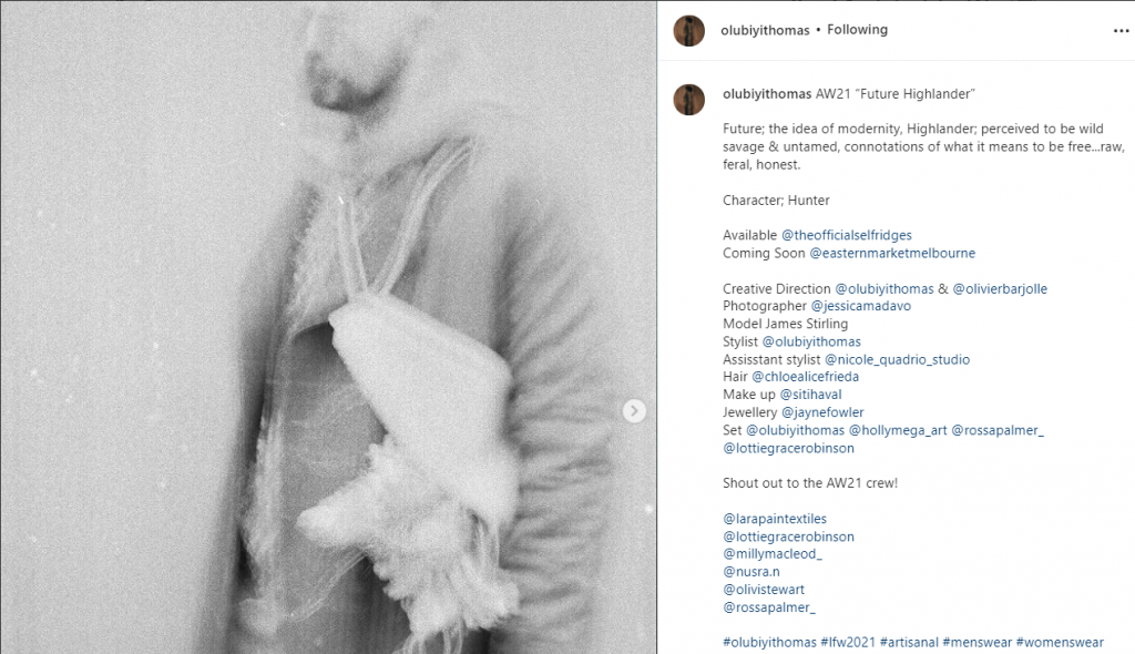
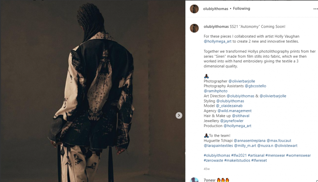
Inspired by the Highland Warrior collection from Olubiyi Thomas and also Viviene Westwood’s take on materiality, story, punk attitude and historic Highland dress/uniform.
Project 1: Part I: Surface/Fabric exploration
If we could wear a garment to protect us or sheild us or help us traverse the busy city what would it look like? What would a protective texture look like, could you have a soft armour that you wear?
Musical Armour
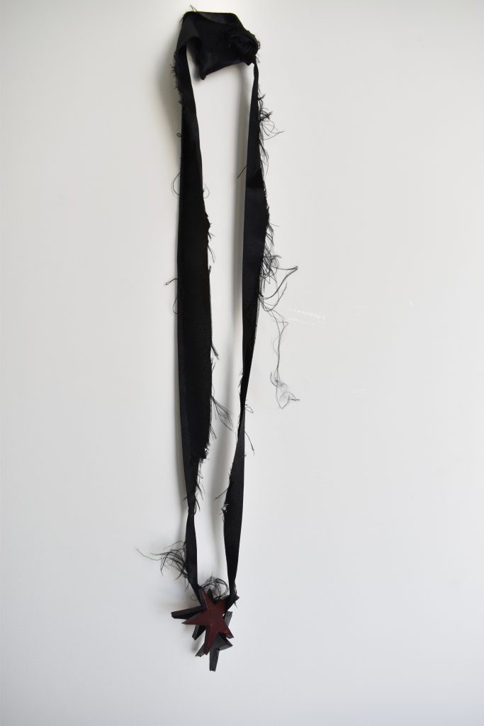
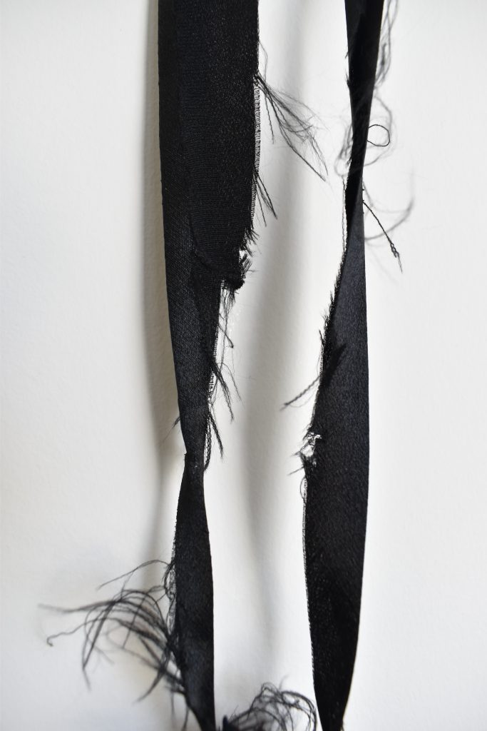
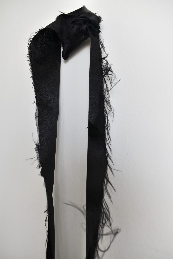
The first exploration was done as an extension to my Reframing/Memory Holder project in Fall semester. I had made a clothing tag tie using black ribbon and deliberately frayed the edges because the result looked harder, edgier and fit with the metal t-shirt. Looking back at that I loved that metal music has that air of musical armour for the city. I thought perhaps that ribbon could form a neck piece that forms a subtle but there signal.
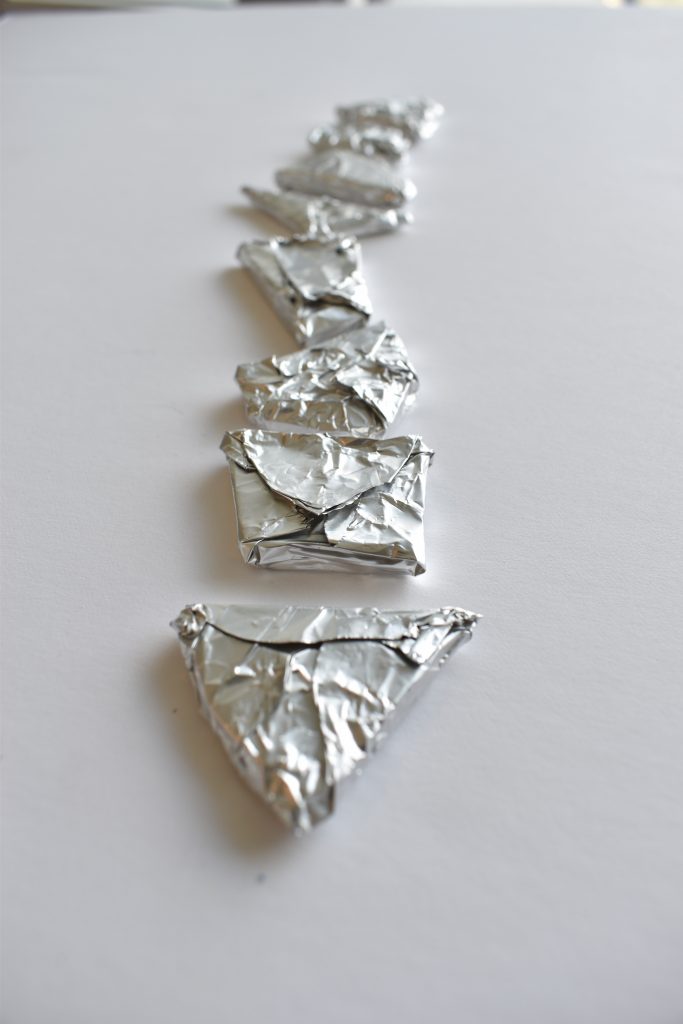
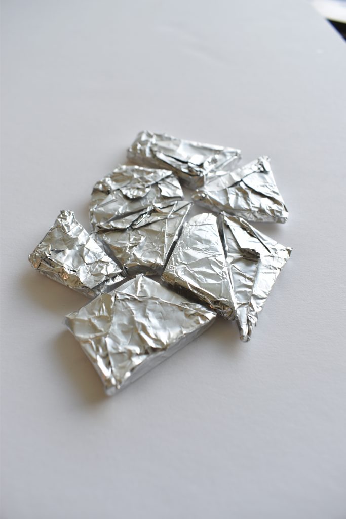
The second was looking more broadly at armour and seeing what that would look like as a surface texture. Although I lke the metallic texture it seemed a little out of sync with the ribbon.
Disruption
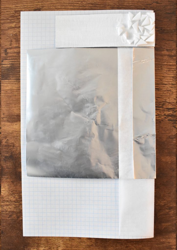
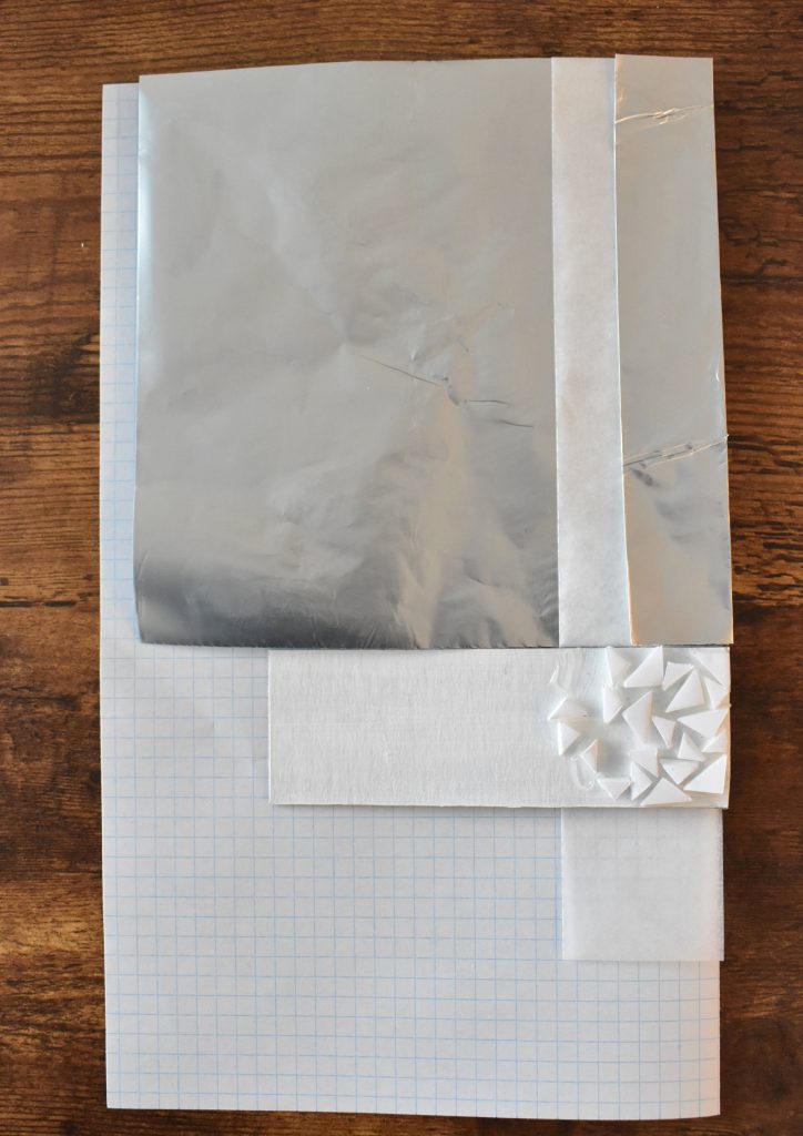
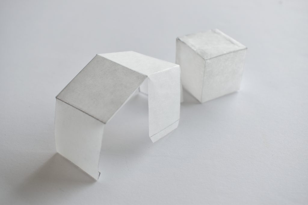
I had started this paper texture study by aiming to create a garment made out of alternatives to fabric and white paper. This was, in part, in order to allow me to write on the garment as a form of journalling. I also wanted to examine the disruption in reading process that happens when you create clothing out of paper (i.e. non traditional materials) and similarly create a book out of non traditional materials (i.e. paper etc). If you use a fabric or surface or material that is different from the norm it causes dissonance, it can recontextualise the idea of a book, it can take it outside the traditional space. It can also make you take the concept in anew, look at something with fresh eyes, and make you pause or pay attention to what you are reading. I did some quick studies of what various paper types looked like together in order to see what could be the front of the ‘garment’, the lapels, the collar etc. I pivoted at this point because the textures spoke to me more themselves than the combinations. Looking at what armour would look like, I liked the idea that the clothing you wear changes as you get to know a city, from coat to perhaps t shirt. Some of this is seasonal but some is due to the fact that you relax and don’t feel the need for the coat. What would that look like in a fabric or surface, could you do some modelling with tracing paper with it’s opacity to suggest this; the moulding shape to suggest the structure of protection, the opacity to suggest that the armour is almost disappearing as we get comfortable and feel a sense of connection.
Project 1: Part II: Journalling: the city at height
Taking a bird’s eye view of the city, snippets of words written down as soon as they came into my head. The exercise was just to write as I saw it, as quickly as possible. Free from typeface, layout and material surface considerations.
And still he climbs up, red frame against the grey sky, dragging the building up behind him.
The placing of careful gesture against the flow of the train, under the trees, pushing arms slowly through the air
When she finally opens up those blue skies and my Mount Baker friend peers under the cloud blanket to say hello. I breathe out.
Reflections/Questions for the next project…
I would like to continue to examine the creation of sense of place in a city. How we connect to the cultures there, the natural environment running through the bones of the city.
I would like to examine clothing as preparation for what the future city holds/what does that look like? I love the idea of the Highland Warrior not just as a historic way to dress and live but the collection by Olubiyi Thomas.
We could extend that out to question what graphic design would look like as a preparation for the city…would it be a calm counterbalance or would it represent a warrior cry to battle?
One of my aims on coming into this course was to push graphic design, perhaps with material textures…part of this project feels like a way into that…