I had a hunch that analogue processes were important to my process to practise-based research. I very much did not want this research to be about solely my approach. What I intended was to demonstrate how analogue processes or apporaches to recording seascape/skyscape could inject more time and space for reflection into the creative process. And that this would allow for subtle reflections of a specific culture or area into visual responses. Culture is probably the more accurate word as introducing place-based tends to encourage responses very tied to traditional notions of place. I think culture is more amorphous.
Looking back I would say that I am not sure if my methods would suit each creative. What I think would have to happen for the methodology to be success is for creatives to be encouraged to take part in and reflect on analogue processes that suit their creative personality, i.e. if a creative has a propensity or drive to use textiles then maybe that is the approach they take. I think perhaps the issue with that or maybe it is not an issue is that 2D visuals have a distinctly different visual language to 3D which are more about the materiality. I wonder how much this matters?
What I have come to the conclusion is that in terms of practice the research question is a lot more tied to creative practices, analogue processes and time for reflection in the landscape/seascape. This is might all describe (in one way) place-based but this term is very misleading to most and so does not fit the research.
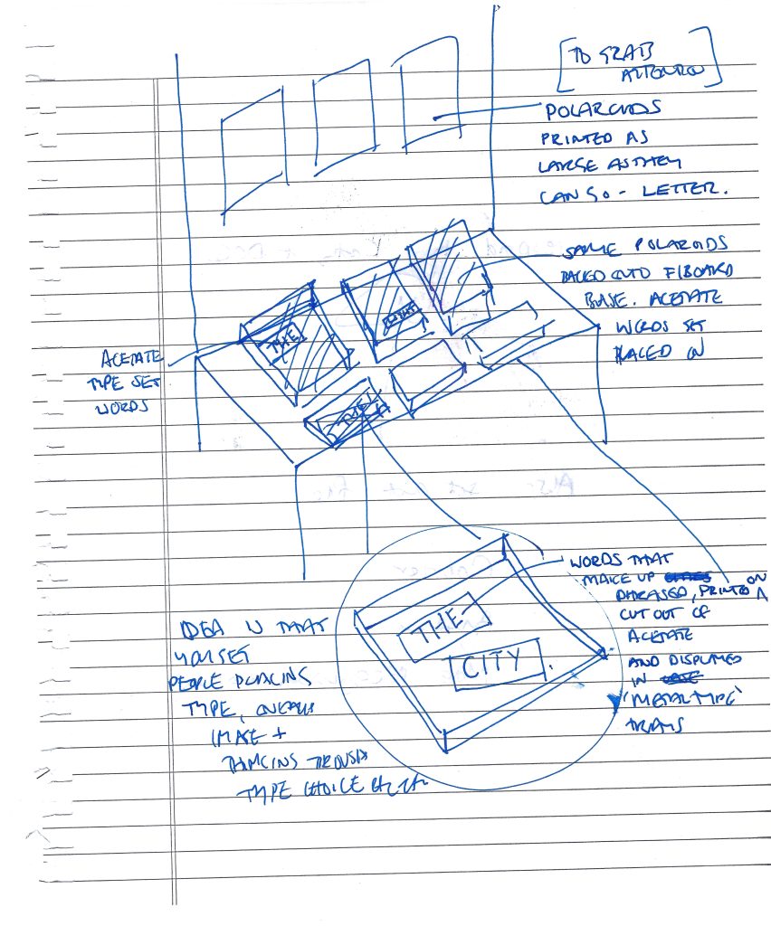
What was I aiming to achieve by splitting graphic design into component parts? I was aiming to see could you isolate the part of each that made it a specific tie to reaction to the place it was made. So for photography (Image), obviously the way you tie that to place is by taking a photo of the place you are talking about. What I chose to do is instead of that is focus on how analogue methods made you slow down and consider the composition in a different way. I also felt (from experience) that analogue methods have a very process driven approach, one that is more linked to experimental methods. So for photography I was really looking at the approach and how to create space inside the image, how to make the page work harder to grab your attnention, in this saturated age, in a more filmic way. But also the way of composing outside.
For typograhy I was looking at what happens when you take the numerous choices of Adobe off the table. ANd what happens when you feel the lettering etc etc.
SO my practice based approach was all about trying to engage with the tacit knowledge that materiality encourages, and analogue approaches encourage.
I have to say that, apart from taking photos of New West and some of the urban poetry being a response to it, I am not sure how it relates to place. I have tried to come back to Vancouver and place in terms of typographic archive research but everything is so general. You end up taling about wider typographic and design movements. Dutch design is an anamoly not the rule.
I am not sure that it is possible to narrow down a typeface to a place. You can to time of creation and the rationale to its design but that speaks more to the wider industrial factors than it does place. Otherwise you go to look at vernacular signage which seems more rooted in idoscyncracies than the rigorous methodology tied to a typeface. (The original Whisper project -fivethousandfingers – was trying to replicate that) and Go the North did that. But are these just replicating a hand drawn feel and therefore not to do with place.
Photography is much more closely linked. Poetry is much more closely linked. Typography (apart from one of fonts) is much more rooted in a rigorous internationally recognised approach.
I am not sure what I am trying to capture is actually the rythm of a place. It is what sort of affect does place have on graphic design but more what affect does how you capture it have on how connected you are to it, and what impact does that have on the graphic design emerging.
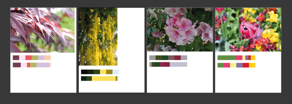
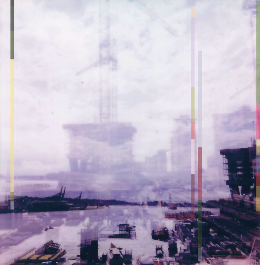
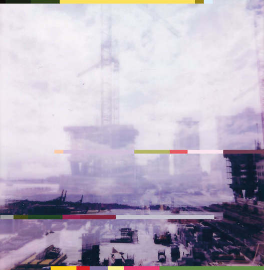
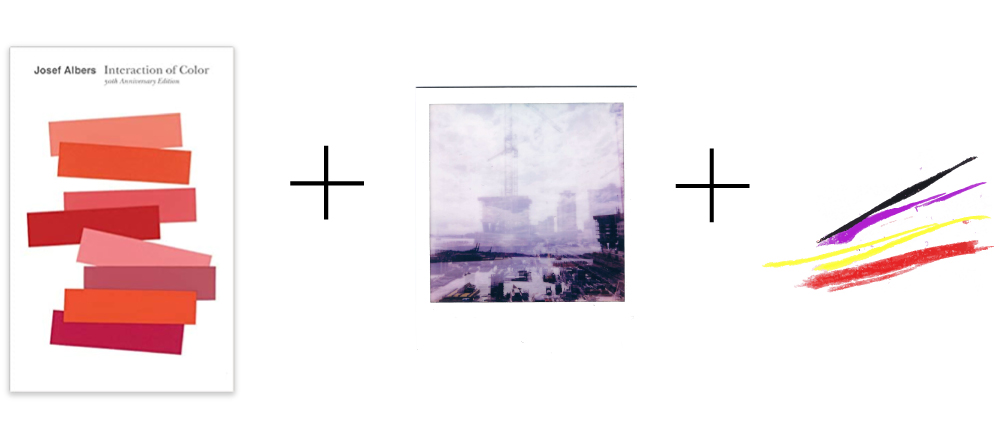
So–surprisingly– this was one of the hardest exercises. I think because I love colour but know that it’s hard to work with, analyse etc etc. But I resolved to be methodical. And this is what I did.
For this experiment I chose to keep the constant the double exposure of New West/Fraser River as image base. I then took pictures I already had of plants from New West and resolved to code these down to colour palettes, doing it be approximate %.
I didn’t think that the above would actually tie the viewer to place when they took in these colours but sometimes assumptions stop you from actually trying so I – at it was very hard – pushed through and made myself do this. Having got the top band I then did the % breakdown. Then in order to have it be a graphic element on the page and not just an out of proportion block of colour lying on top of the photo I stripped it down to a very thin band.
AB1: Colour bands at 50% opacity to help the graphic elements ‘sit’ on the page more within the already layered image.
When I started this project I had thought that the introducing colour was needed but hard to balance with an already atmospheric image. That is, an atmospheric image already has presence on the page and acts as – in perception terms -one message and we’re only capable of taking one in at a time. (Wish I could remember the reference). And so you are consicious, more so as a graphic designer, that anything else is in addition and so has to add something significant or support what is already there.
AB2: Horizontal colour bands at 100% opacity.
Overall I think AB1 is more successful in terms of a read image: the vertical bands sit more quietely within the image and point to markers within the layered landscape to take you through the double exposures, up the river.
In terms of tying one to place I don’t think they function at all, but the point of the exercise was to try and see what the colours and proportions -and these as a graphic asset – added did to the image.
Reflections immediately after (those weeks after are different and worth doing then).
I think words and obviously typeface choice would be a whole other ball game. I am not sure these needs words at the moment.
The placement of the vertical bars could be tweaked to take the viewer more easily through the image.
Reflexive thoughts – To come back to later.
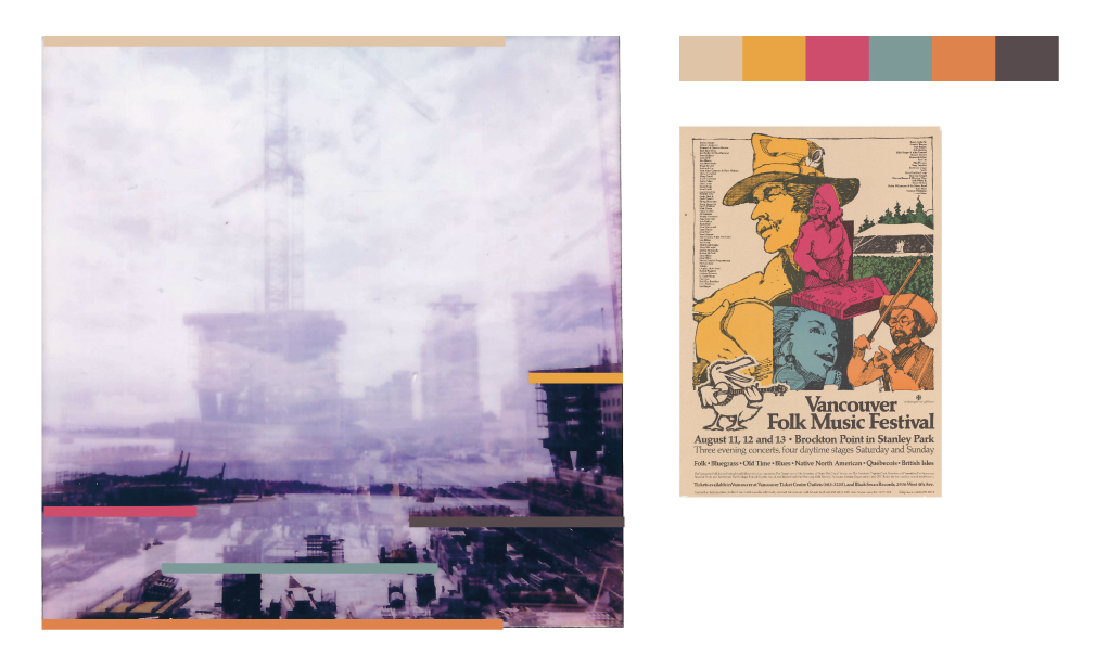
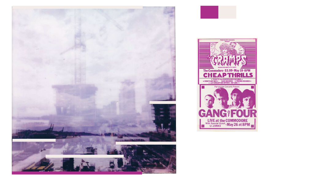
Perry the Poster Man Collection (SFU)
I did this exercise really to show that colour is attached to an older time frame, perhaps, and therefore to nostalgia, but not to a place. These colours are muted and therefore speak to an older time when printing methods were different, the inks were different etc.
I chose the Perry the Poster Man Collection (held in digital form at SFU) because these posters were used throughout Vancouver and so I thought, although I don’t think you can connect colour use to place, if you can this would be the most relevant archive to pick from – as opposed to more international collections.
I chose the above for its very local subject, to see if that translated at all to association in the image to the left. Perhaps the dated colours do, but nothing as specific as location.
I chose this because the colour was unusual. Now colours seem to be used very much in terms of a branded choice, but I am not sure whether this was the case here, it seems much more innocent – just because it looks a little unusual and stands out.
Next steps…
So now that I’ve carried out very scientific analysis…all joking aside colour is so very subjective that short of asking large numbers of people and averaging out the answers to produce approximate generalisations…this was my way into this. The process has confirmed for me that what you are looking for colour to do is convey energy, whether older or more modern. I want to avoid nostalgia so I’ll have to make sure the colour choice is more modern and energetic. But given the power of branding today it might be challenging to get a colour that doesn’t bring with it another association. Perhaps though the fact that the base image is more art than design helps that. Also the words will be poetry and so that further distances this. Anyway my new friend Josef Albers is going to talk me through the next steps, I’ll print out the image and get ready to do some printing trials.
Prepping for this, after our presentation last week has been an acknowledgement that I am only now learning how to articulate the problem space. Well, to be honest, coming closer to finding the words to do so. Or at least what the wrong words are.
As Craig said, it is not about prepping a perfect exhibit of finished pieces but provoking discussions around what you want to discuss. Now this above might not work in reality but it is closer than a polished end piece.
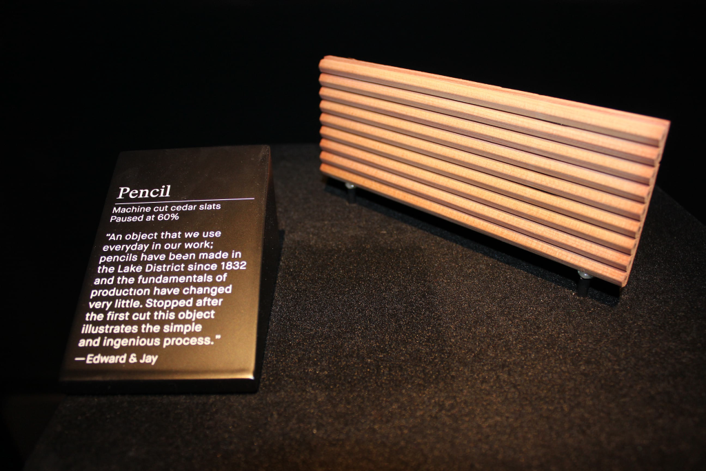
Figure 14.1. Pencil paused at 60%,in the making, curator Barber Osgerby, Design Museum, London, 2014. Photograph: HelenCharman, courtesy of the Design Museum, London. Charman, Helen. “Just What is It that Makes Curating Design so Different, so Appealing?.” Design Objects and The Museum. Ed. LizFarrelly and Joanna Weddell . London: Bloomsbury Academic, 2016. 137–148. Bloomsbury Design Library. Web. 24 Oct. 2022.http://dx.doi.org/10.5040/9781474268820.ch-014.
Something to do with design being about process and showing that process, as exemplified above, stuck with me and I wondered if you can do something around that. Again not sure my exact idea will work in practice but, the thinking through of it, the taking the idea of it into practice-based research is critical in visually and conceptually thinking it through. This and when I talked through my DS project I realised I wanted dialogue about graphic design and not to do it in isolation and so to get the conversation perhaps you have to not always provide the answers.