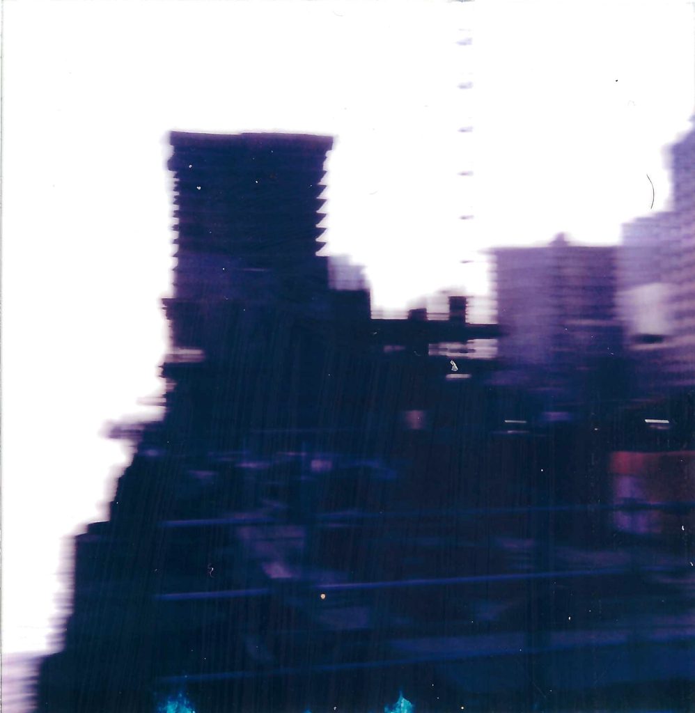
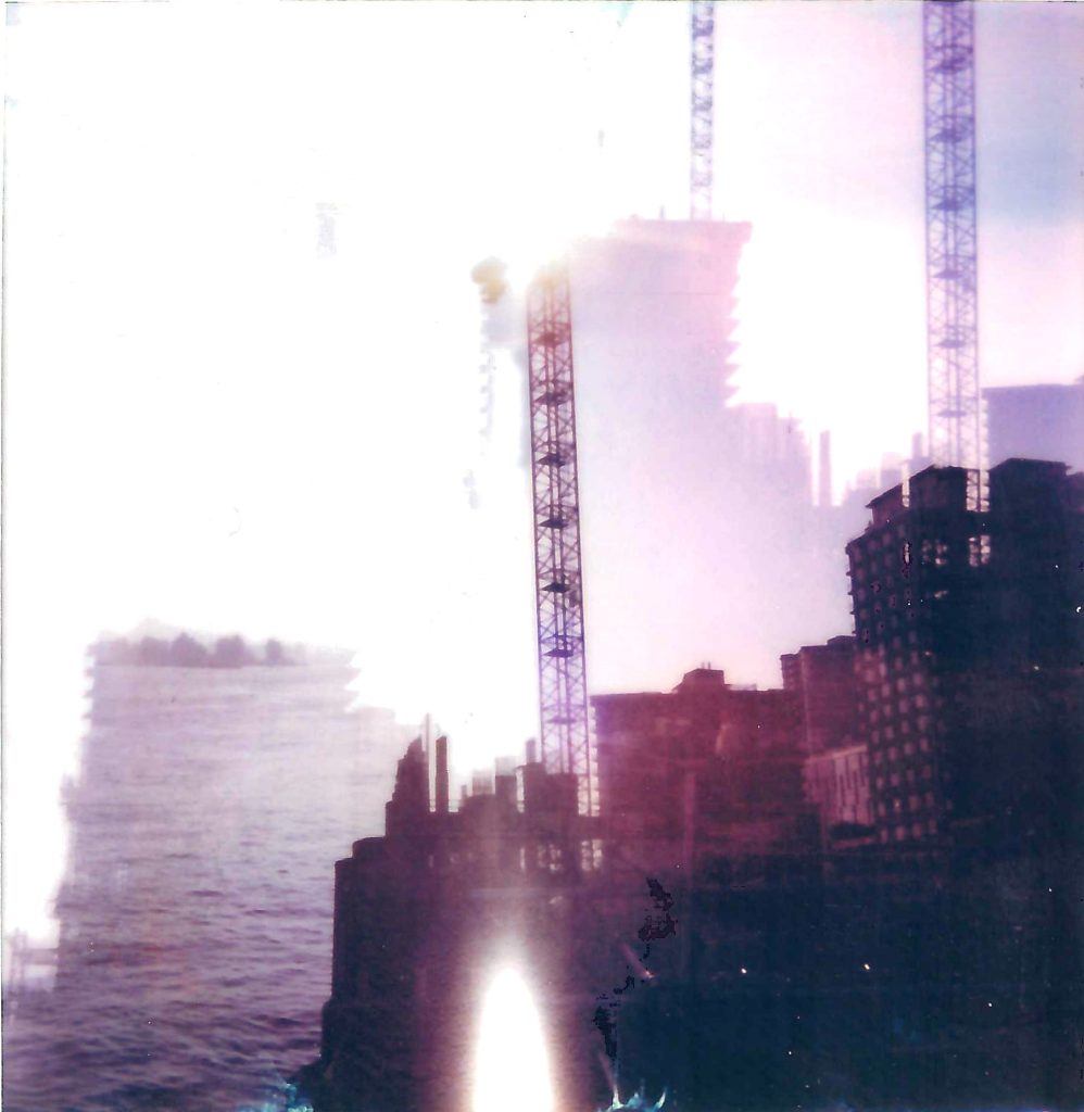
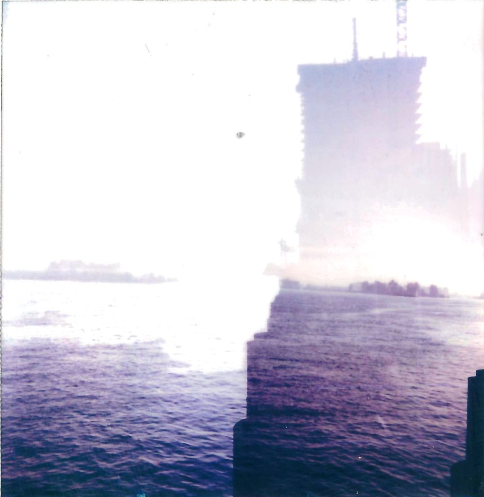
To become familiar with the limitations of the polaroid process and see them as an opportunity to simply ways of looking at and being in the city environment.
To explore my very local (a circumference of maybe 3/4 city blocks) area and look for visual narratives in the everyday, playing with light and composition.
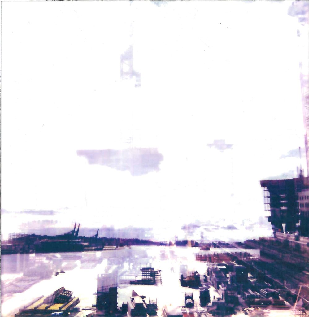
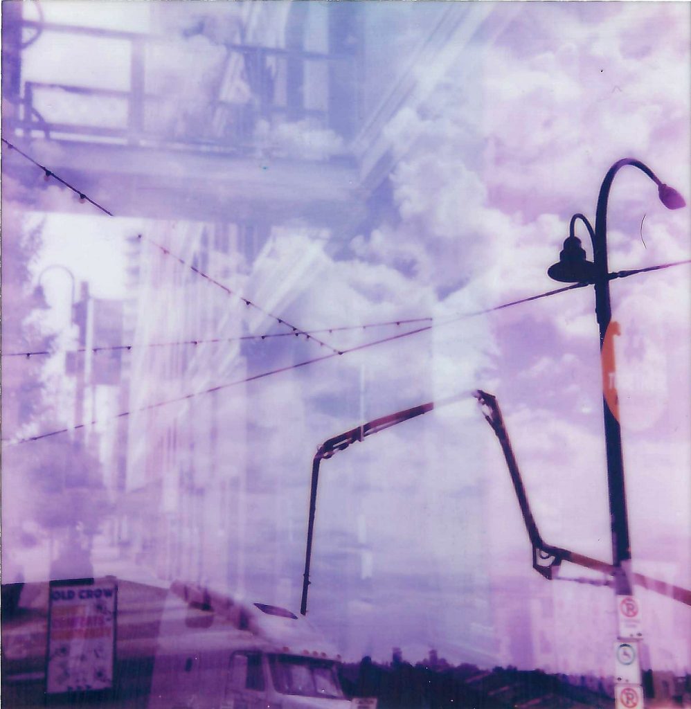
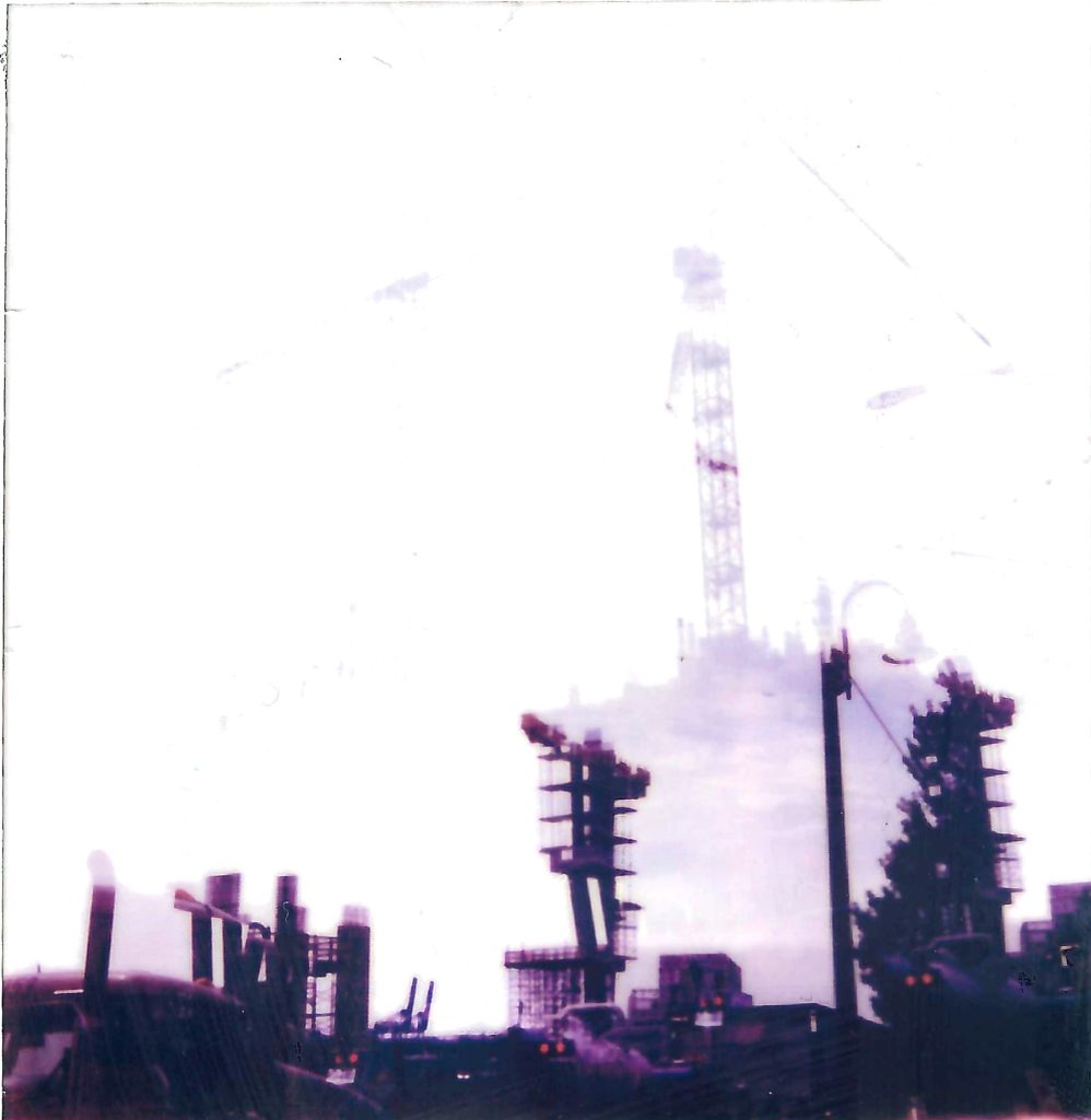
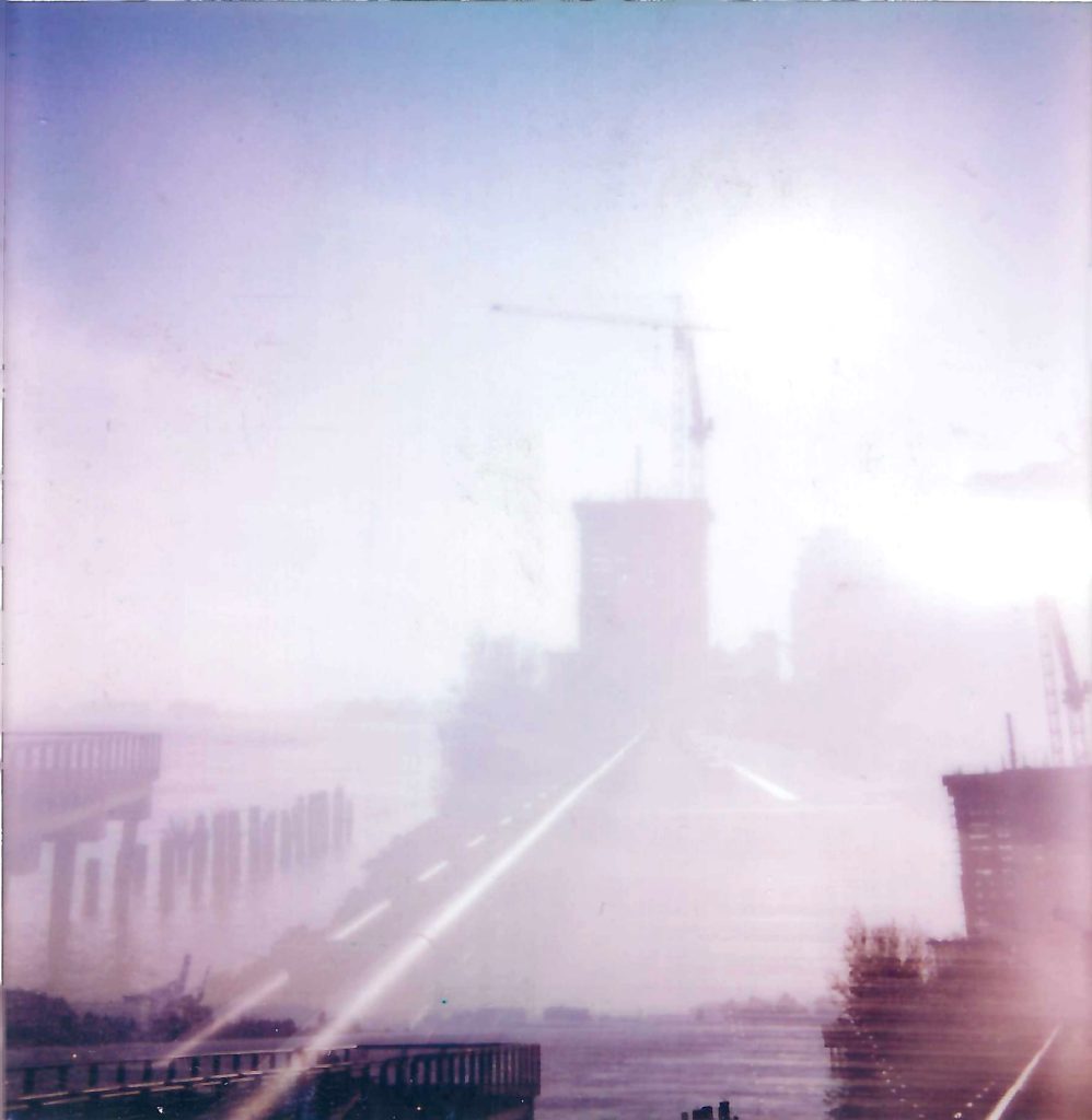
Things got most interesting when I focussed on double explosure composing and even camera shake at specific points – ie. just after exposing the paper.
My reflections back are that the process of executing the method should be analogue but that the method itself does not need to be photography. It needs to be outside in situ so that you are responding to that environment (nature, light, the cityscape, landscape, skyscape) or any of these in isolation but just not to internal influences.
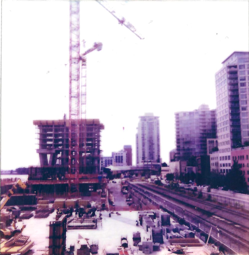
These pictures were all taken through July/August 22.
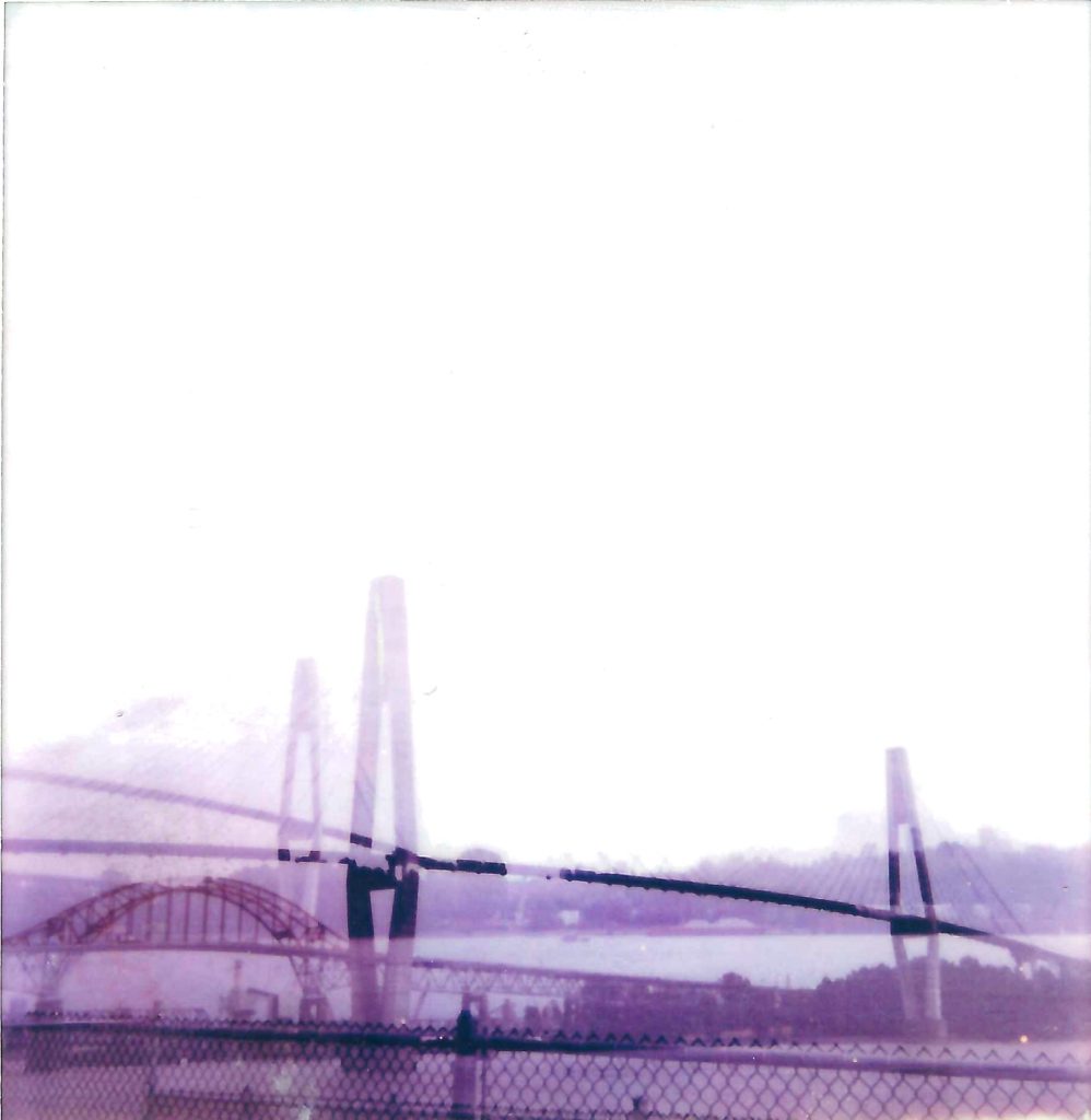
Lots of insitu findings. That the composition has to be simple to be engaging. That beidges – as much as I love them – are not the best subjects – I think that is to do with horizontal structure on top of horiozontal structure. Polaroid cameras have no zoom so trying to focus in doesn’t work. Trying to make complicated stories doesn’t work, and the light has to be good but not over bright as your image surface will only over expose.
Another thing is that in scanning these in the light of the scanner flooded some of them, causing incidental but interesting further exposures I guess you could call them.
(I started this writing on a notepad, your thinking is more tuned into the speed of your thoughts and especially for capturing fleeting moment of consciousness, it is better suited. But then I took it through here to ‘publish’ it and you get to a stage of curating the words/spaces/ what words for what line of text. So there are two stages: flow and curating/editing)
Pavement Breakfast:
Attempt 1:
I just stepped over the small mound of grey fluff, the crow stalked aside, as red triangle in its beak, Ah, I interrupted breakfast
Attempt 2:
stepping over the small mound of grey fluff (fur), I disturbed the crow stalking to one side , red tinge in its beak.
ah. I interrupted his lunch.
Attempt 3:
stepping over the small mound of grey fluff, I noticed then the crow step back, red tinge in its beak, Ah…I interrupted breakfast
Reflection
Trying to capture words immediately after the scene, you watch a small scene unfold in front of you and you become aware of the dynamics happening at pavement level. Then using the right words, phrases, spaces and sentence structure to convey that. I discovered yesterday Baco Ohama’s work, beautiful. Really drew my attention the use of gaps in sentences like this.
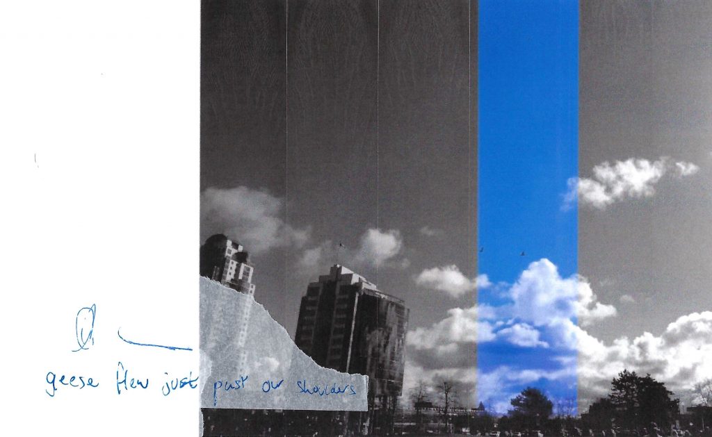
flurry of black
a flurry of black in the sky catches my eye They’re here! I can’t get out to see them fast enough.
they pause briefly over the marsh, come this way and then pause before circling…did they forget a friend?
And then they gather again and twist and soar, darting through to Vancouver.
I realised, sadly, by August that they’d gone somewhere else
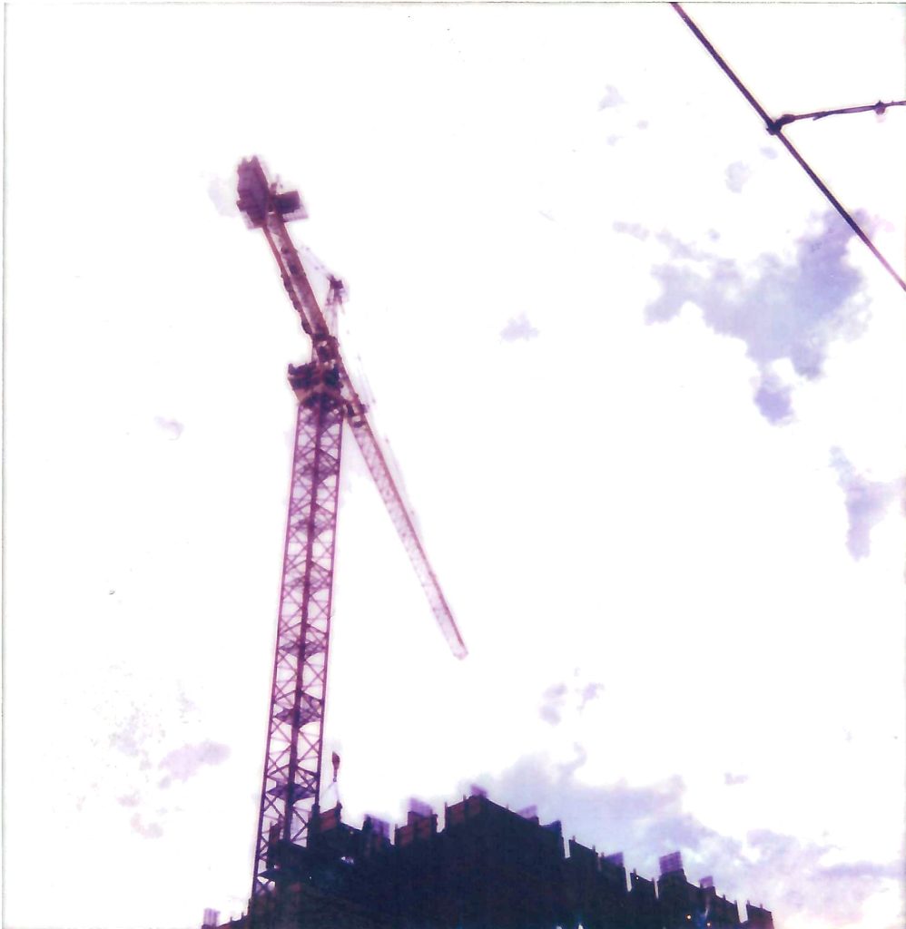
And then in September another flurry, maybe of sparrows? flashed through before sunset to settle on the crane.
sometimes if you are watching you will see a group curve and dart, this way and that over the buildings, as if all tied to one piece of thread
Reflection
Poetry is best read aloud. Or at least in your head. I think especially now with our limited time and head space, a few words that can stop you and create space for nature and to have the soothing properties of nature amidst the constant stimulation of the urban environment are needed.
I had a hunch that analogue processes were important to my process to practise-based research. I very much did not want this research to be about solely my approach. What I intended was to demonstrate how analogue processes or apporaches to recording seascape/skyscape could inject more time and space for reflection into the creative process. And that this would allow for subtle reflections of a specific culture or area into visual responses. Culture is probably the more accurate word as introducing place-based tends to encourage responses very tied to traditional notions of place. I think culture is more amorphous.
Looking back I would say that I am not sure if my methods would suit each creative. What I think would have to happen for the methodology to be success is for creatives to be encouraged to take part in and reflect on analogue processes that suit their creative personality, i.e. if a creative has a propensity or drive to use textiles then maybe that is the approach they take. I think perhaps the issue with that or maybe it is not an issue is that 2D visuals have a distinctly different visual language to 3D which are more about the materiality. I wonder how much this matters?
What I have come to the conclusion is that in terms of practice the research question is a lot more tied to creative practices, analogue processes and time for reflection in the landscape/seascape. This is might all describe (in one way) place-based but this term is very misleading to most and so does not fit the research.
What was I aiming to achieve by splitting graphic design into component parts? I was aiming to see could you isolate the part of each that made it a specific tie to reaction to the place it was made. So for photography (Image), obviously the way you tie that to place is by taking a photo of the place you are talking about. What I chose to do is instead of that is focus on how analogue methods made you slow down and consider the composition in a different way. I also felt (from experience) that analogue methods have a very process driven approach, one that is more linked to experimental methods. So for photography I was really looking at the approach and how to create space inside the image, how to make the page work harder to grab your attnention, in this saturated age, in a more filmic way. But also the way of composing outside.
For typograhy I was looking at what happens when you take the numerous choices of Adobe off the table. ANd what happens when you feel the lettering etc etc.
SO my practice based approach was all about trying to engage with the tacit knowledge that materiality encourages, and analogue approaches encourage.
I have to say that, apart from taking photos of New West and some of the urban poetry being a response to it, I am not sure how it relates to place. I have tried to come back to Vancouver and place in terms of typographic archive research but everything is so general. You end up taling about wider typographic and design movements. Dutch design is an anamoly not the rule.
I am not sure that it is possible to narrow down a typeface to a place. You can to time of creation and the rationale to its design but that speaks more to the wider industrial factors than it does place. Otherwise you go to look at vernacular signage which seems more rooted in idoscyncracies than the rigorous methodology tied to a typeface. (The original Whisper project -fivethousandfingers – was trying to replicate that) and Go the North did that. But are these just replicating a hand drawn feel and therefore not to do with place.
Photography is much more closely linked. Poetry is much more closely linked. Typography (apart from one of fonts) is much more rooted in a rigorous internationally recognised approach.
I am not sure what I am trying to capture is actually the rythm of a place. It is what sort of affect does place have on graphic design but more what affect does how you capture it have on how connected you are to it, and what impact does that have on the graphic design emerging.
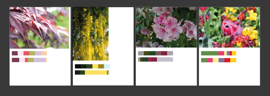
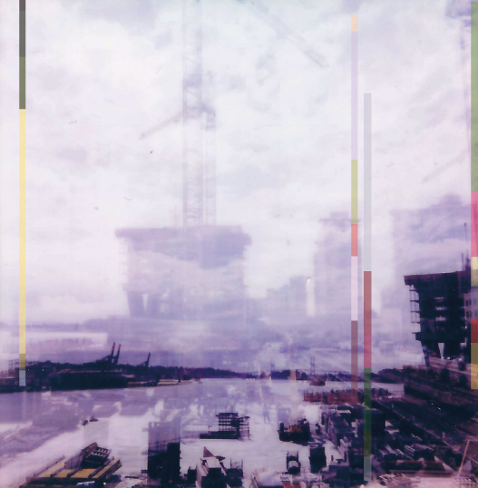
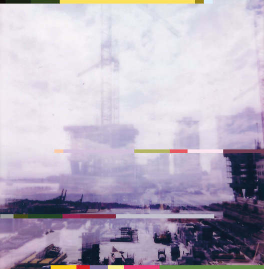
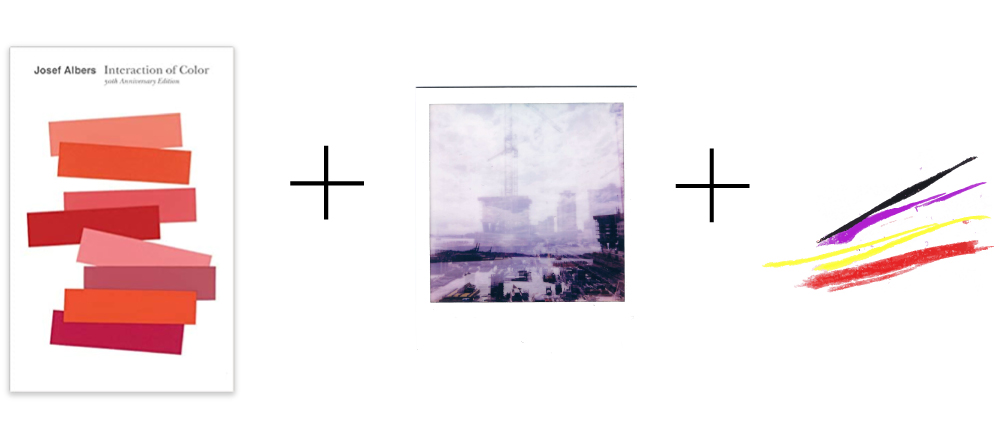
So–surprisingly– this was one of the hardest exercises. I think because I love colour but know that it’s hard to work with, analyse etc etc. But I resolved to be methodical. And this is what I did.
For this experiment I chose to keep the constant the double exposure of New West/Fraser River as image base. I then took pictures I already had of plants from New West and resolved to code these down to colour palettes, doing it be approximate %.
I didn’t think that the above would actually tie the viewer to place when they took in these colours but sometimes assumptions stop you from actually trying so I – at it was very hard – pushed through and made myself do this. Having got the top band I then did the % breakdown. Then in order to have it be a graphic element on the page and not just an out of proportion block of colour lying on top of the photo I stripped it down to a very thin band.
AB1: Colour bands at 50% opacity to help the graphic elements ‘sit’ on the page more within the already layered image.
When I started this project I had thought that the introducing colour was needed but hard to balance with an already atmospheric image. That is, an atmospheric image already has presence on the page and acts as – in perception terms -one message and we’re only capable of taking one in at a time. (Wish I could remember the reference). And so you are consicious, more so as a graphic designer, that anything else is in addition and so has to add something significant or support what is already there.
AB2: Horizontal colour bands at 100% opacity.
Overall I think AB1 is more successful in terms of a read image: the vertical bands sit more quietely within the image and point to markers within the layered landscape to take you through the double exposures, up the river.
In terms of tying one to place I don’t think they function at all, but the point of the exercise was to try and see what the colours and proportions -and these as a graphic asset – added did to the image.
Reflections immediately after (those weeks after are different and worth doing then).
I think words and obviously typeface choice would be a whole other ball game. I am not sure these needs words at the moment.
The placement of the vertical bars could be tweaked to take the viewer more easily through the image.
Reflexive thoughts – To come back to later.
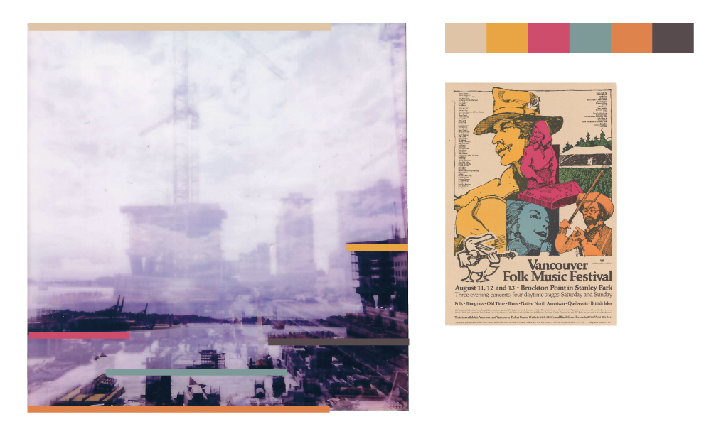
Perry the Poster Man Collection (SFU)
I did this exercise really to show that colour is attached to an older time frame, perhaps, and therefore to nostalgia, but not to a place. These colours are muted and therefore speak to an older time when printing methods were different, the inks were different etc.
I chose the Perry the Poster Man Collection (held in digital form at SFU) because these posters were used throughout Vancouver and so I thought, although I don’t think you can connect colour use to place, if you can this would be the most relevant archive to pick from – as opposed to more international collections.
I chose the above for its very local subject, to see if that translated at all to association in the image to the left. Perhaps the dated colours do, but nothing as specific as location.
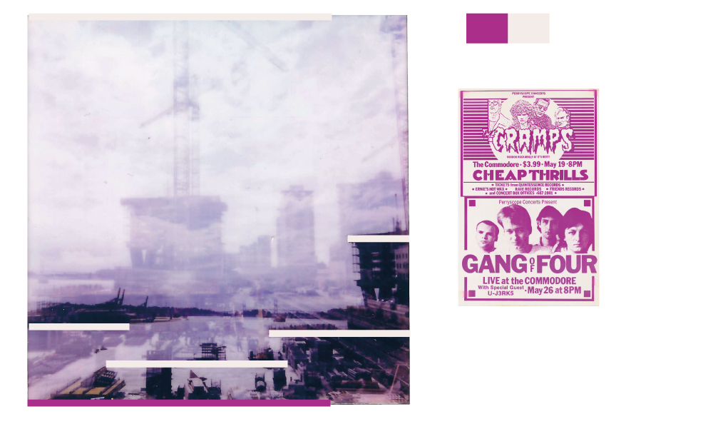
I chose this because the colour was unusual. Now colours seem to be used very much in terms of a branded choice, but I am not sure whether this was the case here, it seems much more innocent – just because it looks a little unusual and stands out.
Next steps…
So now that I’ve carried out very scientific analysis…all joking aside colour is so very subjective that short of asking large numbers of people and averaging out the answers to produce approximate generalisations…this was my way into this. The process has confirmed for me that what you are looking for colour to do is convey energy, whether older or more modern. I want to avoid nostalgia so I’ll have to make sure the colour choice is more modern and energetic. But given the power of branding today it might be challenging to get a colour that doesn’t bring with it another association. Perhaps though the fact that the base image is more art than design helps that. Also the words will be poetry and so that further distances this. Anyway my new friend Josef Albers is going to talk me through the next steps, I’ll print out the image and get ready to do some printing trials.
Prepping for this, after our presentation last week has been an acknowledgement that I am only now learning how to articulate the problem space. Well, to be honest, coming closer to finding the words to do so. Or at least what the wrong words are.
As Craig said, it is not about prepping a perfect exhibit of finished pieces but provoking discussions around what you want to discuss. Now this above might not work in reality but it is closer than a polished end piece.
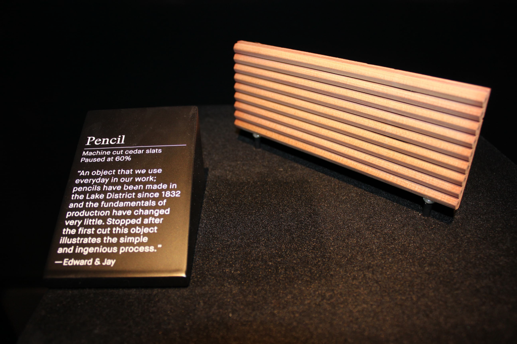
Figure 14.1. Pencil paused at 60%,in the making, curator Barber Osgerby, Design Museum, London, 2014. Photograph: HelenCharman, courtesy of the Design Museum, London. Charman, Helen. “Just What is It that Makes Curating Design so Different, so Appealing?.” Design Objects and The Museum. Ed. LizFarrelly and Joanna Weddell . London: Bloomsbury Academic, 2016. 137–148. Bloomsbury Design Library. Web. 24 Oct. 2022.http://dx.doi.org/10.5040/9781474268820.ch-014.
Something to do with design being about process and showing that process, as exemplified above, stuck with me and I wondered if you can do something around that. Again not sure my exact idea will work in practice but, the thinking through of it, the taking the idea of it into practice-based research is critical in visually and conceptually thinking it through. This and when I talked through my DS project I realised I wanted dialogue about graphic design and not to do it in isolation and so to get the conversation perhaps you have to not always provide the answers.
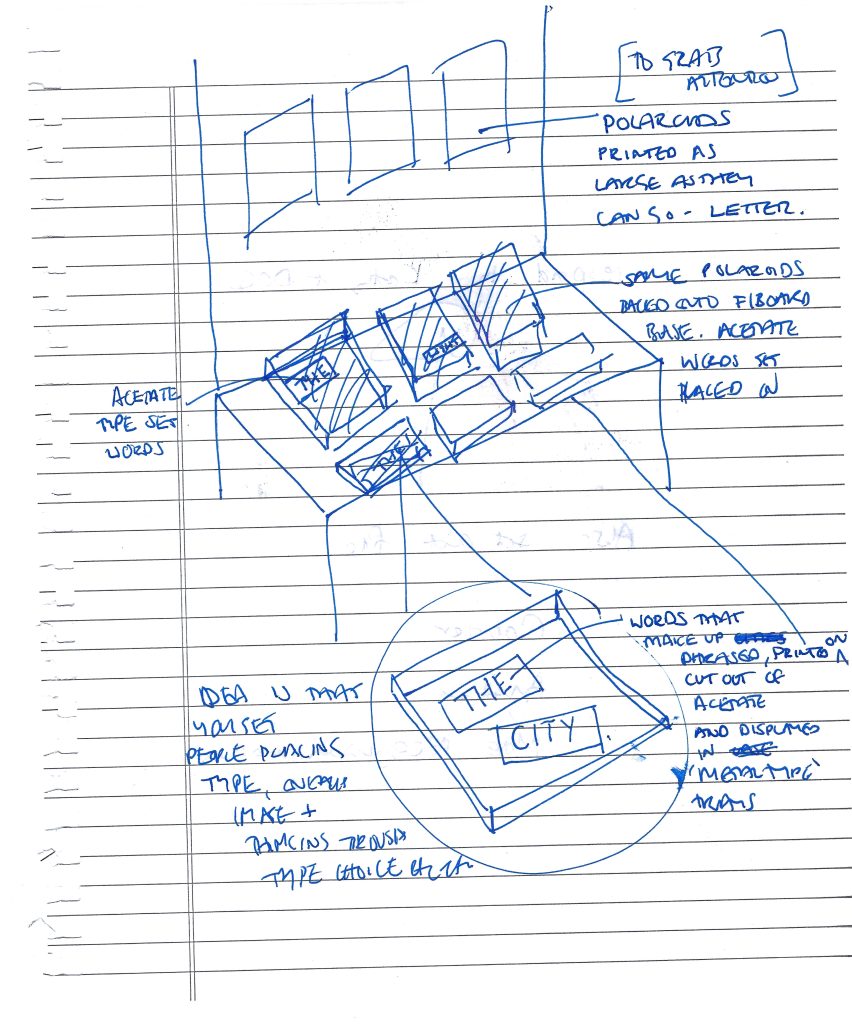
Looking back on the two semesters so far, in order to do the Interim Thesis Presentation, I had a moment of realisation that my work is based on visceral impressions of the city and its peoples, and that it was therefore fitting that it should have a fragmentary aspect to it. This is how a city works: impressions, cultural overlaps, creative overlaps, fragments. It is fitting then that the design provocations I want to produce should be fragmentary also.
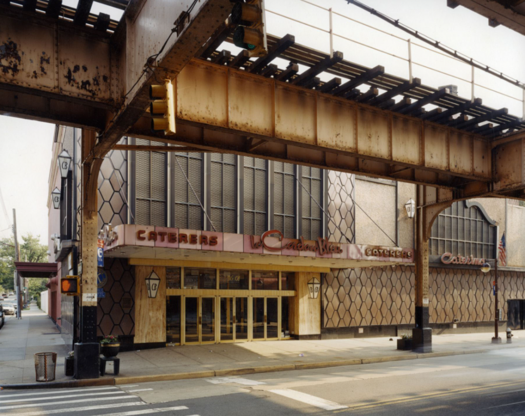
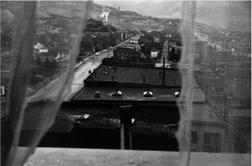
Street Photography
Credit: Joseph Sternfeld ‘ Landscape as Longing’Credit: Robert Frank ‘Snapshot Aesthetic’
Street Photography
This has been quite an influence on me recently. Chatting with Romane Baldou has reminded me that photography is a medium that lends itself to capturing fleeting impressions, overlaps, moments in time. I used to do a fair bit of urban photography but at the time I didn’t know how to progress it beyond the urban gritty / industrial imagery that sometimes becomes the specialism’s default. I don’t know that I know better how to achieve something more subtle but I know now that there is a way out there, I just need to work on my skills through practice on the streets and reflect on what I capture each time.
Summer Thoughts
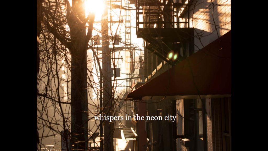
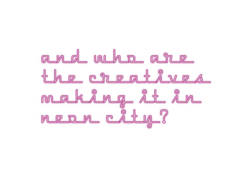
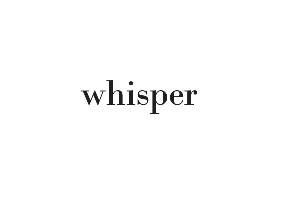
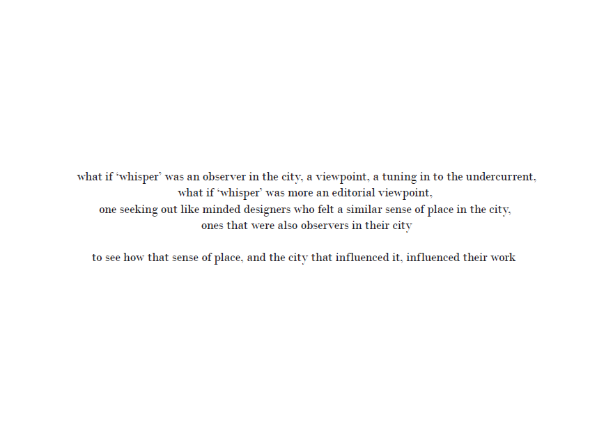
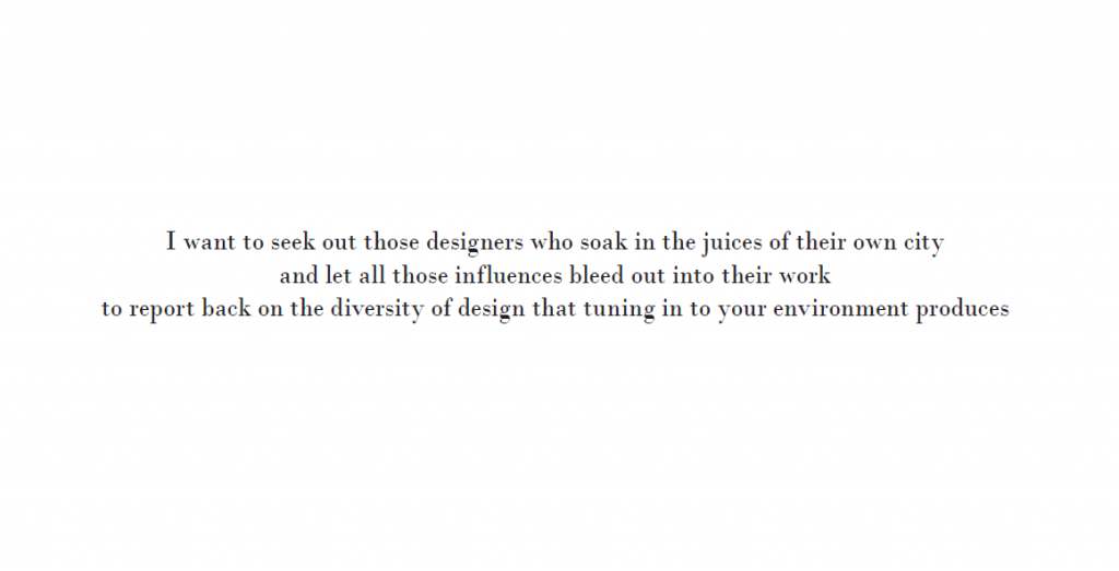
I plan to seek out those other designers tuned into the rhythms of their environment, aided by my design journalism proposal ‘whisper’. I aim to have these stories gathered and distilled over the summer so that I can then produce a range of provocative design fragments that will then provoke others to look at their city afresh, to encourage a different, more subtle form of creative response to their city. When I say subtle I don’t mean quiet as the word ‘whisper’ might suggest, I mean simply a creative response more attuned to the rhythms of the city – it could be gorgeously vibrant graphic design or textured black and white photography or anything in between. We will reflect as we go along whether ‘whisper’ is the right word but, for now, let’s stay with it.
Practice based research is one way that I will record and reflect on my own reaction to the city that I am in at a given moment, and this will feed into my own journalistic drive to seek other designers and other creative / environmental rhythms.
My aim is to create alternative narratives of a city, based on my own observations and reflections on others’. Where their own existing work or their graphic design responses to my probes comes into this is yet to be determined. I suspect it will form its own path once I get cracking at a new set of interviews (in the works).
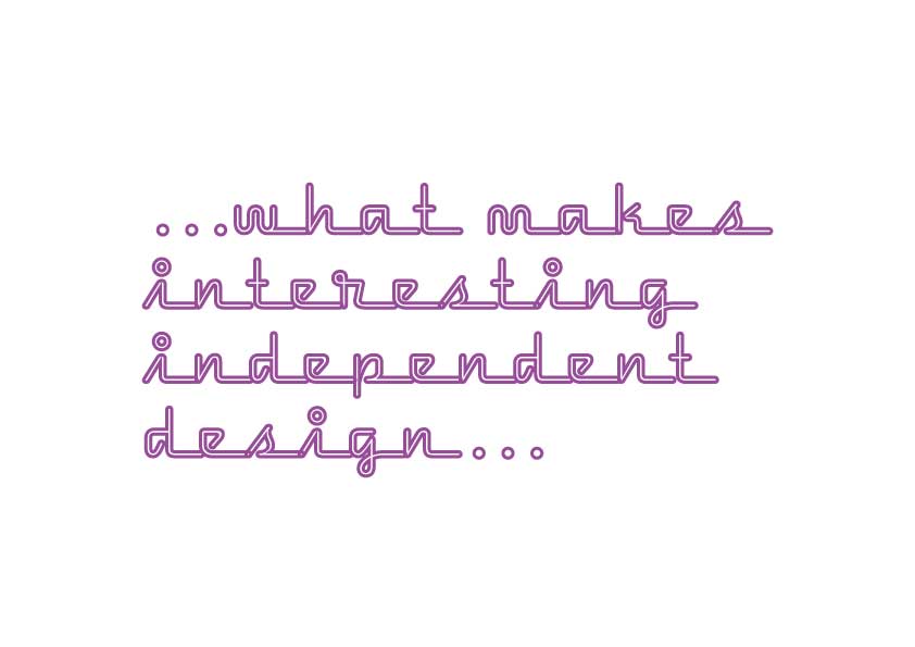
It is dawning on me that exploring what contributes to independent cultures in one location will be dependent on how graphic designers in turn respond to this. Each of them will have their own sense of themselves, their environment, their local culture. This the space I will be working in, and their versions will be different to mine.
So it will be about what makes up their sense of themselves in that place, how this feeds into or is visible in their work, and perhaps comparing a range of these perspectives.
A final note to methods of capturing the city. I will use urban poetry and photography to record and gather, and together with interviews, distill all of this into design fragments as described above. I had thought that I might collaborate with a film maker to explore another way of recording interviews /and the city itself. If I do this for the interviews I may separately record the city itself as the former will be an objective recording of the interview, while the latter is a more subjective capturing of the city…to be decided…
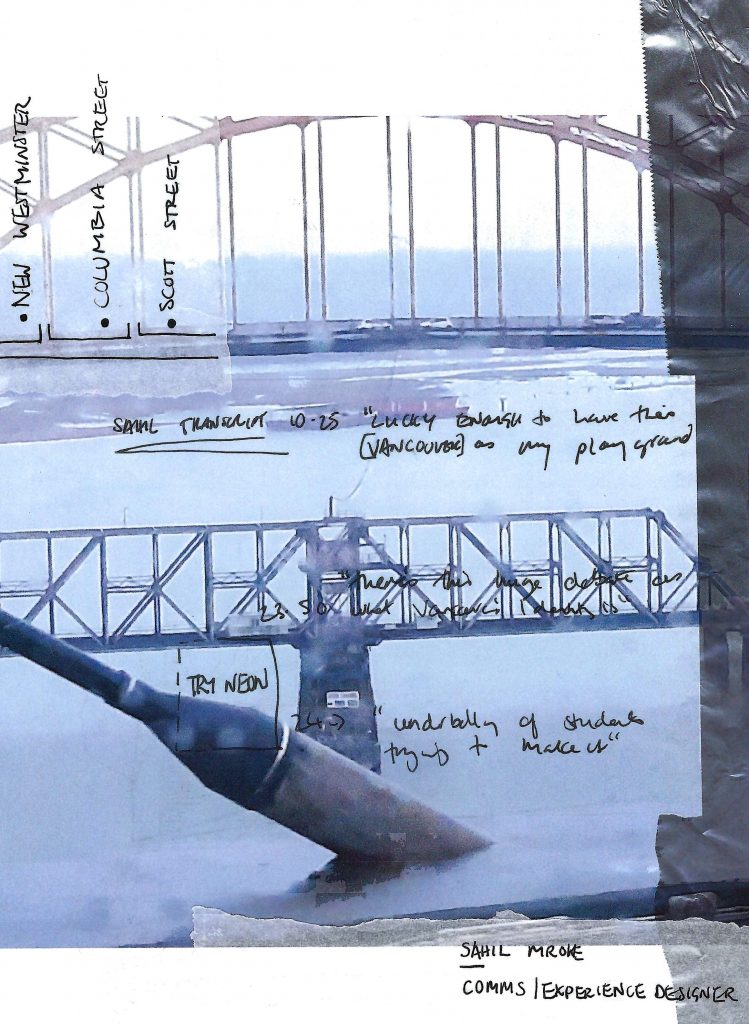
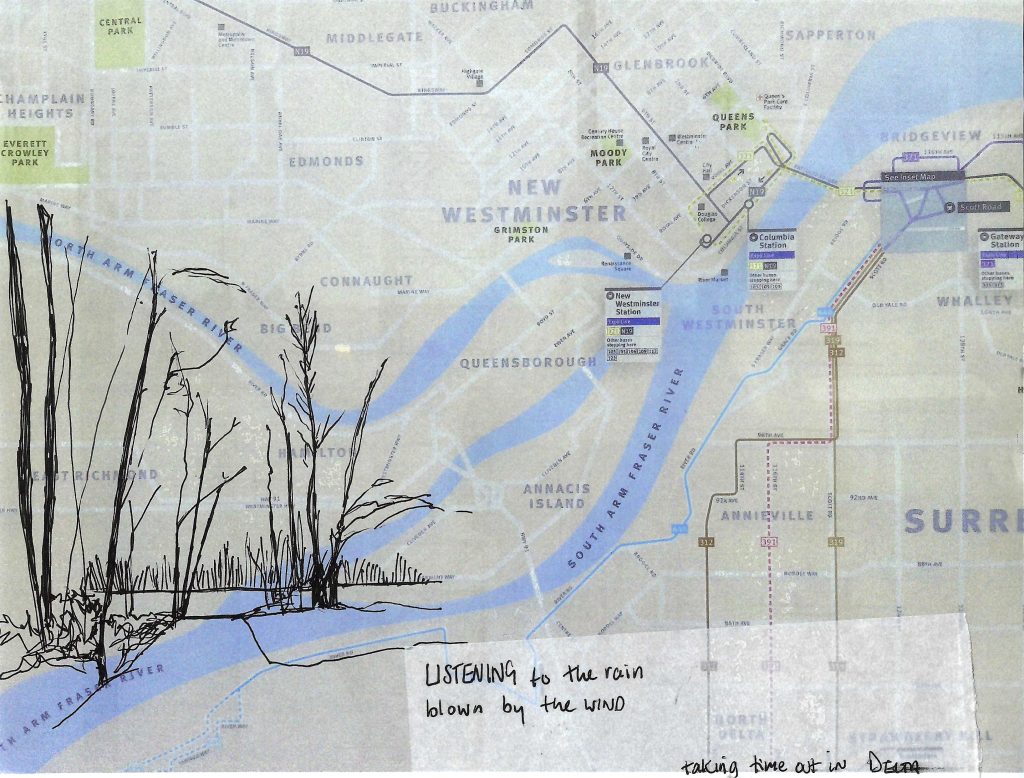
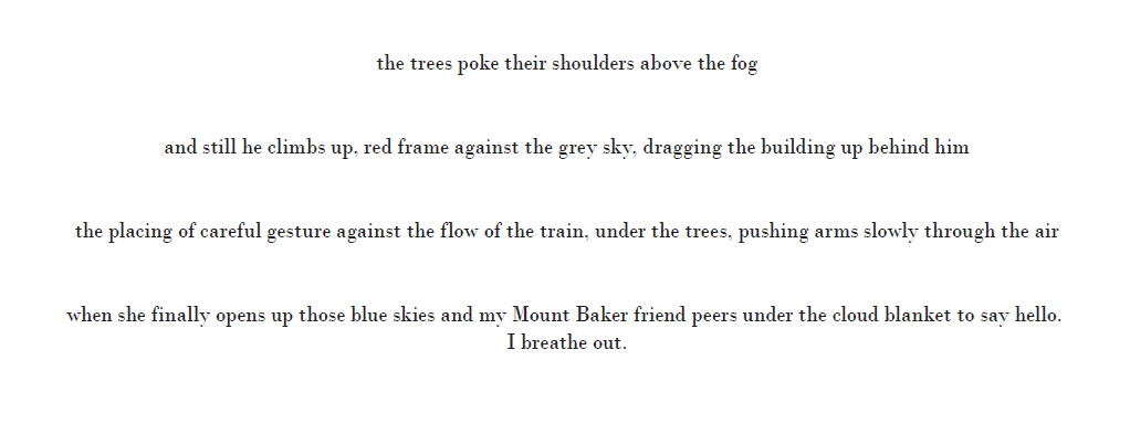
After our Design Walk (explain), I took the pictures I’d taken on the day and collaged these together with handwritten quotes from the first interview. The aim was to convey a flavour of the walk, the landscape, that it had been raining, how I got there.
I took a photo of the map at Scott Street, printed it and used that as a backing page for a pen drawing of the spot on the Fraser River where we’d chatted.
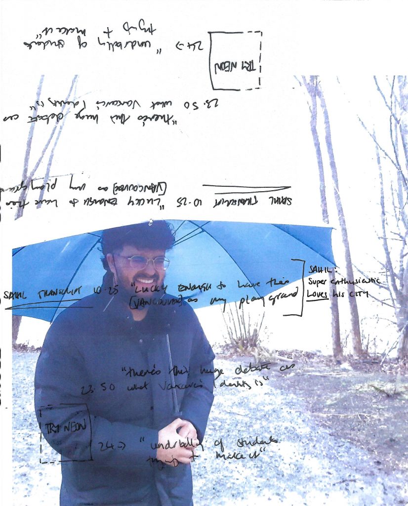
This is Sahil himself, and this picture sums him up: a warm and friendly person! I wanted to feature a picture of the designer himself and then overlay quotes in a photocopied, analogue way to avoid the A4 page, and traiditional Adone software – for now at least.
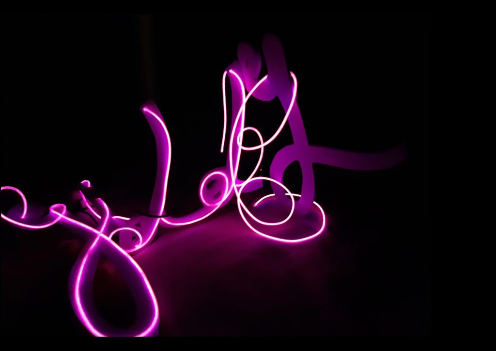
Before I started this course I had been experimenting with my version of neon writing – using el wire to replicate its effect at a smaller scale. I love the strangeness and loneliness that neon writing conveys – for me it captures the oddness and giddiness of coming to a new city. One of my works is below ‘giddy’. My aim is to ask Sahil to handwrite one of his quotes from the interview which I will then render in this neon-esque style. My aim is to play on the individual in the midst of a neon city, neon being one of the key typographical languages in many cities, but especially Vancouver.
Interview 2: Catherine Falk
This interview was carried out over the phone, it was a getting to know you conversation and should be followed up by a Design Walk.
Interview 3: Sarah Hay
This is my third interview and will be a stand alone as opposed to the two stage process. I’d anticipate in future that I would interview certain people a few times, to build more of a narrative.
Reflections so far
What is the connection between a person having a sense of place and this showing in their design output?
Can someone tell this or is this better seen by outside observers…so is gauging this better done by viewing their work ?
How would I gauge this? Do I have a sense of Vancouver? Not yet…so how would I tell this?
I think I can sense a different vibe in French graphic design but Vancouver specific is much harder for me to tell, so how do I recognise this in someone elses’s work? If I saw a range of independent design work fromVancouver designers would I sense a common theme?
I have the idea that great independent design is like fresh fruit sourcing. You have to get to know locals, find out the spots. What if is just as simple as asking lots of designers for local recommendations from their own backyard? Is it a matter of gauging if their work is influenced by sense of place? And then working out how to promote this wider?
Is what I am doing a form of Design Enthnography?
Sarah Hay
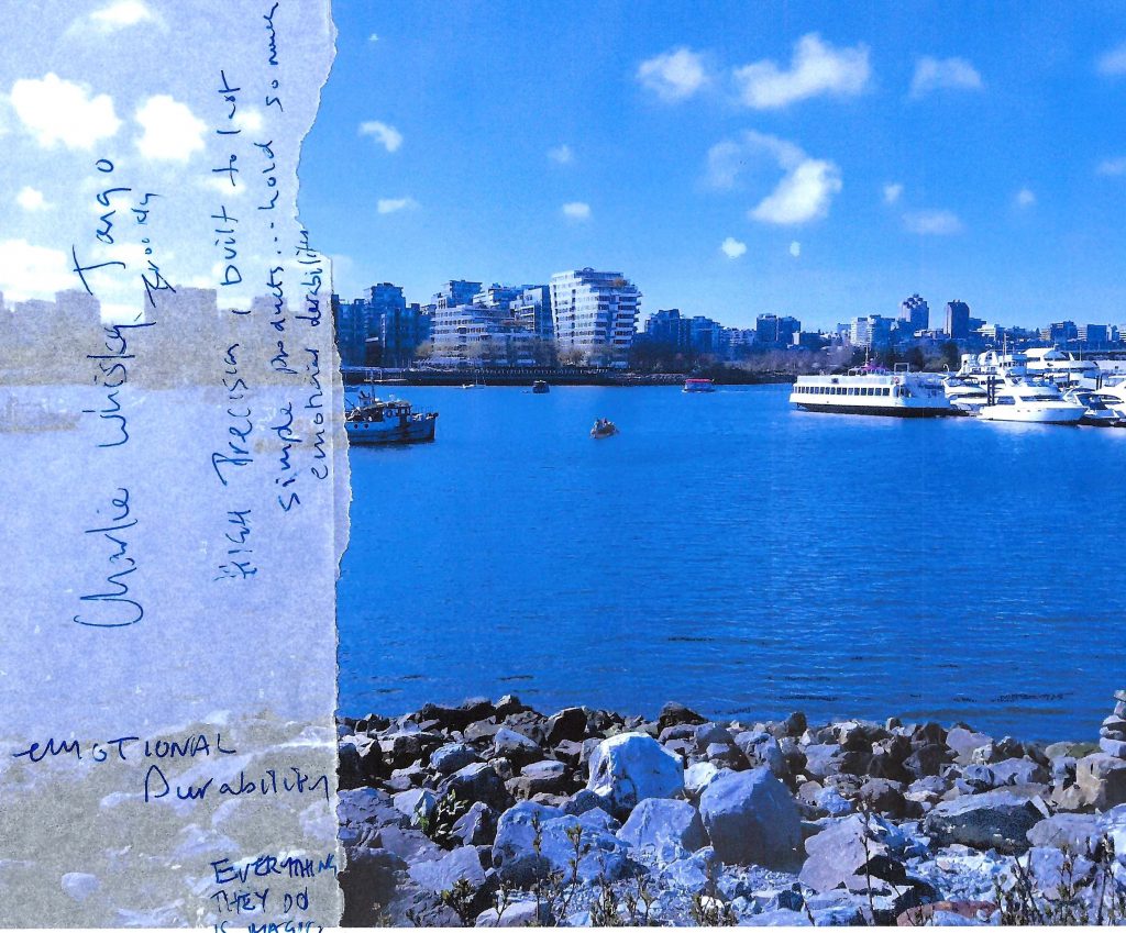
Walking along beside False Creek, a stunningly beautiful day with the grounded, calm, designer extraordinaire Sarah Hay. She was so clear in her values of mindfulness, calm and peace and living in harmony with the landscape. And when one of her favourite designers is Charlie, Whisky, Tango – a group based in Brooklyn – you might wonder what the connection is to Vancouver. The answer is simple: durable design made to last. And suddenly one aspect of Vancouver was clear. Yes the place influences local design, design thinking, the movement of sustainability in design. Not the same as the vibrant graphic design of Montreal but no less meaningful.
Reflections
My impressions of Vancouver are forming around a city deeply affected by sustainability. The proximity of mountains and Pacific Ocean foreground the landscape here – and the outdoor opportunities it affords – and Emily Carr has drawn sustainable designers keen to be around a vibrant design group keen to change design for the better. I am going to diagram or trace or map or sketch / document the rhythms as I see them here, tuning in with nature as it happens and searching still for what graphic design means here. There is an aspect of independent cafe culture here and I need to tap into that. I wonder if the relaxed ( is that the right word?) vibe feeds that independence?
I think I need to be more specific with my enquiries. If I contacted graphic designers in Montreal, Asia or New Orleans and found distinct design, how would I celebrate and promote that – materially/visually etc
Sahil Mroke/Experience Designer from Delta, BC (speaking about Vancouver)
The idea behind the first interview was for it to be of someone interested in design processes and collaboration and who has worked in BC all his life. The setting was to be Emily Carr as this initial interview was made up of general place setting questions, so sitting looking out of the school to the mountains behind seemed fitting. Sahil was already primed – he knew what I was looking into, someone unknown would need to be asked to read the Whisper presentation first.
The interview was recorded, the questions asked listed below. The plan was to then do a design walk in a setting closer to Sahil’s home, a setting of his choosing in Delta.
Describe in as much detail where you are from/ where you live? (sets the scene, grounds it and hopefully gets him talking)
How would you describe yourself as a designer? What words would you use? What do you hope to achieve? (links it to profession)
Where is your favourite design space? // What environment would you say you need to be successful as a deisgner? (links it more precisely to ways of working, what effect environment has)
How do you feel the city of Vancouver influences your design thinking or design practice? (What affect the city (specific to him) have on his work?
How did your experience of working in Vancouver differ from working in Los Angeles? (Does he have anything to say about the different cities?)
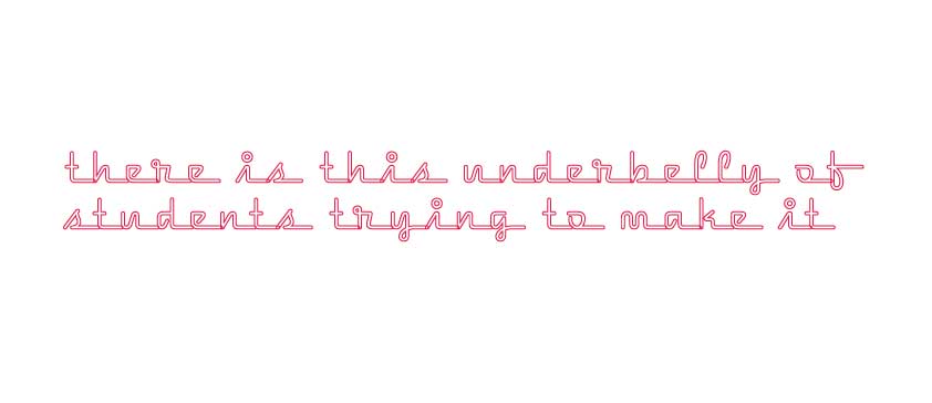
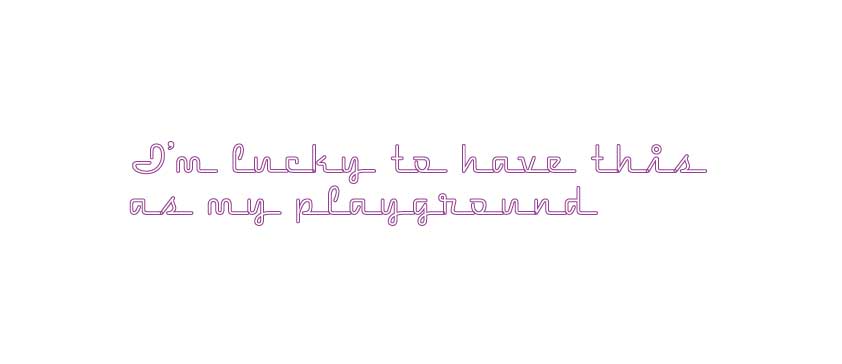
After listening back to the transcript two quotes held together as interesting contrasts (illustrated below in a neon typeface as homage to its predominance in Vancouver but also I like the way neon has the power to simultaneously convey excitement and a kind of strange loneliness which my interactions with cities seem to generate).
‘There is an underbelly of students trying to survive’
A note on this typeface / quote choice. If I were to develop this into an object, a neon installation, I would consider wording carefully and typeface choice, this above and below is more of a shorthand to sketch out the idea.
‘I’m lucky to have this as my playground’
So after much reflection and questioning what I am trying to find in another voice, another whisper, I think I would need to significantly narrow down my questions for our design walk. Proposed questions are below. Also to note that the place itself would almost be a participant in this interview, yes there would be suggested questions as below but really you would want the designer to reflect and be in the place, so that they start talking about wider inspirations. So that they, in effect, relax.
So tell me about Delta? (General question about the area to get him talking)
What is it about this specific place that draws you back here? (Gets him talking about his relationship to this personal place)
This is where the issue becomes is the personal space (outside) there as a device to show the designer’s connection to the landscape/city or is it a device to relax the designer so that you can then ask him/her/they the following and get a more open answer (say that sitting in a busy coffee shop in the city).
If you could pick any place in this city and do whatever you choose design to be, without constraint on resource or budget, what would you do in that space? (To encourage a more experimental and affirmative mindset, a more speculative design mindset)
What are some of your favourite spaces/places/art spaces/works by other indie designers in this city? And why? (To encourage them to talk about their local inspirations)
next steps…
Reflections
How on earth did Anthony Bourdain do this just so well?!
I think you would be able to guess that this city was Vancouver from this transcript. (Still considering how to visualise the whole thing.) I think though that you would need to dig deeper into what makes Vancouver independent design, what does the interesting stuff here look like? Is the way to do this to to ask Sahil for his favourite local designers as in the suggested second interview questions above?
What criteria are you using for ‘interesting local independent design’, is it the stuff that comes out of small agencies R&D budget? Is it artists’ or designers’ residencies (for example working with Labs like Material Matters?). Is it work not happening in this space, but hyper local gig posters, is it super niche metal artwork?
It takes a while to research who to interview, set it up, consider questions, read the transcript and reflect on changes for next time. So I plan to research publication design/possible typographic treatments and stock to work with in between interviews.
Possible Other Interviews: (Intention being to do the two interview method if possible) Sarah Hay Charlotte Falk Julien Langois Cameron Neat Paul McDonnell Possibly someone from Occasional Press…?
I also plan to do a design walk myself in order to relate this research to my own practice. I’ve taken street style photography before in other cities but perhaps now is the time to revisit this part of my practice. I am looking at publications as a practice to highlight the multiple voices in local design. Interviewing as a method is a large part of my overall practice at the moment, I am doing this for Directed Studies also and so I’m hoping that this will inform my interviews for this Whisper series.
This term so far has been about me going between ideas of nature and ideas of traversing or creating a sense of place in the city. I was struggling to reconcile these two themes, how does nature fit into the city experience, how do they align?
In looking at the last blog post at ‘breathe’ and ‘deep in the brightest shades of green’ I realised that the former didn’t work to relax or create room for pause outside of the activities of active meditation or minfulness, and the latter seemed a little heavy handed on reflection. I also found myself steering towards the natural world part of the theme too much, to the exclusion of the stimulating city experience. I wanted to combine both themes but wasn’t sure how.
The city, for me, means culture, experiences, designed streets and signage, independent makers etc. And I’ve always wanted to hear more from these independent makers to see how that culture forms in a city.
What I shorthanded to ‘nature’ is really pausing in the city, observing it. Thinking about what aspects of it contribute to a sense of place.
So what if you took ‘whisper’ as a persona. One that observes the city. It ‘observes’ by occassional urban poetry to set the tone and then seeks out those graphic designers who also work to that tone, who identify with the feeling of a sense of place within their city. This influences their work and they feedback into that independent design culture. What if ‘whisper’ became a collection of curated graphic design interviews?