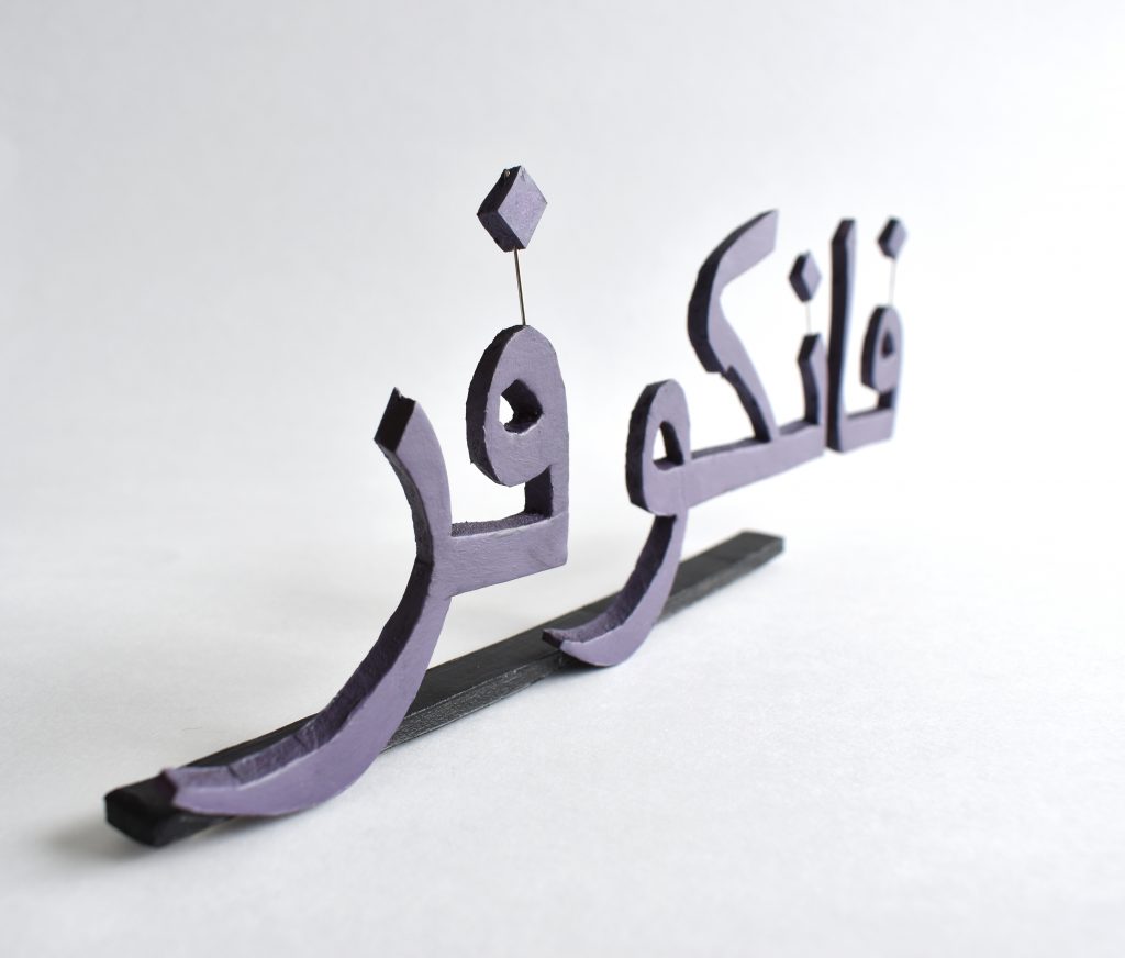
Partnered with Fajer
I was partnered with Fajer, she is from and currently based in Kuwait but very keen to get here toVancouver.
We have a love of typography and letterforms in common, so I decided to focus my gift in on that. Fajer loves the idea of combining Arabic and English and so my take on that was to use the Arabic to write a welcoming phrase in English. I started by looking at Arabic script, it is very beautiful and so I was looking forward to working with it for this project.
Working in 3D
My background is in digital graphic design in in-house roles but my personal practice has been based largely on 3D modelling, experimental print making and photography based on the work I have made. I knew for this project, given the time constraints, and also the fact that it was a gift, that I wanted to create a crafted object that would sit on Fajer’s desk. I therefore resolved to work in 3D
My most recent work has all involved 3D foamboard modelling and so it was my go to material. In a previous life I studied architecture and used balsa wood to model to-scale projects, but for me foamboard is much easier and much quicker to finish with paint, although it doesn’t have the strength of balsa wood.
Design Process
I started the design process by considering ‘Welcome to Vancouer’ as an option but could see that this phrase in Arabic script would have many parts and as I wasn’t sure how I was going to present the gift I thought this a little ambitious in the time given – especially given the complex shapes in the script. I had two ideas for how to present the final piece: the first being as a collection of letters that I could present in a parcel or small bag, to be assembled on the flat desk in real time, to read out the message to Fajer online; the second was to have the whole piece as a freestanding form. Both of these would have to be simplified in order to complete a gift that took into account the time it would take to cut out the beautiful but complex Arabic phrases. I therefore edited the whole phrase to simply Vancouver. I still thought this would be a nice gesture to Fajer, paying homage to the stunning letterforms while tying into the city that she was very keen to call her next home. Having decided to focus on Vancover I knew that the first task was the scale I would do it a
Scale
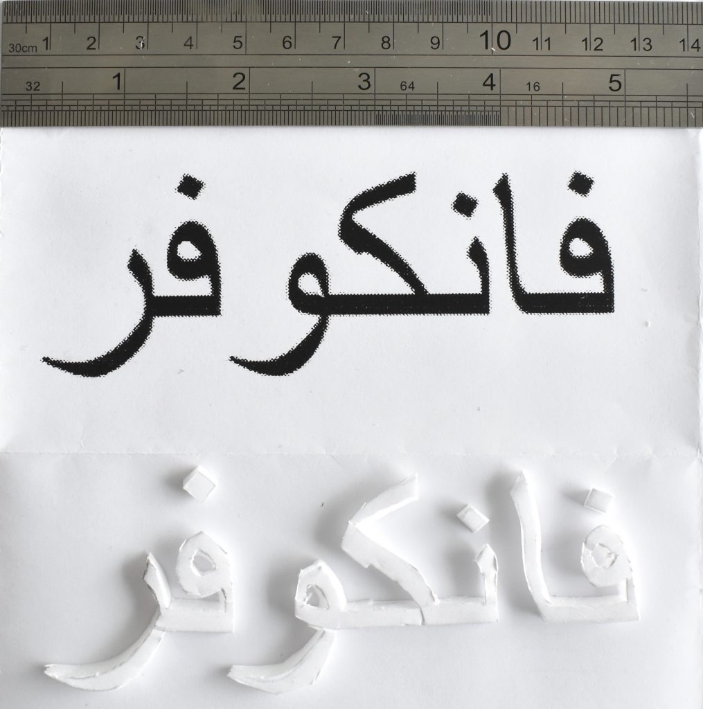
First Scale Trial
The first scale trial was to do a rough cut with the scalpel to quickly gauge what size the lettering would need to be in order to achieve the smoothest finish possible. I knew from experience that this size, scales shown by the metal ruler shown, would likely be too small but it helped confirm this and allow me to quickly move on to a larger scale as below.
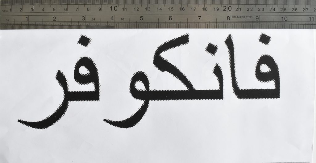
This sizing made each phrase much easier to handle in foamboard and much easier to cut down with my scalpel.
Colour Choice
Initially for the colour I was going to use the bright green of Vancouver as Fajer is keen to get here and into the hiking culture. On reflection I wasn’t happy with the way the colour looked, either the tone or finish, I wasn’t sure it conveyed the outdoors aspect I was going for (it might have needed a layering of various greens such as you actually find when out in the forest) than just bringing to mind the apple type Granny Smith. I had a further chat with Fajer and discovered her favourite colour was purple and so, after a lot of colour mixing and trials, I went with a deep purple.
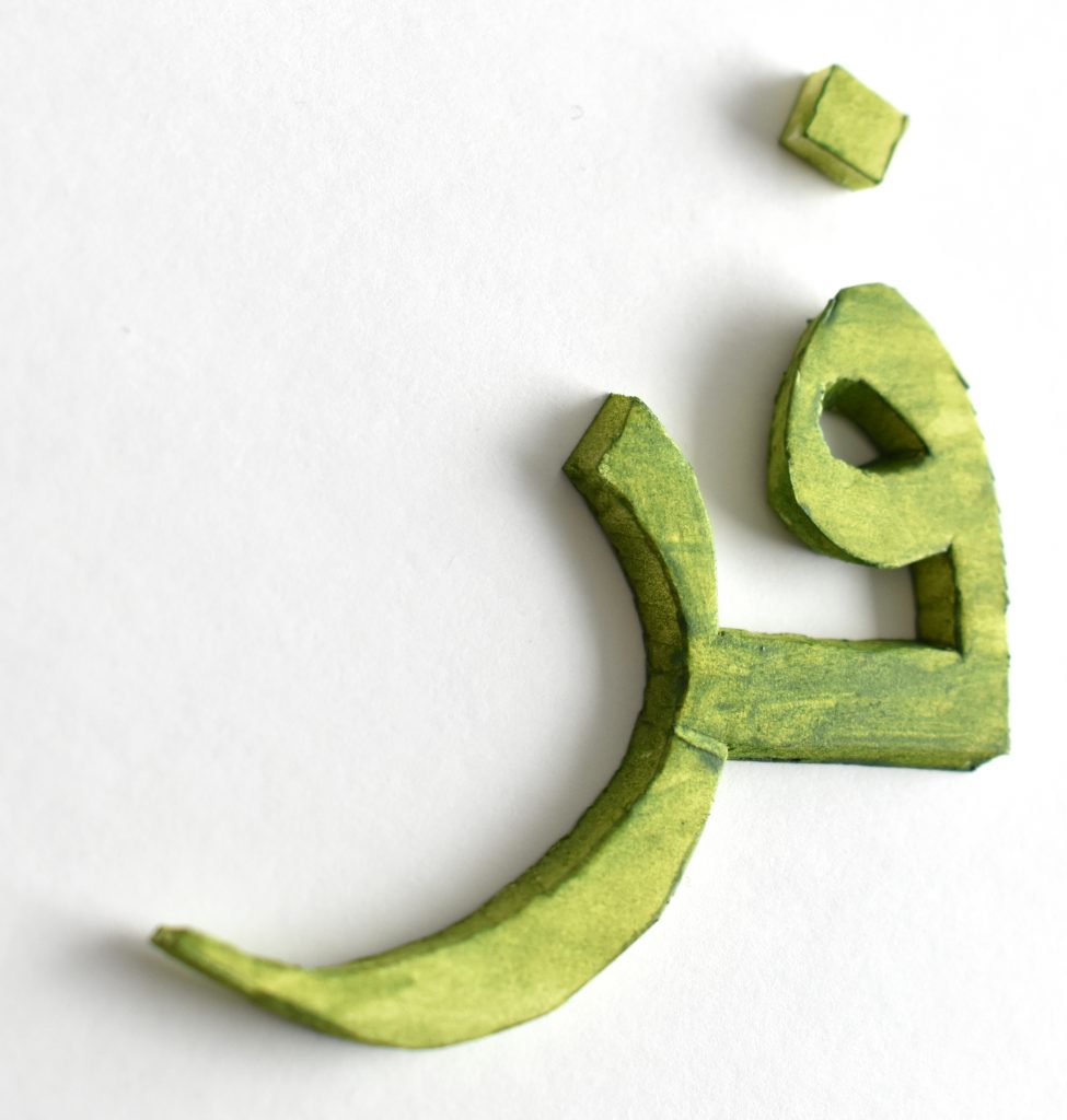
First test colour – green for the Vancouver forests 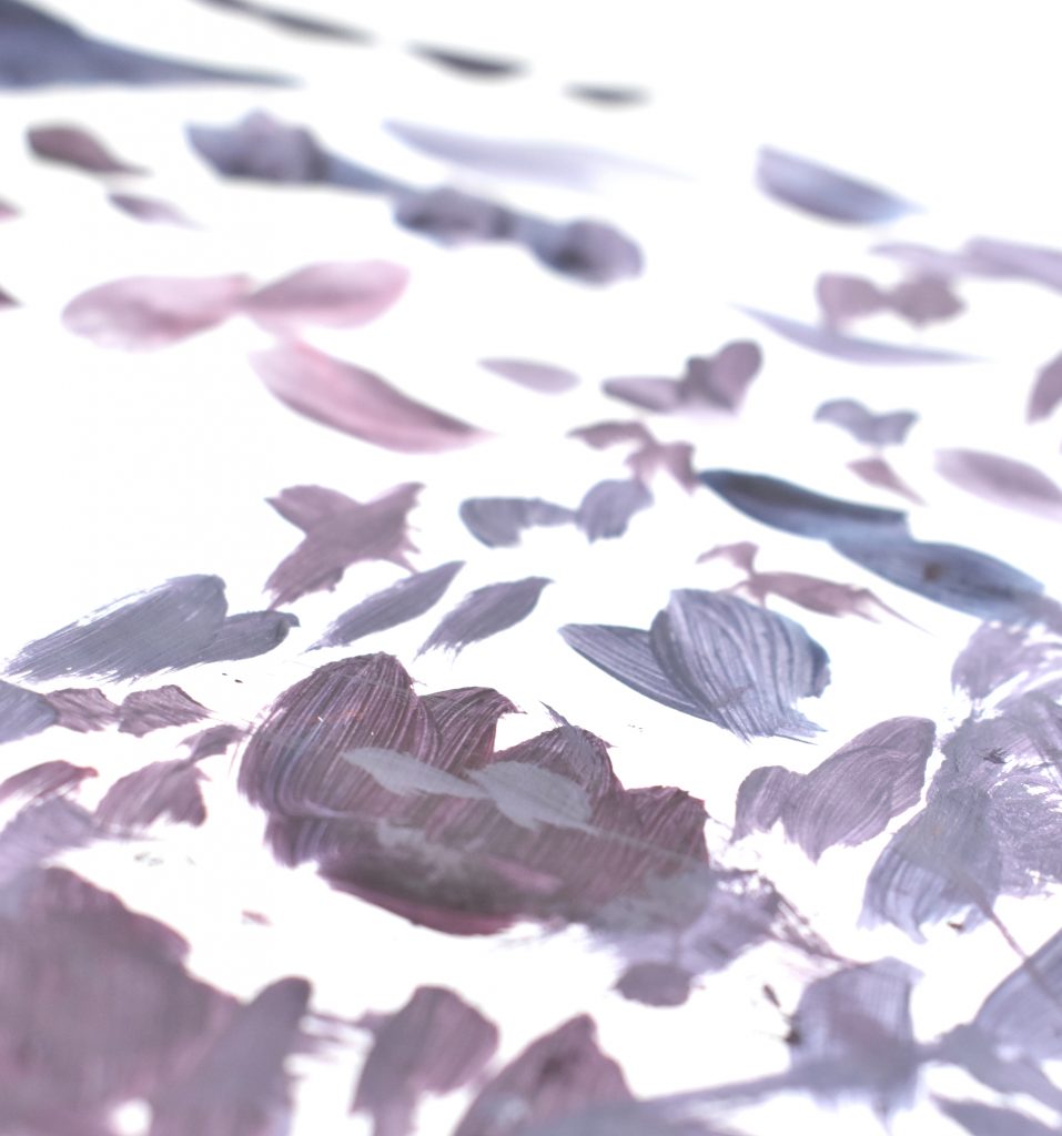
Second test colour, capturing the right purple
Support System
The next issue was to present the lettering as a gift and I resolved to make it a freestanding structure to sit on the desk, to remind Fajer of home when she is here in Vancouver. That presented a number of challenges. How to create a base to sit the letters on, how to then connect each phrase to this so that it all sat together as one. How to connect the accents of each phrase to the letters below in order to have them suspended in the air at the right height, as there are subtle variations that need to be paid attention to and incorporated.
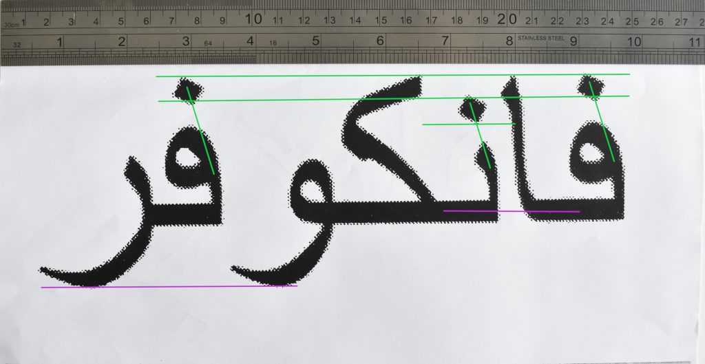
In order for the lettering to stand as a freestanding piece it needed to have a base, and each of the phrases had to connect. I created two key black strips, one at the base and one connecting the 2nd and 3rd pieces at their horizontal base (shown in purple lines above). Luckily as the piece is only 23cm x 8cm and made from foamboard it is very light and so the cantilever effect doesn’t happen at all. Then I created 3 metal supports to hold the accents in mid air above each letter (shown by the green diagonal lines above). One key aspect I mentioned above was that the accents differed in height above each letter. I was able to accommodate this in the metal rods simply by adjusting how deeply I embedded the rods into each letter below and therefore how much rod was left in the air to hold the accent. The aim was to make the supports as discrete as possible so as to make the Arabic script itself the main focal point.
The Completed Gift

The completed piece – free standing Arabic script of ‘Vancouver’.
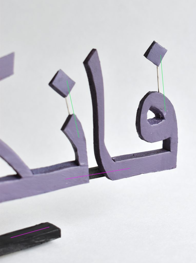
Close up detail of the support system in place: the black base and thin black support as indicated by the horizontal purple strip; the metal rods as indicated by the diagonal green strips. For me this level of detailed design was a way of considering how the piece would work as perhaps a larger scale model and the support system that would need to be in place to support much larger and heavier base pieces, and also what I would have needed to do for the whole ‘Welcome to Vancouver’ phrase if I had done that.
Reflections
If I could have developed this idea I may have taken my two earlier ideas and combined them. The earlier one was to present Fajer with a bag of letter treats and assemble them online, flat on the desk to reveal the message in real time.
If I had commited to a hybrid of the two ideas I would have adjusted the assembly method and built on the supports system I devised for the completed piece above in order to support the whole ‘Welcome to Vancouver’ in one full free standing model.
The finished piece in that case would have been the performance of me putting each Arabic phrase together in a single freestanding structure to reveal the final phrase to Fajer when she saw it all together. The intention would then be for this complete form to sit on Fajer’s desk for when she gets here.
