Ongoing Work : Material Exploration
I have always been interested in surface texture, colour and form and how they interact with each other visually. Texture heightens the effect of colour and so if you are looking at how you would visualise the concept of giddiness, this is an interesting place to start.
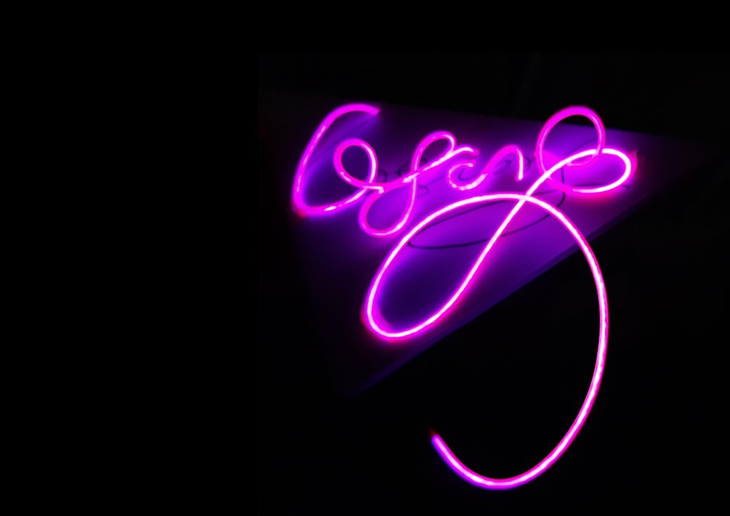
The idea to do this came as a development of the Dublin project below. Having tried the writing in neon and using metal sheeting as a base for pen and ink writing (see below), I was keen to take the design off the page a little more.
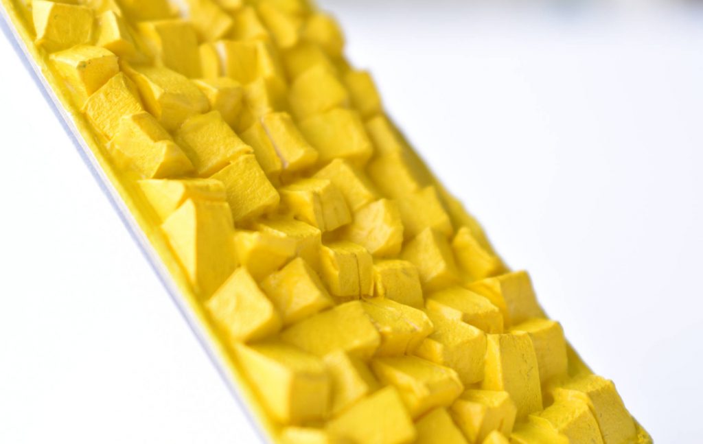
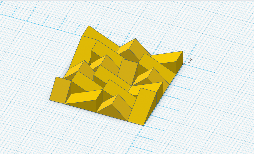
The yellow texture above came about by trying to get across the dizzying feeling of losing myself in a new city. I had taken the idea of the lines of the notepaper and made these out of yellow strips of foamboard to heighten the message. This got me thinking about how could I take that shape further, I cut it into triangular shapes and placed these in a random pattern as above. The inspiration for this random pattern came about when I watched a documentary film about the Titanic Exhibition Centre in Belfast. The designers had been set on ensuring that the exterior metal facade was made up of a pattern that didn’t follow a standard pattern, this meant that it was more eye catching because it wasn’t standard-your eye needed to pay attention and not switch off as it would do had it been standard. The yellow colour is my best attempt to match the gorgeous yellow favoured by Mexican architect Luis Barragan in his Tlalpan Chapel, Mexico City. I am currently working on a 3D print model for this, I’d like to see what variance in scale did to the effect of colour and shape on an interior and possible attempt a garment with this surface design.
Dublin
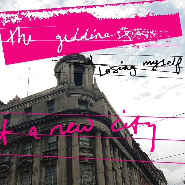
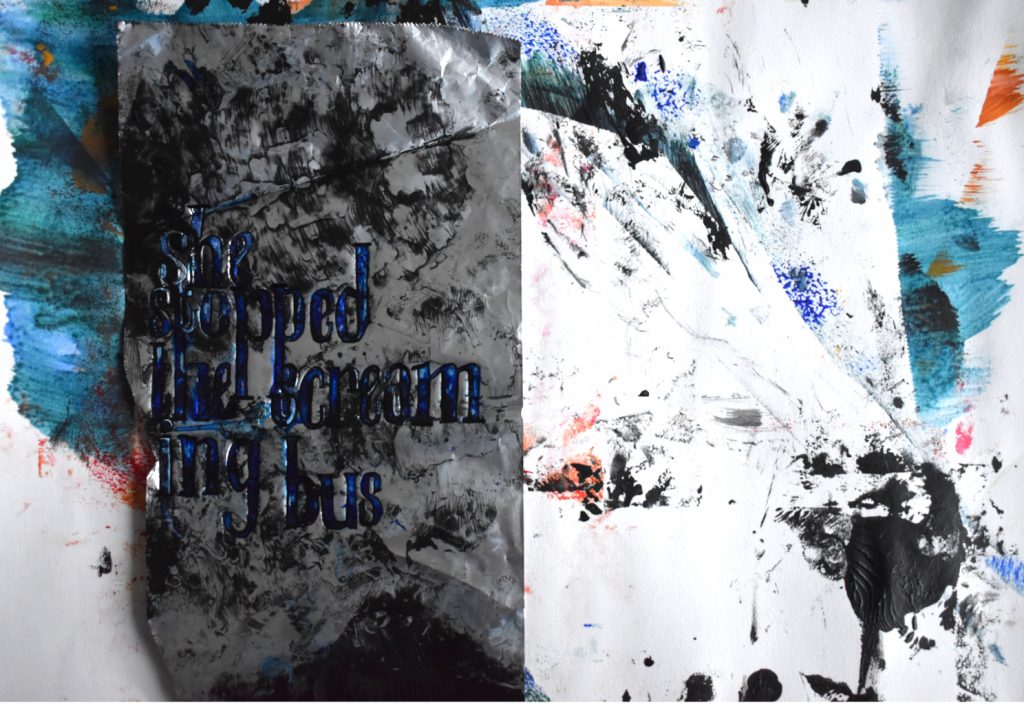
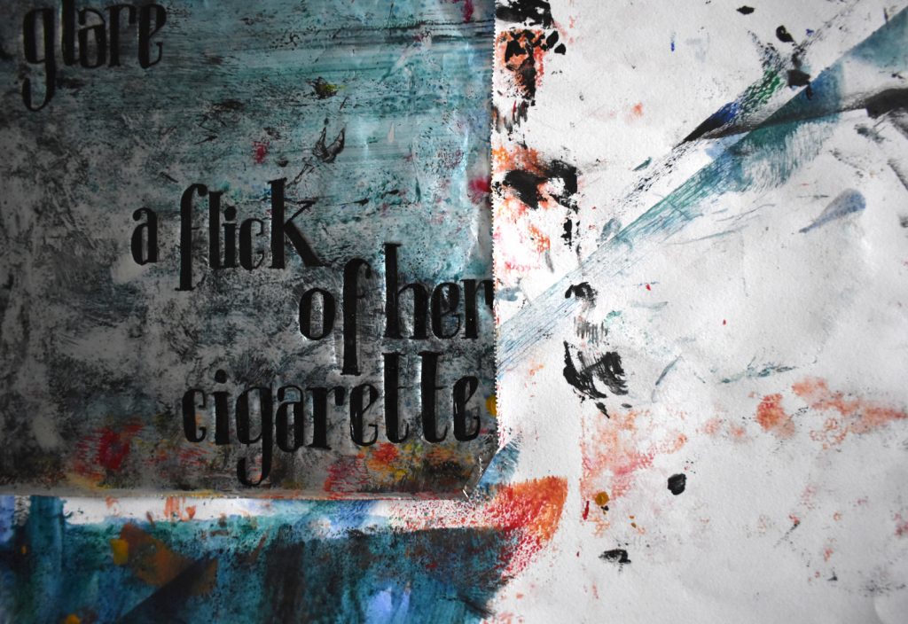
This project came about through recording my first impressions of living in the Irish capital. Words my own, street art backing in image below right credit unknown.
“The giddiness and losing myself of a new city”
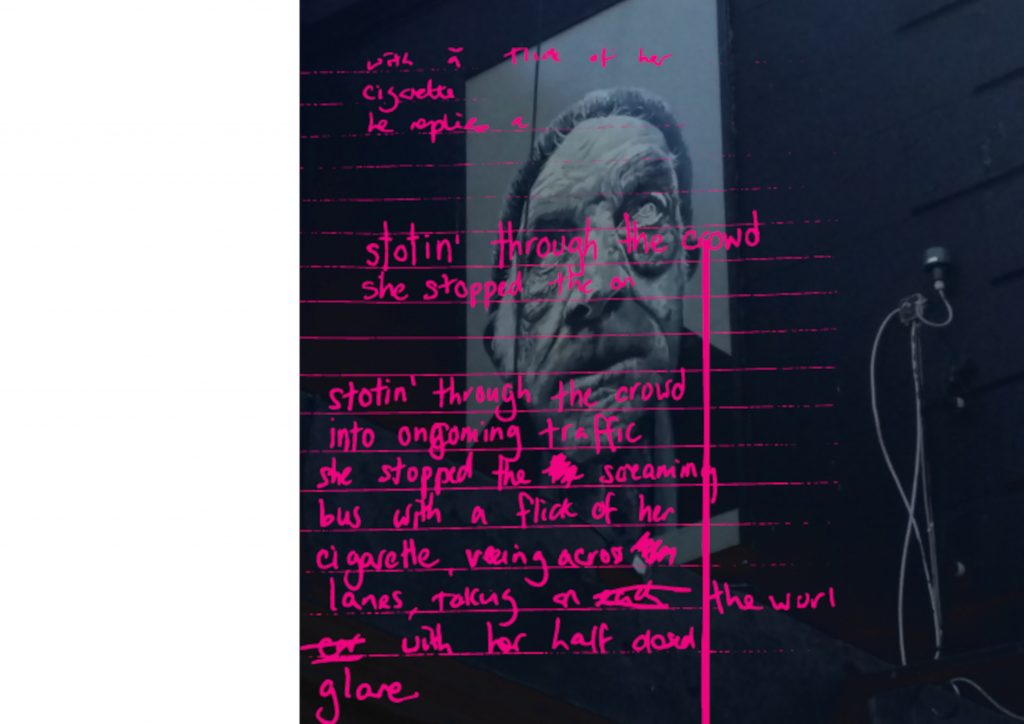
“Stotin’ through the crowd into ongoing traffic, she stopped the screaming bus with a flick of her cigarette, veering across lanes, taking on the world with her half closed glare”
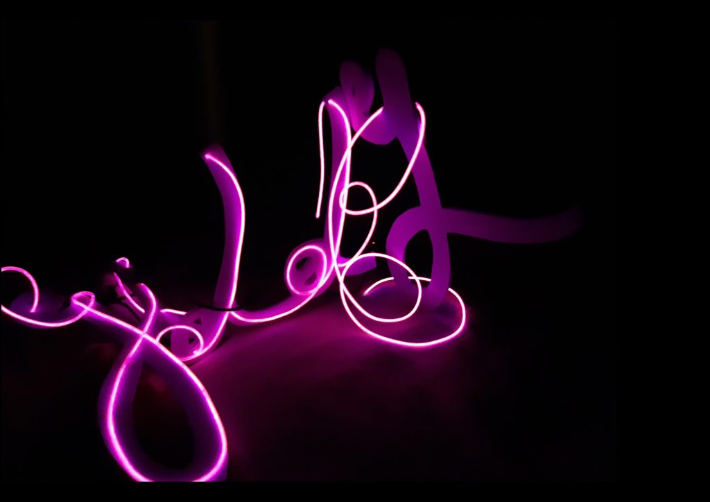
I used El Wire to replicate the look of neon Diner writing, the sign writing that you get in those outskirt of city cafes, where you get a coffee before you hit the centre of town and look for your new home. It’s usually a feeling of excitement, trepidation and a little strange loneliness. This is what I set out to capture.
This was in homage to that fierce Irish woman, I used a serif font on al foil with pen and ink, you can just make out the writing on the mixed media al foil, backed by mixed media on white card.
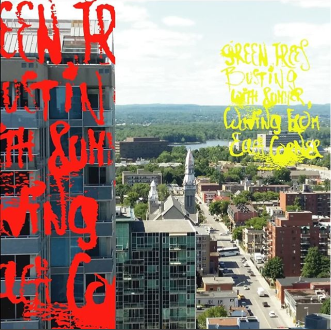
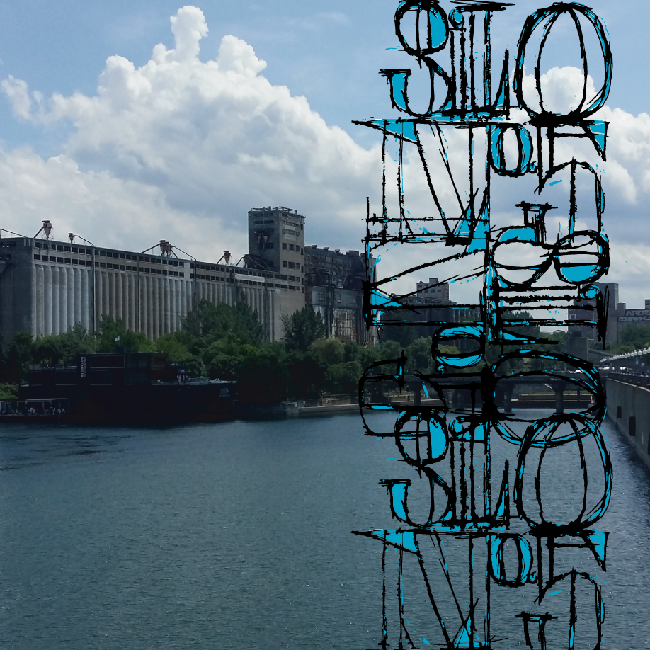
Traveling in Canada
A couple of compositions created from my own photographs of Ottawa and Montreal, the left image (Ottawa) describes summer:
“Green trees busting with summer,waving from each corner”, while the right image is a tribute to the Silo No. 5, the massive Silos at the back of the picture.
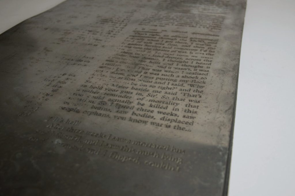
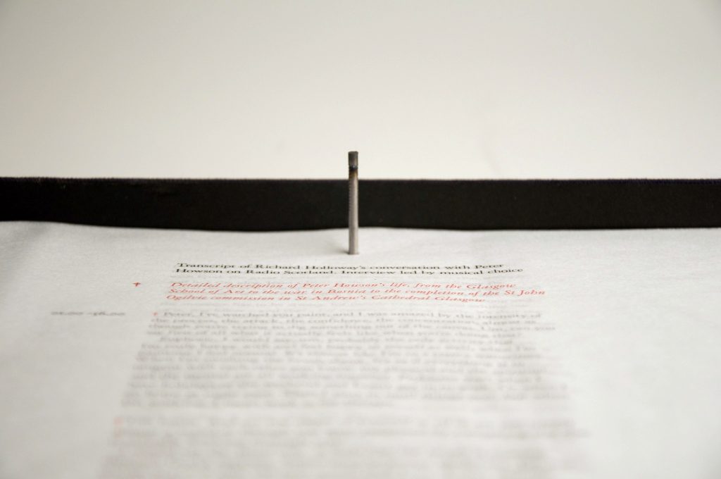
Richard Holloway / Peter Howsen Interview
Graphic response to an interview between broadcaster Richard Holloway interviewing artist Peter Howson. Peter Howsen, a fragile character, had gone on a war artists assignement and had come back troubled. I printed the interview words, typographically set out like the King James Bible,on tissue paper and bound these loose leaves with a single nail. I etched the same words onto metal sheeting as a contrast and a reference to where he had been