Spring 2022 | Diamond dust | Painting Research

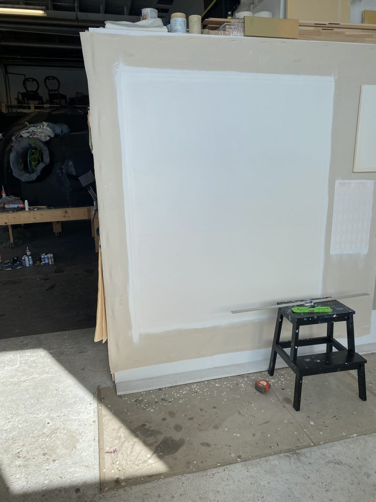
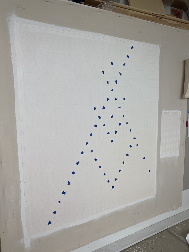
Preparing for my final critique on April 8th, 2022

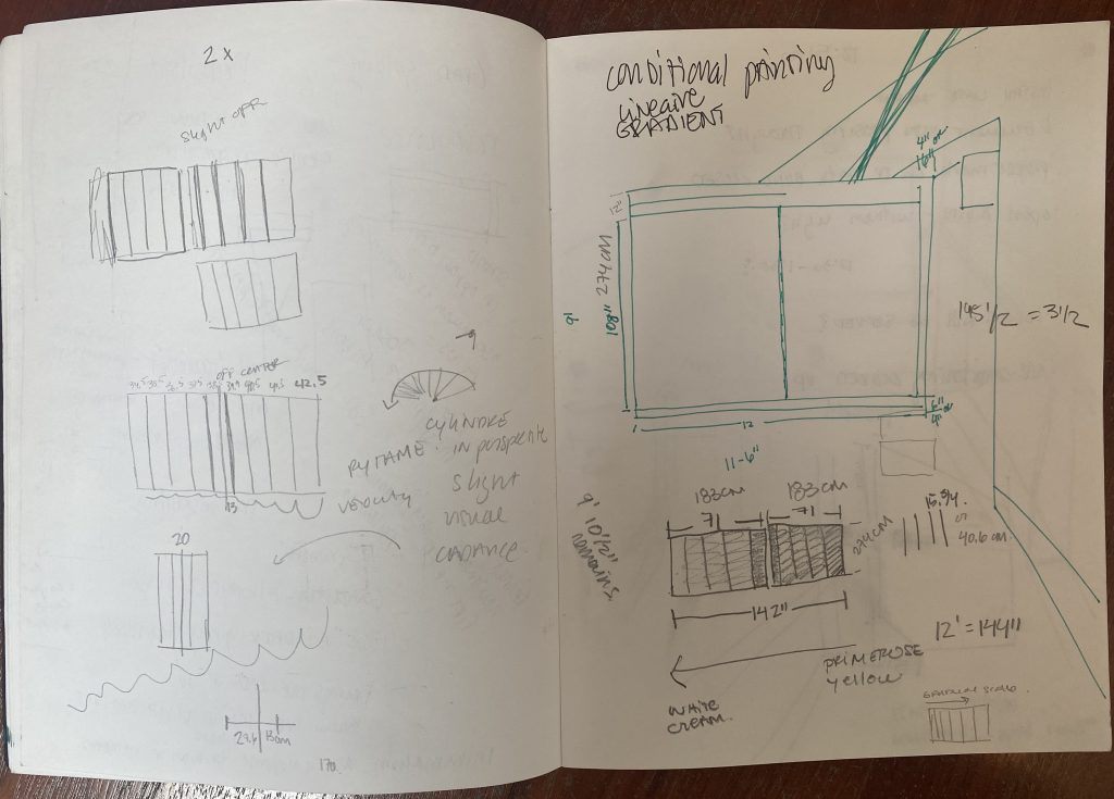
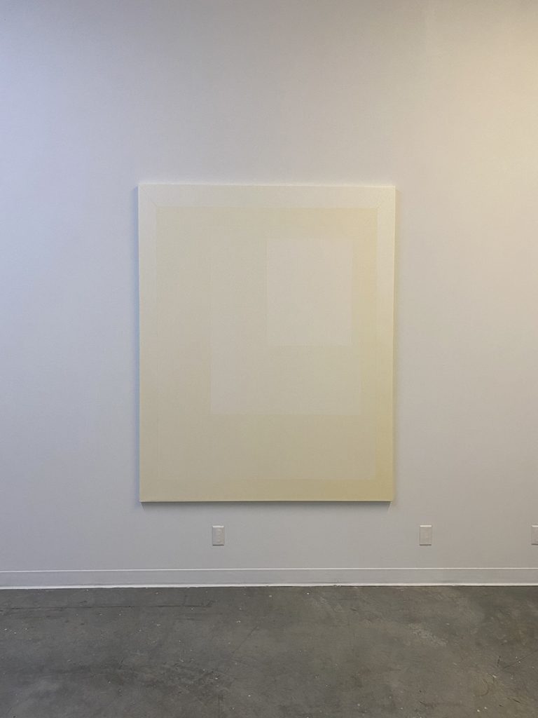
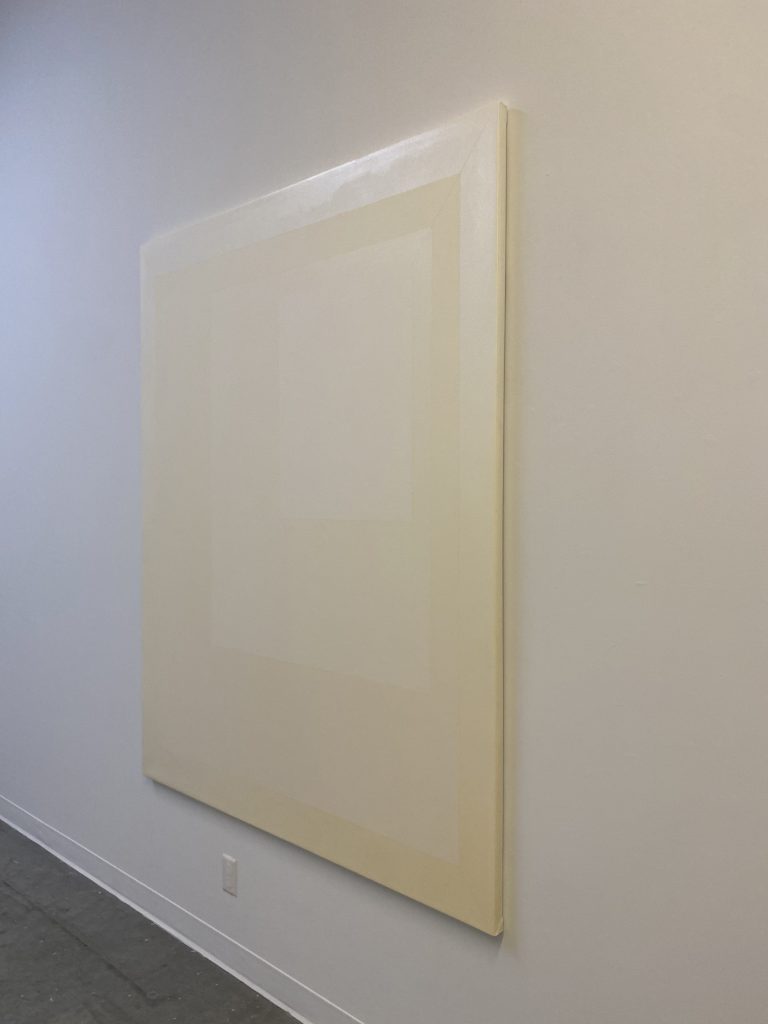
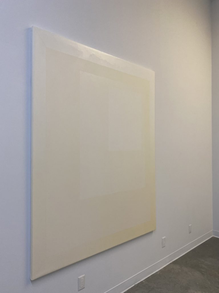
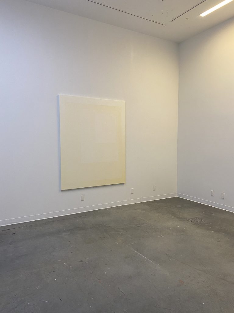
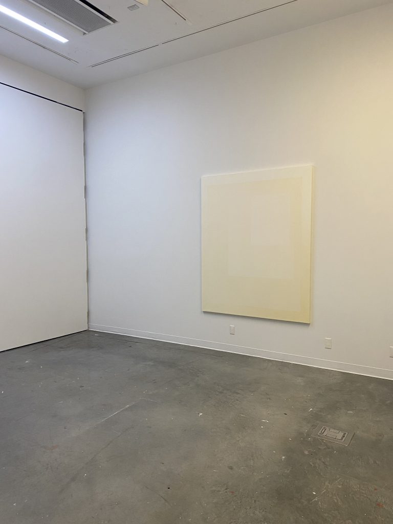
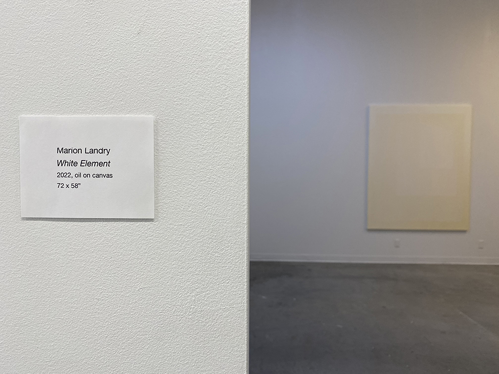
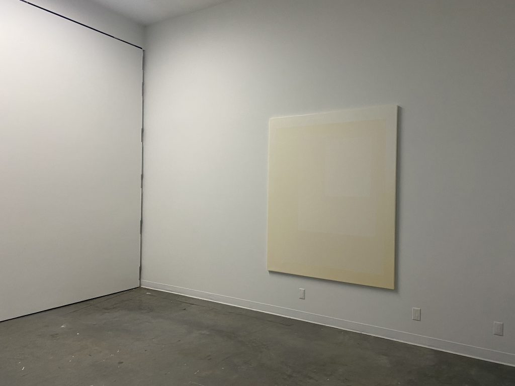
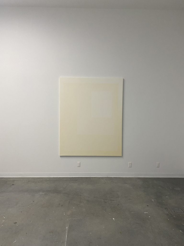
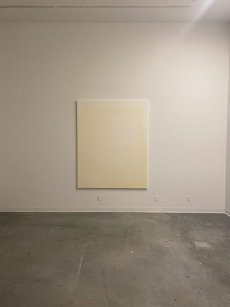
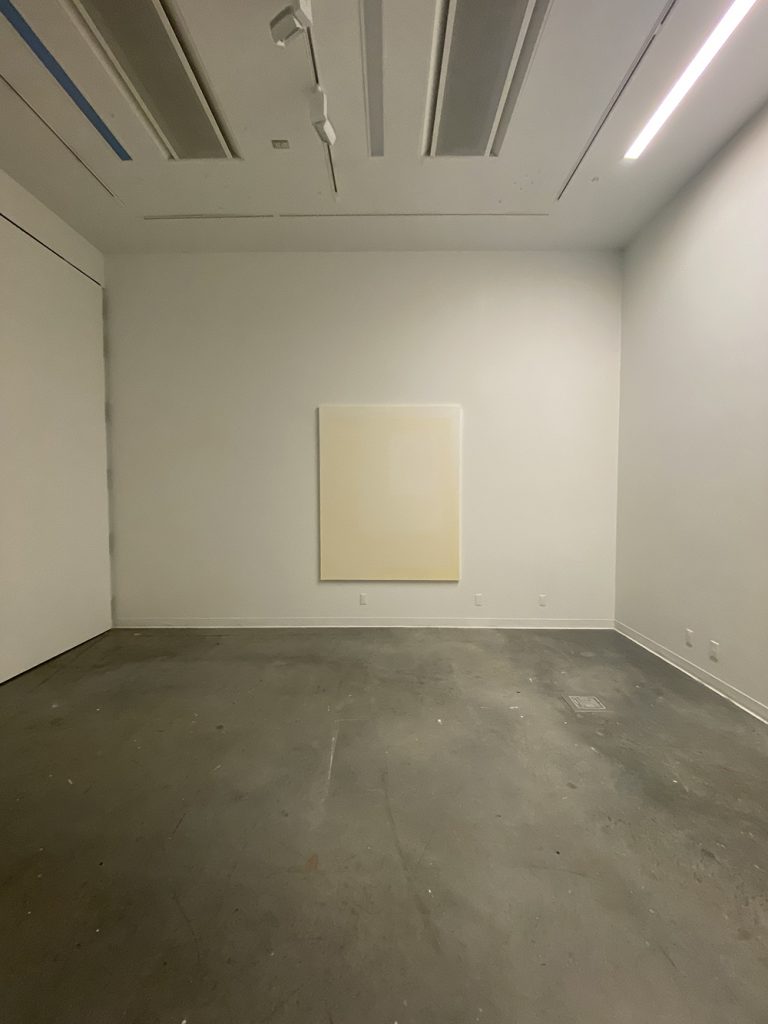
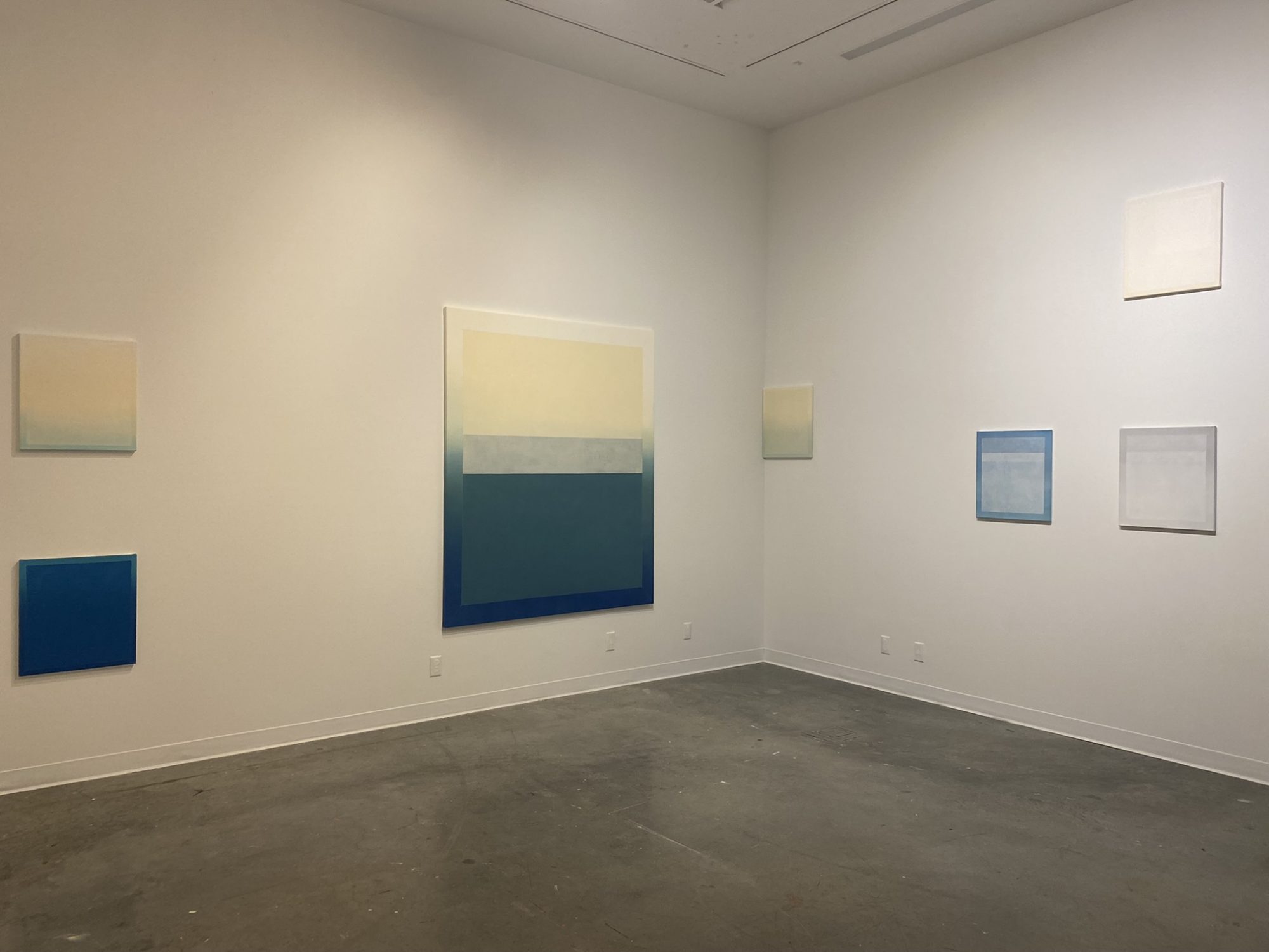
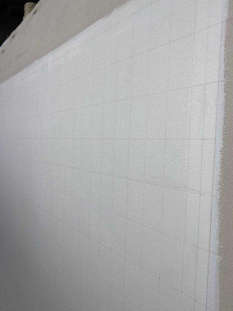
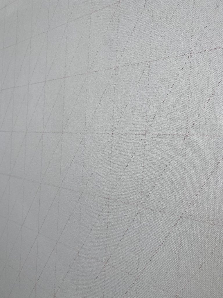
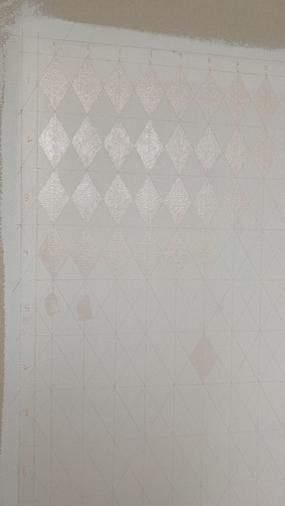
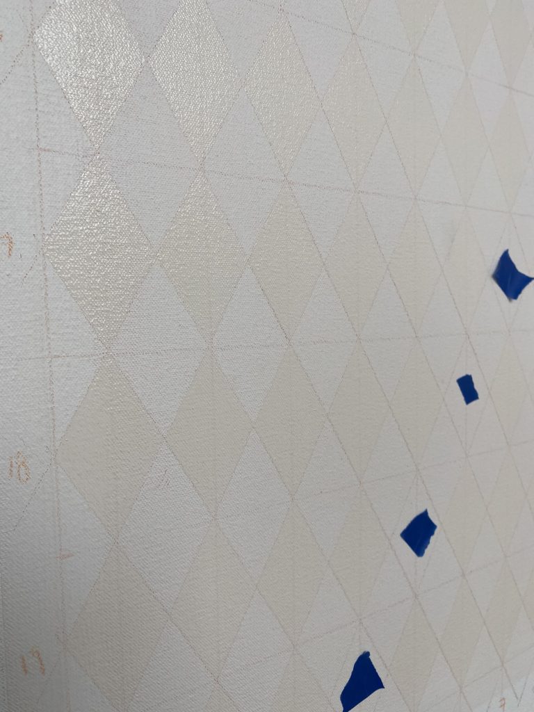
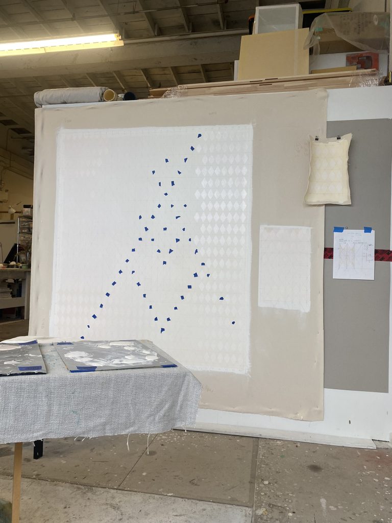
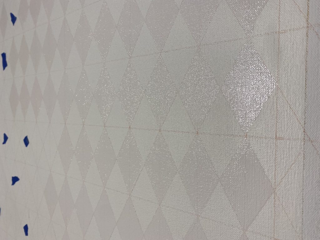
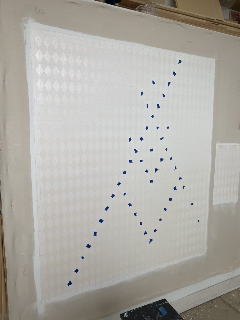
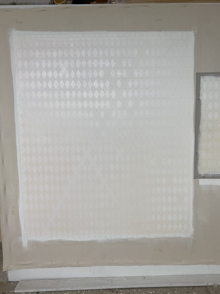
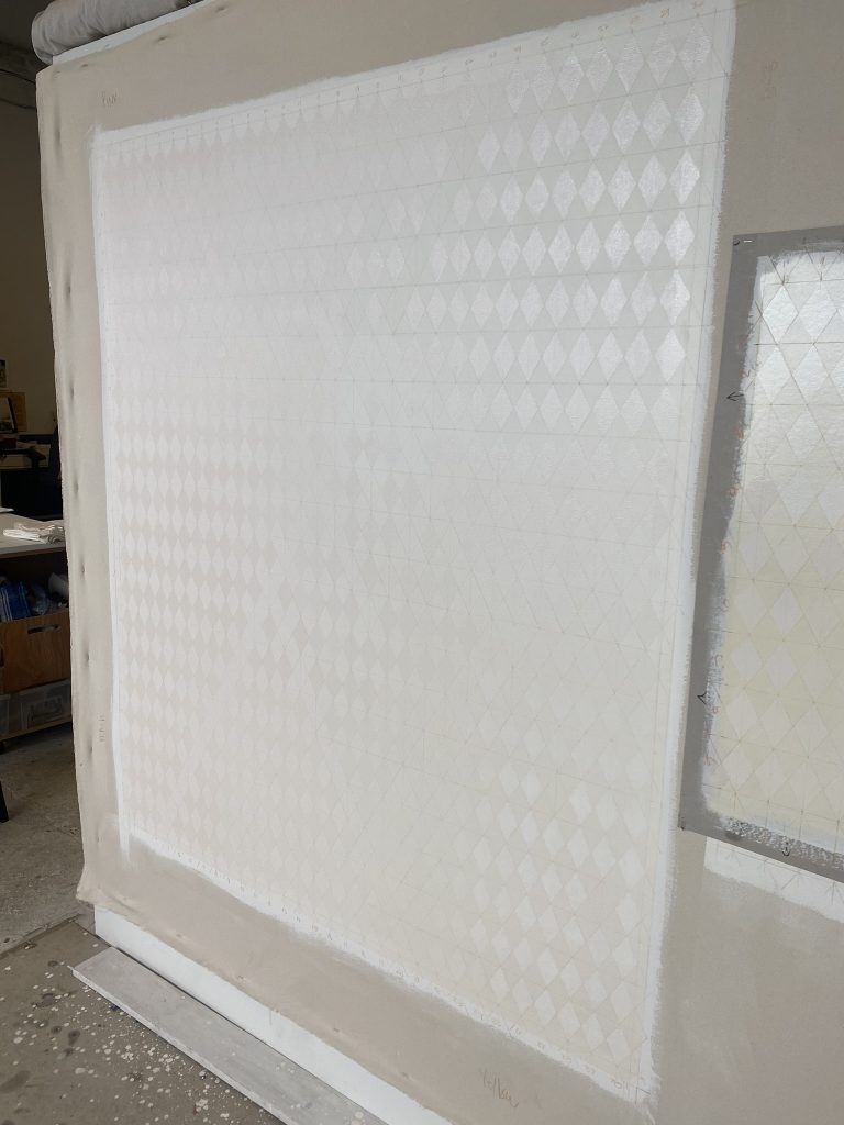
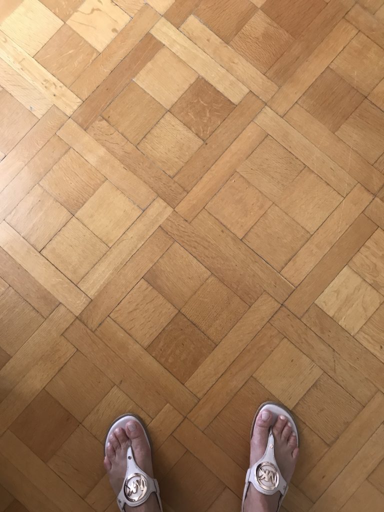
Painting description: Colours: 4 colours gradient of warm warm, pale yellow, pale peach, and pale pink. The foundation layer is super matte which was achieved using cold wax and mineral spirit as a medium. A 4 x 7cm grid was traced using a pink color pen. A grid was first laid out for the alignment and creation of the diamond shapes. 600 diamond shapes where hand painted using a glossy medium. The 4 colours gradient was shifted 90 degree when painting the diamond which helps created a slight contrast between colour rendering the pale colour more visible. Some of the diamonds where not painted breaking the grid rhythm as well as adding a hidden pattern.
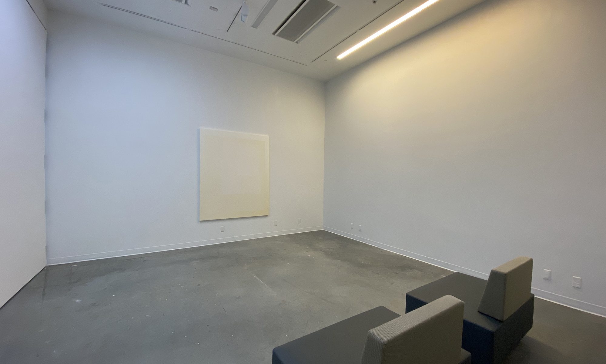
– 140cm x 120cm
– oil on canvas.
– Almost white.
– Glossy and matte medium.
– Grid pattern 4 x 7 cm creating 600 diamond shapes.

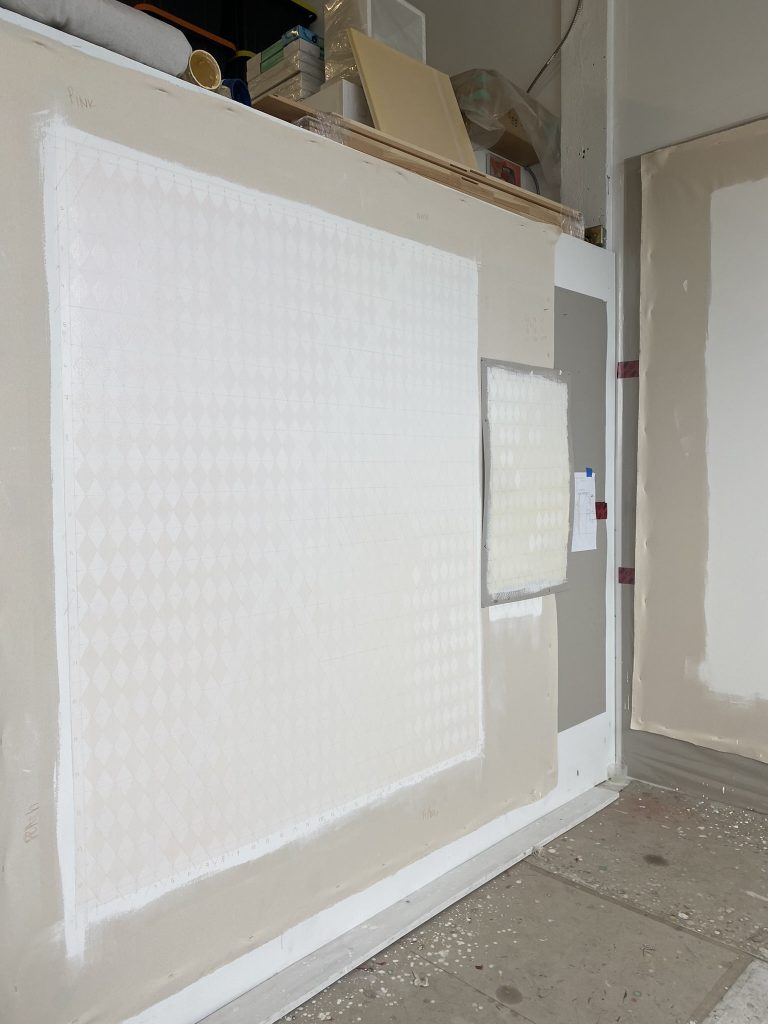
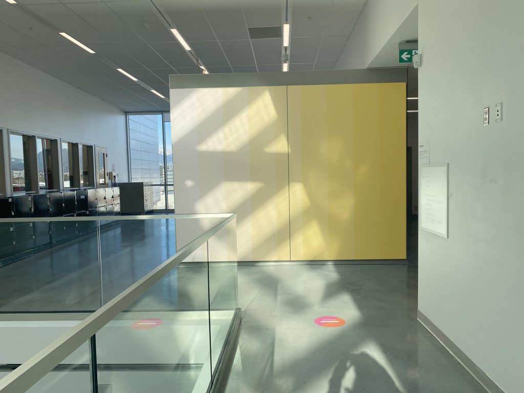
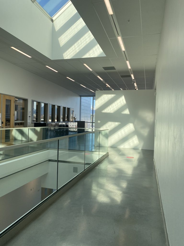
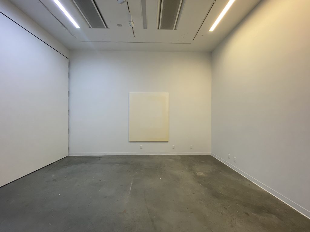
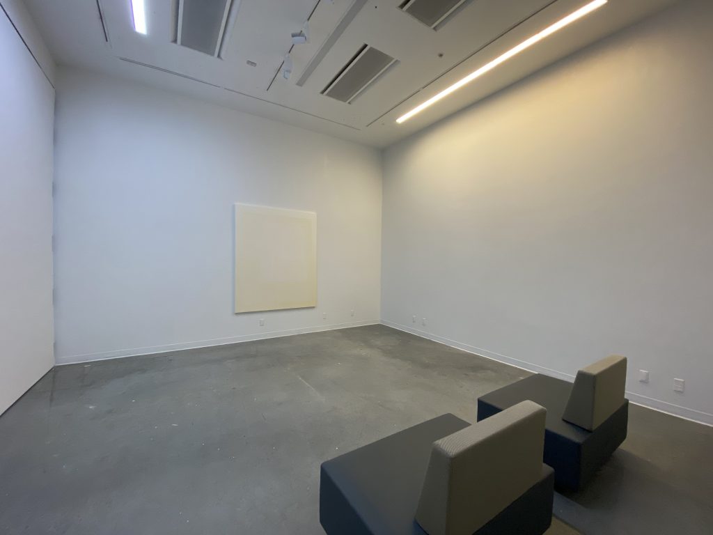
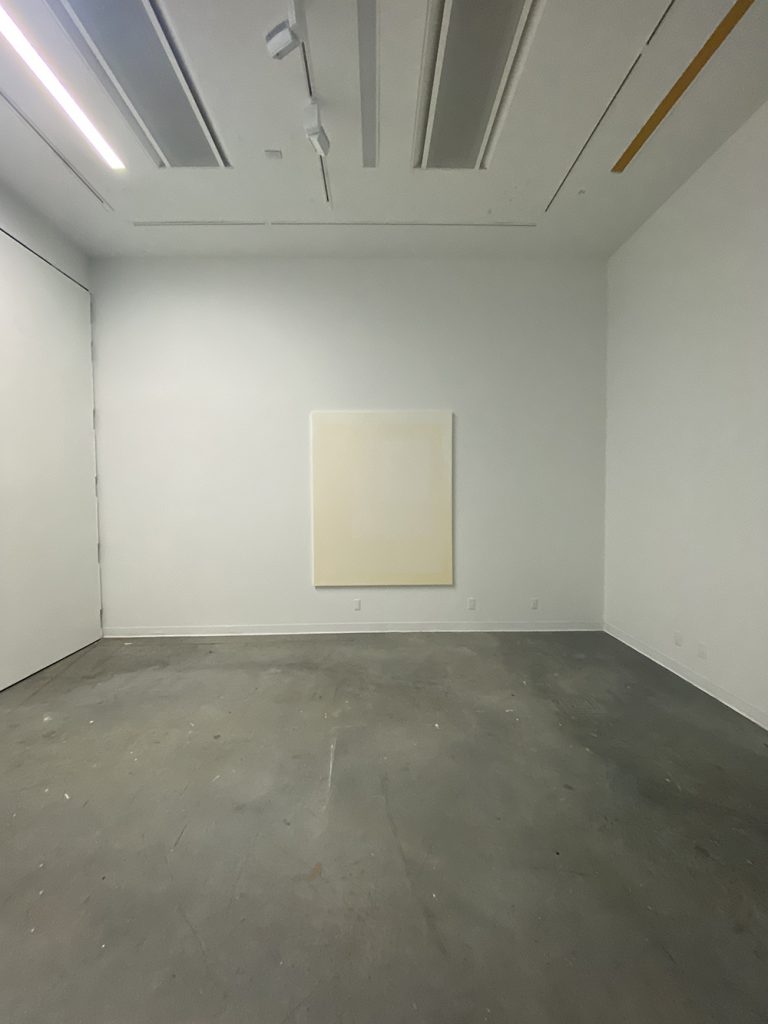
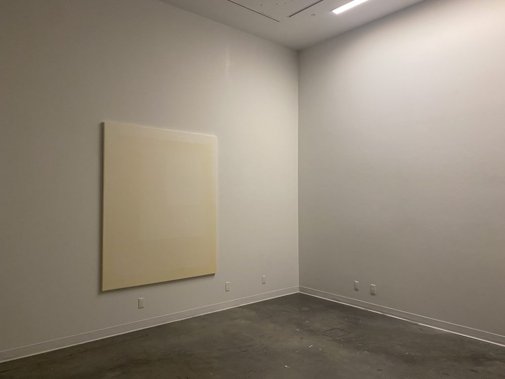
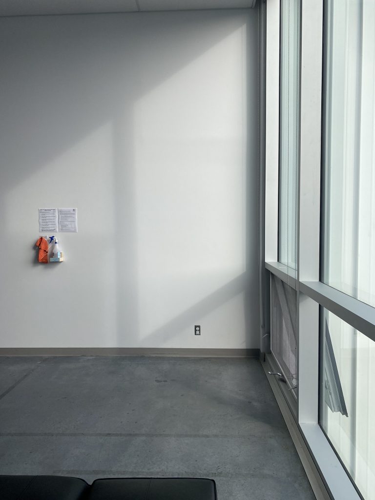
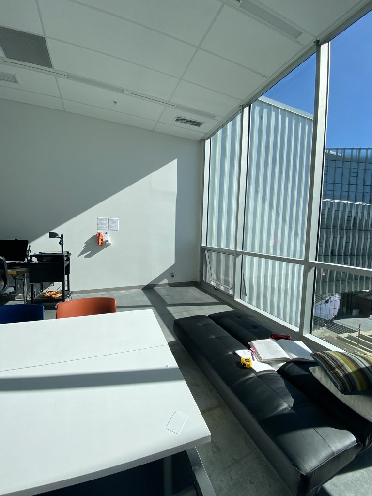
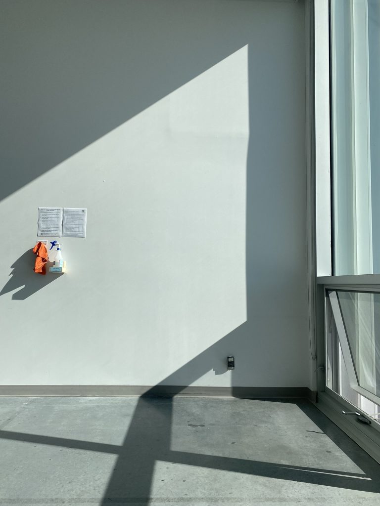
Condition for installation: The painting will be installed in room B4130 – Senior Studio. This room offers a West facing wall as well as windows from floor to ceiling on the South Side allowing for the afternoon sun to land on the West facing wall. The same condition can be found at my Industrial Street Studio.

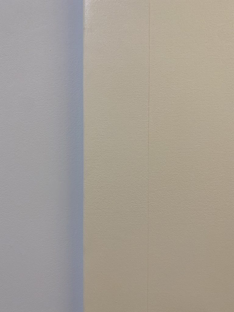
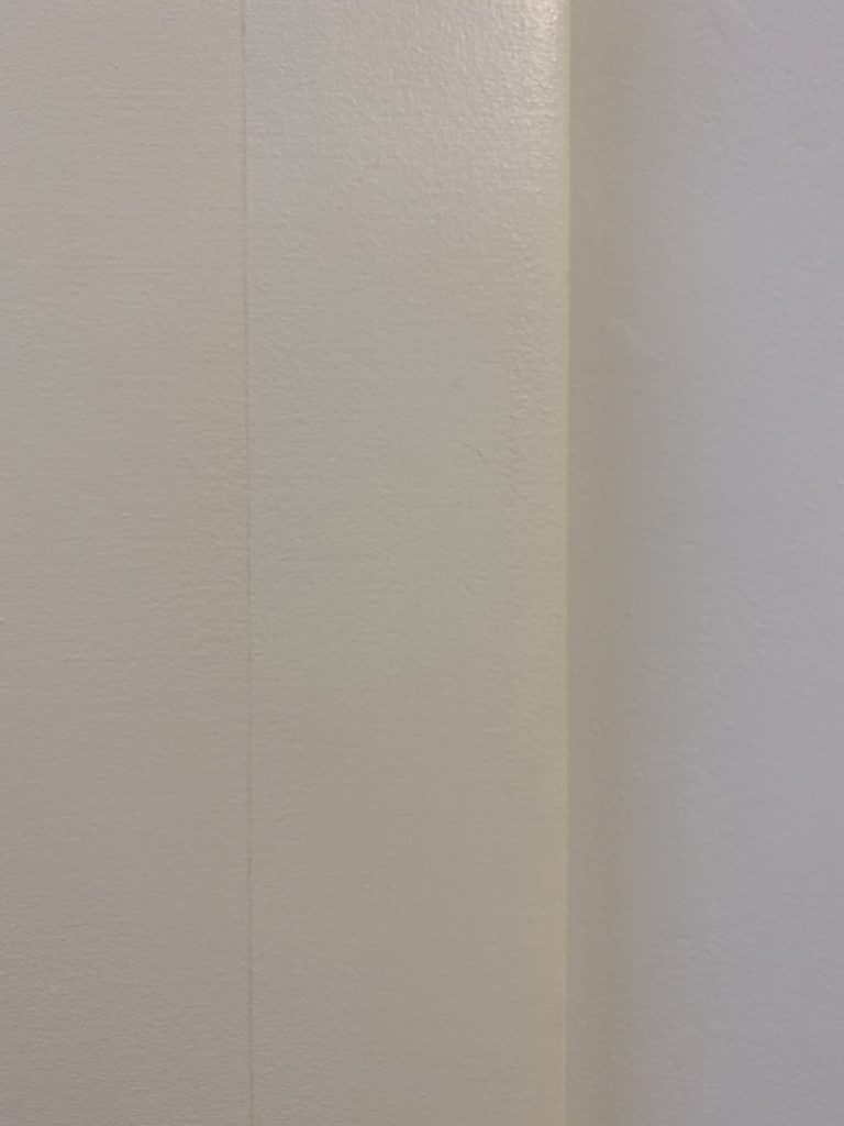
Viewing condition: The painting should be critique in the afternoon when the sun or natural light is shining on the wall and the painting. Because the painting has both matte and glossy surfaces, the natural light will animate the painting. The viewing angle will reveal different condition in the painting. When looking at the painting from the left side, the glossy diamonds will get animated by the light, might change colour depending on the weather condition caused by the reflection of natural light. The hidden pattern created by the omission to paint the diamond shape will offer a broader section of matte colour and will become more visible. When looking at the painting from the front, the diamond shapes will be almost non-visible. What will be visible from the front is the slight contrast of colour which will render the gradient more visible. The middle of the painting will become almost like a space or a vortex as the colour are almost the same and therefore disappearing within the space.

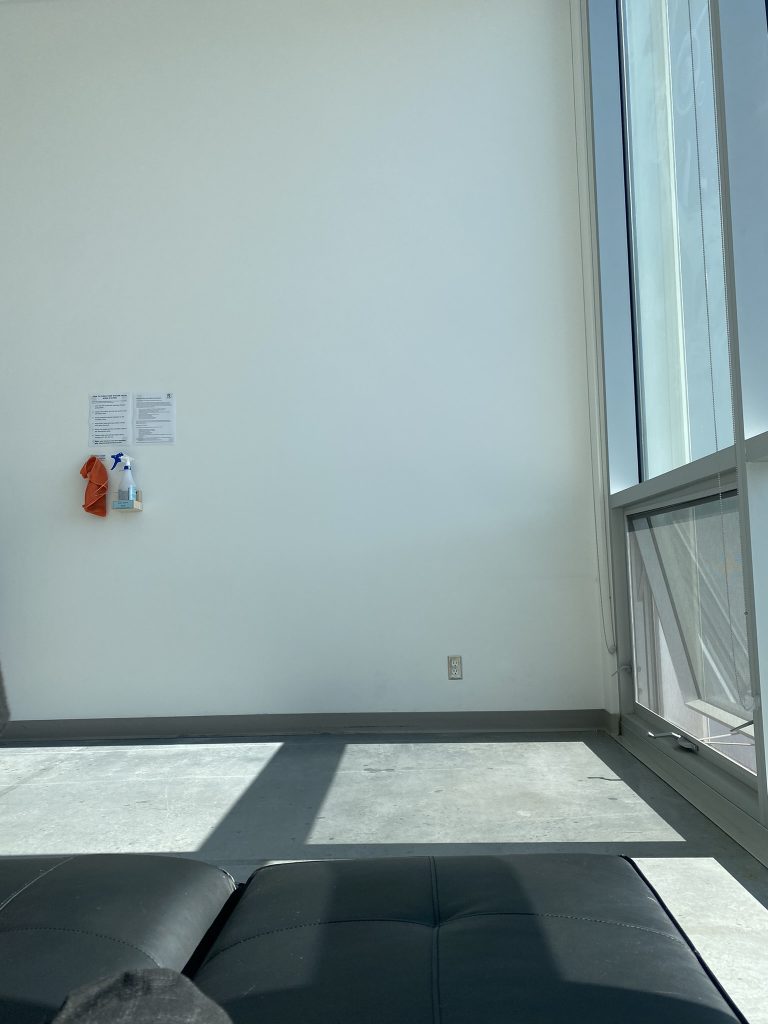
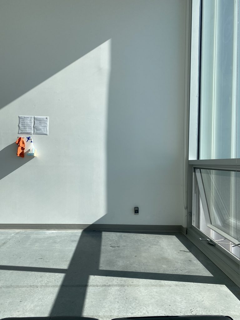
Documentation condition: Because it is hard to predict the weather for my final critique I will be documenting the light condition over a span of about 10 days. The documentation will be compile into a step motion video compiled from images captured ever 30 sec over a span of 4-5 hours. I am not sure if I will have sun or what the weather has in the forecast for me. However, all light condition will offer different viewing and atmospheric effect. The goal is to document different viewing angle and different light condition and have the videos (or one of the most successful video) played for the final critique and included in the conversation. This piece was created to be in conversation with the natural light and the atmospheric condition it creates.

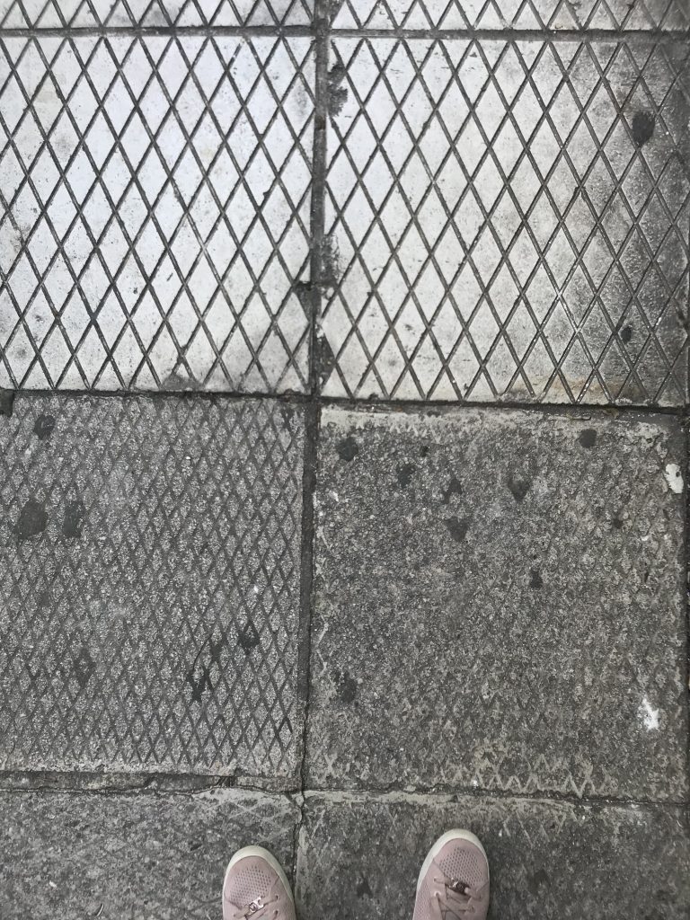
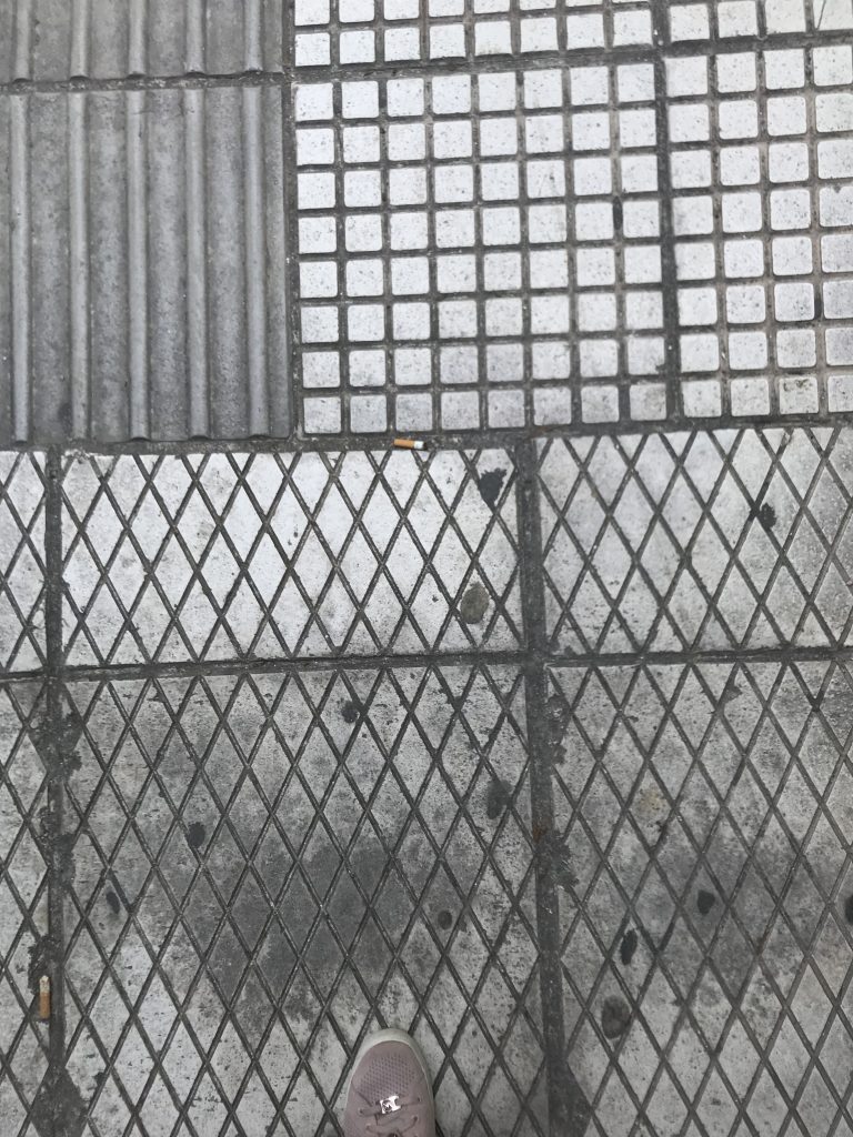
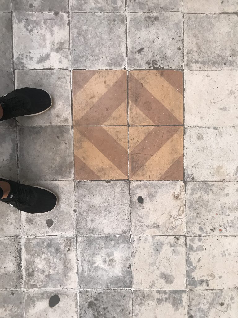
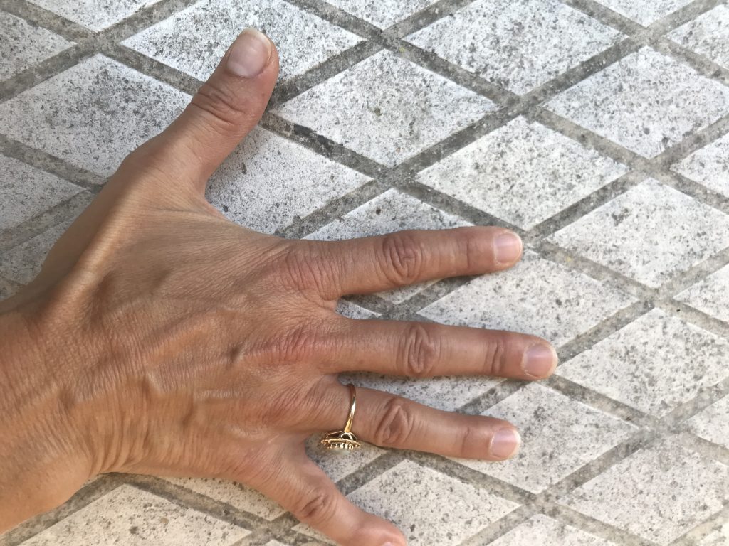
Diamond pattern: The diamond pattern is one that I keep revisiting. This will be the forth time I use this pattern in a painting. It came to me during my month long residency in Athens, Greece in 2019. My main focus for the residency was to generate of series of paintings inspired by the geometrical patterns found in the Greek architecture and everyday life decor. Upon my first walk throughout the city my eyes captured the strong presence of the square as a foundational shape, both in architecture and decorative designs. The squares, sometimes organized into intricate grid patterns, are also often presented as lozenges inclined at a 45-degree angle, or squeezed slightly into diamond shapes.  Two striking moments are worth the recollection when this pattern had a strong impact on me. First, the pavement in my neighborhood was meshed with this diamond pattern. Sidewalks is a big term for Athens; there are narrow and often used as parking so you are always looking down to step on and off it. In a lot of cases, the concrete or stone gets polished (glossy surface) in high traffic area and really dirty (matte surfaces) in other parts. As you walk and the sun hits the diamond pattern, the pavement shimmers is becomes more like an animated/moving surfaces. That was always so mesmerizing to me making my daily walk and activity so much more pleasant.

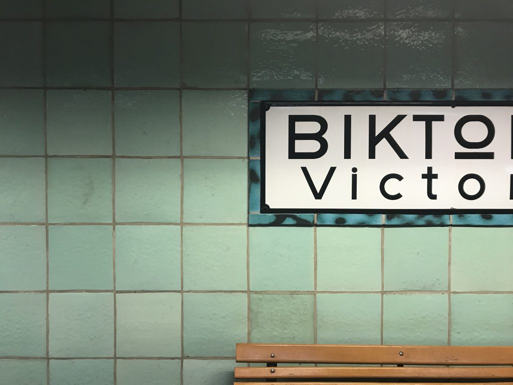
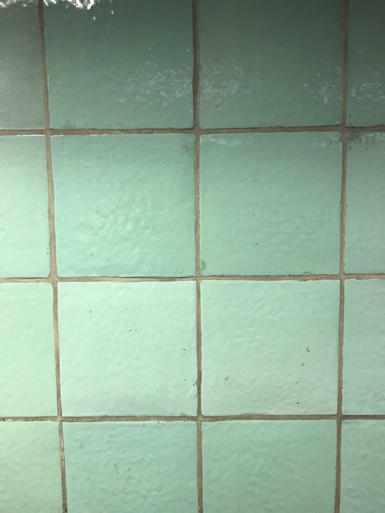
The other moment I observed this shimmering effect was at the Victoria train station. The architectural style of the station is Art Deco and the walls are covered with an hand made glazed light blue tiles. Over the years, some of the tiles have been replaced with a cheaper/mass produced version of the tile randomizing the blue tones. Upon entering and leaving the station, the tiles always shimmered and appeared to shift at a 45 degree angle.

Inspiration: The inspiration from this piece came from a recent trip to Magog, Quebec. This semester started a bit slow due to the latest scare of the omnicron virus. First, the school start was delayed by a week, then we where told that the first week would be online. I had been trying to find a way to go back to Montreal in mid-January to celebrate my dad’s 80th on January 17th and my Granny’s 100th on January 22nd. I couldn’t figure out how to pull it off without having major repercussion on my semester. Needless to say that this news, which came as a downer for most of my cohort, was received as an blessing for me. So I booked a flight to Montreal from the 16-23 of January. I was able to surprised my dad, shovel in hand, the morning of his birthday and help him shovel away the 16 inches of snow that had fallen overnight. What a surprise it was for him. Quebec was under very strict restrictions at the time and all restaurants and venues where closed. There was not much else we could do then enjoyed each other’s company. It was magic. Coffee and a walk with my dad in the morning and online school in the afternoon.

With my grandmother living in the eastern township, as well as my extended family, I aimed to be in Magog on Friday January 21st and visit her on the Saturday for her birthday. She had asked me to come in the afternoon so we had set the time for 1 pm. When I woke up in Magog that morning, it was the most exquisite sunny day but the thermometer indicated -32. I had not experienced that kind of weather in a very long time since I have been avoiding being in Quebec at this time of the years.

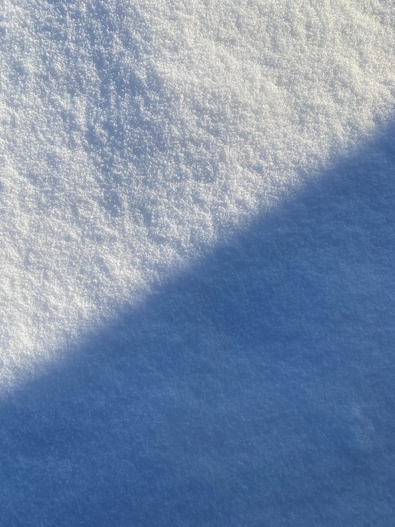
As I leaned over the window to look at the beautiful weather, a frequent but rare atmospheric phenomena happened. Diamond dust where floating all around the window. Diamond dust is a ground-level cloud composed of tiny ice crystals. Diamond dust generally forms under otherwise clear or nearly clear skies, so it is sometimes referred to as clear-sky precipitation. It is most commonly observed in Antarctica and the Arctic, but it can occur anywhere with a temperature well below freezing. And it happens in Quebec when the weather drops. I remember it from my childhood but I had not witnessed it in years. I stepped outside to be in it.

When you are outside at below -32, it hits you. You really need to dress up for it but you also need to be mentally prepared. When you live in Quebec, it becomes normal. You get used to it. When you don’t live there anymore, it hits you like a wall. Your nostrils stick together making it hard to breath. The cold air entering your lungs hurts so you want to breath it through your scarf. You need to cover most of your face other wise your skin hurts and your feet and hands freeze within about 5 minutes. It is highly recommended to move at all times.

BUT IT’S SO BEAUTIFUL AND WORTH IT! Diamond dust can only happened when it’s really cold and being immersed in it is magical. Diamonds float all around you. They don’t fall like snow flakes, they float and shimmer. Without any sunglasses, it’s hard to open your eyes in this brightness. You have to remembered that there is a foot of fresh snow on the crown and everything is white and so so bright that you open and close your eyes really quickly until you can somewhat get used to this brightness. Every time I opened my eyes, I was surrounded by this dance between light and weather condition. Light blue, pink, yellow and purple is shimmering around me. And for a moment, I forget, I get lost and taken to another dimension.

I was not able to capture the diamond dust but I created that video that show how the snow appears as diamonds on a sunny day.

Spring 2022 | Conditional Painting proposal | Revised

Site Specific / Conditional Painting

Site: South Facing wall of the Outside Knee Gallery, 4th floor.

Painting action – revised
Due to the availability of the Outer Knee Gallery wall, I have revised the proposal painting action to be executed on a canvas as opposed to directly on the wall. This will allow me to paint the artwork in a different room, and move the painting on the Outer Knee Gallery for documentation and viewing. For that reason, I have adjusted the scope of the project to be created on 2 canvases joined at the center. The wall is 120″ x 144″. For technical reasons, I am reducing the overall size of the painting to 142 x 108″ (366 x 274cm) so each stretcher will be 108″ x 71″ (183 x 274cm) each. This piece will be painted using commercial water based paints.

Condition: Sunny day, early February 2022, between 11:30 to 2:30pm

Timeline: The painting will be painted during the month of June 2022. At this time of the year I am hoping to be able to reserve access to a classroom for the duration of the month. Room to consider: The Inside of the Knee gallery would be the best case scenario. I would be closest to the light and could continue the understanding of it as I am painting the piece and move the artwork back in forth to the Outer wall for understanding. Alternatively, any other classroom along the north side of the building would also work. Consider: B4170, C4382, C4384 or C4388

NOTES: I will be documenting the sun on the outside Knee Gallery every month. Already it has changed quite a lot in four week. I will be adding the videos to this post.

February 16th, 2022 : 11:30 to 2:30pm

March 3rd, 2022: noon to 3pm

April

May

June

July

August

Sept

Oct

Nov

Dec

Jan

Spring 2022 | White Element | Critique notes + Documentation

WHITE ELEMENT | MARION LANDRY | Grad Gallery | Feb 25-28, 2022

About the title WHITE ELEMENT
The source of the title came from few references. I think it is important to establish that the name was intended to be a follow up to the naming convention established in my previous show (titled BLUE ELEMENT) as a continuation to my research with atmospheric effect in the gallery and the relationship it creates with the reception/perception and feeling within this otherwise generic Grad Gallery space.

Blue element was base on a memory of water.
White element a memory of snow.

What I was thinking mostly about was my experience with the perception and understanding of the whiteness of snow on that cold day in Magog. (Read my previous blog for full story. ) That afternoon, the snow was not white it was lead white. Lead white like the tube of paint I had found one day in London as a lead white alternative and rocked my painting world ever since.

Lead white was always the practical choice up until the 19th century because of its density, opacity, and warm tones. It was irresistible to artists like Vermeer and later the Impressionists like Van Gogh. Its glow couldn’t be matched, and the pigment continued to be widely used until it was banned in the 1970’s. Zinc white was proposed as a replacement to the poisonous lead white in the 18th century. However its cool and semi-transparent pigment composed of zinc oxide never achieved the level of satisfaction painters seek. In 1921 titanium white started to be produced with a claim to be twice the opacity of lead white. Yet again, painters never found it as satisfying or with having any relationship with the warm qualities of lead white. I personally never understood the fuss, that was before I experienced lead white.

My paintings, up until 2020 used a combination of zinc and titanium white depending if I want more vibrancy/opacity or more transparency. I remember stories told by my studio mate who used lead white in the early 70′ on how satisfying lead white was and that once you have used it, you could never find the same level of satisfaction or impact with any other white alternatives. Many years later, I found myself in London at an art store where I came across a tube of Michael Harding warm white lead alternative. Curious, I brought a tube back home with me. It was not before 2020 that I ended up using this mysterious white and what an impact it had. I completely rocked my world. It had the quality of wiped cream, a rich and voluptuous warm white that mixed and warmed other colours beyond description.

It is that exact pigment that came to mind when experiencing the warm white of snow on that late afternoon in Magog at -32 degree. The sun made the snow feel warm and inviting, impacting the interpretation of snow white which I had up until now categorized as a more blueish white, definitely cool white. It is in that moment that I really understood that the white of snow is actually, like water, reflecting and refracting the light of it’s environment and therefore always changing. On that specific day, when the sun started to lower on the horizon and bear it’s warmest shades, the snow became buttery and warm as well. What also became obvious is that I could actually read the yellowness mostly due to the contrasting cool mauve shadow that lay next to it. Joseph Albers would explain that well. Colors are in a continuous state of flux and can only be understood in relation to the other colors that surround them.

“In visual perception a color is almost never seen as it really is – as it physically is. This fact makes color the most relative medium in art. “ (Albers 1)

On that day, it was the cool mauve that helped me see and noticed the yellowness of the snow. In that context, WHITE ( as snow ) and ELEMENT (a part or aspect of something abstract, especially one that is essential or characteristic) felt appropriated calling on the relationship to chemistry, the complex history of the white pigments and the changing nature of colour perception.

Josef Albers Albers, Josef. Interaction of Color 50th Anniversary Edition. Yale University Press, 2013.

ATMOSPHERIC research | Comments
WHITE ELEMENT was my second installation using colour gels to alter the atmospheric ambiance of the gallery. For this installation, I wanted the painting to sit at the intersection of the cool and warm light. It was important for me to reproduced cool atmosphere of winter that appears warmer from the sun. Similar to what I had experience on that cold day in Magog. I couldn’t envision the painting living in any other lighting environment. With a certain sensitivity to colours I am deeply affected by light. I can easily identify the colour of the light and my level of comfort or discomfort is affected by it. On that day in Magog it was extremely cold outside at -32 degree and yet, the call to the outside was so strong because it was sunny and everything looks so crisp and inviting. When I went out at 3pm, I really had a feeling that it was warmer – from standing inside looking out – and yet the reality was far from my perception. It was my intention to attempt to recreate this atmospheric conundrum within the gallery space. I wanted the viewer to be able to physically navigate between the two different light condition and was curious to see how it would affect their perception and understanding of the painting.

To reproduce this atmospheric impact, few elements came into play. First I needed to close the gallery space. The gallery has a fairly large entrance allowing for the corridor light to impact and create a pretty hard shadow on the west and east wall of the gallery. For Blue Element I had closed the opening with a piece of canvas. The canvas was pretty effective at blocking the light but yet, was not neutral. Because of the natural canvas colour, it brought a warm tone to the gallery which I didn’t want this time around. I wanted a more neutral tone that would not tint the ambiance. So I chose a white blackout curtain big enough to completely block the hallway light. The addition of the curtain had two impact. First it filtered the sound outside of the gallery creating a more cocooned effect. Second, it added privacy to the space emphasizing the ambiance of reverence created within the gallery space. The addition of two seats aligned with the painting at the farthest distance possible also added an intention for a pause, a break, or an invitation to take a moment to absorb the work. The fact that only one large painting was presented in the gallery made it obvious that the focus was it.

The Grad Gallery is equipped with two choices of light condition. Track lighting and LED neon stripes. Because I wanted the light to provided a wider and more diffuse cast, I chose to work with the LED stripes this time. The focus was to create and ambiance more than a projection of light. To emphasis the intersection between the two light spectrum, I used only the LED stripes that where located on the extremity of the painting, landing the cone of light more on the wall and allowing the intersection towards the center of the gallery. I wanted the warm light to sit on the right side of the painting. The artwork rectangle composition is gathered towards the right side and I wanted to aim towards warmth. On the left side of the painting I wanted the cool light to cast a cool mauve shadow and render the yellow side more visible. The stretcher I am using is fairly thin so the shadow it created is about 1 1/2″ all around. I didn’t want the atmospheric ambiance to be to visible and become theatrical. So I used at 1/4 warm and cool tone gel. Visually speaking when looking at the artwork, the impact was not too obvious. However, I wanted the impact on the viewer to be more noticeable as to bask him/her in the coloured light. So I saturated LED stripe above the viewer towards the back of the gallery by doubling the gels right above the viewing area. I also allowed some of the visitors to see the painting within only the blue or yellow light to help them understand what was going on.