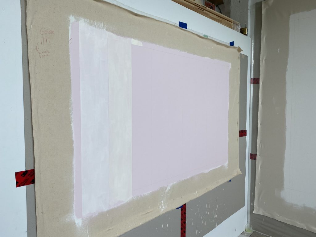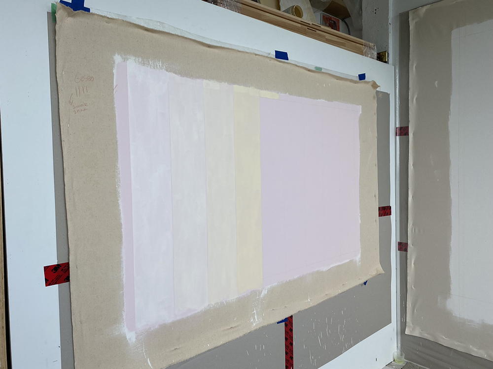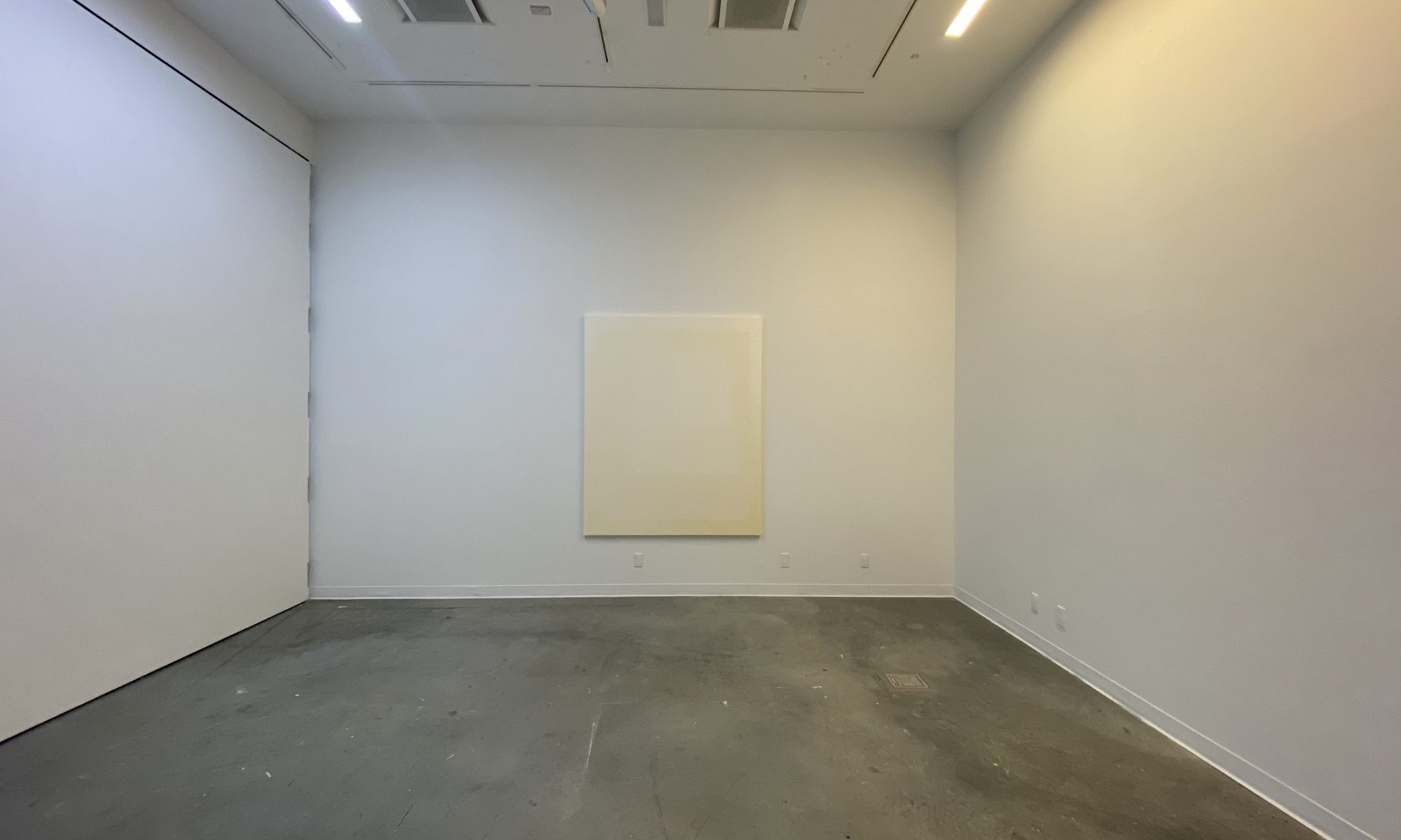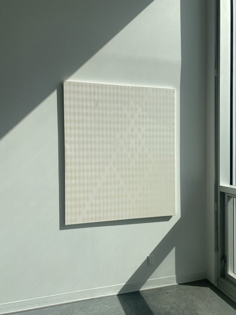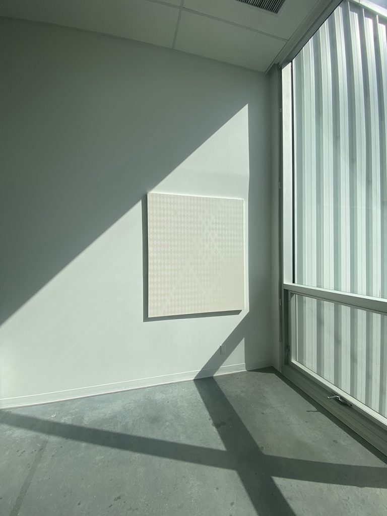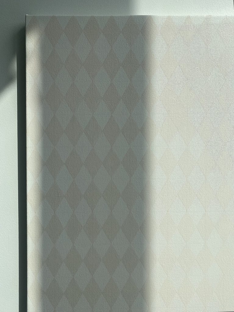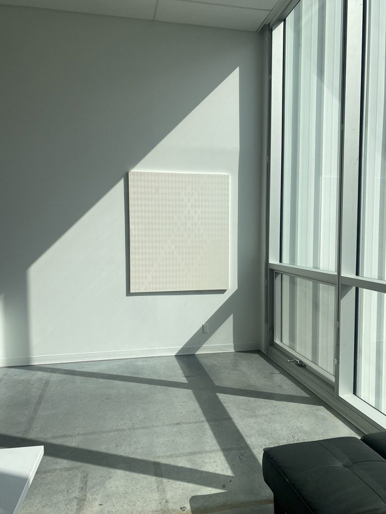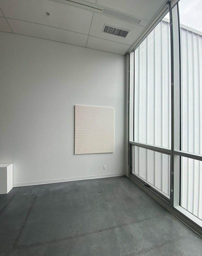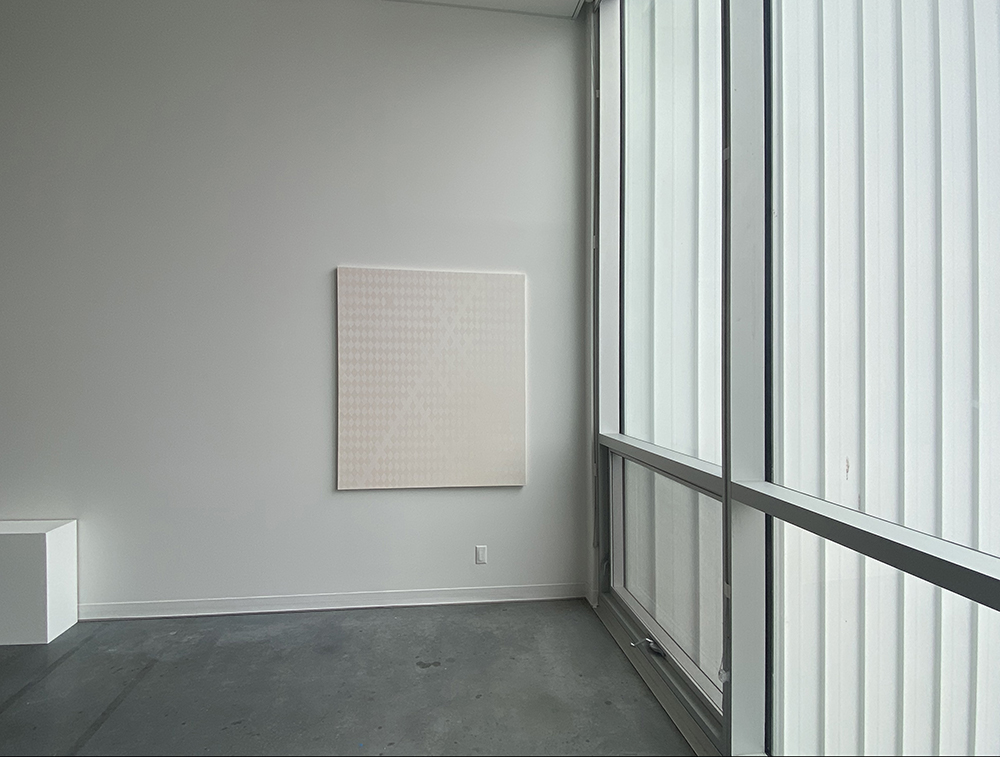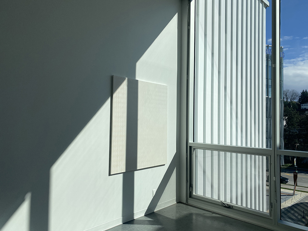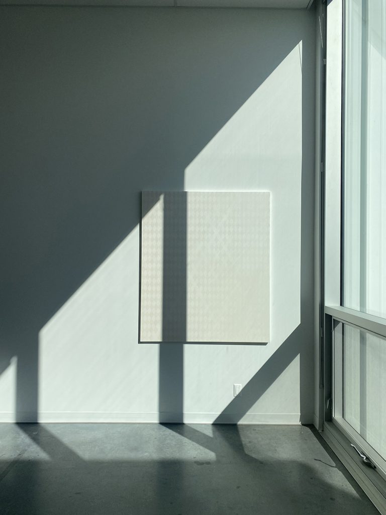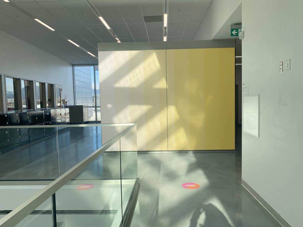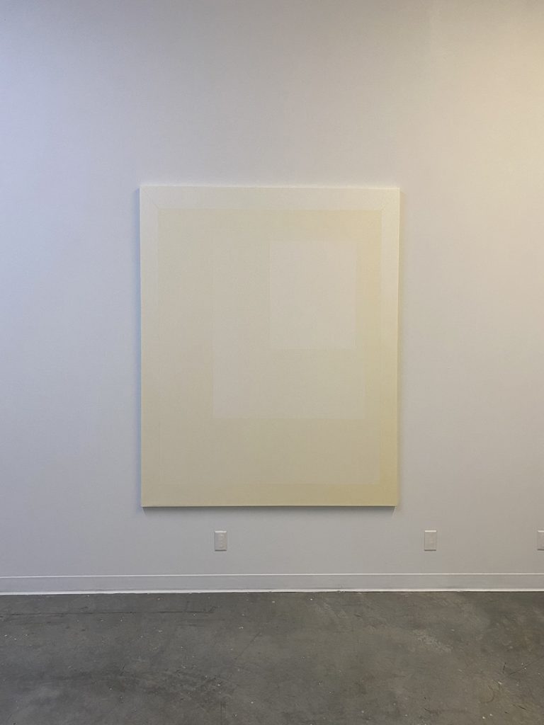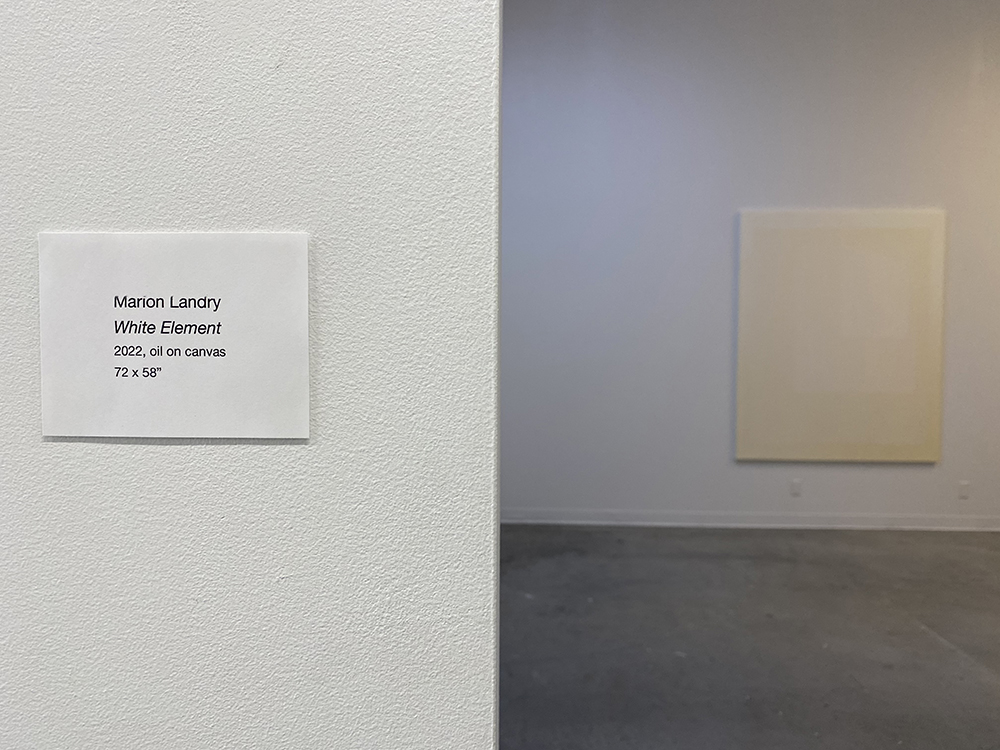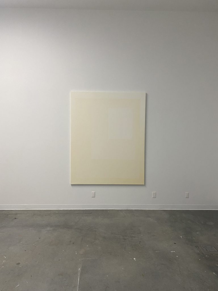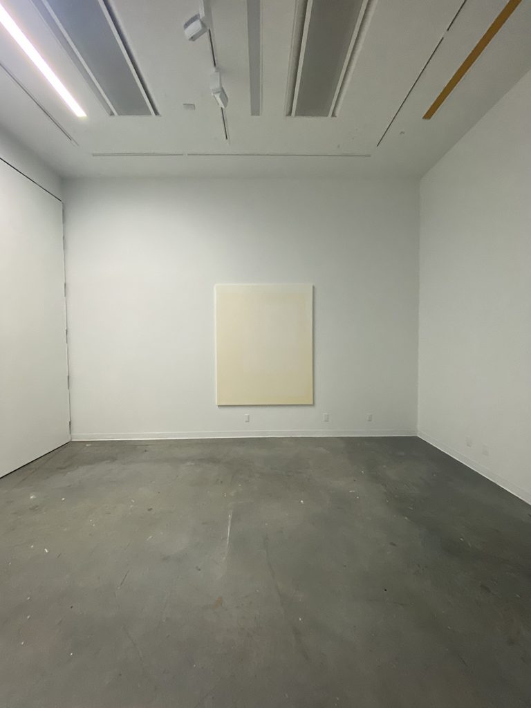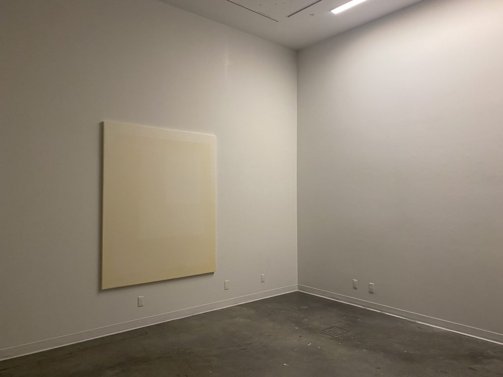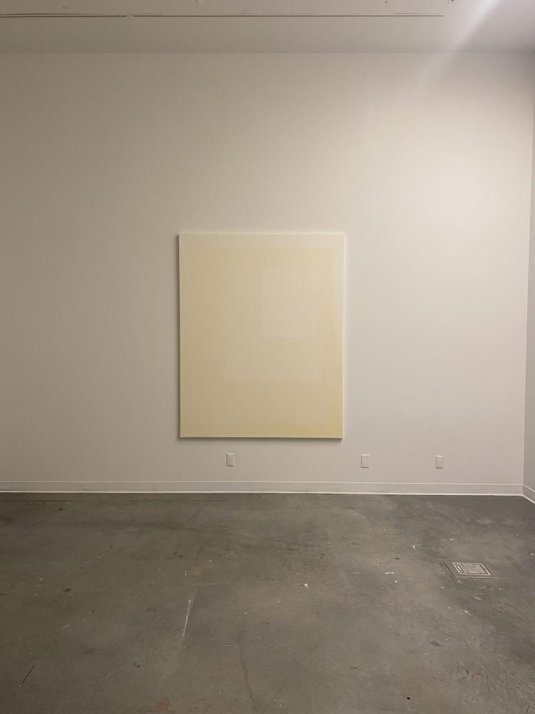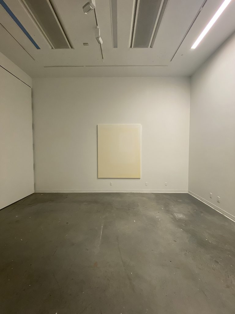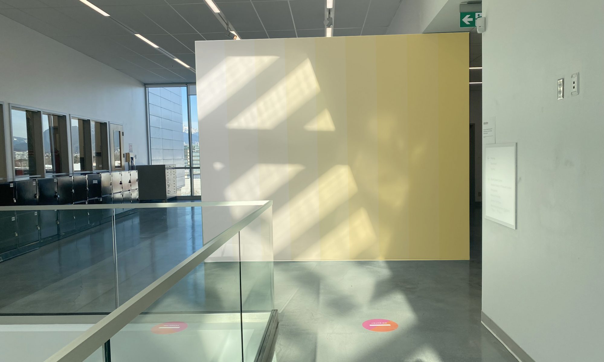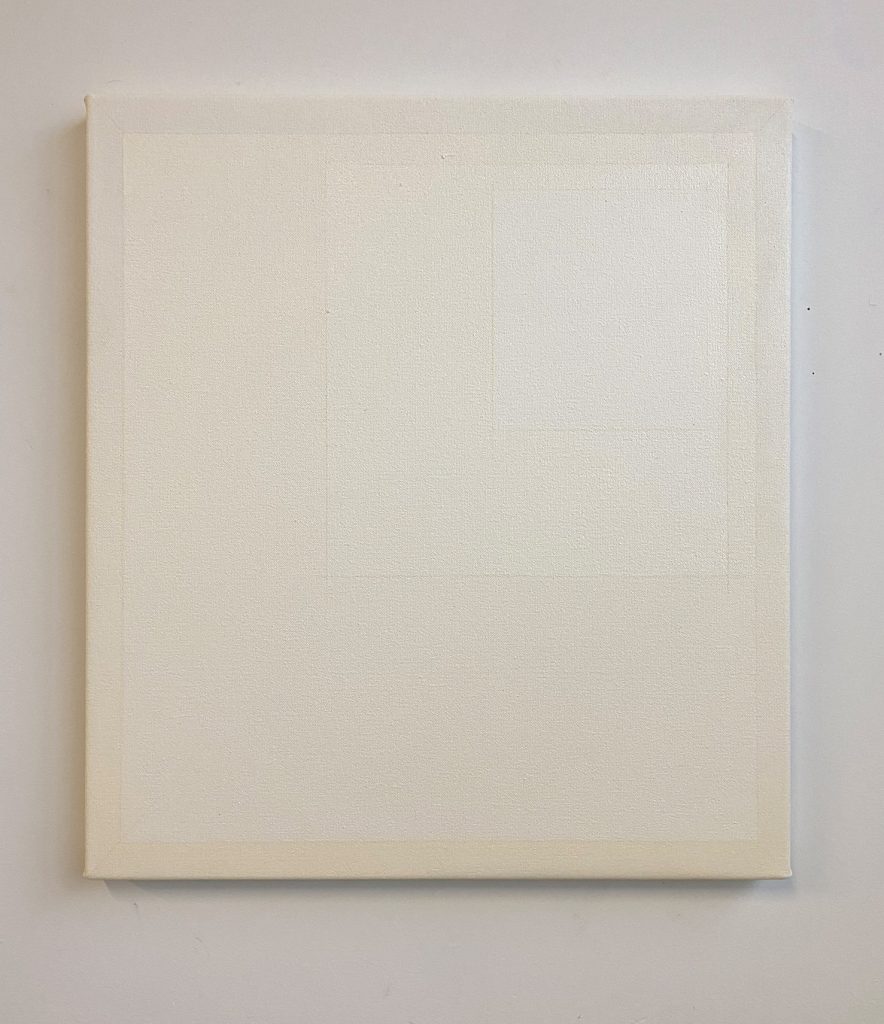
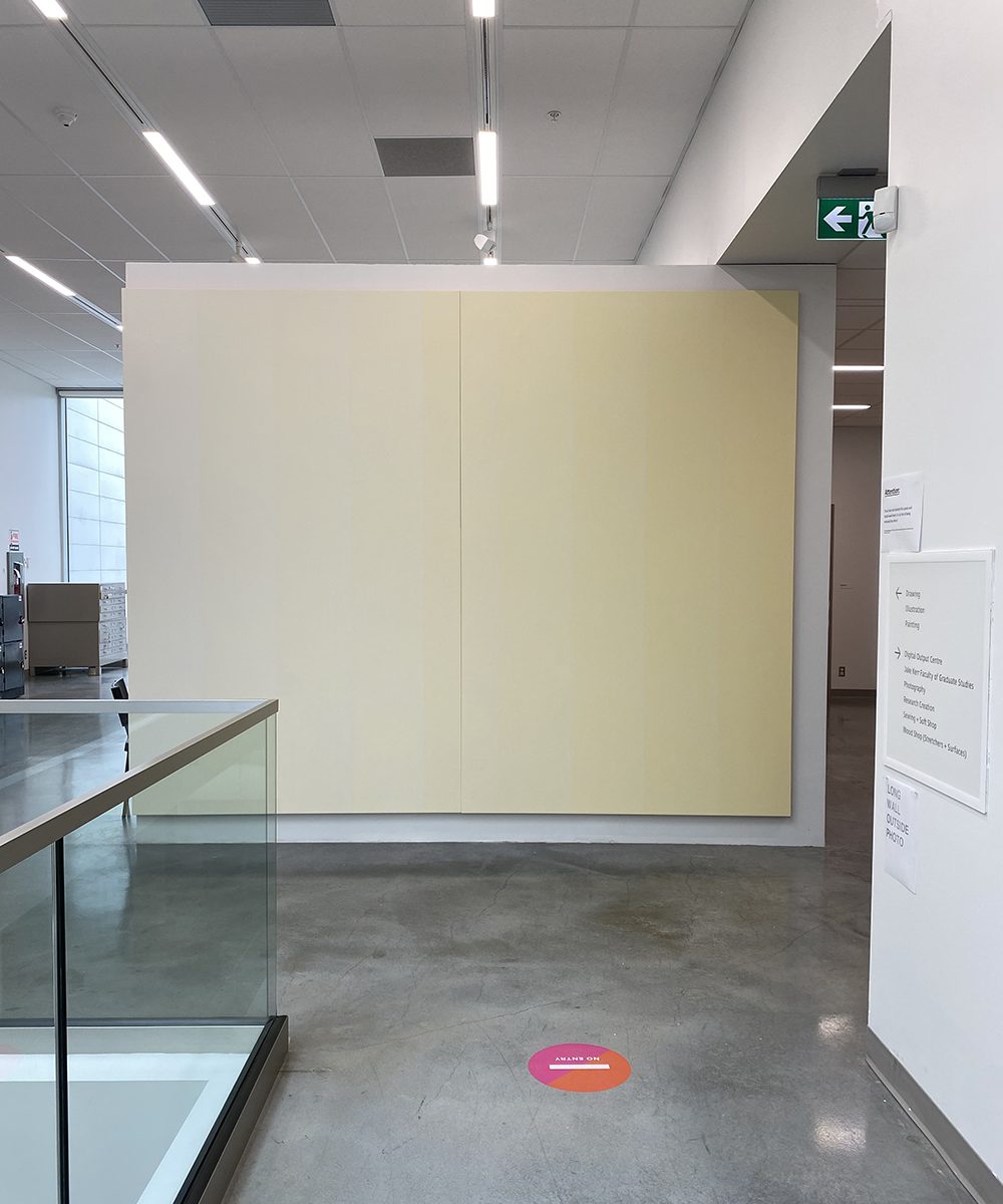
9 Elements (Towards the light)
175 x 275cm, acrylic on canvas
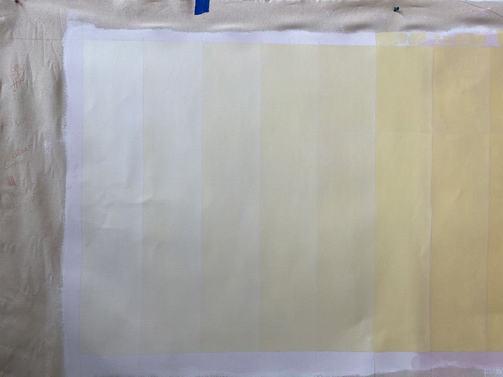
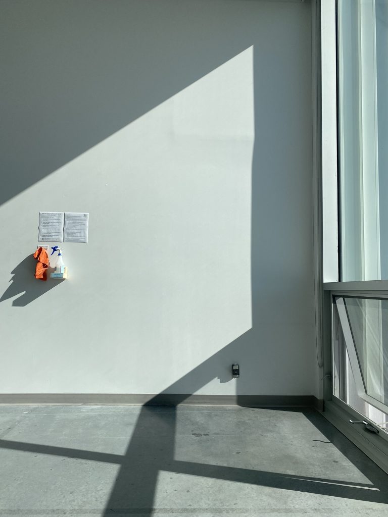
Condition: Summer sunlight August 3-7, 2022
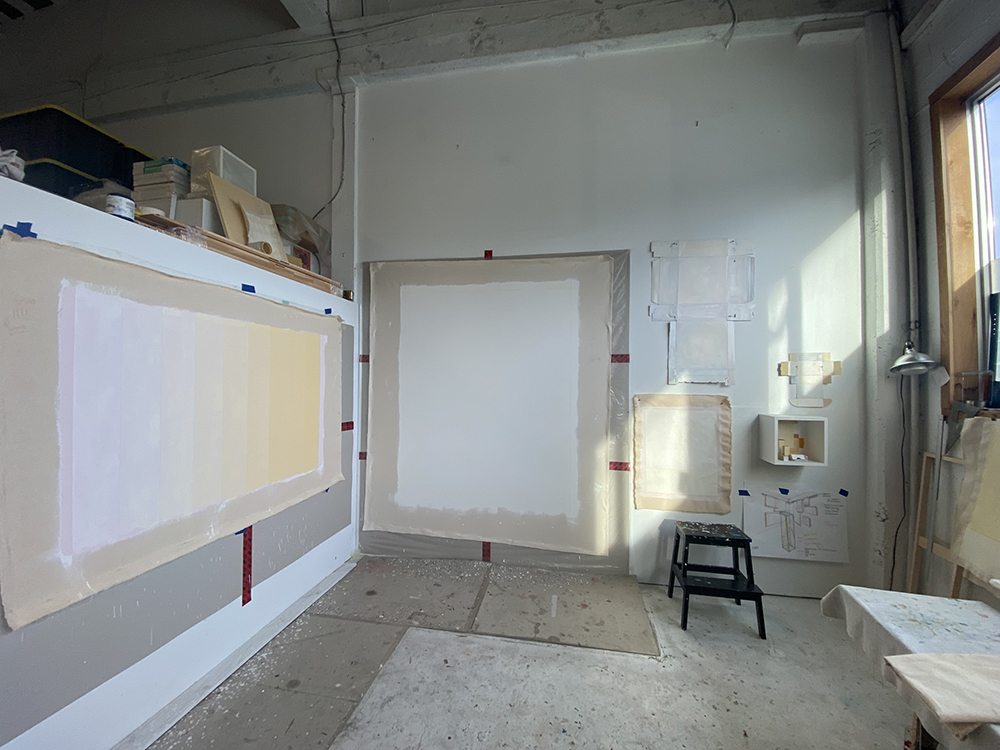
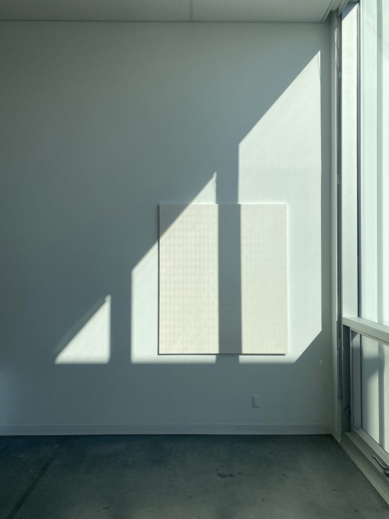
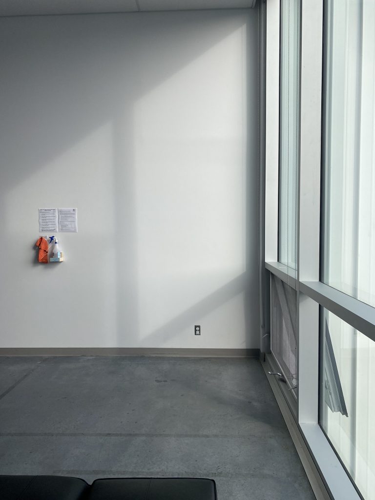
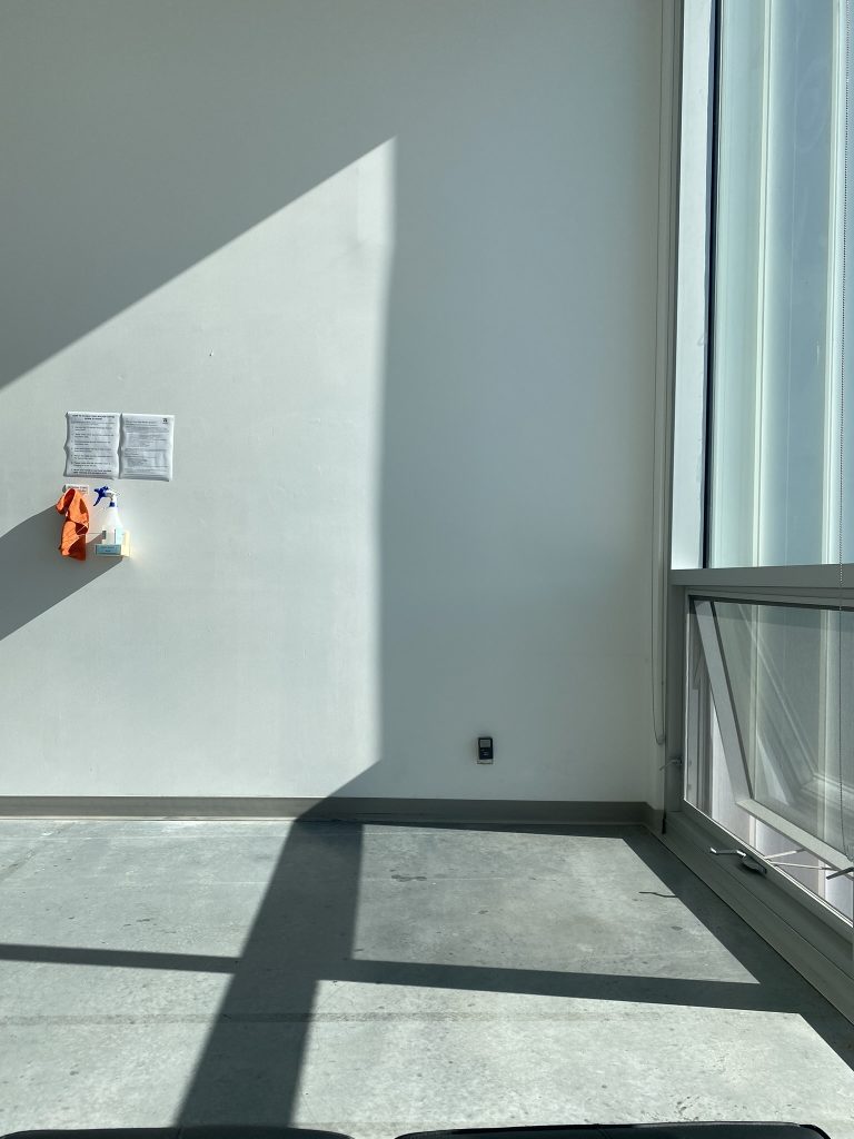
This project was initially envisioned as a conversation between a painting and the winter sun. From January to February, the sun sits low in the horizon (about 23 degrees) allowing for its rays to penetrate deep into the ECU campus. With a skylight located slightly south of the Knee Gallery, the wall becomes an obstacle to light capturing an interesting pattern – only for a few hours – on its outer wall. Having a lot to do with being there at the right time, these moments can only be noticed by a few that venture on the campus interested in observing light phenomena. Let’s not forget that light can be a rare thing in the winter months of the Pacific Northwest. On these rare occasions when light peaks through the dark clouds and shines, to me it feels majestic making me aware of time and space. My vision was to create a painting that could act as a container and perhaps capture this phenomena making it more visible.
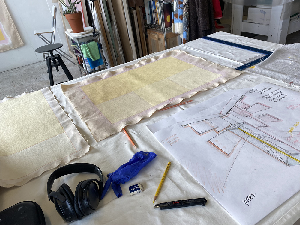
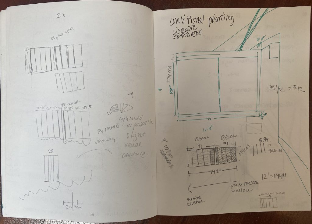
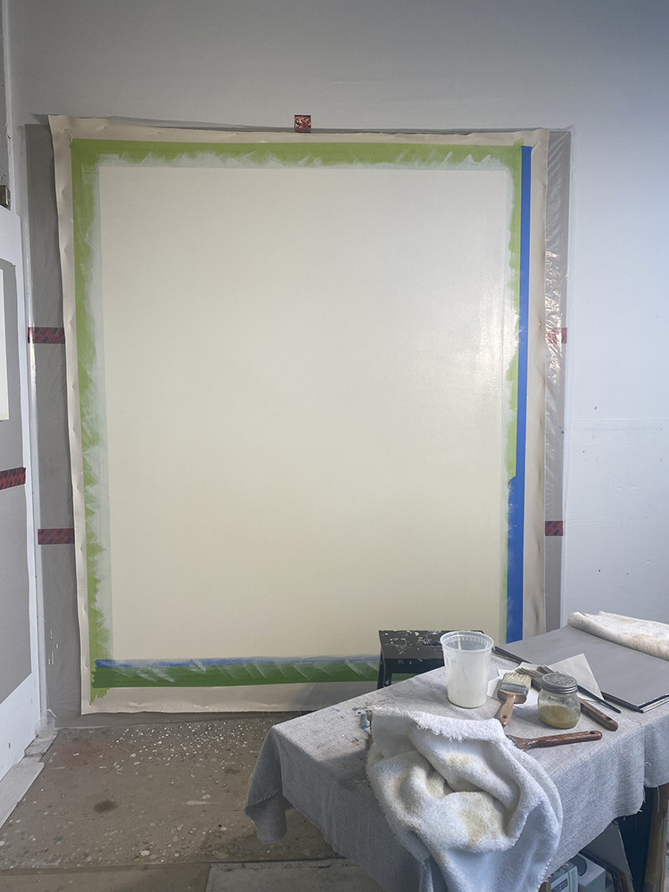
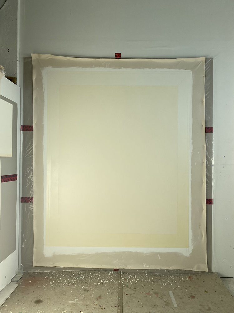
This project was first conceptualized as a wall painting in February 2022. It was proposed as a painting project for my summer thesis research. This project will be completed when installed on the Outer Knee Gallery wall between January-February as well as documented into the similar lighting conditions that it was first envisioned in.
The research aspect of this project is an ongoing conversation and continues to question, amongst other things, it’s viability as a painting under different lighting conditions. For this reason, It will be exhibited in the upcoming State of Practice Exhibition scheduled for September 2022 in the sculpture gallery section of the the Michael O’Brian Exhibition Commons at ECU.
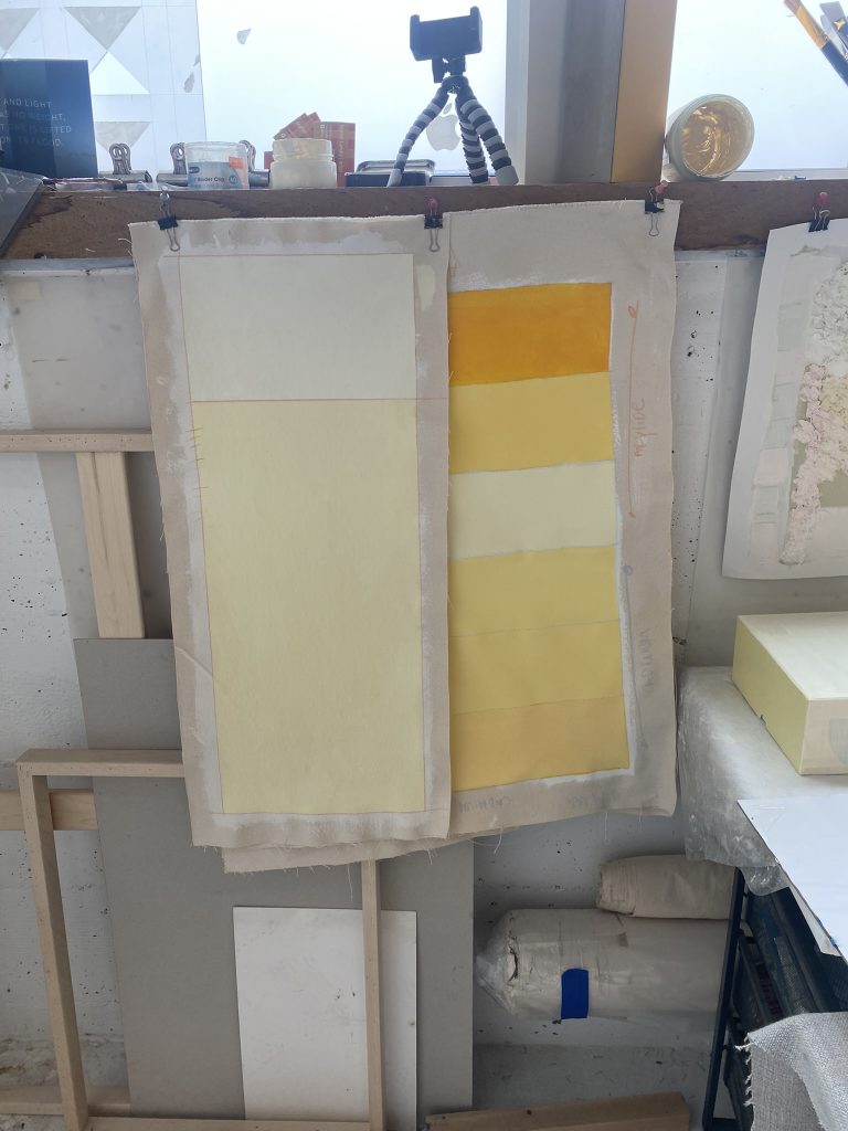
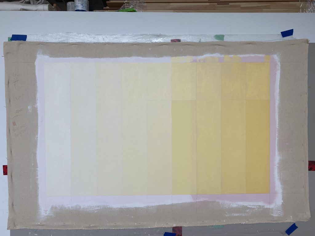
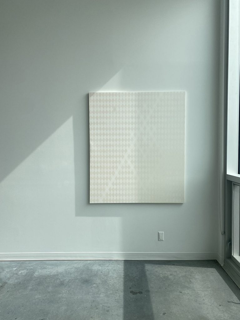
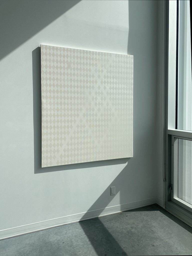
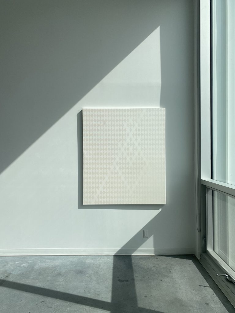
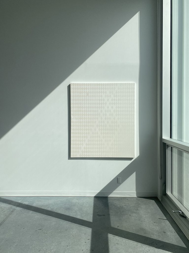
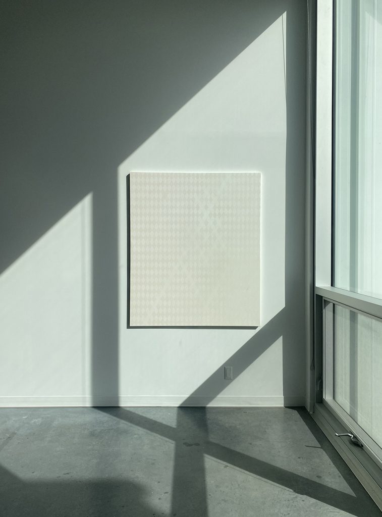
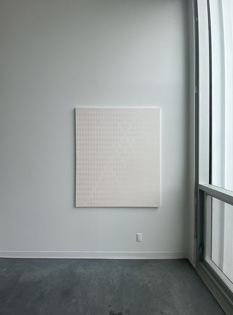
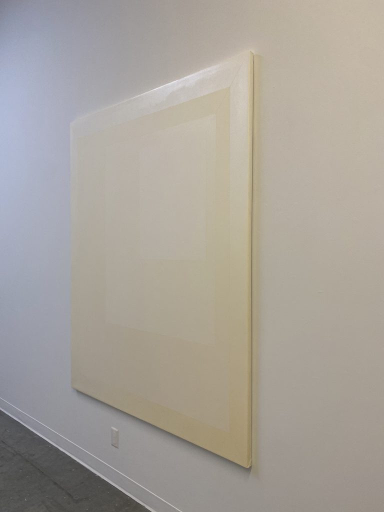
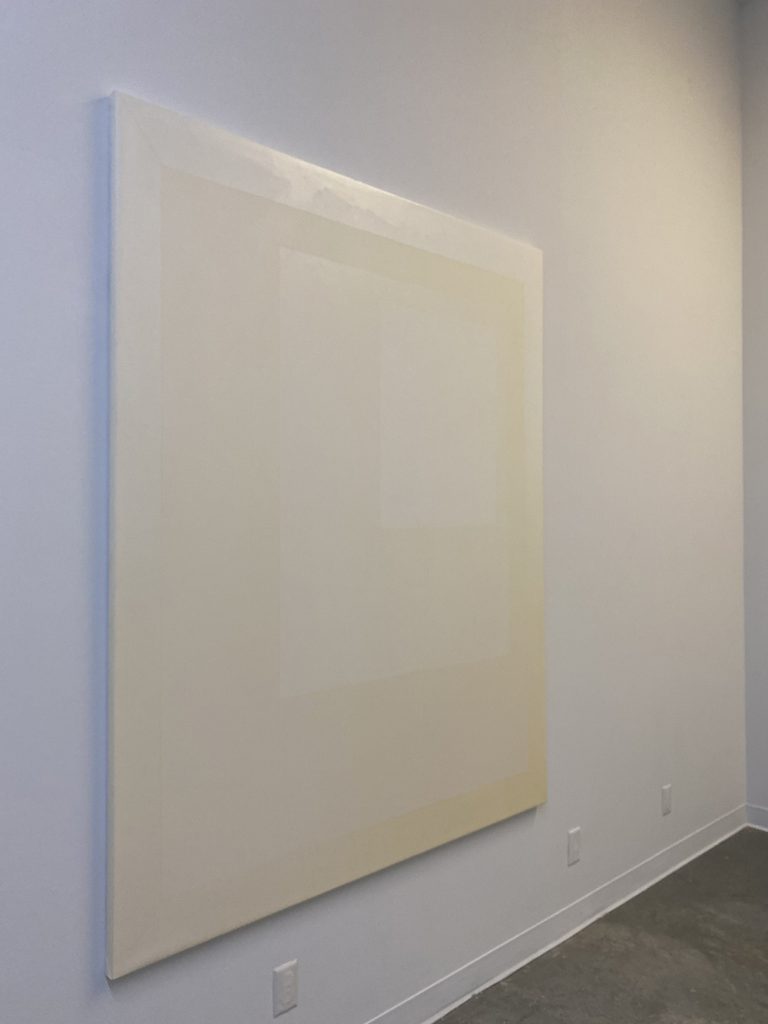
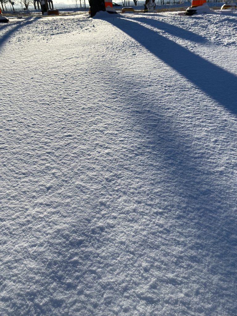
9 Elements in conversation with summer sun 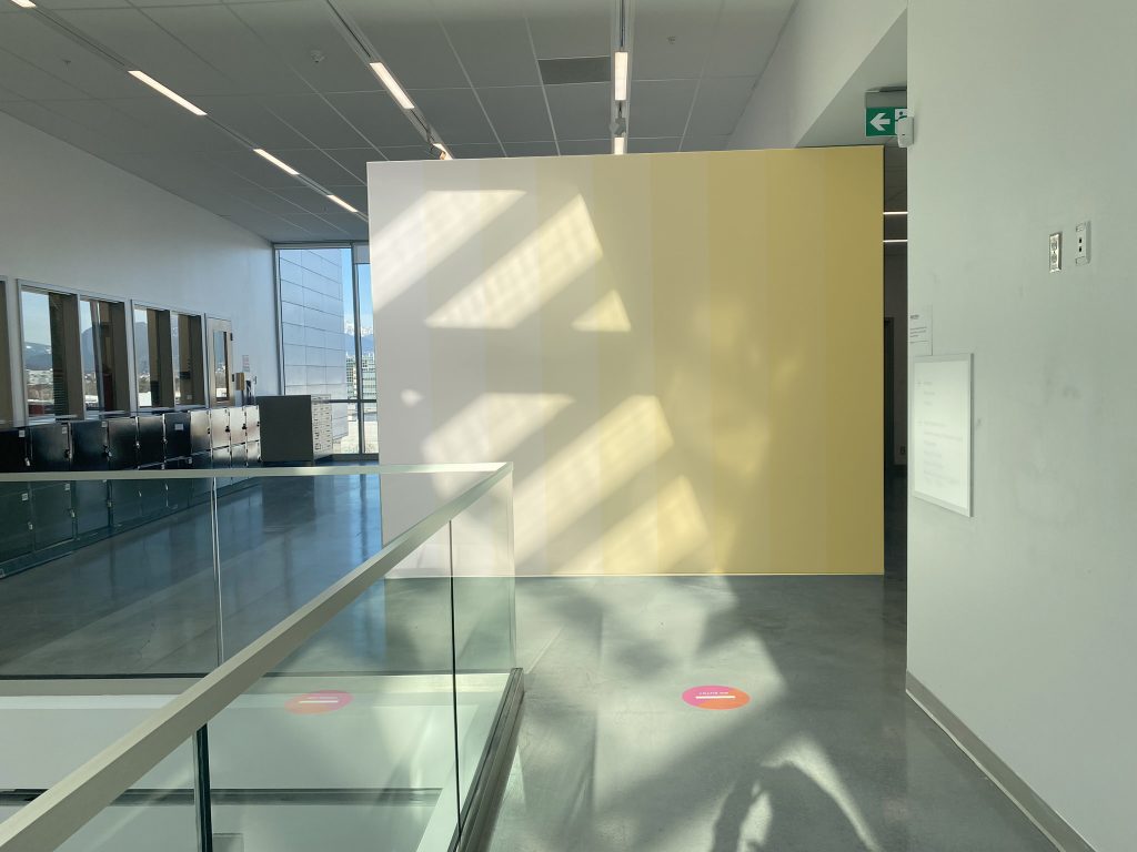
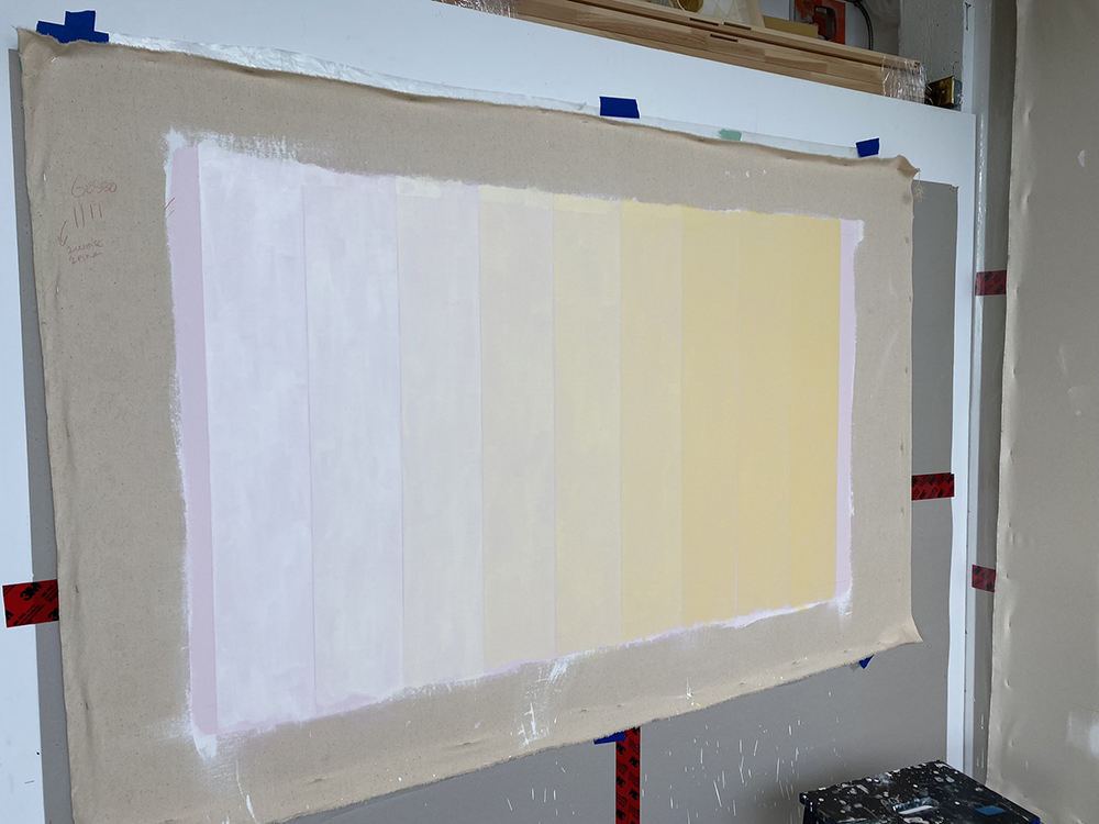
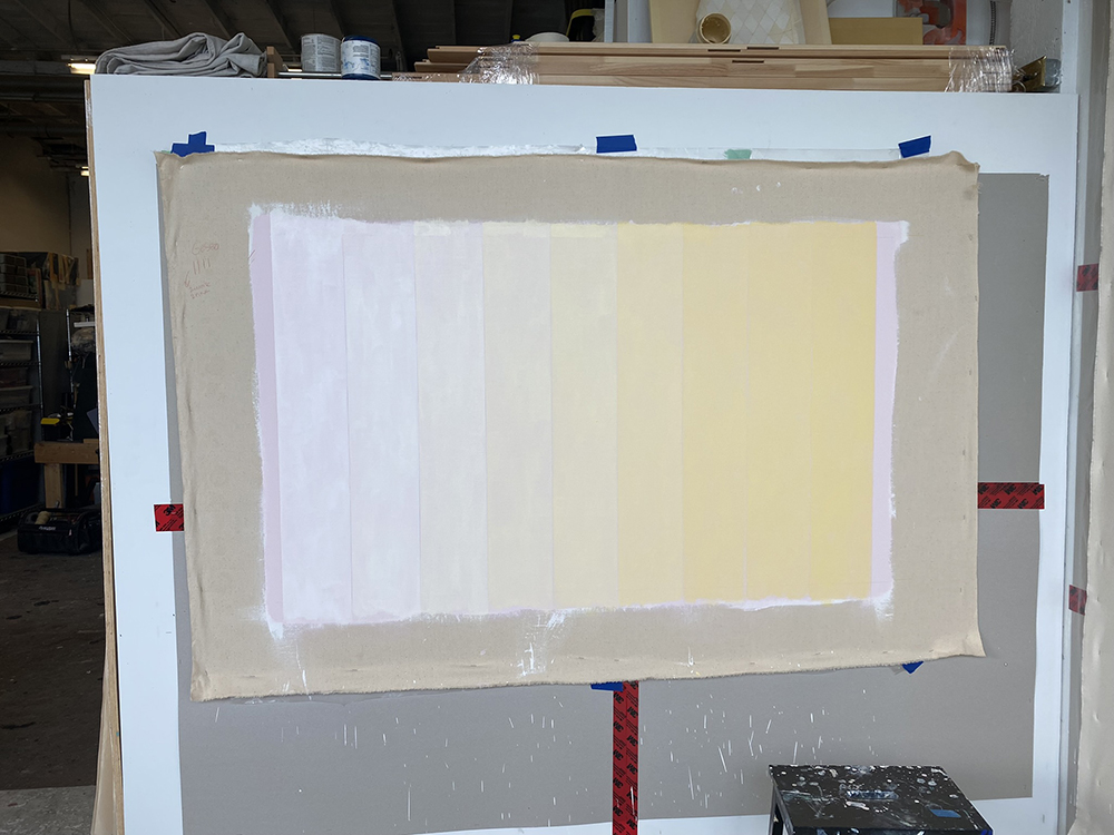
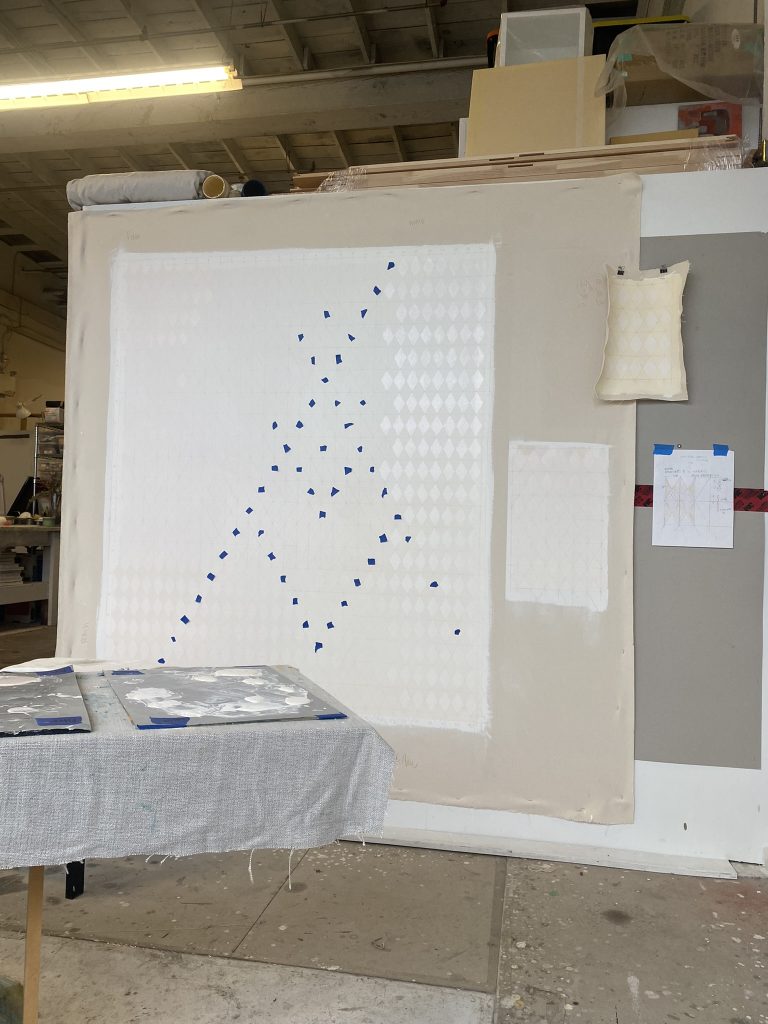
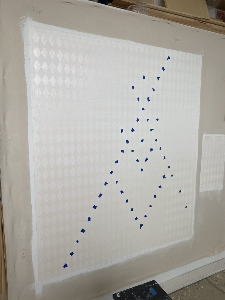
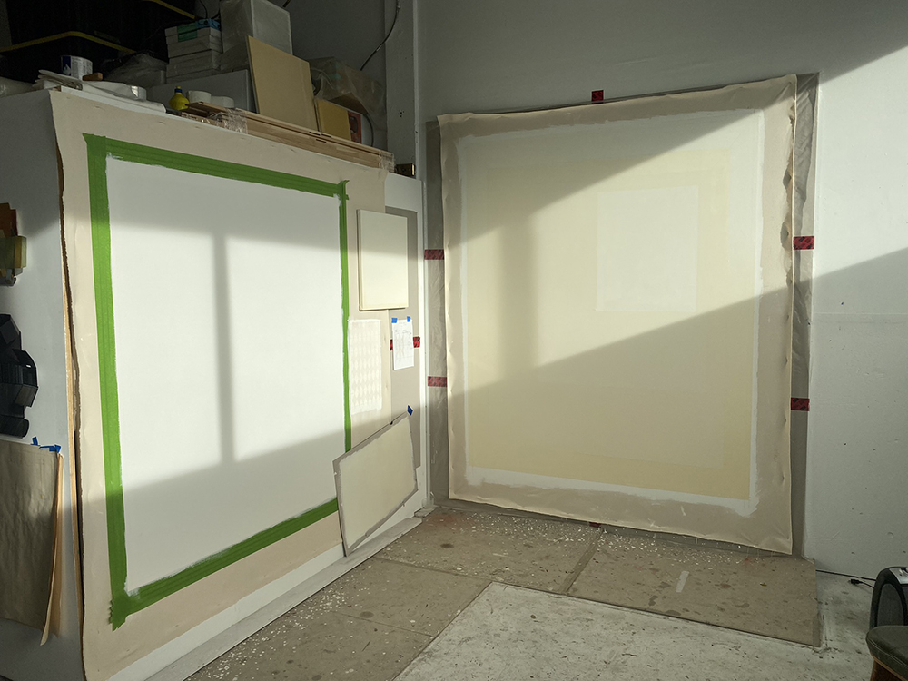
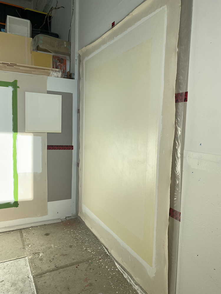
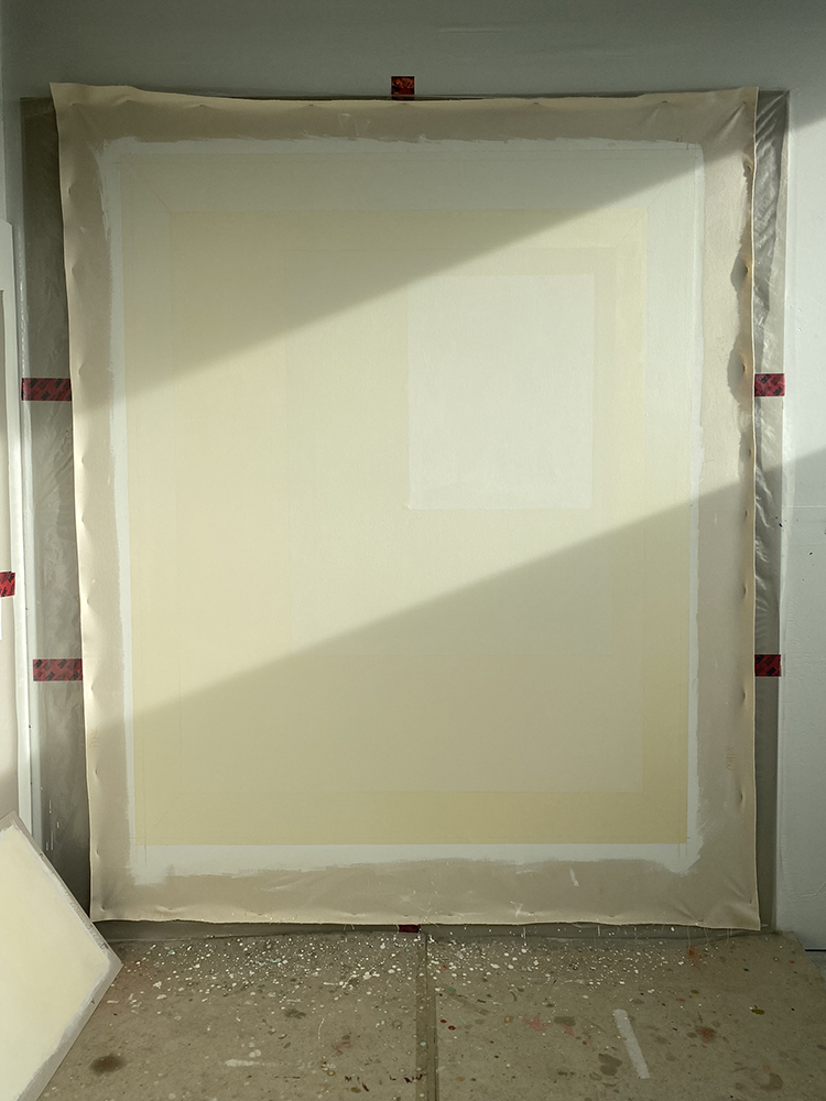
Mockup for 9 elements in conversation with winter sun
Watch this video to see the full passage of August Sun onto 9 Elements.
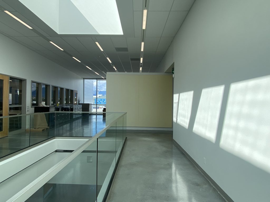
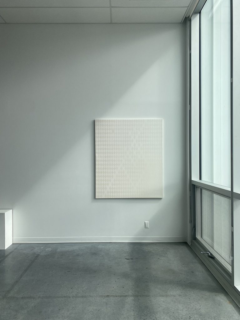
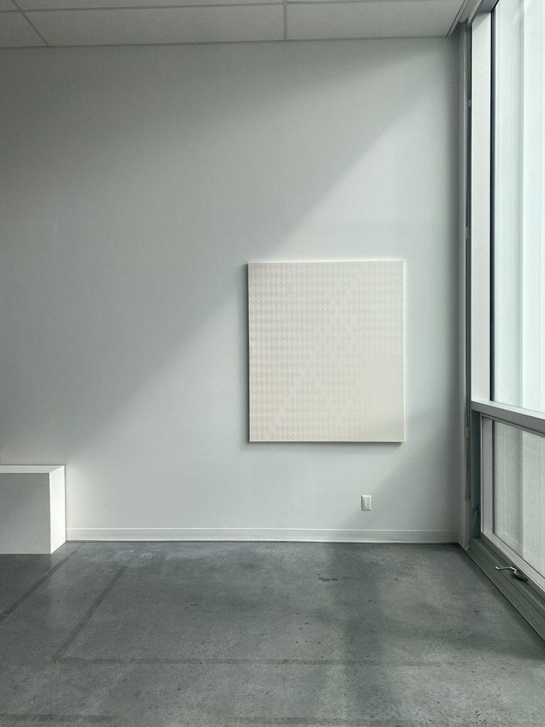
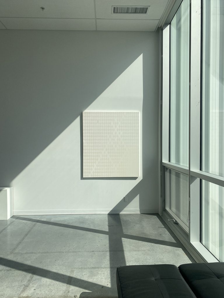
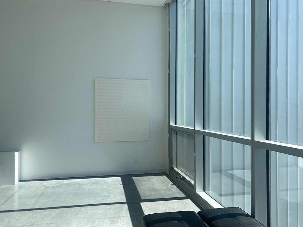
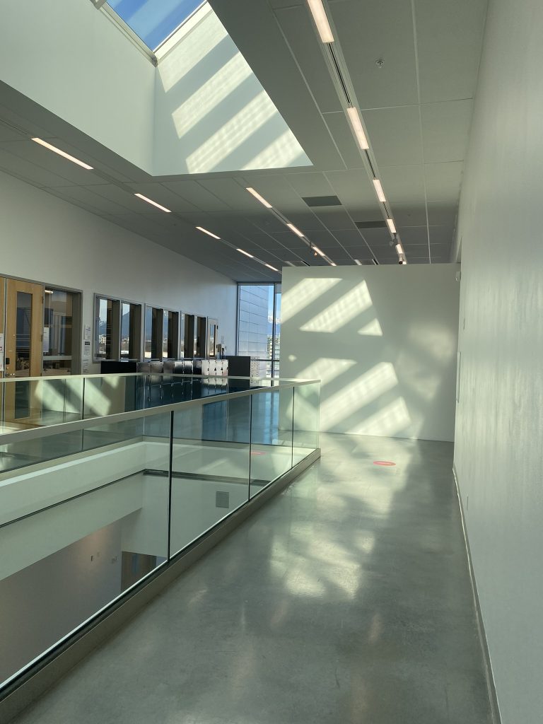
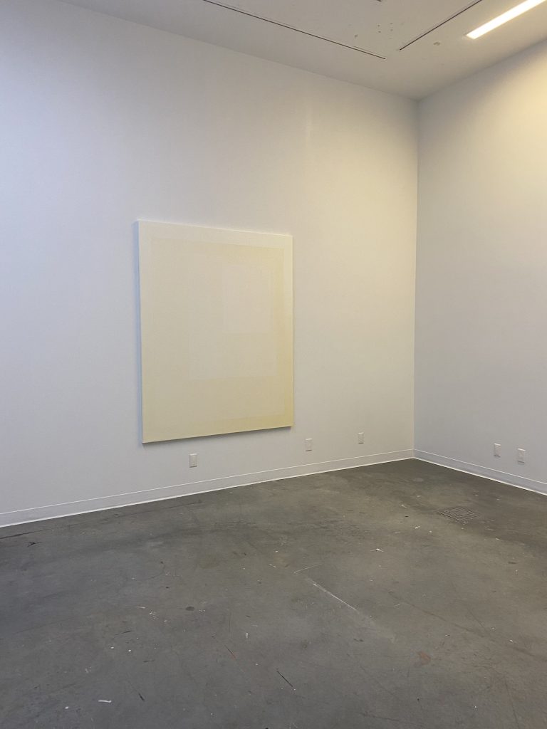
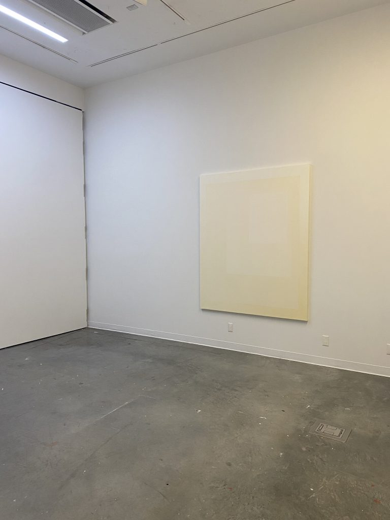
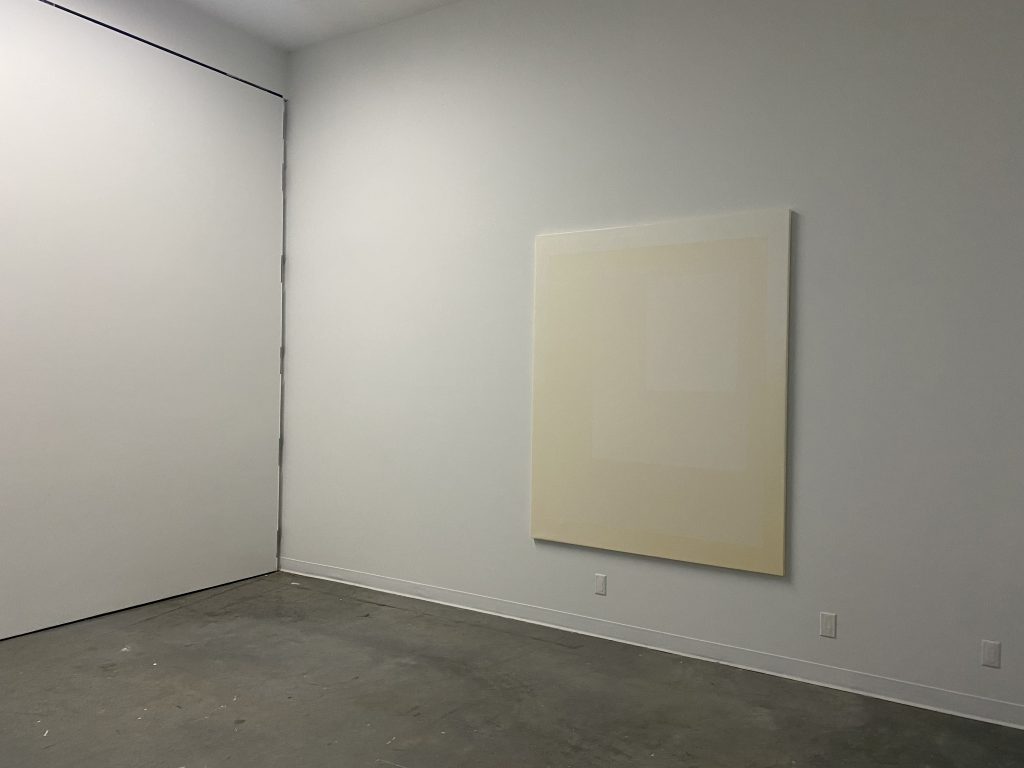
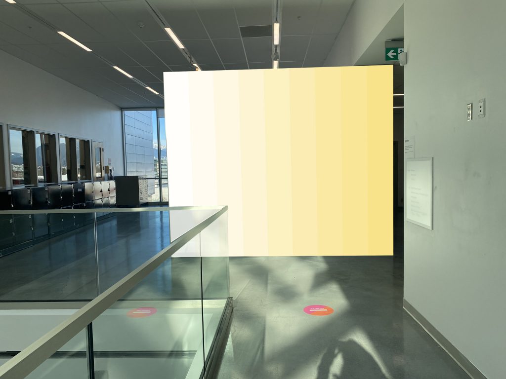
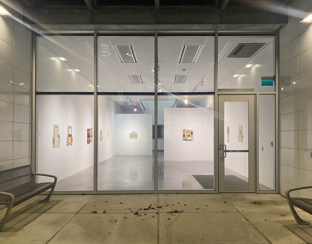
9 Elements – view from East side hallway 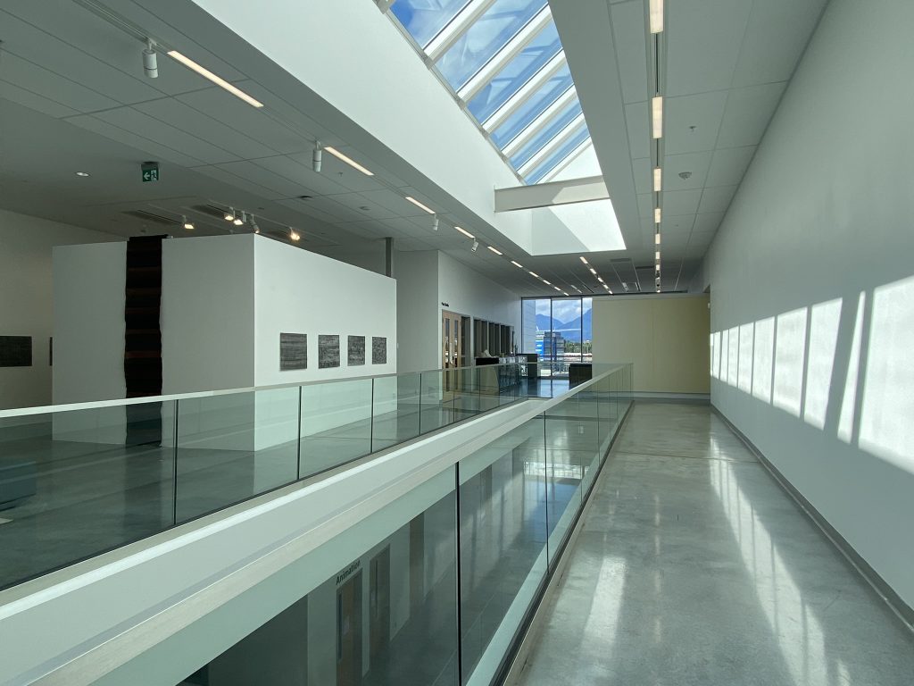
9 Elements – view from East side hallway
Ruth Beer’s installation can be viewed in the Elbow Gallery (left side of the frame)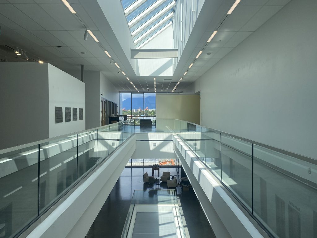
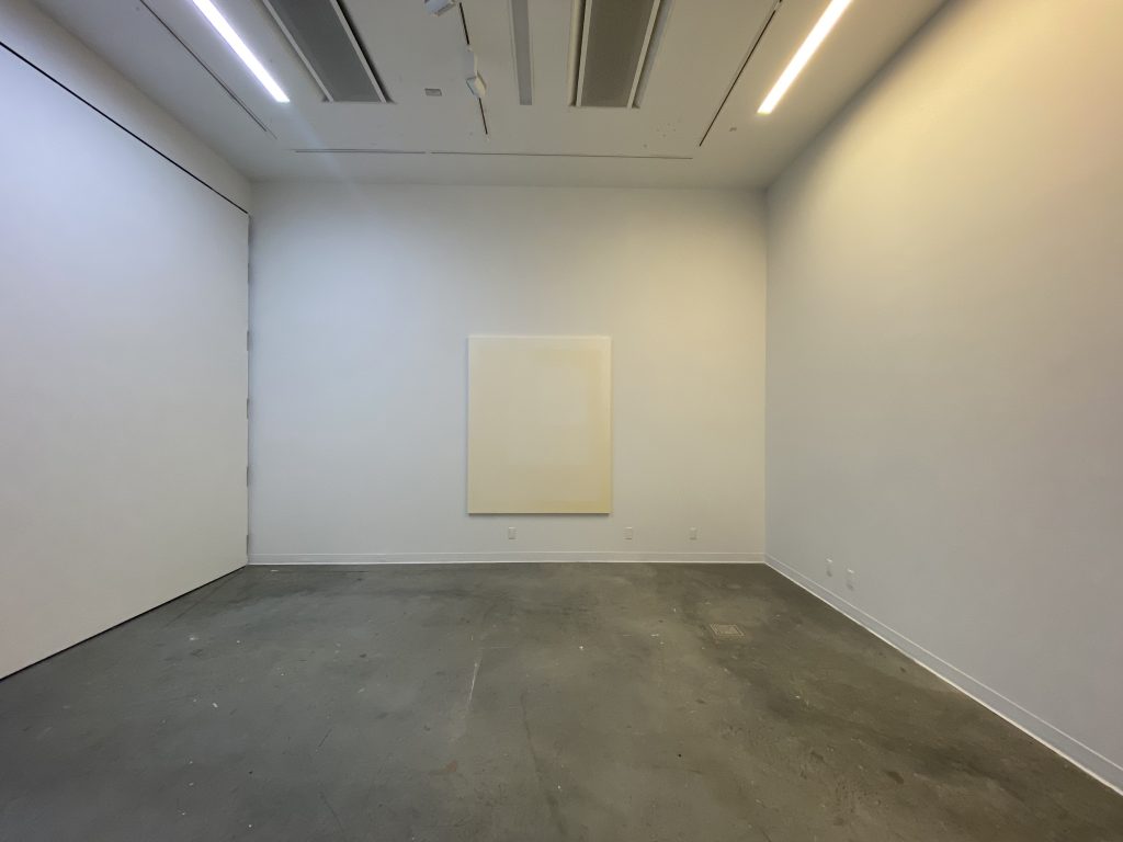
9 Elements – view from South hallway.
Ruth Beer’s installation can be viewed in the Elbow Gallery (left side of the frame)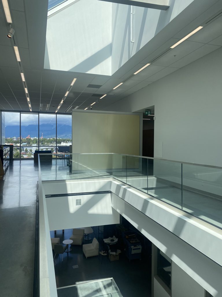
9 Elements – view from West side hallway 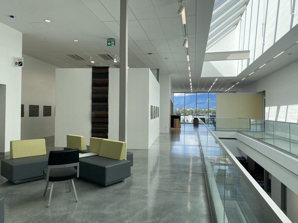
9 Elements – view from West side hallway
Ruth Beer’s installation can be viewed in the Elbow Gallery (left side of the frame)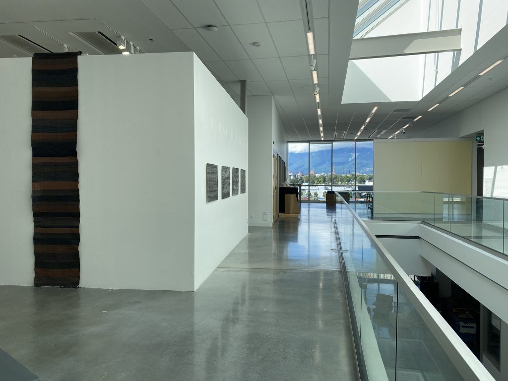
9 Elements – view from West side hallway
Ruth Beer’s installation can be viewed in the Elbow Gallery (left side of the frame)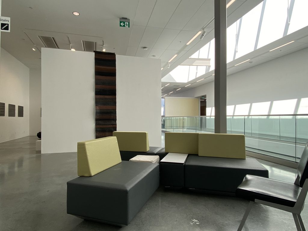
9 Elements – view from West side hallway
Ruth Beer’s installation can be viewed in the Elbow Gallery (left side of the frame)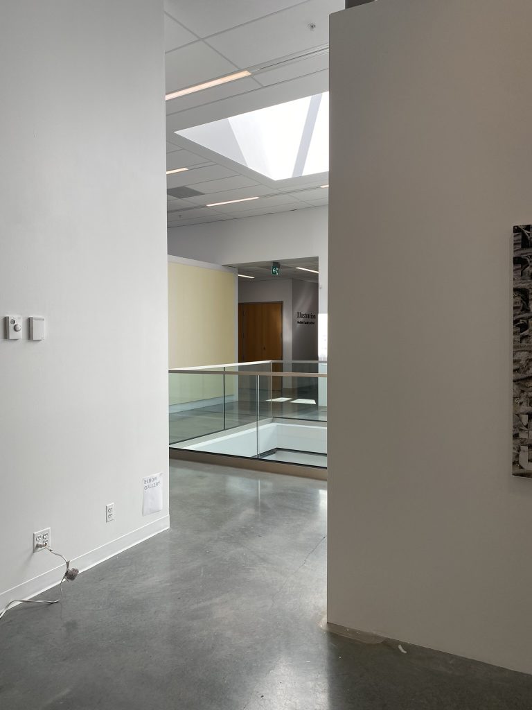
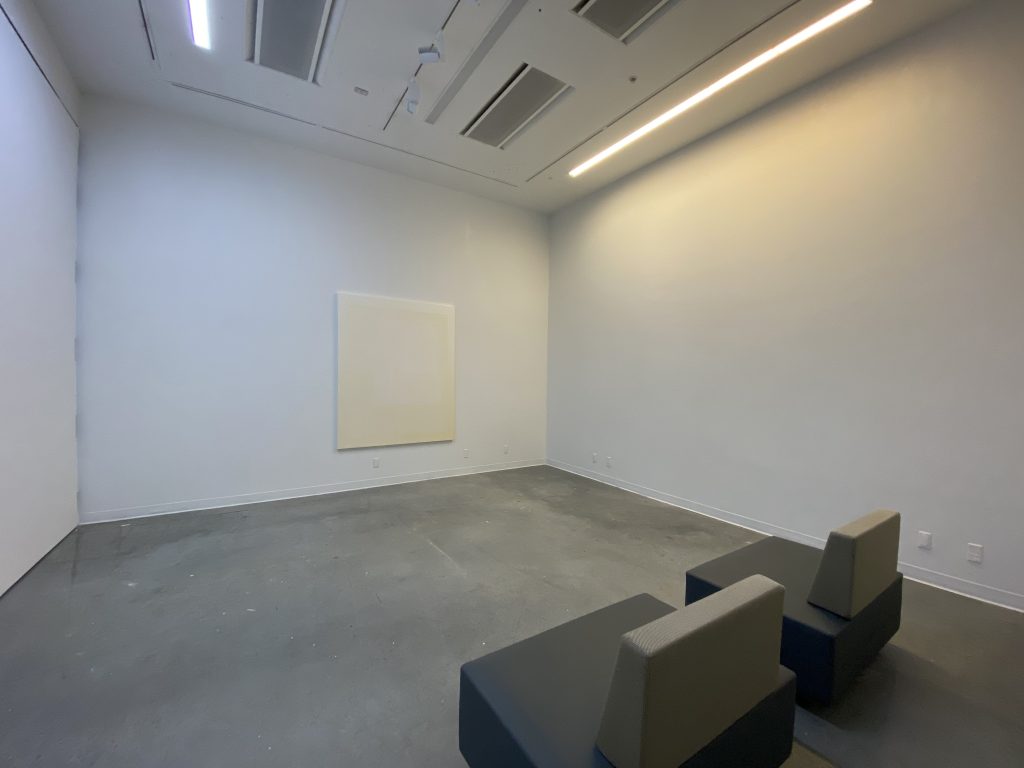
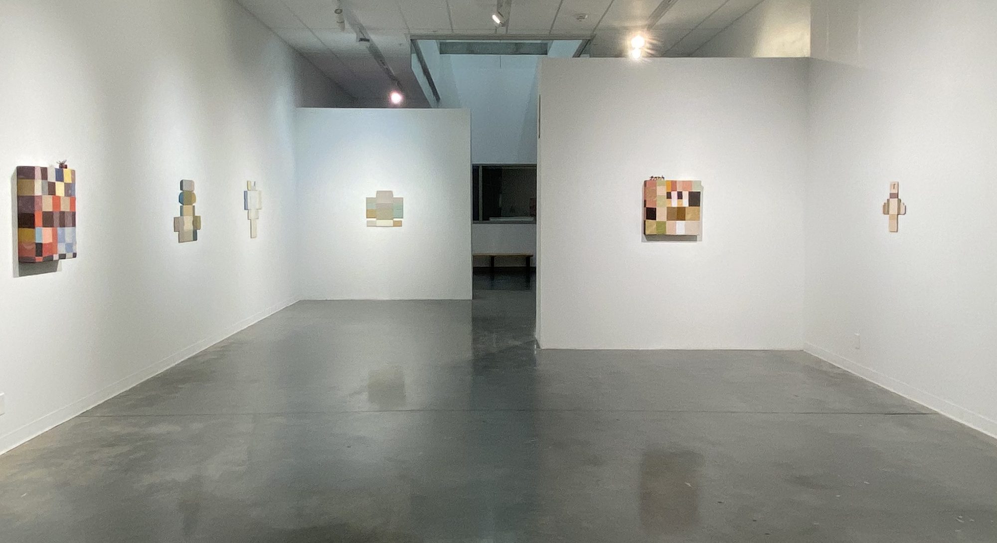
9 Elements – view from Elbow Gallery next to Ruth Beer’s installation 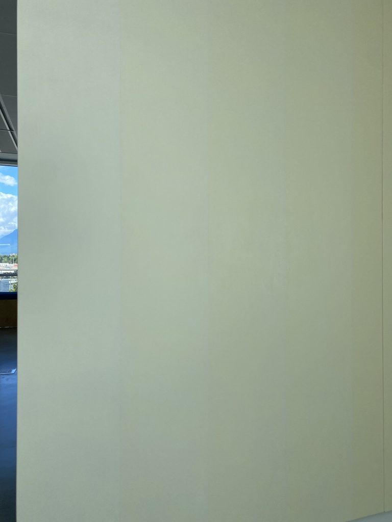
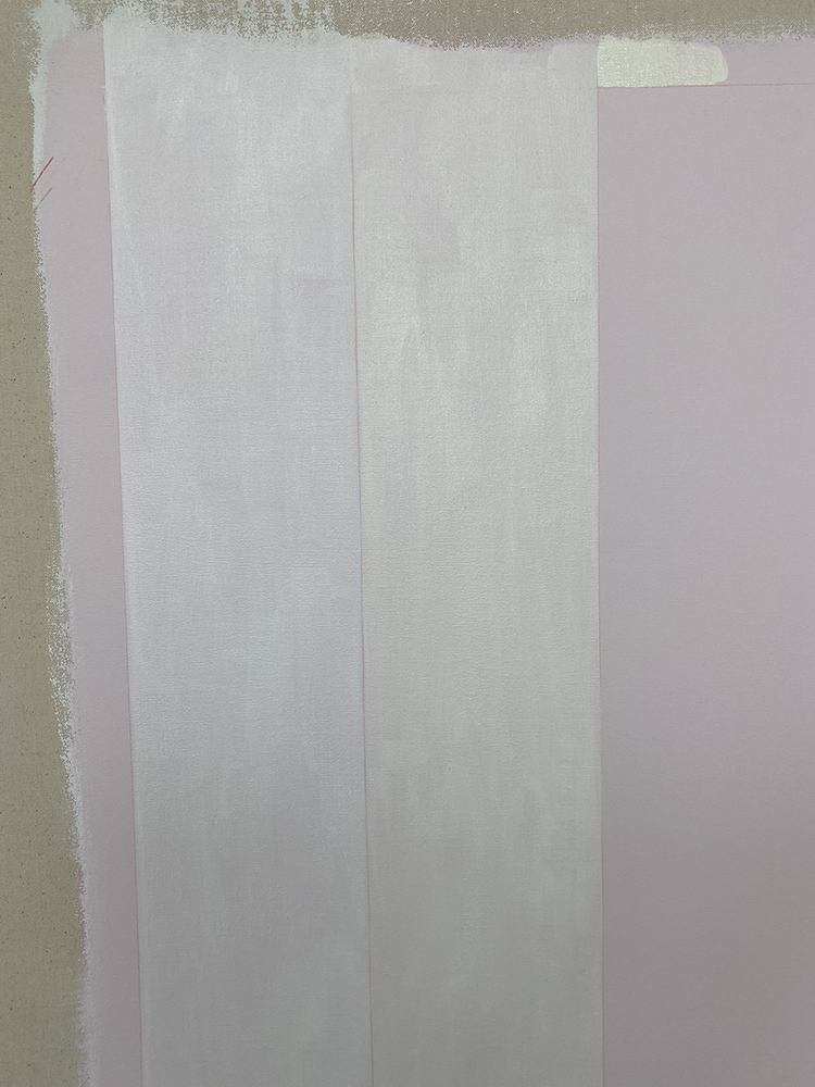
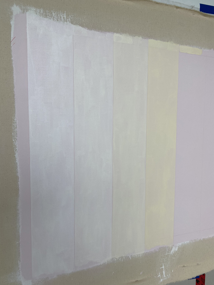
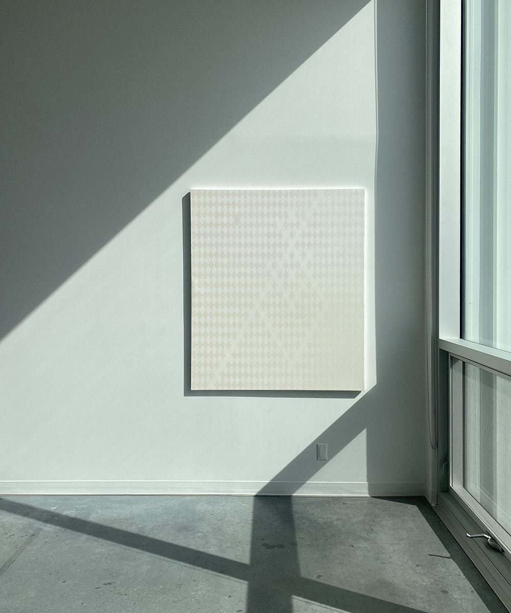
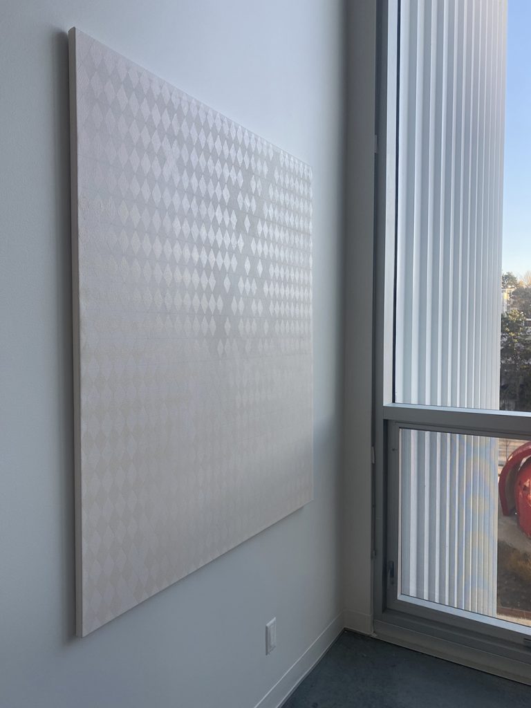
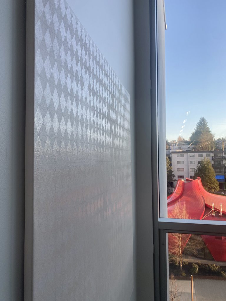
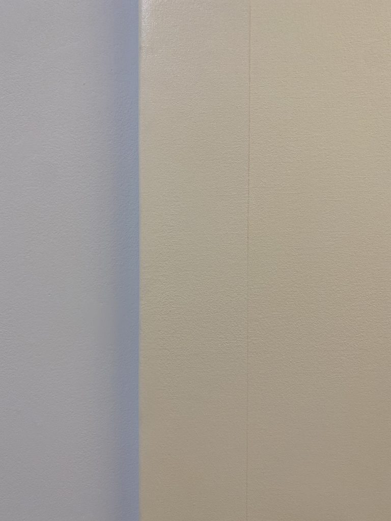
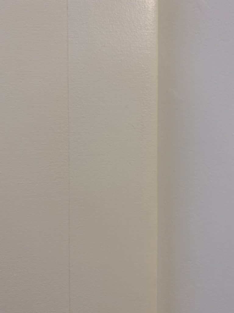
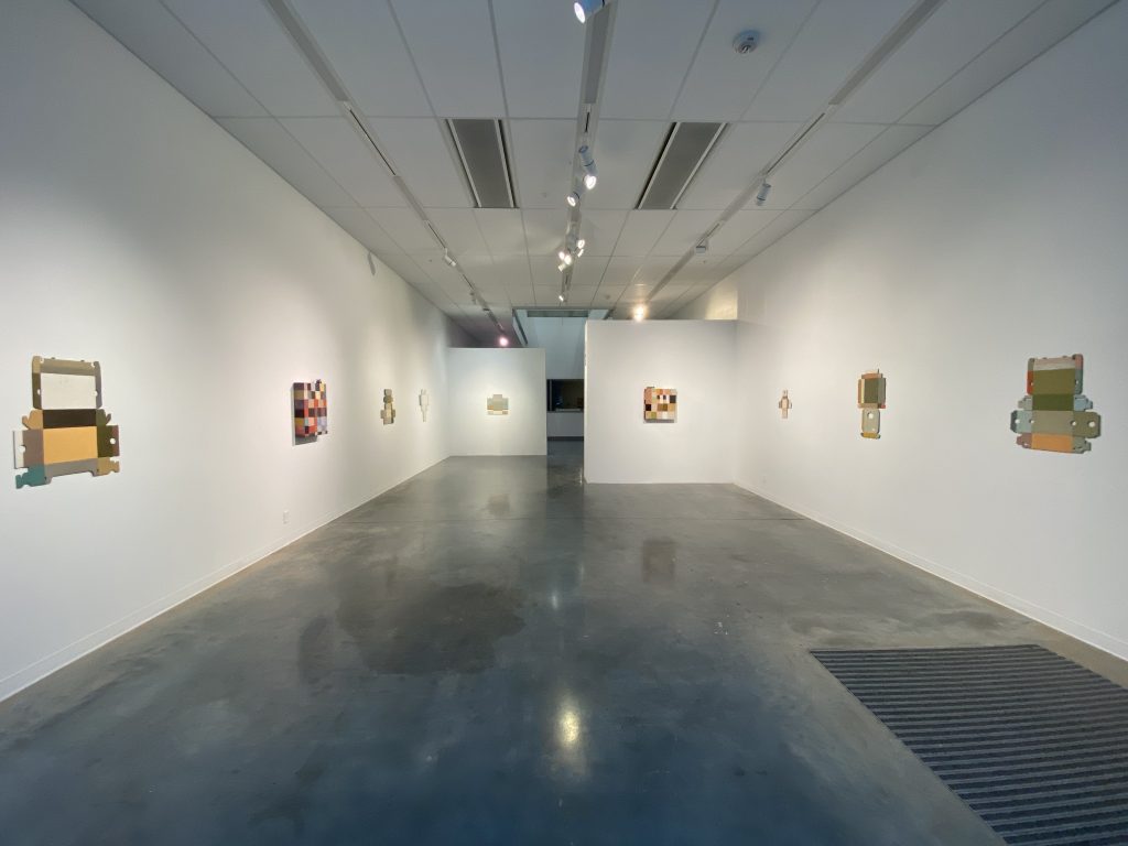
9 Elements – Left side close up 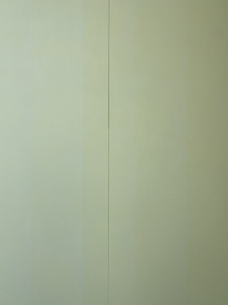
9 Elements – Middle close up 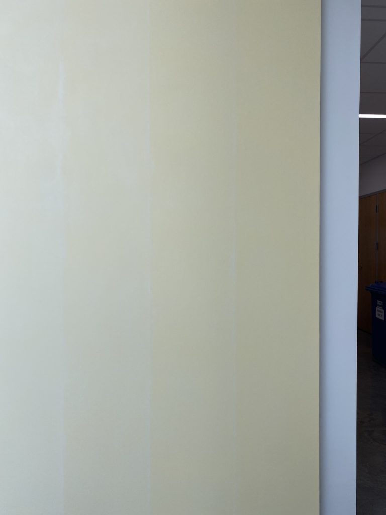
9 Elements – Right side close up 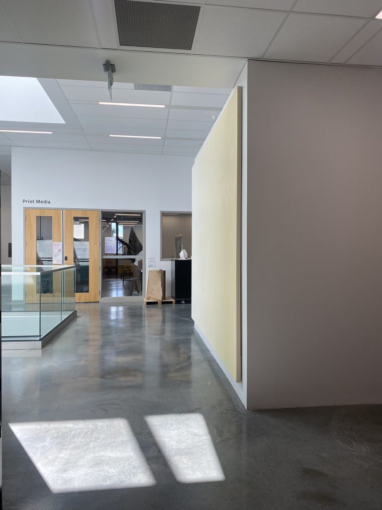
9 Elements – View from East lookin West
General observation and comments
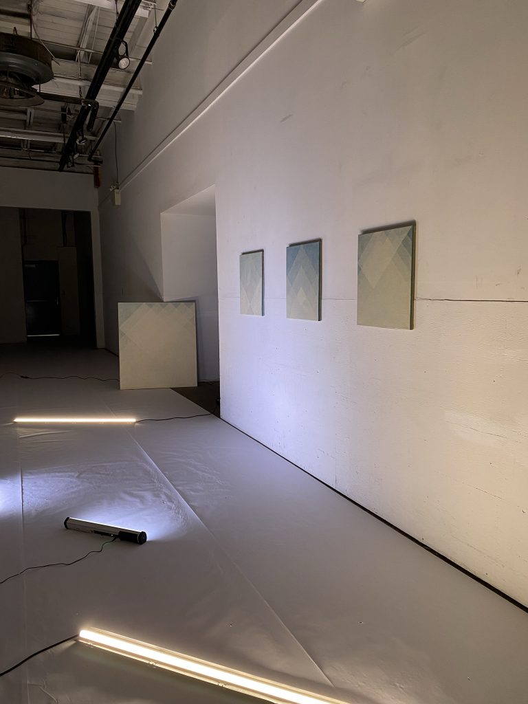
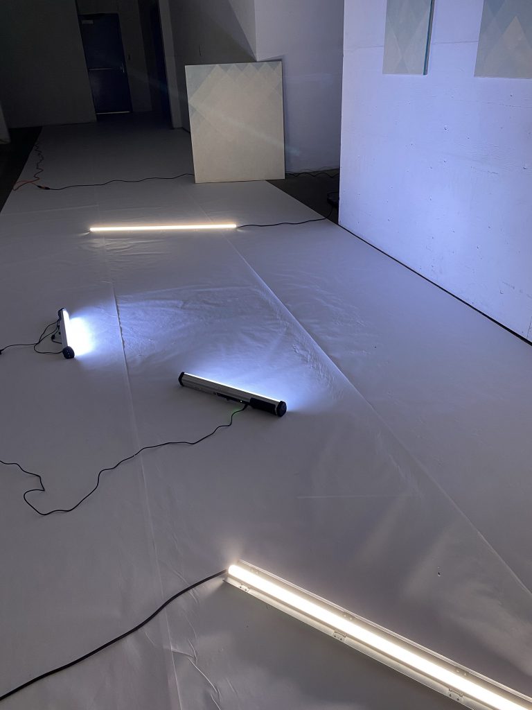
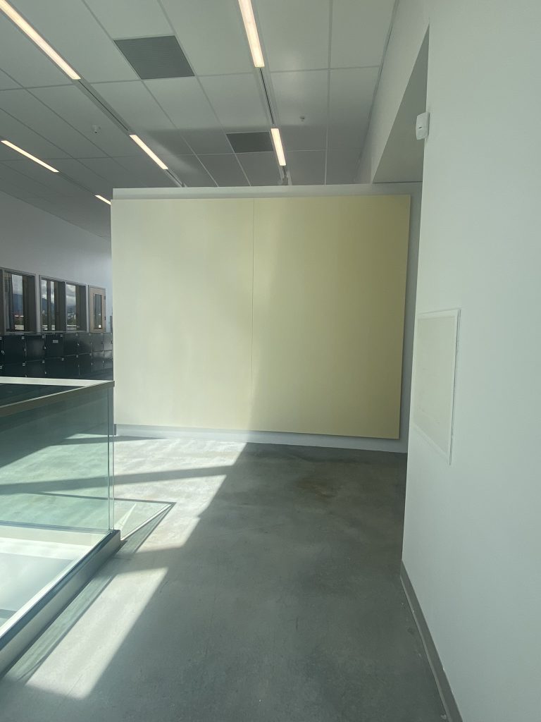
I installed 9 Elements for 4 days on the Outer Knee Gallery wall from August 3rd to 7th, 2022. This allowed me to sit with the piece, document it and received critique from invited guests. Neil Wedman, Jack Jeffrey, Gwenyth Chao and Molly Burke came by and discussed the work in presence with me. Landon Mackenzie and Damian Moppett discussed the work virtually with me while reviewing digital documentation. The comments below where generated from these conversations.
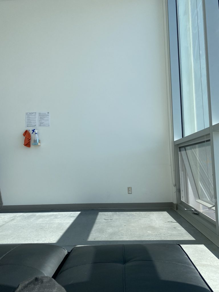
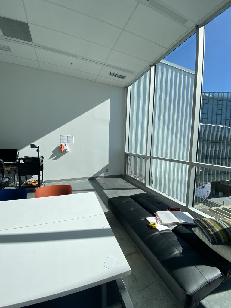
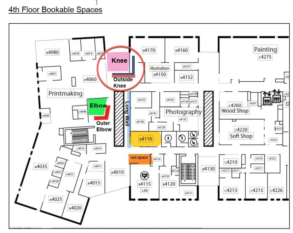
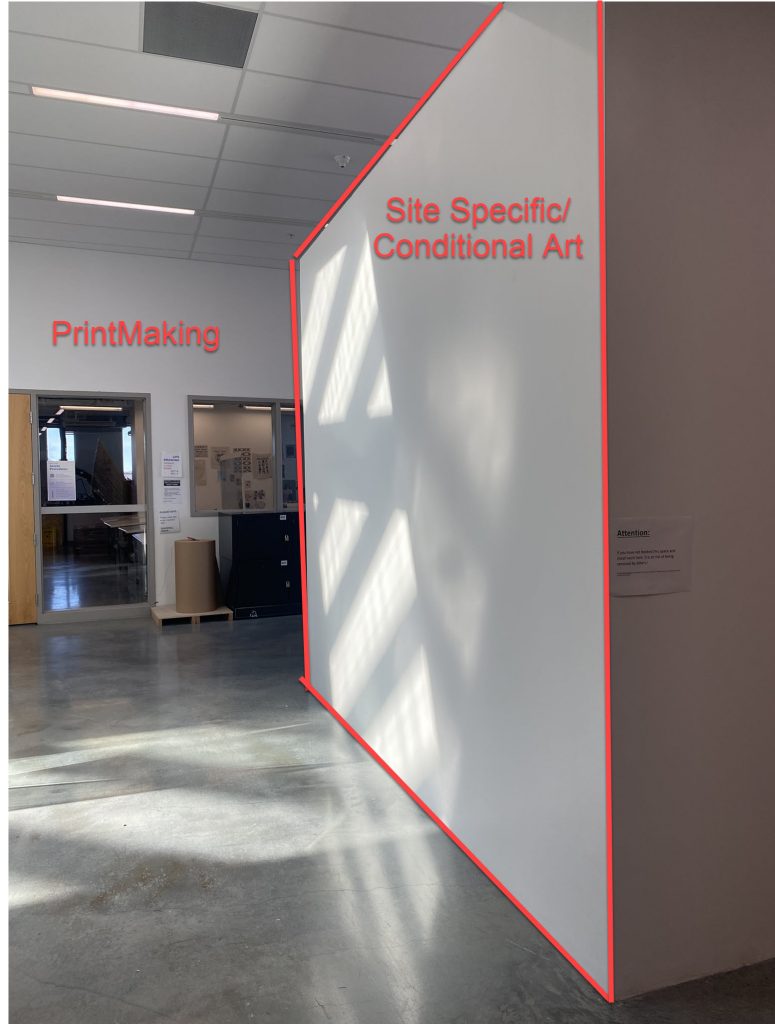
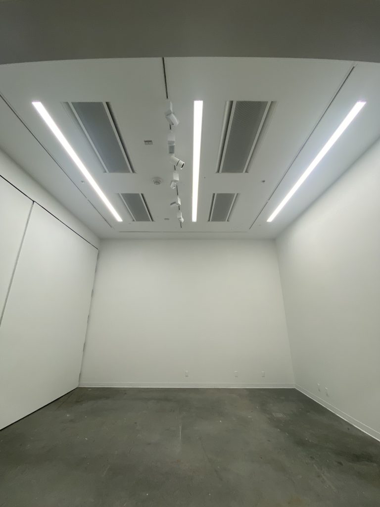
Important to note that the Outer Knee Gallery wall is a transient space used as a corridor. It is about 6 feet wide. It opens up to an skylight atrium that runs through the 3 levels below which is framed by a glass railing. This gallery space is challenging as It offers limited viewing space in front of the work and forces the viewer into narrow corridors to view the piece. As a result of this viewing conditions, the comments have pointed to note that the painting offers 3 distinct readings: at close, mid and far range.
Close range – about 2 feet from the piece:
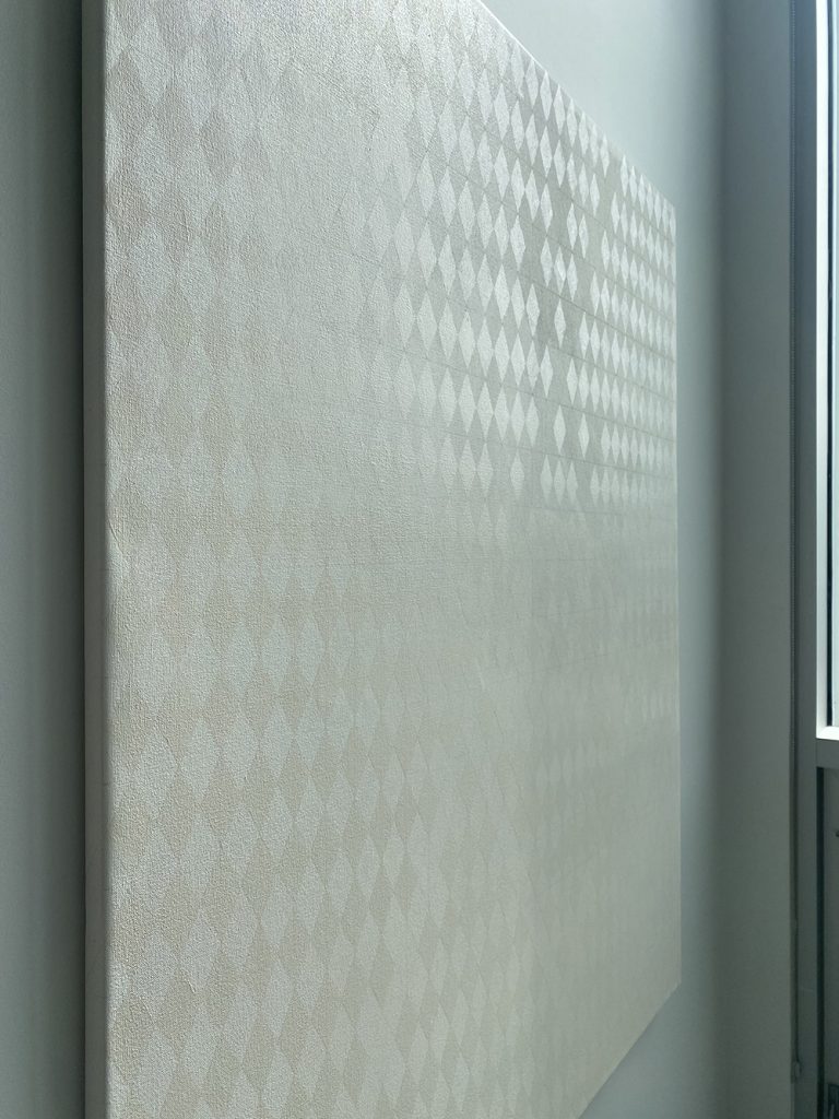
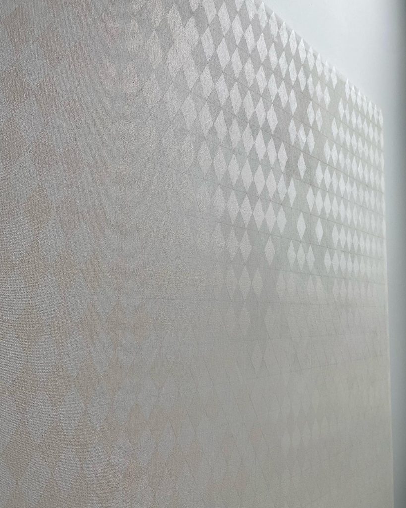
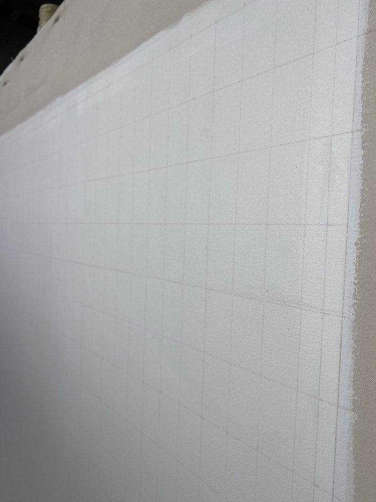
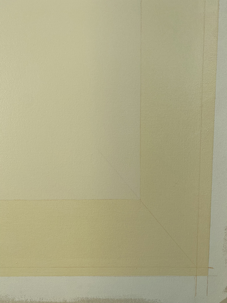
This is the range that painters or those looking for technical information about the painting are attracted too. When standing close to the piece, one feels completely immersed in the yellowness of the work. The piece covers your entire field of vision making it at times difficult to keep your balance as you feel absorbed by a vaporous field of colour. It is hard to keep your eyes focused on the very details you came to seek. The matte finish offers no reflection of light or the viewer and tend to pull you in even further. The coloured pencil line used as a guide to paint each colour band is the thing that is most visible at close range. Once you are able to focus on the line, you also start noticing the loose brush marks of the thinly painted fields. Imperfection and unevenness in the application of paint is observed and suddenly one realized that this piece was painted fairly loose. You don’t tend to stay within this range for too long as it somewhat feels uncomfortable and hard to focus on anything.
Mid range – 3-5 feet from the piece:
Most common range that viewer will stand from the work. This is an awkward position as the area in front of the work is a corridor broken by an opening in the floor surrounded by railing so the viewer only has limited options to stand in front of the piece which is standing on the right side of the work. Once you find the most convenient place to pause and really observed, a strong optic illusion occurs. Each band of colour appeared to have been painted on a vertical gradient from purple to yellow. This effect is so strong that one is convinced that it was painted that way and need to move closer again to verified this fact. And one can kind of proved it’s point by noticing that in some areas, the edges of the painted band appeared to be painted differently but upon closer observation, one will noticed that no, the unevenness of the paint is actually throughout the entire band and not just present on the edges as per the optic illusion. Moving back to a 3-5 feet range, the optic illusion starts again creating a wave with the painted band. This is so strong and hard to understand leaving the viewer puzzled with the effect. At that range, the paintings appears yellow and purple and vibrates quite a bit.
Far range – 15-20 feet from the piece:
Not a lot of people took the time to walk all the way around the floor opening to stand directly across the painting. At this range, the 9 coloured bands completely disappeared becoming one unified gradient from pale yellow to a more saturated yellow. What stands now is the painting within its context. The architecture of the space, the skylight, the corridor, the railing and mostly how the light interact with all these details. At that range, the window behind the painting on the north wall of the Knee Gallery comes into the conversation. Architecturally speaking, it is divided into vertical window panes which recall the geometrical composition of the painting, but most importantly it is overlooking the mountain range and reads has bluish purple, the complementary colour of yellow. One starts wondering if the effect of the blue next to the yellow painting is actually altering the perception of it or contributing to the optic illusion that happens at mid range. Nevertheless, at this range, the painting completely feel like it belong to the wall and its presence enhance the awareness of space.
Unresolved ideas:
The context: This is a very difficult area to view a painting that size. The wall opens to a transient corridor for those moving along the North hallways, into the Print Studio or Elbow gallery or transitioning to the south hallways. It is not a space where one can sit and really spend the time with the painting. It makes it a really hard space to see the painting in it’s entirety without being partially block by the railing. It’s also a bit awkward to find a place to stand still has others will walk by you at all time, on their way to their business. In fact, I am not sure if most people actually notice the painting as it is so subdued and tends to melt with the context. In my opinion, It does soften the area and bringing a sense of calm. On the south side of the Elbow Gallery, there is a lounge area and I have taken the time to rearrange the orientation of the loungers to offer a more welcoming configuration where students are invited to gather. Two of the loungers are also offering a great view towards the painting but once sitting, the railing really constraint the viewing of the piece. Me and Gwenyth spend a considerable amount of time there talking about the work from those loungers and many ideas where discussed. We discuss the calmness of the piece, the context it was sitting it, the transient space, the railing but one thing that resurfaced was how the piece could provide a space to empty all content: our oversaturated world of images, news, social media, emails and general sense of lacking time. This piece is suggesting the opposite: a contemplative moment to observed time pass by, the transition of sun over a certain lapse of time, awareness of context and possibly of self.
The dependance of sunlight:
Have I gone too minimal?
The relationship to modernist abstraction, what makes this piece still relevant?