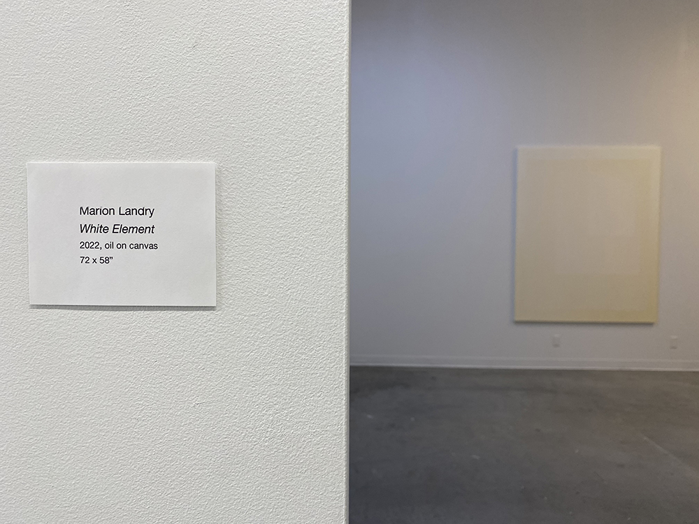
WHITE ELEMENT | MARION LANDRY | Grad Gallery | Feb 25-28, 2022
About the title WHITE ELEMENT
The source of the title came from few references. I think it is important to establish that the name was intended to be a follow up to the naming convention established in my previous show (titled BLUE ELEMENT) as a continuation to my research with atmospheric effect in the gallery and the relationship it creates with the reception/perception and feeling within this otherwise generic Grad Gallery space.
Blue element was base on a memory of water.
White element a memory of snow.
What I was thinking mostly about was my experience with the perception and understanding of the whiteness of snow on that cold day in Magog. (Read my previous blog for full story. ) That afternoon, the snow was not white it was lead white. Lead white like the tube of paint I had found one day in London as a lead white alternative and rocked my painting world ever since.
Lead white was always the practical choice up until the 19th century because of its density, opacity, and warm tones. It was irresistible to artists like Vermeer and later the Impressionists like Van Gogh. Its glow couldn’t be matched, and the pigment continued to be widely used until it was banned in the 1970’s. Zinc white was proposed as a replacement to the poisonous lead white in the 18th century. However its cool and semi-transparent pigment composed of zinc oxide never achieved the level of satisfaction painters seek. In 1921 titanium white started to be produced with a claim to be twice the opacity of lead white. Yet again, painters never found it as satisfying or with having any relationship with the warm qualities of lead white. I personally never understood the fuss, that was before I experienced lead white.
My paintings, up until 2020 used a combination of zinc and titanium white depending if I want more vibrancy/opacity or more transparency. I remember stories told by my studio mate who used lead white in the early 70′ on how satisfying lead white was and that once you have used it, you could never find the same level of satisfaction or impact with any other white alternatives. Many years later, I found myself in London at an art store where I came across a tube of Michael Harding warm white lead alternative. Curious, I brought a tube back home with me. It was not before 2020 that I ended up using this mysterious white and what an impact it had. I completely rocked my world. It had the quality of wiped cream, a rich and voluptuous warm white that mixed and warmed other colours beyond description.
It is that exact pigment that came to mind when experiencing the warm white of snow on that late afternoon in Magog at -32 degree. The sun made the snow feel warm and inviting, impacting the interpretation of snow white which I had up until now categorized as a more blueish white, definitely cool white. It is in that moment that I really understood that the white of snow is actually, like water, reflecting and refracting the light of it’s environment and therefore always changing. On that specific day, when the sun started to lower on the horizon and bear it’s warmest shades, the snow became buttery and warm as well. What also became obvious is that I could actually read the yellowness mostly due to the contrasting cool mauve shadow that lay next to it. Joseph Albers would explain that well. Colors are in a continuous state of flux and can only be understood in relation to the other colors that surround them.
“In visual perception a color is almost never seen as it really is – as it physically is. This fact makes color the most relative medium in art. “ (Albers 1)
On that day, it was the cool mauve that helped me see and noticed the yellowness of the snow. In that context, WHITE ( as snow ) and ELEMENT (a part or aspect of something abstract, especially one that is essential or characteristic) felt appropriated calling on the relationship to chemistry, the complex history of the white pigments and the changing nature of colour perception.
Josef Albers Albers, Josef. Interaction of Color 50th Anniversary Edition. Yale University Press, 2013.
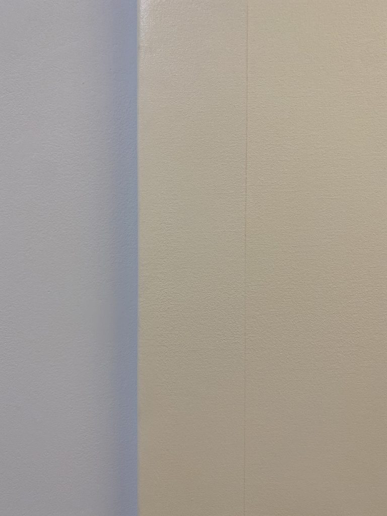
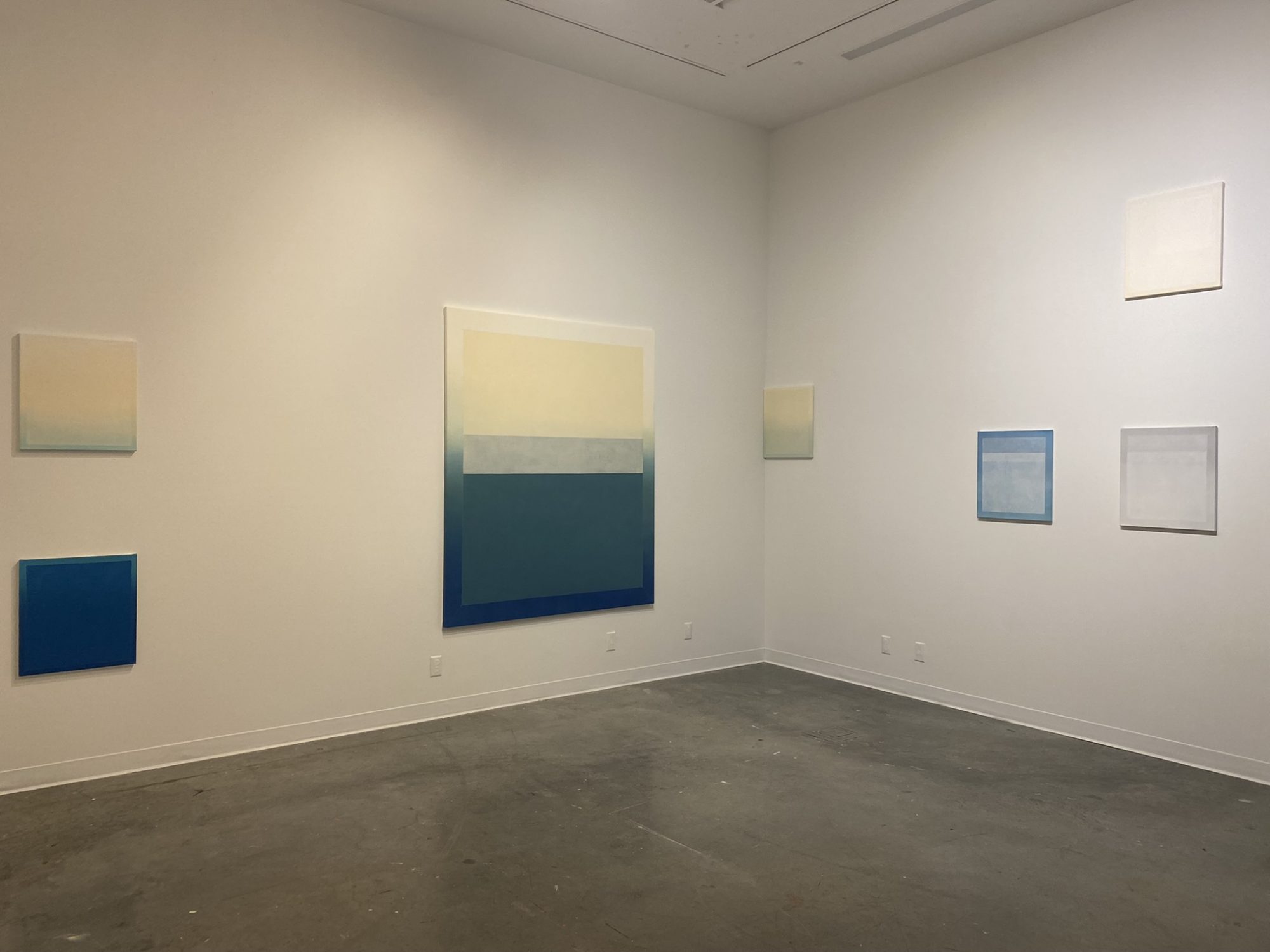
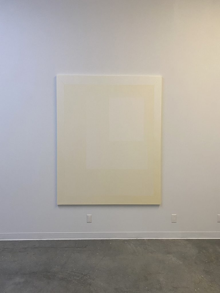
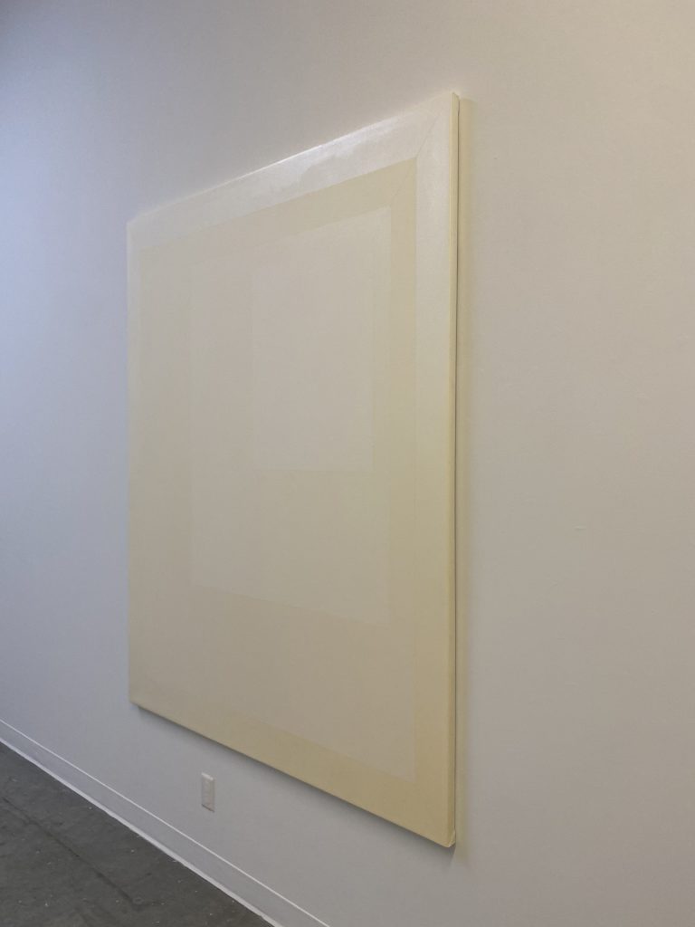
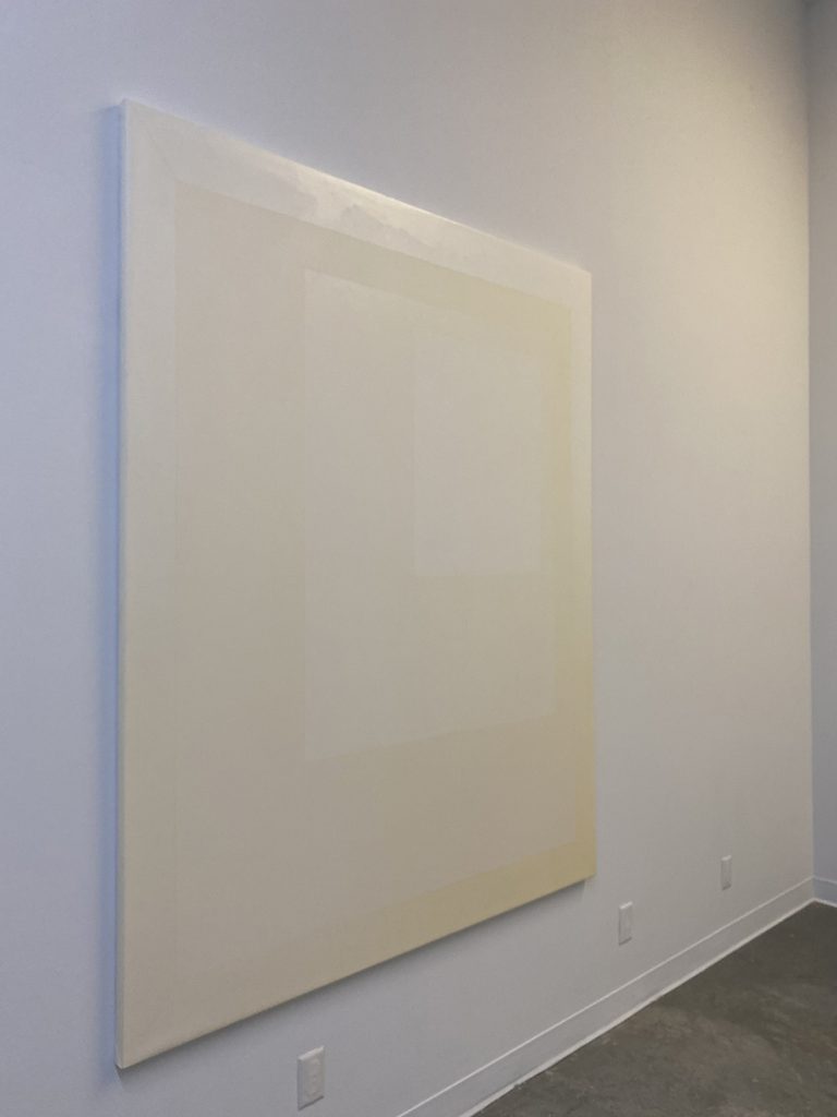
Blue shadow – created by the addition of a cool gel to the gallery lighting system 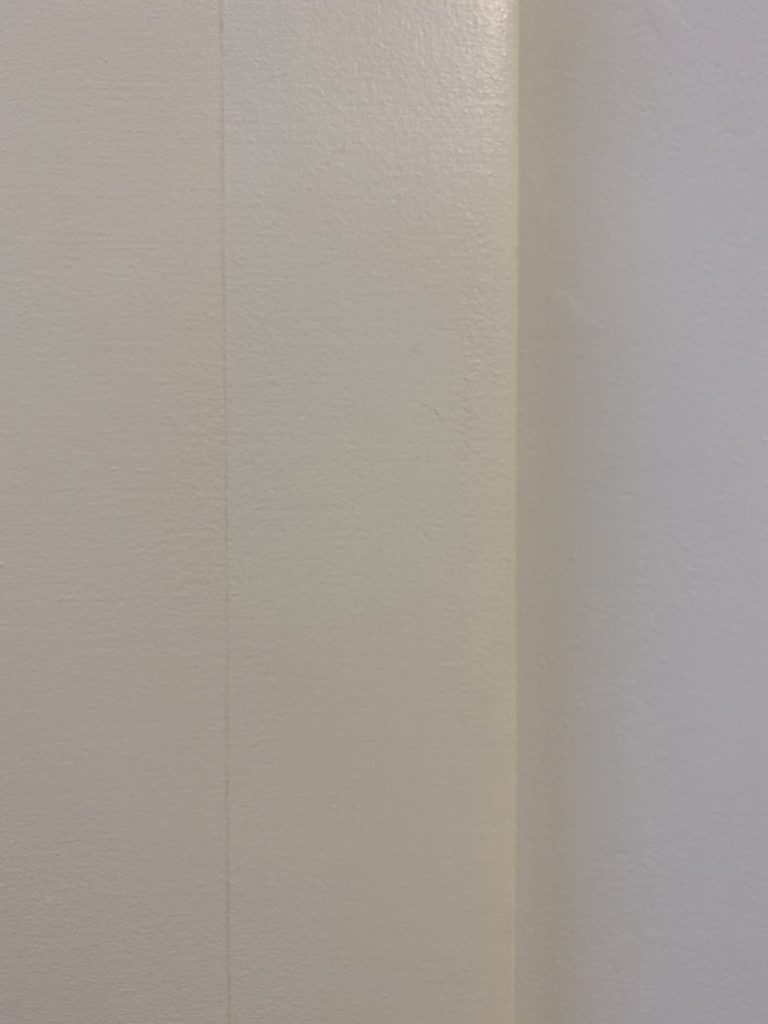
Yellow shadow – created by the addition of a warm gel to the gallery lighting system 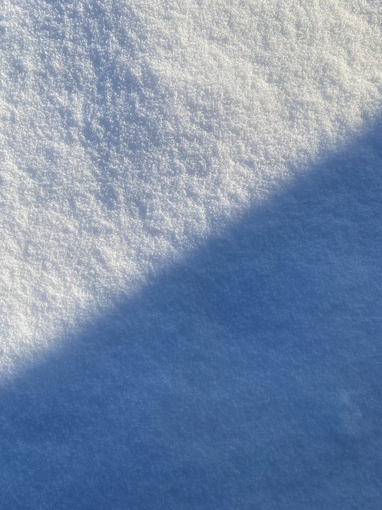
Understanding the yellowness of the snow perceived in contrast of the cool mauve shadows
ATMOSPHERIC research | Comments
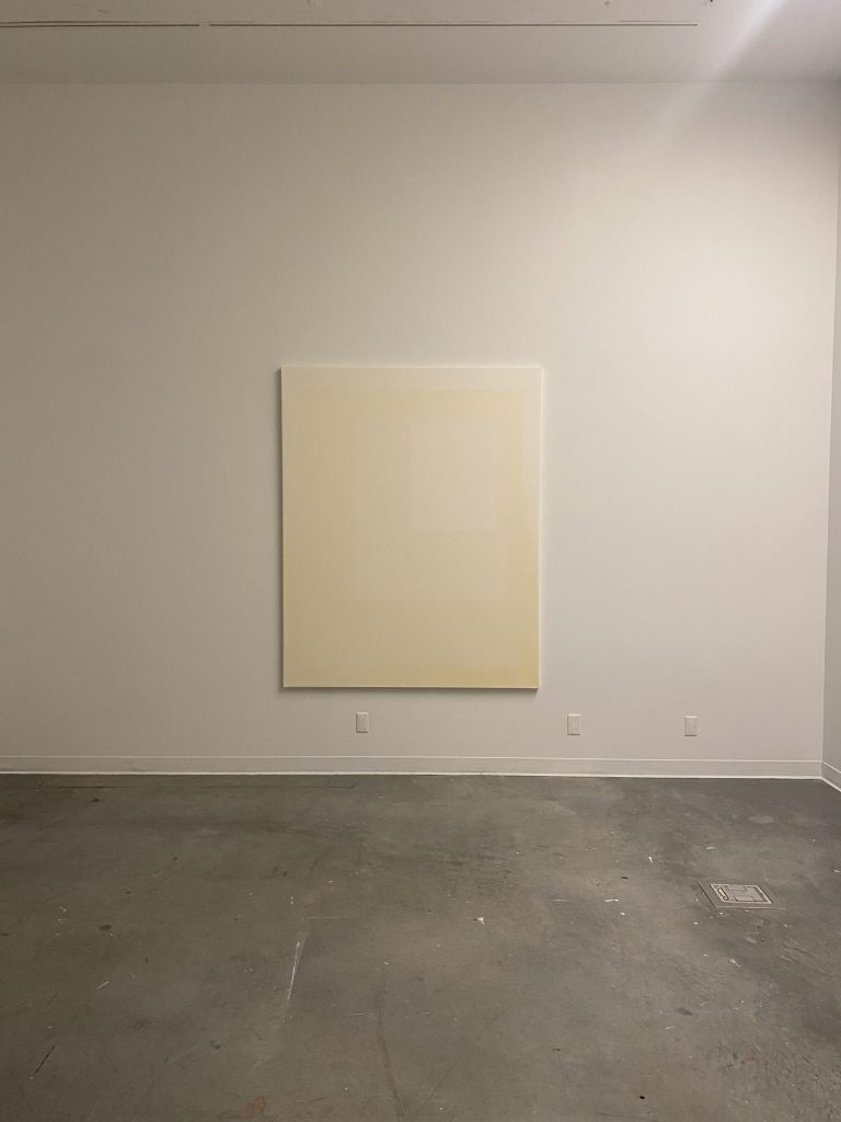
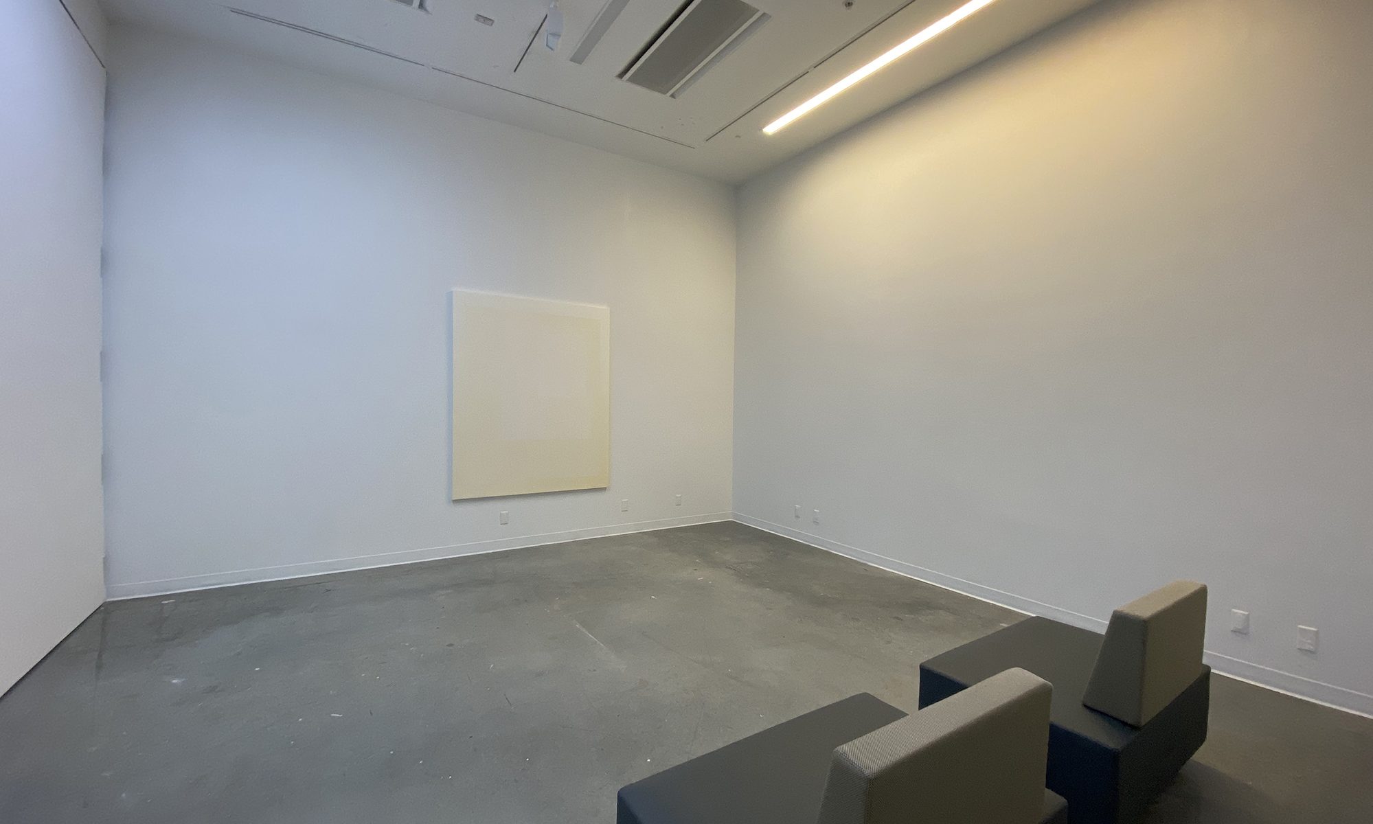
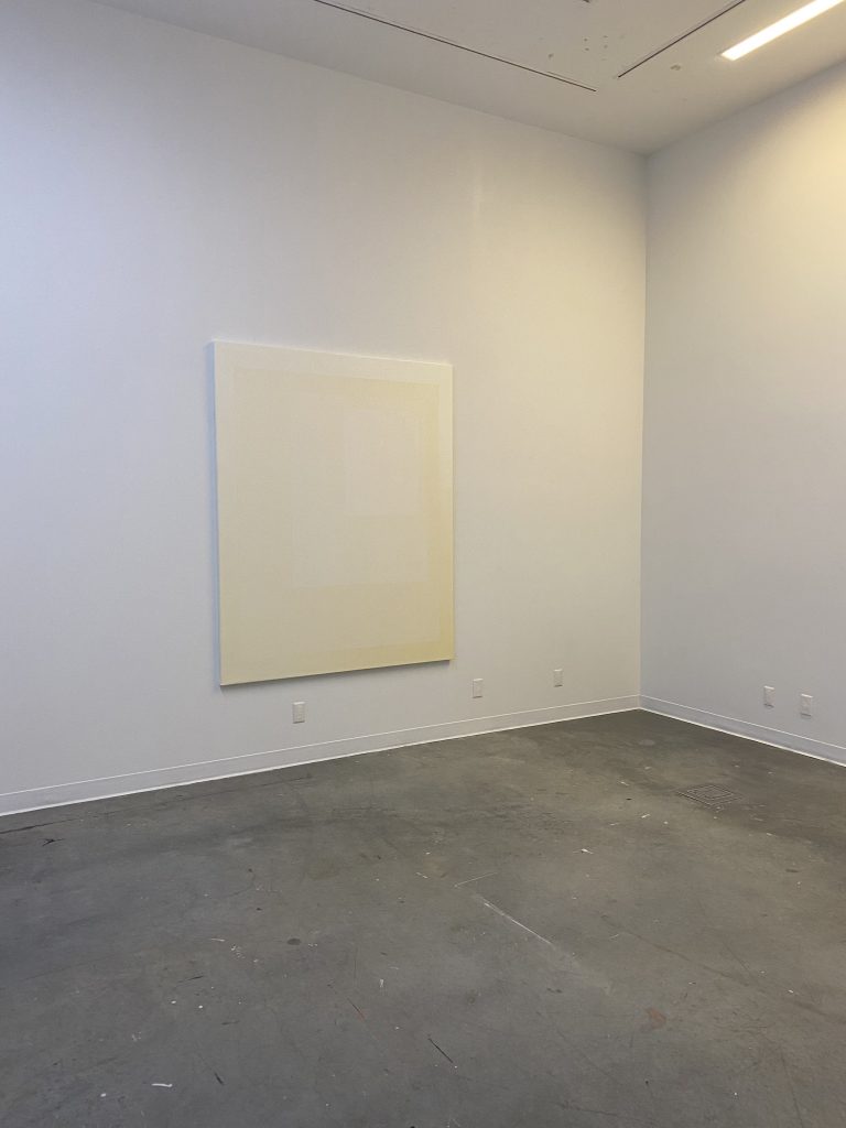
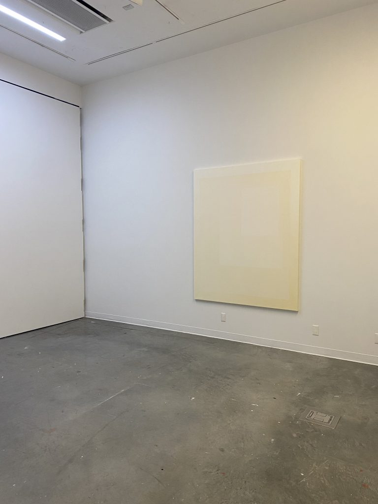
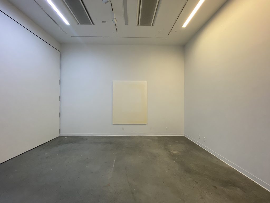
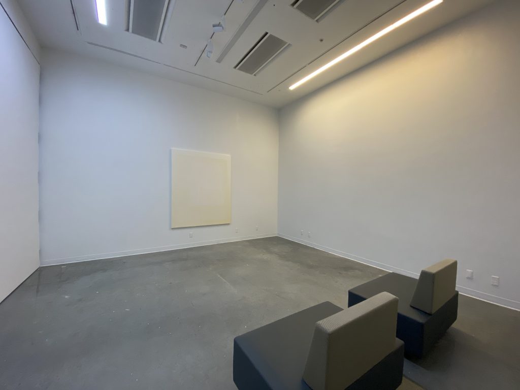
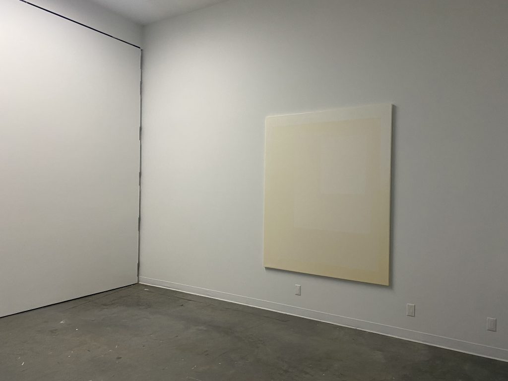
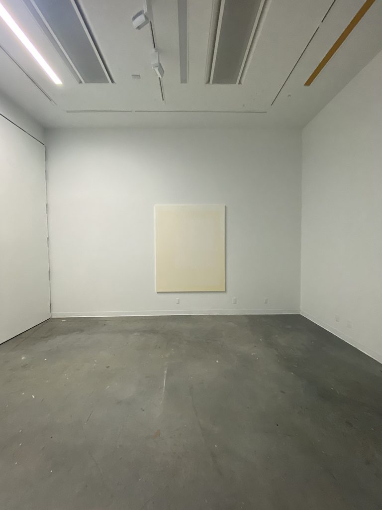
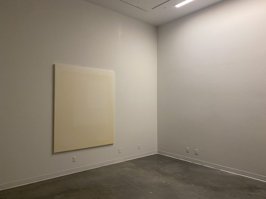
WHITE ELEMENT was my second installation using colour gels to alter the atmospheric ambiance of the gallery. For this installation, I wanted the painting to sit at the intersection of the cool and warm light. It was important for me to reproduced cool atmosphere of winter that appears warmer from the sun. Similar to what I had experience on that cold day in Magog. I couldn’t envision the painting living in any other lighting environment. With a certain sensitivity to colours I am deeply affected by light. I can easily identify the colour of the light and my level of comfort or discomfort is affected by it. On that day in Magog it was extremely cold outside at -32 degree and yet, the call to the outside was so strong because it was sunny and everything looks so crisp and inviting. When I went out at 3pm, I really had a feeling that it was warmer – from standing inside looking out – and yet the reality was far from my perception. It was my intention to attempt to recreate this atmospheric conundrum within the gallery space. I wanted the viewer to be able to physically navigate between the two different light condition and was curious to see how it would affect their perception and understanding of the painting.
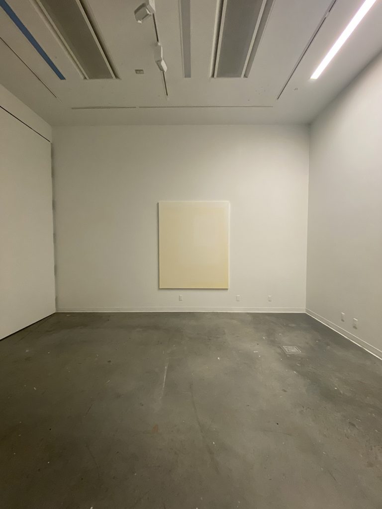
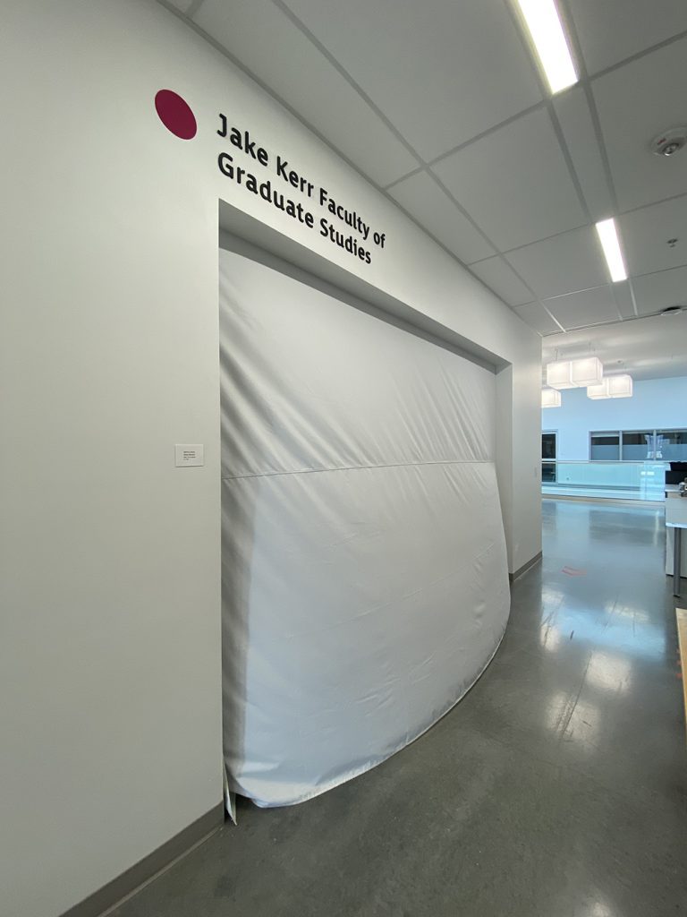
To reproduce this atmospheric impact, few elements came into play. First I needed to close the gallery space. The gallery has a fairly large entrance allowing for the corridor light to impact and create a pretty hard shadow on the west and east wall of the gallery. For Blue Element I had closed the opening with a piece of canvas. The canvas was pretty effective at blocking the light but yet, was not neutral. Because of the natural canvas colour, it brought a warm tone to the gallery which I didn’t want this time around. I wanted a more neutral tone that would not tint the ambiance. So I chose a white blackout curtain big enough to completely block the hallway light. The addition of the curtain had two impact. First it filtered the sound outside of the gallery creating a more cocooned effect. Second, it added privacy to the space emphasizing the ambiance of reverence created within the gallery space. The addition of two seats aligned with the painting at the farthest distance possible also added an intention for a pause, a break, or an invitation to take a moment to absorb the work. The fact that only one large painting was presented in the gallery made it obvious that the focus was it.
The Grad Gallery is equipped with two choices of light condition. Track lighting and LED neon stripes. Because I wanted the light to provided a wider and more diffuse cast, I chose to work with the LED stripes this time. The focus was to create and ambiance more than a projection of light. To emphasis the intersection between the two light spectrum, I used only the LED stripes that where located on the extremity of the painting, landing the cone of light more on the wall and allowing the intersection towards the center of the gallery. I wanted the warm light to sit on the right side of the painting. The artwork rectangle composition is gathered towards the right side and I wanted to aim towards warmth. On the left side of the painting I wanted the cool light to cast a cool mauve shadow and render the yellow side more visible. The stretcher I am using is fairly thin so the shadow it created is about 1 1/2″ all around. I didn’t want the atmospheric ambiance to be to visible and become theatrical. So I used at 1/4 warm and cool tone gel. Visually speaking when looking at the artwork, the impact was not too obvious. However, I wanted the impact on the viewer to be more noticeable as to bask him/her in the coloured light. So I saturated LED stripe above the viewer towards the back of the gallery by doubling the gels right above the viewing area. I also allowed some of the visitors to see the painting within only the blue or yellow light to help them understand what was going on.
Cool light only – hard to capture the light tone on a digital camera 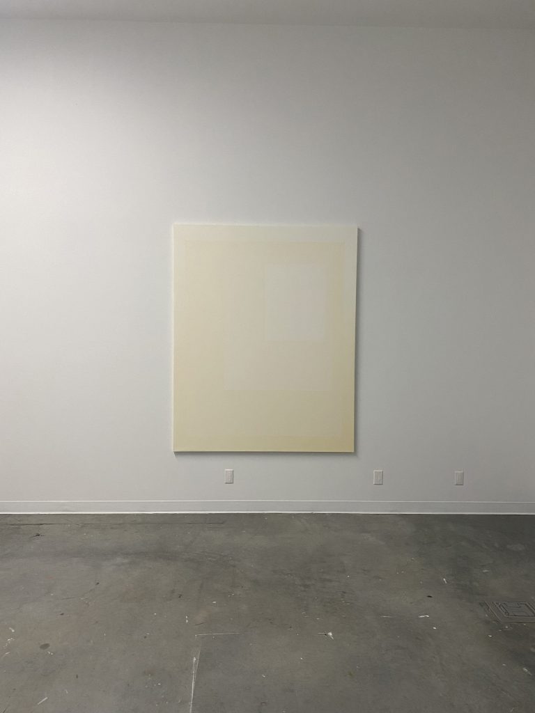
Warm light only – hard to capture the light tone on a digital camera