MARION LANDRY | Graduate Seminar II | April 27th, 2022
This paper seeks to address a recent shift towards a style of painting that takes in consideration the conditions of viewing and of perceiving. My thesis research initially focused on a desire to expand painting beyond the surface of the canvas to include the structural elements on which a painting is produced. At the time, I was interested in dismantling the hierarchy and unifying the elements used – such as painting studies and painted objects – as part of the painting process. To me these elements constituted the communities in which a painting had evolved, and I viewed them as equally important components. The first installation I presented for critique was assembled as a wall tableau and included a large-scale painting, six painting studies, as well as painted objects. After hours trying to adjust the tableau, I struggled to bring it to life. The gallery lighting worsened this condition by flattening the installation even more. The critiques I received from my cohort were similar, confirming that something needed to change. The lighting conditions and overall atmosphere of the gallery, I felt, needed adjustment to better support my paintings and intention. As a result, my focus began to turn towards a greater awareness of space. The physical environment of the gallery (that of Emily Carr University or Art + Design (ECU)), the pictorial space within my canvases, as well as one mental space needed to evolve and thrive.
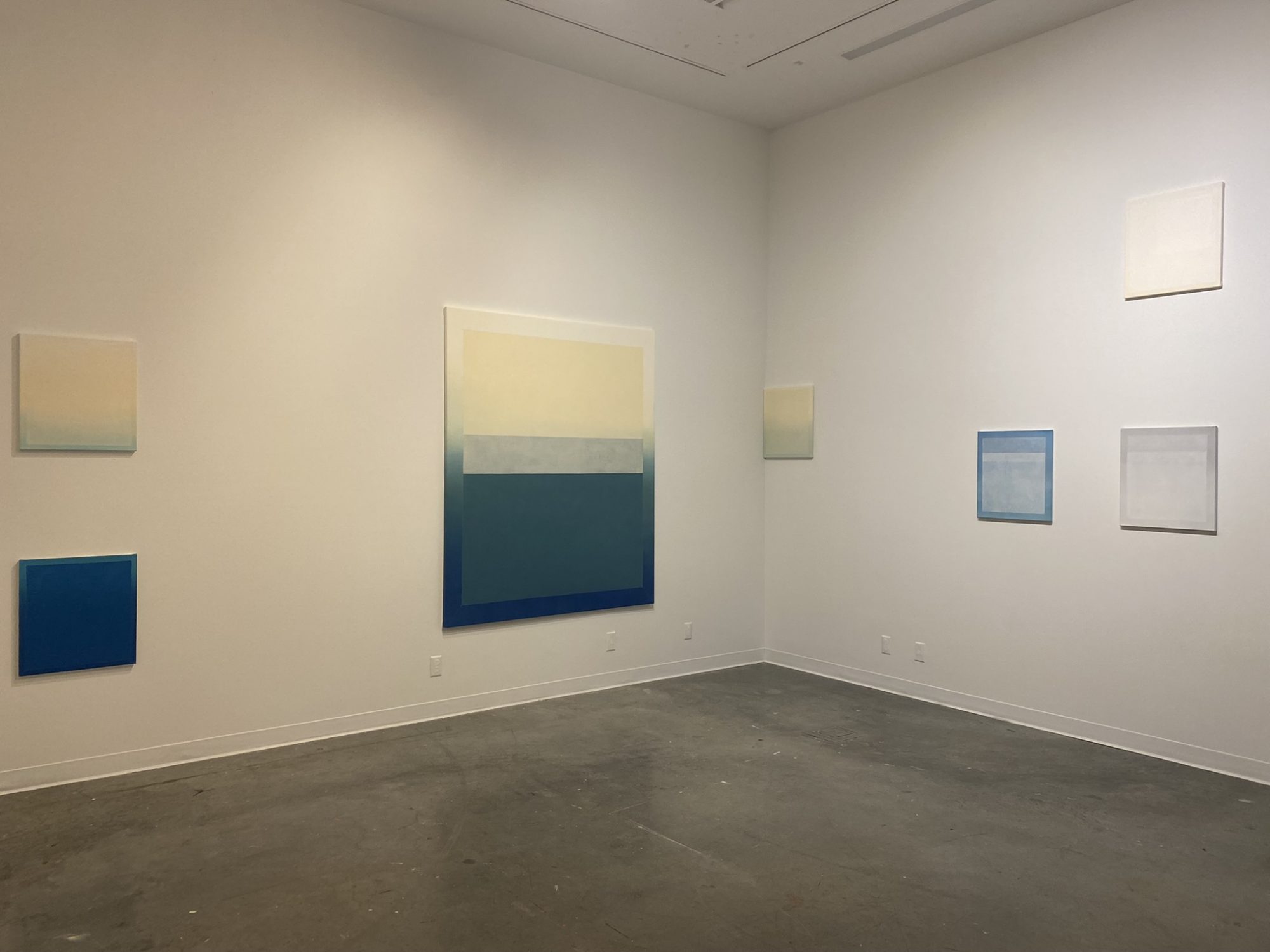
To expand on this recent shift towards the context of viewing, I will refer to one of my latest installations titled White Element (fig. 1). To me, this installation was the most successful at illustrating my recent research on tempering the atmospheric conditions of viewing and experiencing my paintings. To help situate my practice I will use reading references that have accompanied my research. It is also important to note that some visual references, ideas, and artistic influences that are ingrained within my practice are extensive and therefore outside of the scope of this paper.[1] For that reason, I have limited my references to the art and writings of Agnes Martin, Joseph Albers, and Robert Irwin.
To begin, I feel the need to expand on the conditions of producing and presenting work within the ECU campus. ECU is an institution that encourages experimentation both with our studio practice and our critical thinking and is an environment full of ideas, opinions, and points of view which are at times different than my own. As a result, my thinking has also needed time and space to adjust. Thinking is what is being asked of me in the context of the master’s program: intellectualizing the experience of painting in particular, a mindset that is elusive and challenging as I find most of it resides beyond language. My mind is a very dangerous place to be in as it obsessively worries about the past or the future. For me painting has always been a refuge: a pause from mental obsession and an escape that provides access to a different mode or aspect of thinking. A more present, calm, and intuitive state of mind emerges to greet me in this state. Agnes Martin refers to it as the “conscious mind”: the voice of the positive and the source of inspiration (Writings, 111-119). As my mind is being filled with new knowledge, ideas, and concepts, it begins to crave even more mental space and a kind of “unity”. It’s as if more ideas are not needed in this new environment but instead space is: space to absorb revealed concepts and allow meaning to take root within, as opposed to being consumed or used. It is not surprising to observe a shift in my work’s composition towards simpler geometrical forms such as the rectangle –as if my paintings could provide more space by offering a surface that is minimized of content.
My recent installation titled White Element is a good example of this recent shift in focus. It was installed in the grad Gallery, a generic white cube with a high ceiling and an arched doorway leading to the campus corridor. In using the space, I hung a single large-format painting on the back wall. The painting offers a simple geometrical form and a limited colour palette. The ground colour is painted with a gradient ranging from bone white to butter yellow tones. Painted as multiple layers, using the same colour as the gradient ground, it is an arrangement of three rectangles receding in size toward the top right corner signaling an ode to Joseph Albers’ Homage to the Square paintings.[2] Using a range of glossy and matte finishes, the rectangles either reflect or absorb the light, creating an illusion of depth. The otherwise generic ambiance of the gallery was altered using a mix of cool tones on the left side, and a warm tone on the right by affixing gels directly on the ceiling strip lights.[3] The lights cast warm and cool tones on both the painting and the walls of the gallery completely changing the space’s atmosphere. The painting was strategically positioned on the wall at the intersection of the cool and warm light. The visual impact on the painting was that the right side appeared warmer than the left side reproducing a gradient effect already present within the pigment of the painting. Two comfortable seats were installed at the back edge of the gallery with enough distance for the viewer to capture the entirety of the space. It is important to note that the light was intentionally more saturated above the sitting area in comparison to the more subdued effects around the painting. To limit light leaking from the archway entrance of the gallery, a white blackout curtain was installed which also served as a barrier for sound. Upon entering, the viewer needed a moment of adjustment, both for the eyes and the mind, as the atmosphere of the gallery greatly differed from that of the campus sealed from view.
The first impression was one of gentle perplexity; the painting was very minimal and felt vaporous in the space. The painting’s warm white tones appeared to expand to the walls of the gallery. What looked like a pale lavender shadow was cast on the left side of the painting while on the right side a more yellow shadow emerged. In contrast, the top edge of the canvas appeared to be glowing, creating a strong parallel to the atmospheric effect observed when sun is reflecting on snow, which was the inspiration for this piece. A sense of calm was felt in the gallery space as the viewer was invited to sit and contemplate. The perception of the painting continually shifted between surface and space offering a sense of time, or “mise en abyme” created by the recurring rectangular shapes.[4]
In that atmospheric context, my painting appeared completely stripped down of extra gestures and was mostly reduced to its core simplicity. It was meticulously crafted demanding a level of precision which made it appear minimal. I like when Martin describes her painting as being “about perfection” and not perfect.[5] This idea of perfection is something often perceived in my work, and yet, due to the free hand process used my work is far from perfect when one takes the time to observe it more closely. The geometrical shapes appear crisp and idealized. As such one would assume that they are produced with the help of tape. At closer range one can see that each shape and line are instead drawn and painted free hand. Measurement marks reveal information about the hand drawing process of the grid as well as the structural work needed to render my geometrical shapes. The grid itself, which is acting as an anchor to a 2D dimensional space at close range, easily disappears with distance from the piece.[6]
This semester my reductive palette consisted mainly of white hues, which introduced an additional challenge to my painting process. In order to truly “see” colour, contrast is needed, so when building the multiple layers of geometrical shapes that are painted with the same colours, it’s impossible to see what you are painting. To solve this challenge, I had to rely on the glossiness of the wet medium contrasting against the dried layer underneath, and the only way to see a glossy surface lies in its capacity to reflect light. My Industrial Street studio is equipped with a series of south facing windows which allow natural light to penetrate freely and abundantly. This greatly aids in this process. It has also brought a different understanding and awareness with how it alters the perception of my painting – mainly at the colour level – but also within the atmospheric and psychological impact it has on me. The sun tends to alter the overall tonality of the piece, but beyond that it also affects how I feel in the space and therefore perceive the work. The atmosphere, in this sense, acts as a filter to perception.
My sense of light and space is strongly informed by a parallel career as a 3D Architecture Visualization Specialist. I spent two decades in the virtual world bringing life to digital architecture to help tell a story about its design. In the virtual world, I became quite efficient at using lights to produce atmospheric impact, emotion, and meaning to a world that is completely devoid of such conditions. When experiencing a room, I have an acute awareness of the conditions offered both by the architecture of the space and the atmosphere created by its lighting. The campus is a LEED Gold certificate building, so it focuses on good quality daylight penetration which is extremely satisfying on sunny days. However, the reality of Vancouver weather is that the campus is mostly experienced under artificial light conditions. In all the common areas, including most of the gallery spaces, the lights are digitally controlled to achieve cost efficiency irrelevant of their atmospheric impact or artistic merits. The LED ceiling mounted light strip installed across the campus might work well in an office, but for an art school it’s an unappealing solution. It produces a flat greenish brightness that imposes itself on every corner creating a flat brightness that is unartistic and flattens any artwork viewed in it. We can recall here my experience with my first installation in the Grad Gallery where the dull atmospheric impact flattened the work and robbed it of life and depth. As Robert Irwin describes, “Circumstance, of course, encompasses all the conditions, qualities, and consequences making up the real context of your being in the world. “(Circumstances, 181) With a sensitivity to light and extensive virtual experience manipulating such conditions, it is not surprising that I turned my attention towards lighting of the gallery and its potential impact on my work.
What is becoming more apparent to me is my desire to alter the atmosphere for the viewer and the work to better control how my paintings are perceived. It is my intention to create an experience that involves more of the senses and leans towards haptic perception.[7] I can draw strong parallels with my experience of painting – an action that helps me transition into a state of presence and intuition – and my desire to provide a transformative experience for viewing. I believe that this style of installation offers a chance to become more aware of the conditions of the space, and perhaps to the self while perceiving, within it. Robert Irwin alludes to this idea in his work by stating that “it has the potential to make you more aware” (Circumstances, 181). This is something I also hope comes through in my installations.
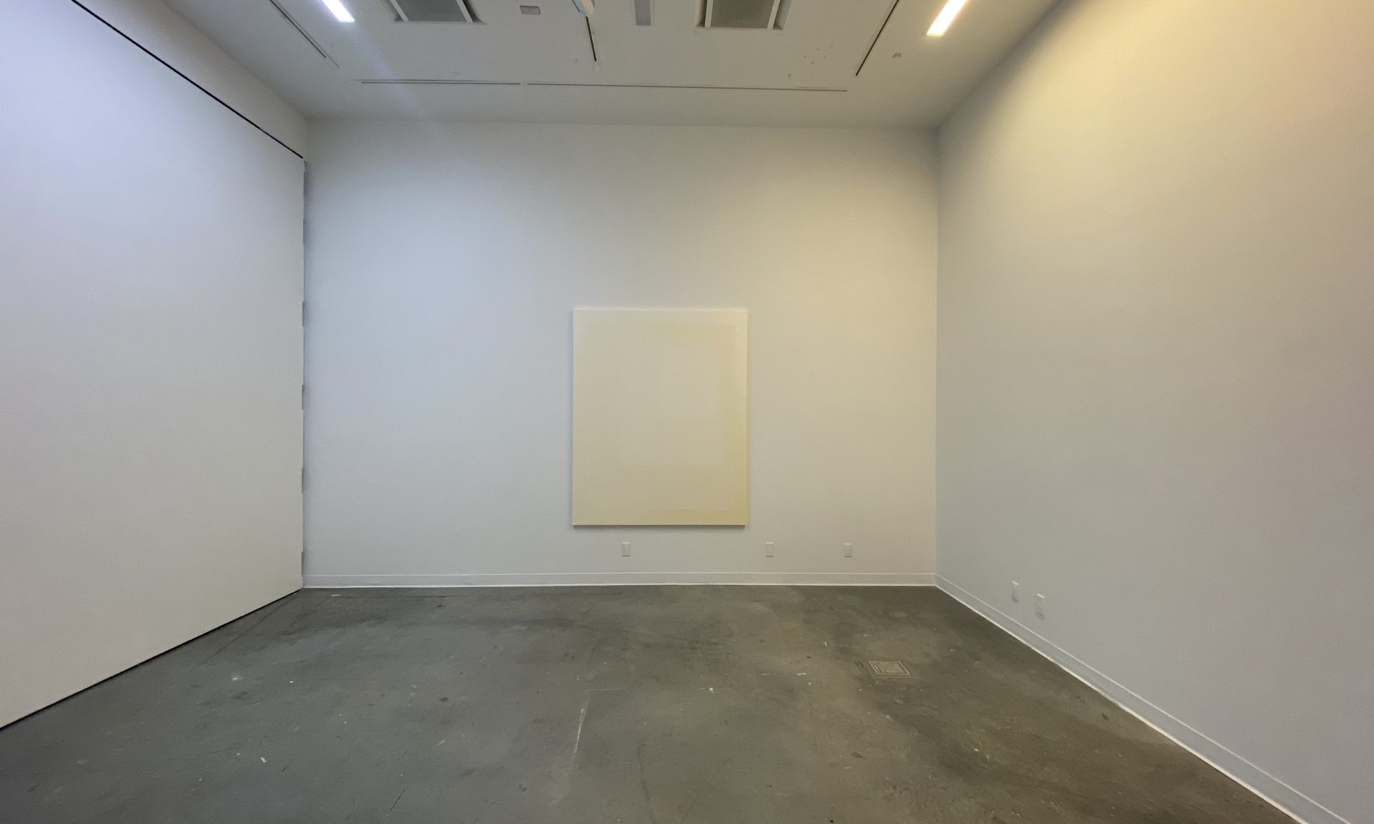
The painting I will be presenting for my last critique of the term, titled Diamond Dust, attempts to do exactly that. It was created as a direct response to the architectural conditions of the Senior Studio (B4130). On sunny days the studio is completely basked by natural light entering from the floor-to-ceiling windows located on the south side of the room (note these are the same conditions found in my Industrial Street studio). As a result, the atmosphere of the room feels bright, warm, and welcoming making it the perfect context to show my work. A beautiful dance of light and shadows is performed and projected on the walls of the room as the earth rotates, while orbiting around the sun. The painting sits in the middle of this natural performance being framed, changed, and animated by the sun. I am looking forward to learning more about the impact – both physical and psychological – it will have on the audience during my upcoming critique.
Marion Landry
[1] Although this paper does not expand on all the artists that have influenced my work, it is important to note that the historical work of the loosely affiliated group of artists referred as the Light and Space movement has been the focus for this term. Mainly the work of Robert Irwin, James Turrell, Peter Alexander, Helen Pashgian, Larry Bell, and Marie Corse as well as Olafur Eliasson a contemporary artist inspired by this pioneer art movement. The Montreal movement referred to as the Plasticiens and post-Plasticiens have also sustained and influenced my interests with geometric abstraction and are part of the lineage from which I identify. Notably the work of Guido Molinari, Denis Juneau, Yves Gaucher and If I am permitted to include within that movement the later work of Francoise Sullivan. These artists favoured a formal vocabulary of geometric abstraction, hard-edge surfaces and compositions that tended toward a subtle balance between volumes and spaces which can be easily referenced in my work.
[2] Albers produced about 2,000 iterations of the same square arrangement in his Homage to the Square series. The series investigates the interaction of colours with one another, adjusting hue, tone, and intensity to explore optical effects. In his writings of the period Albers also examined the psychological effect of such optical experiences on the viewer. Albers’s extensive exploration of colour and form was accompanied in 1963 by his book Interaction of Color. The book offers “an experimental way of studying color and of teaching color” in which Albers emphasises the practical exploration of colour above any theoretical concerns (Albers, 1). For Albers, working with colour was about engaging with materials in a subjective manner: “as we begin principally with the material, color itself, and its action and interaction as registered in our minds, we practice first and mainly a study of ourselves” (Albers, 52).
[3] Important to note that all my installations that involved lighting have been executed in collaboration with Alexine McLeod a Vancouver artist. Our shared interests with embodied perception and the use of atmospheric lighting in our work have sustained our interests since we both graduated from ECU with our BFA (2016).
[4] The concept of “mise en abyme” was introduced to me by Paul Mathieu during a studio visit and one I want to research further. For now, my understanding of it is of being a formal technique of placing an image within an image, often in a way that suggests an infinitely recurring sequence such as those observed in mirror objects.
[5] Glimcher quotes Martin on perfection: “I paint about perfection that transcends what you see – the perfection that only exists in awareness” (Remembrances 71).
[6] In her article titled “Grids”, Rosalind Kraus expands on the two functions of the grid: spatial and temporal. I find insightful her statement about the grid model “The grid capacity to serve as a paradigm or model for the antidevelopmental, the antinarrative, the antihistorical.”
[7] I was introduced to the concept of haptic perception when reading The Eyes of the Skin. In his book Juhani Pallasmaa argues for an elevated appreciation of the sense of touch. He also argues that the sense of touch is fused to visual perception when he states that “Even visual perceptions are fused and integrated into the haptic continuum of the self; my body remembers who I am and where I am located in the world.” (84)