米 (mǐ) is the Chinese character for uncooked rice

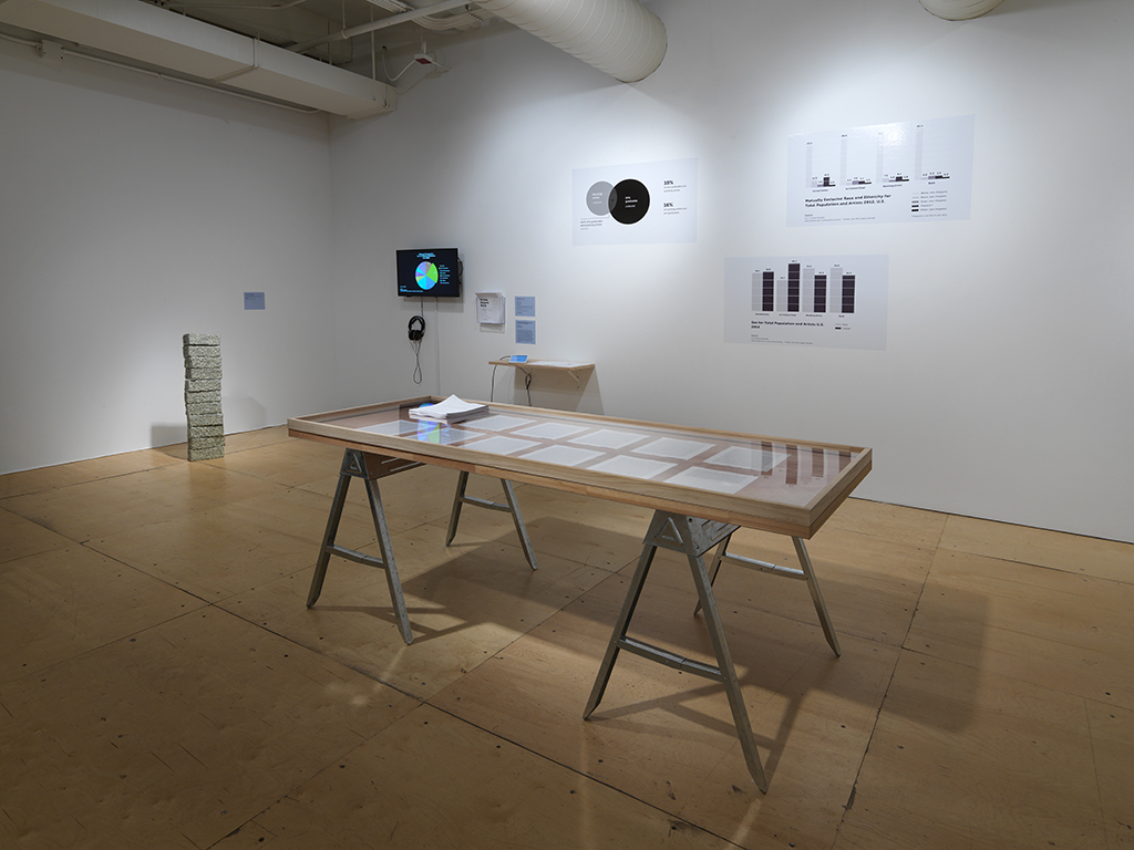
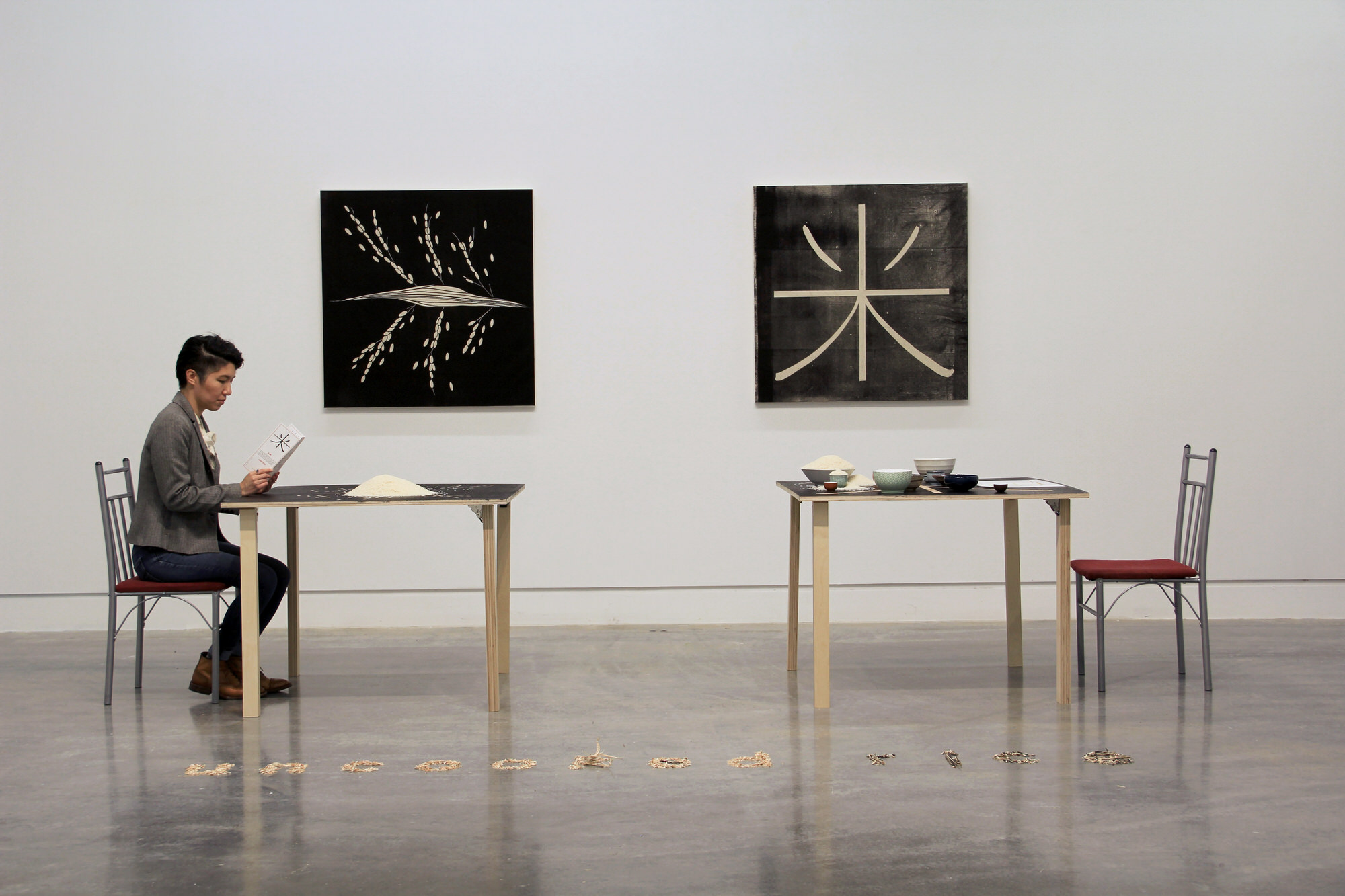
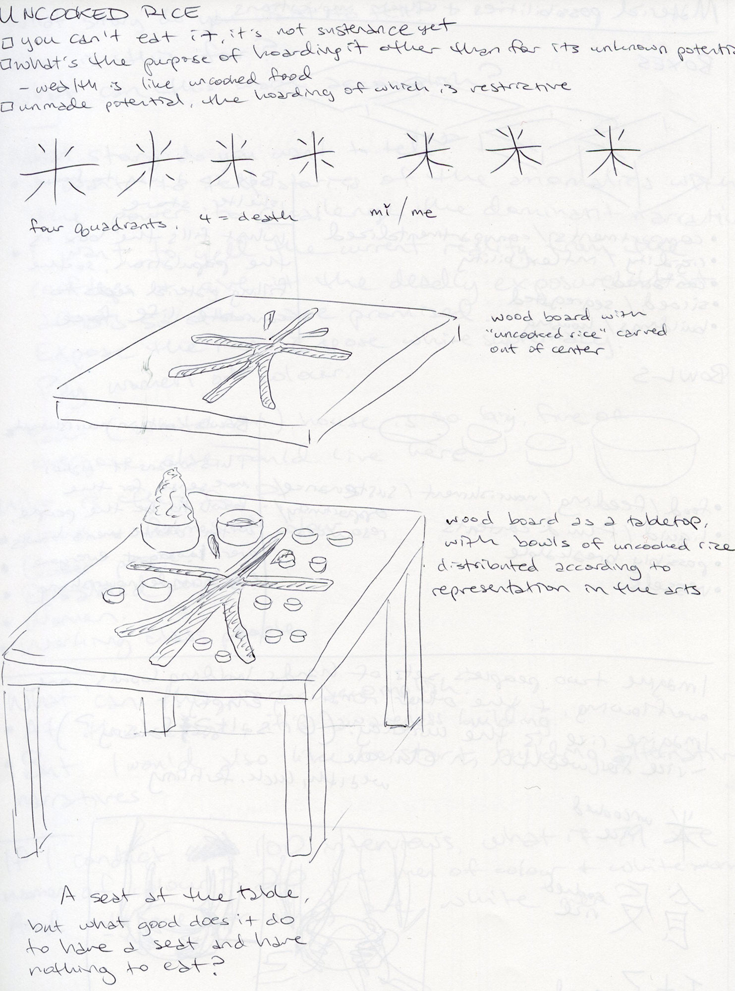
Below is the concept sketch of my art installation, mǐ / uncooked rice.

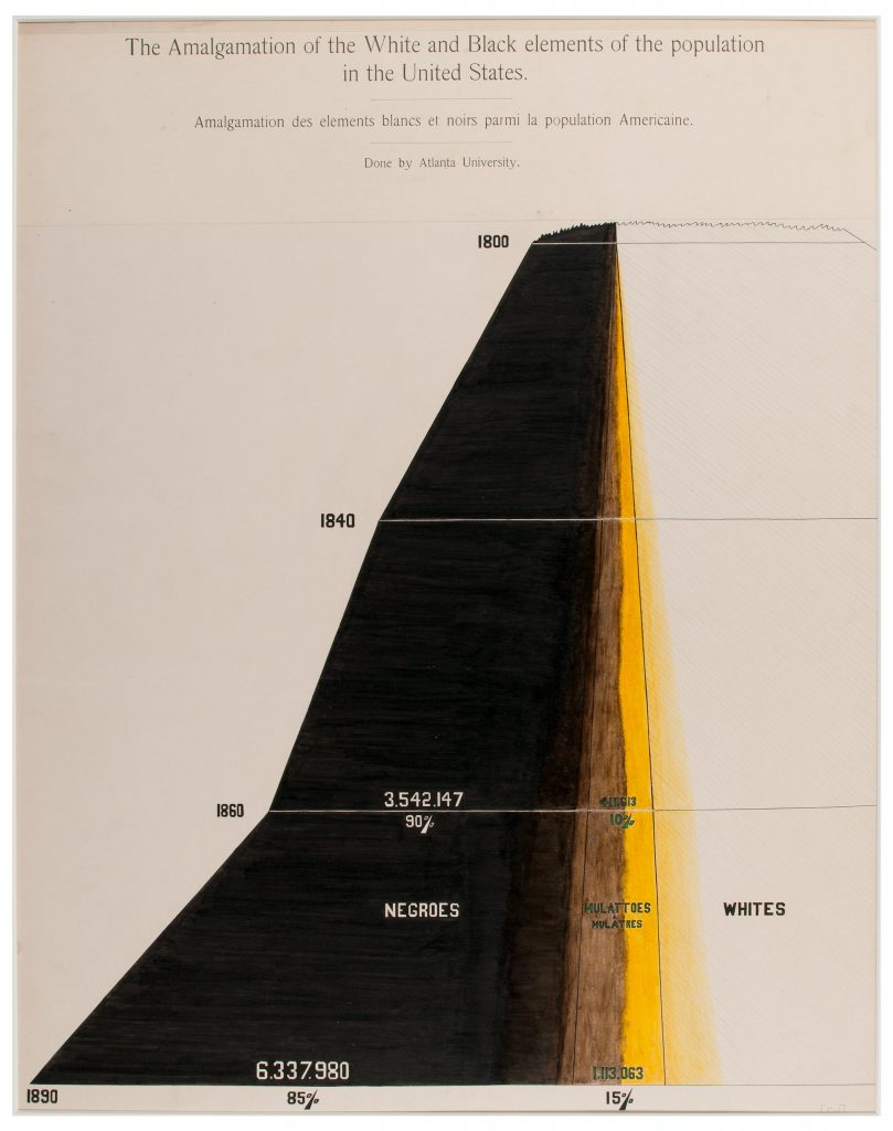
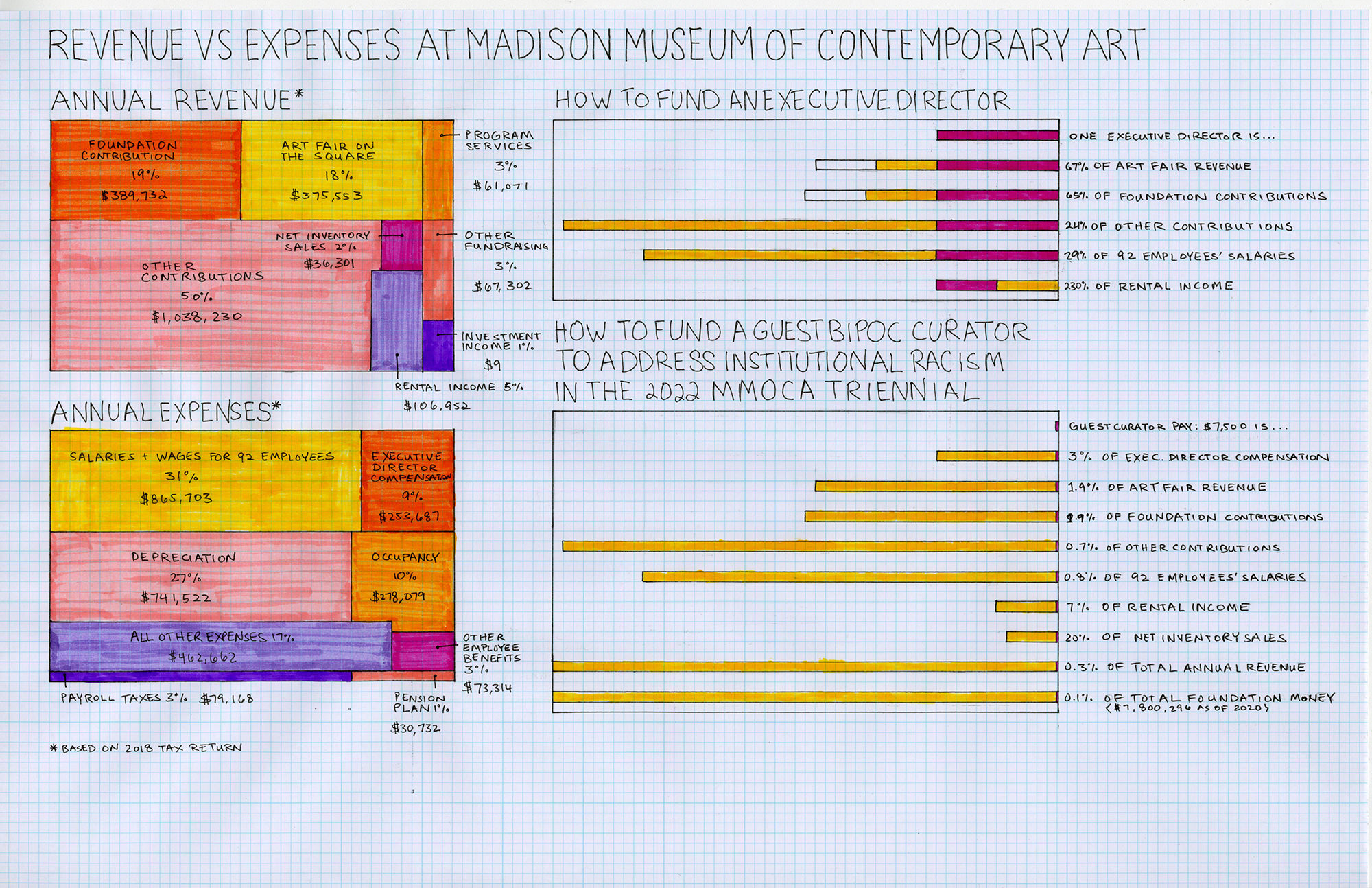
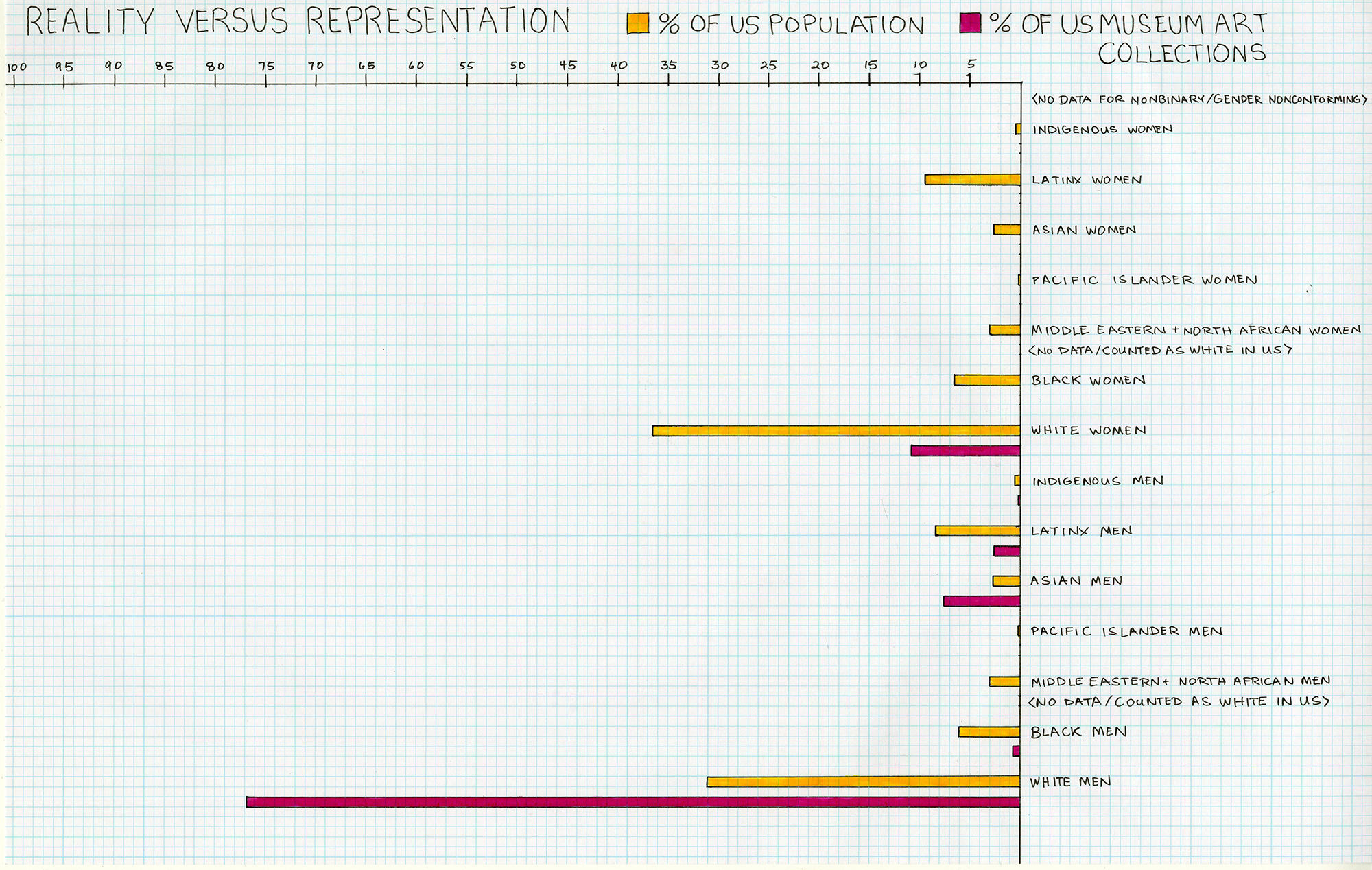
I have collected a great deal of data on disparities over the years, and as I explore data visualizations in my work, I am contending with this tension: When people share data and statistics, their goal is to prompt some kind of emotional reaction. Surprise. Shock. Rage. A desire to take action. But the visual representations of data tend to be cold and analytical, even if they are beautifully designed. We seem to want numbers to be objective and unbiased, but they are not, and our use of them is highly subjective and biased. I am embarking on an investigation of how to depict data in a way that is emotional and personal, starting with my formative experiences growing up in my family’s Chinese takeout restaurant.

Concept sketch for mǐ / uncooked rice, an art installation.
mǐ / uncooked rice will physically illustrate the data contained in this chart of the US population versus representation of artists in US museums.

A note on using multiple languages: As an Asian American woman, daughter of immigrants who grew up in rural Kansas, former educator in the underfunded Milwaukee public school system, former project manager in the white male dominated industry of manufacturing, and artist-entrepreneur who communicates between the arts and clients in other industries, I am well accustomed to code switching.

This is the irony of cultural assimilation. I spoke exclusively in Chinese and some Taiwanese until I was 3-4 years old. When I started preschool at age 3, the other children made fun of how I spoke, so as soon as I started learning English, I told my parents I no longer wanted to speak Chinese at home. The pressure of cultural assimilation was for someone like me to speak exclusively in the English language. But the long-term reality of assimilation is that I will be translating between communication strategies for the rest of my life.

In the context of data visualization, I wonder, how will the way data is represented change how people perceive and interact with it? When it is propagandistic? When it is personal?

How many times will I have to translate this information before you, the viewer, believe what I am telling you?

Exploring Data Visualizations

On a broad level, I am investigating potential countermeasures to arts-based gentrification. Specifically, I am currently looking at representation and compensation of women of colour artists, one of the most excluded groups in the arts industry, and what their access to cultural and economic power entails for the future of the arts and city development.

Jenie Gao’s poster, Do women have to be white to get into the Met. Museum?, on arts representation in 2021, following up on the 1989 Guerrilla Girls poster
Jenie’s hand drawn bar graph of US population versus US museum representation. Click image to view larger.

I am working with drawings, prints, and data presentation. My material interests include:

  1. Reproducible, distributable items like postcards, prints, and maps / tools for guidance.
  2. Large-scale works like projections, installation, and billboards to take over public space.

I come from a strong technical background. I enjoy creating beautiful things and images as vehicles for emotion and action. I am pondering, how do I develop an aesthetic language for this work that feels genuine to me? I am referencing examples of how others have presented data, like W.E.B. DuBois’ data portraits of Black America, and Susan Jahoda / BFAMFAPhD’s criticism of the academic-industrial complex, in which nothing can finally be paid off.

BFAMFAPhD’s installation, in which nothing can finally be paid off.
W.E.B. DuBois’ data portraits of Black America

In her Art News article, What Can We Learn from Institutional Critique?, Aruna D’Souza writes, “Is the goal to make institutions ‘better,’ more responsive to social concern…models for a just society? Is the goal dismantling institutions in general? …Does institutional critique even have a politics and theory of change?” This quote articulates my concern—to what end is this for? My work can function across contexts, in the gallery or the community centre or public space, but long-term success relies on becoming a part of mainstream solutions. Ta-Nehisi Coates’ essay, The Case for Reparations, was once criticized and is now discussed in the US Congress. To sustain, what was unrecognized must enter society’s framework of comprehension. So the ideal contexts for my art are those that enable it to connect with public awareness and lay the groundwork to connect with future policymaking.

How do I develop an aesthetic language to carry this information? How do I make room for personal exploration, particularly as an AAPI woman living in a majority Asian [diasporic] city for the first time? Coming from the US, what makes this work and research relevant in Canada? What funding and partnerships do I need to build to scale research efforts and grow this work?

Jenie’s hand drawn graphs of Madison Museum of Contemporary Art’s annual revenue versus expenses. Where does the money go, to what and to whom? Click image to view larger.

Final Notes

When I created the Instagram handle @paywomenofcolor, Instagram immediately flagged and deactivated the account before it ever went live. I submitted an appeal for Instagram to reactivate the account. Below are screenshots of the email Instagram sent me on how to appeal to have my account returned to me, a process that required me to literally dox myself and submit a mug shot. They never released the Instagram account.