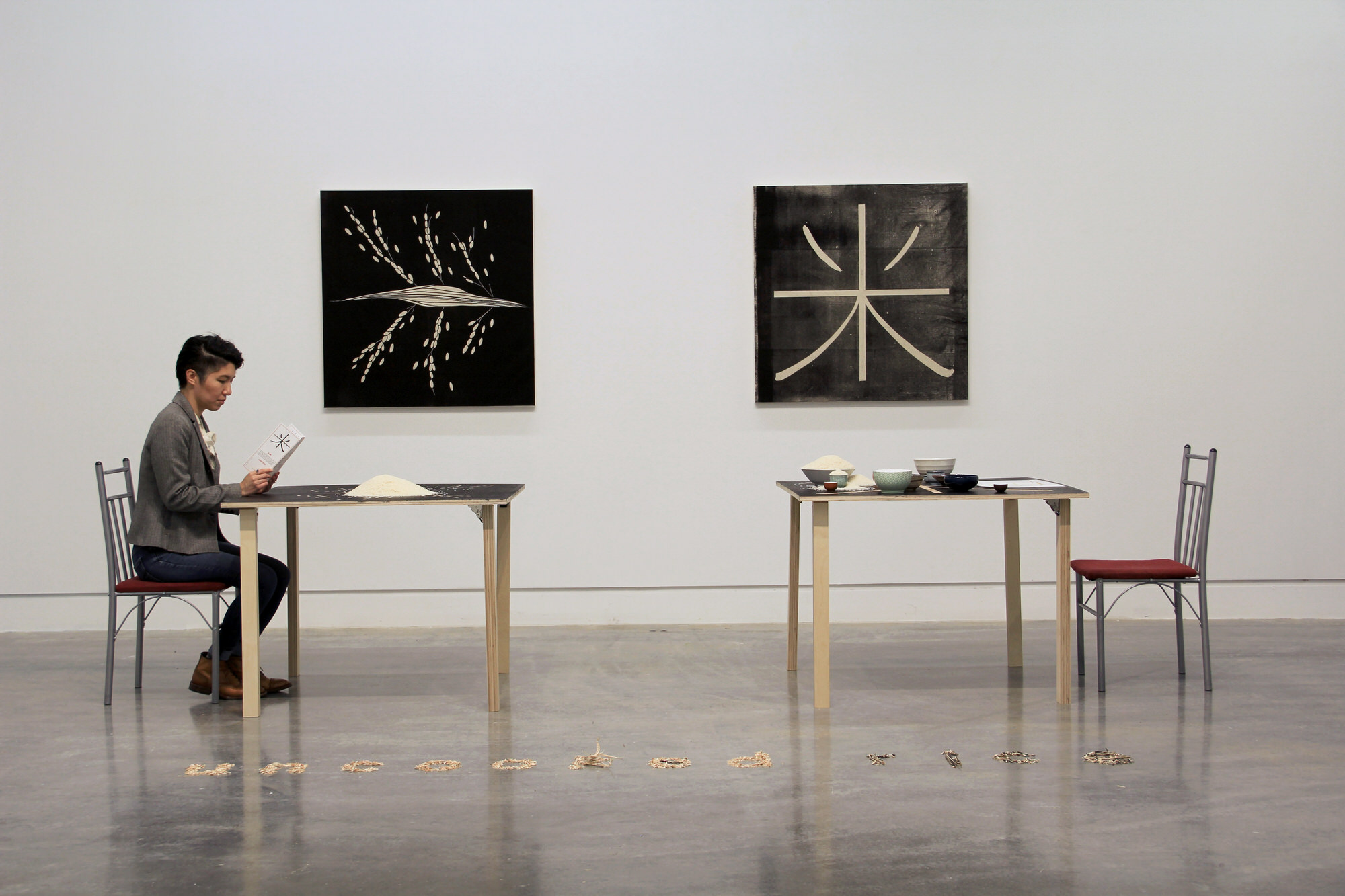
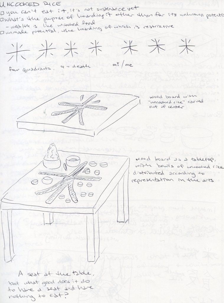
Below is the concept sketch of my art installation, mǐ / uncooked rice.
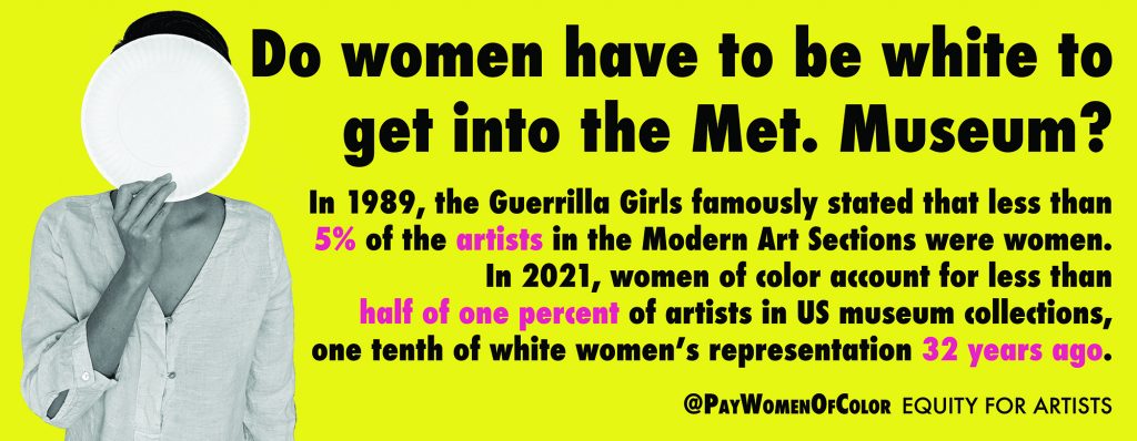
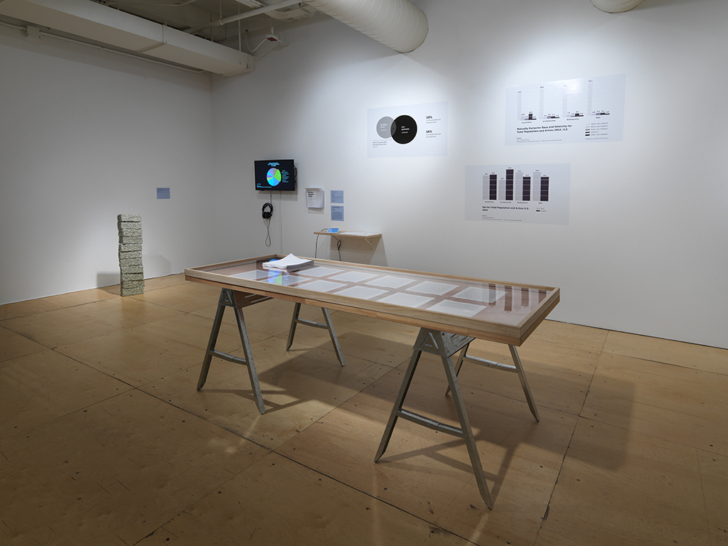
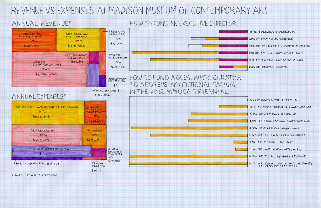
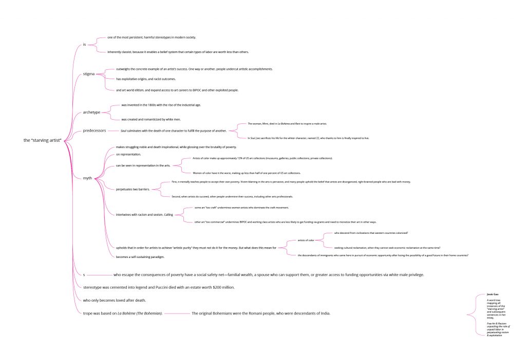
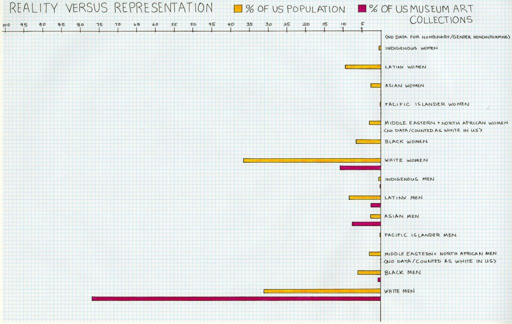
I have collected a great deal of data on disparities over the years, and as I explore data visualizations in my work, I am contending with this tension: When people share data and statistics, their goal is to prompt some kind of emotional reaction. Surprise. Shock. Rage. A desire to take action. But the visual representations of data tend to be cold and analytical, even if they are beautifully designed. We seem to want numbers to be objective and unbiased, but they are not, and our use of them is highly subjective and biased. I am embarking on an investigation of how to depict data in a way that is emotional and personal, starting with my formative experiences growing up in my family’s Chinese takeout restaurant.
A note on using multiple languages: As an Asian American woman, daughter of immigrants who grew up in rural Kansas, former educator in the underfunded Milwaukee public school system, former project manager in the white male dominated industry of manufacturing, and artist-entrepreneur who communicates between the arts and clients in other industries, I am well accustomed to code switching.
This is the irony of cultural assimilation. I spoke exclusively in Chinese and some Taiwanese until I was 3-4 years old. When I started preschool at age 3, the other children made fun of how I spoke, so as soon as I started learning English, I told my parents I no longer wanted to speak Chinese at home. The pressure of cultural assimilation was for someone like me to speak exclusively in the English language. But the long-term reality of assimilation is that I will be translating between communication strategies for the rest of my life.
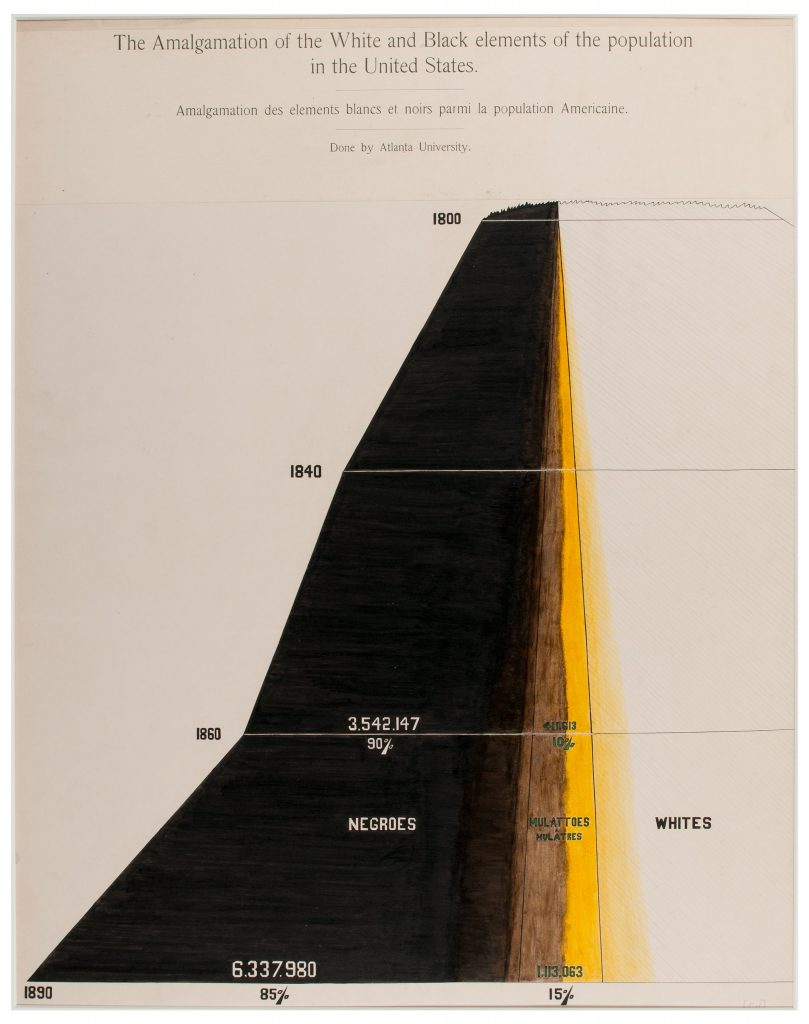
In the context of data visualization, I wonder, how will the way data is represented change how people perceive and interact with it? When it is propagandistic? When it is personal?
How many times will I have to translate this information before you, the viewer, believe what I am telling you?
