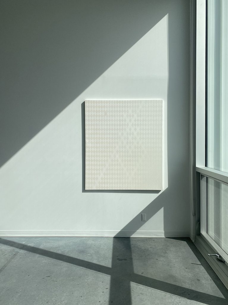
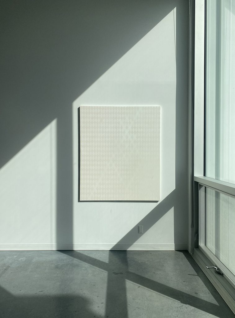
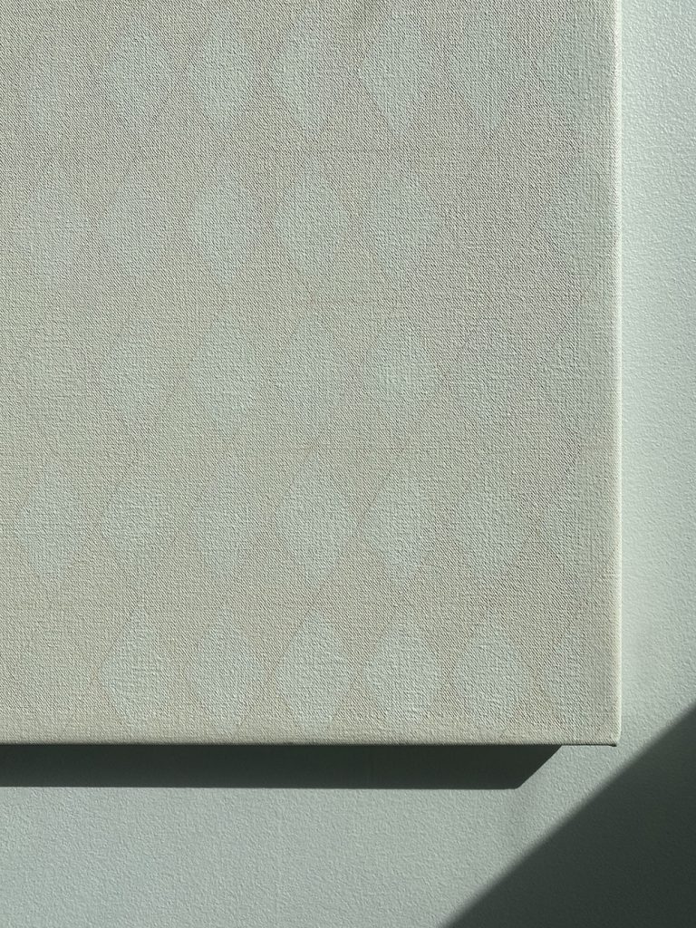
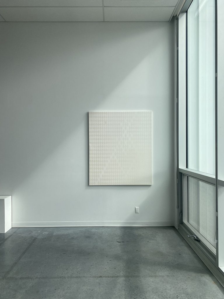
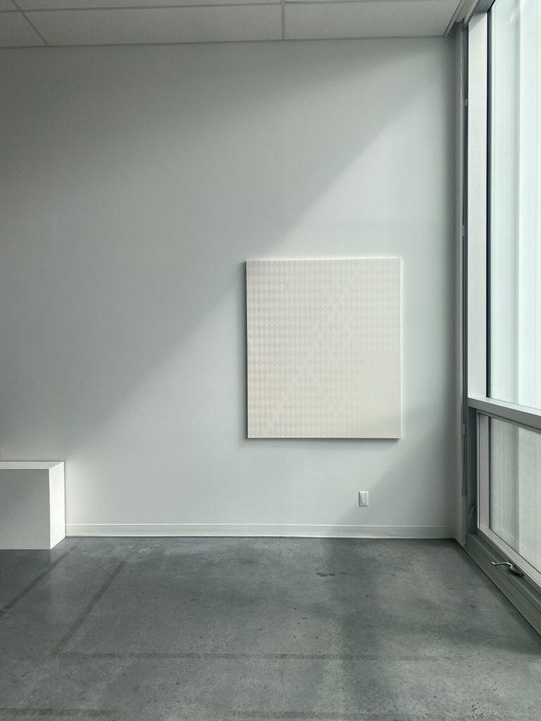
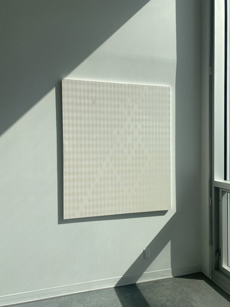
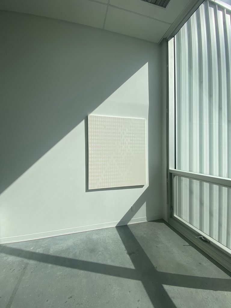
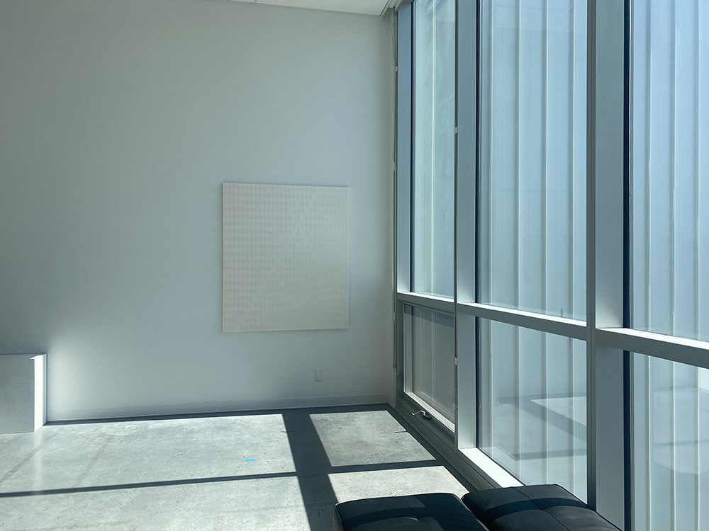
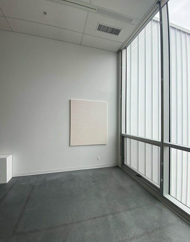
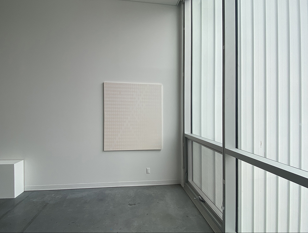
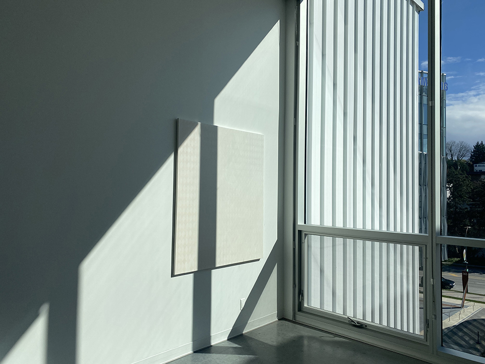
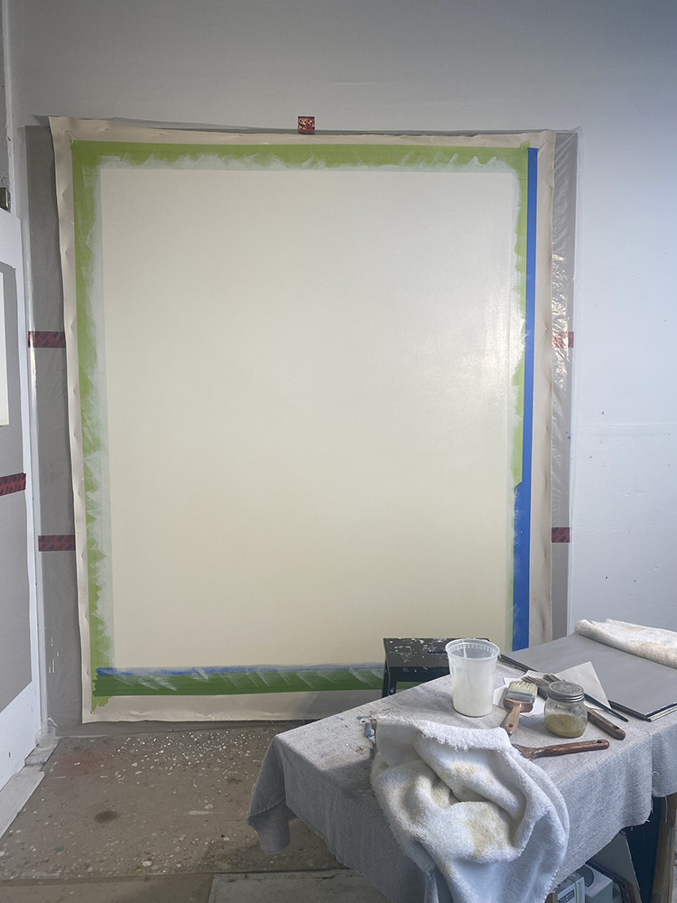
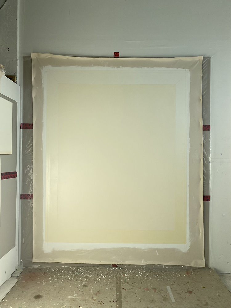
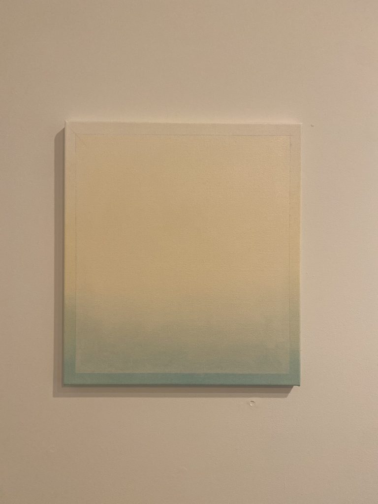
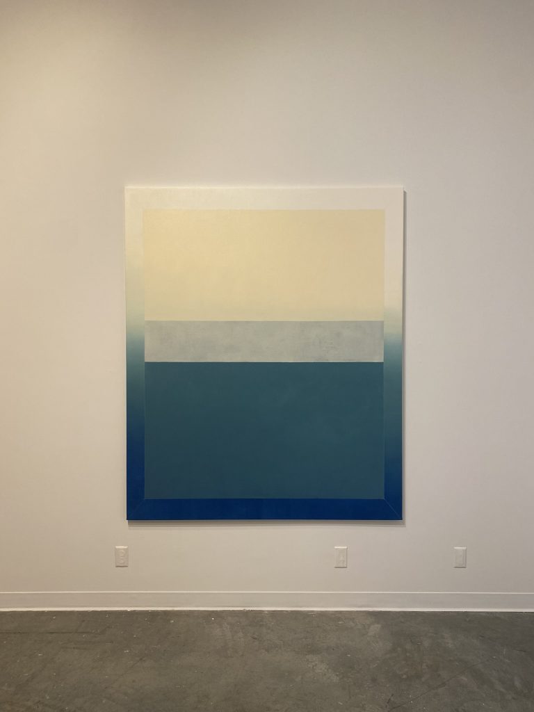
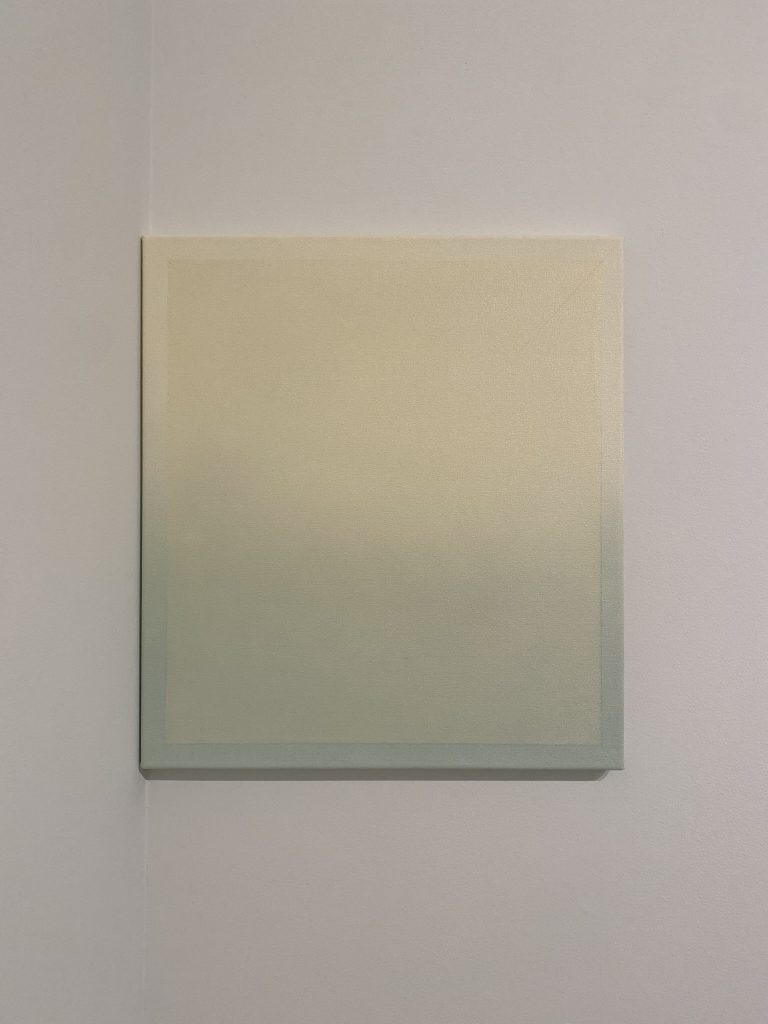
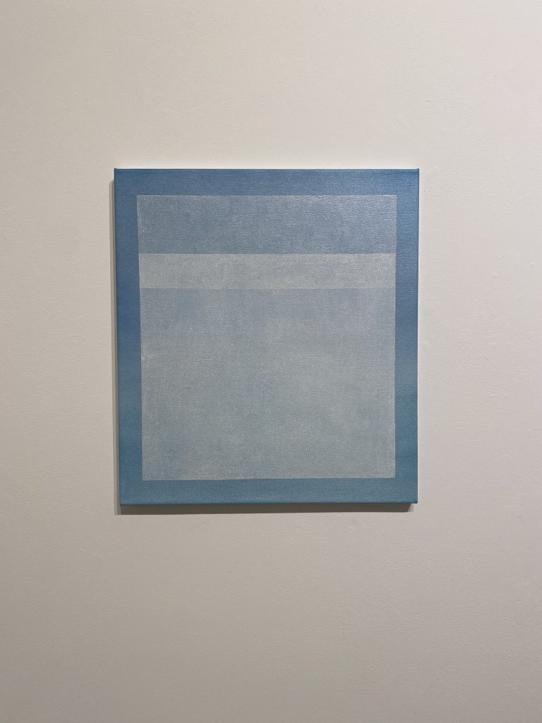
9 Elements| Summer research project 2022 | Documentation

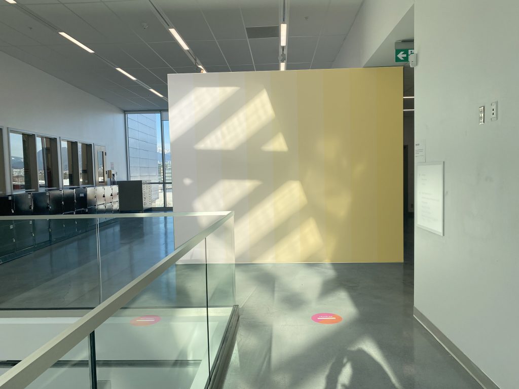
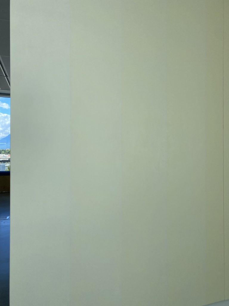
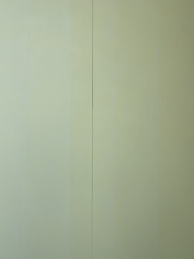
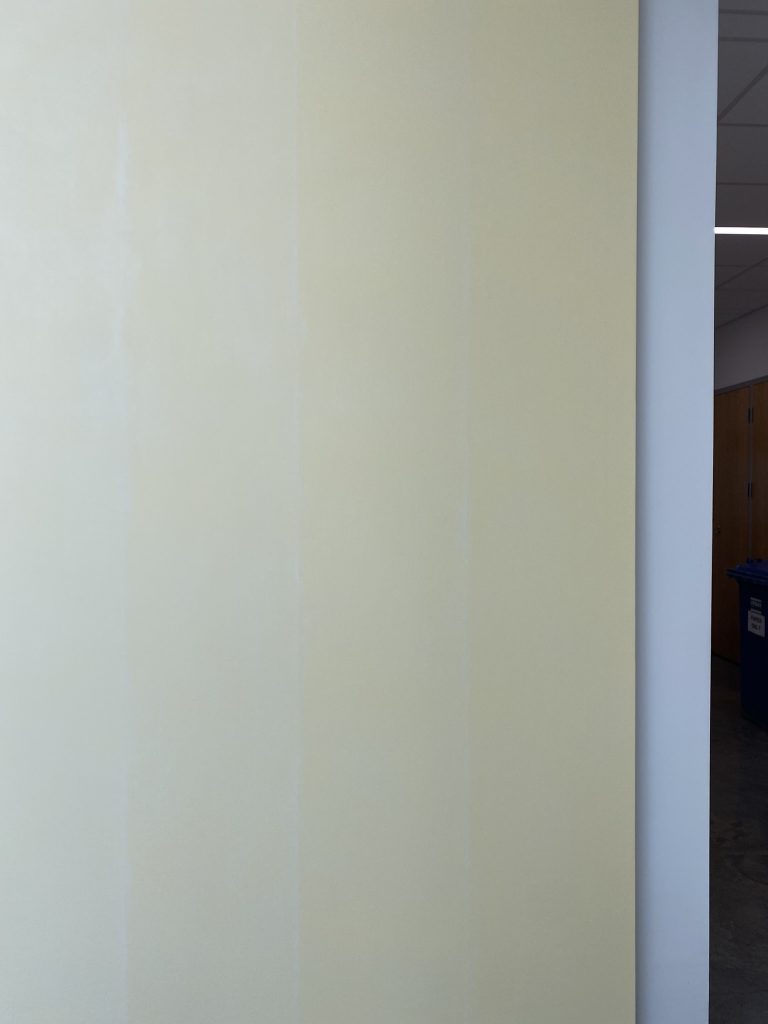
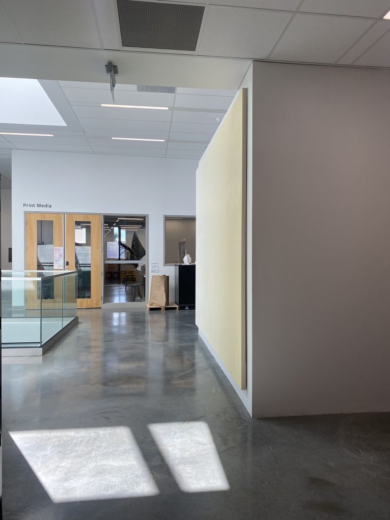
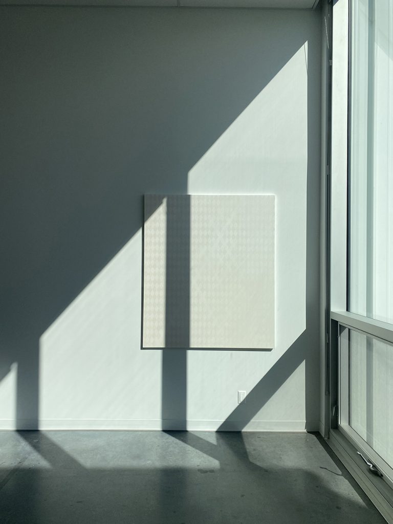
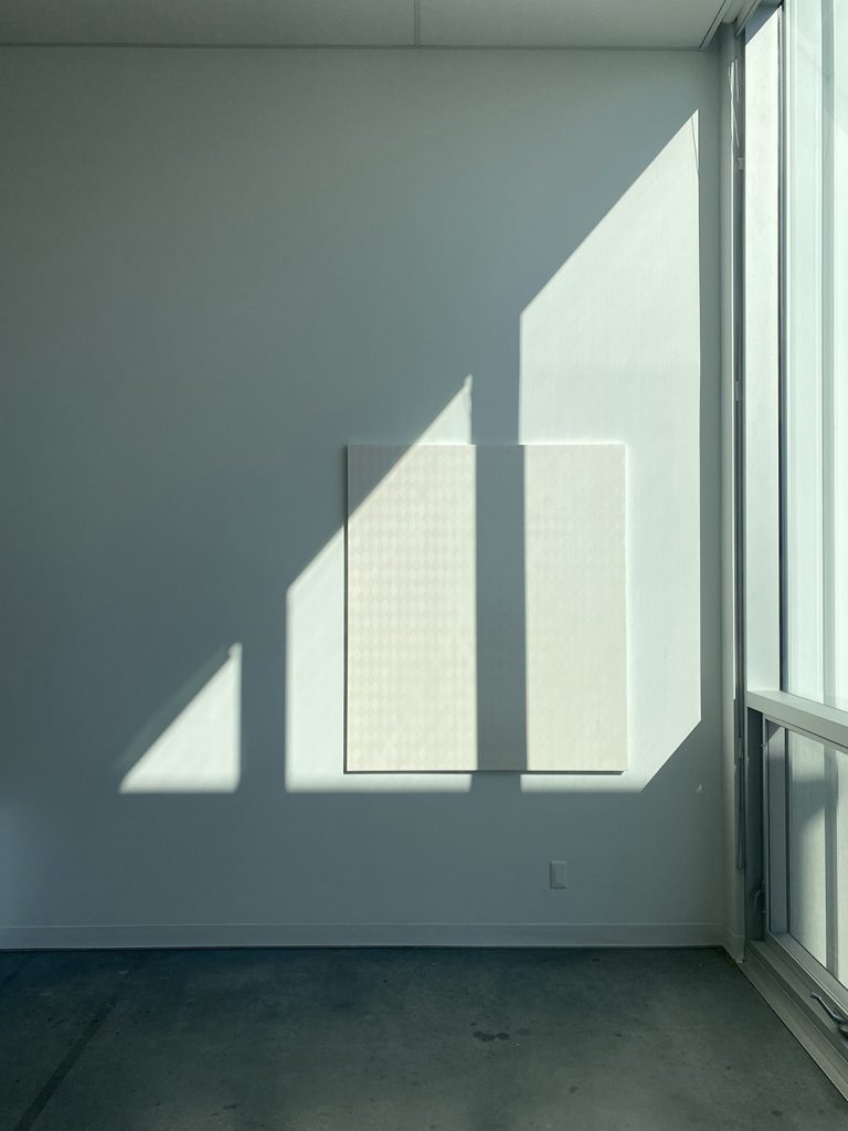
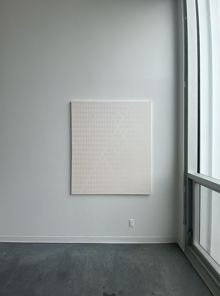
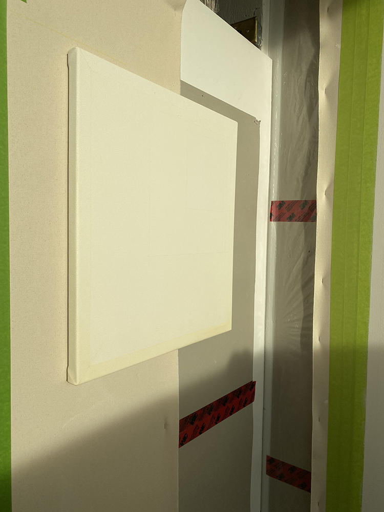
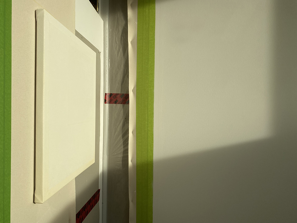
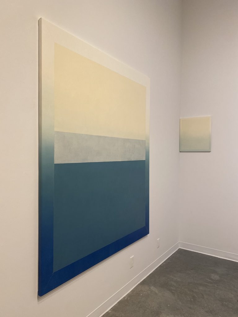
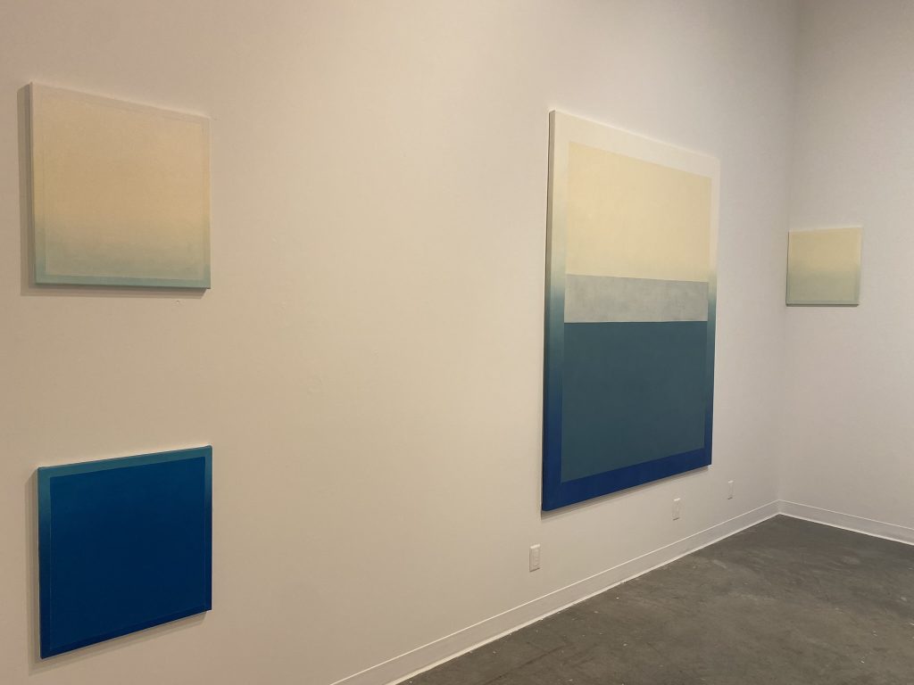
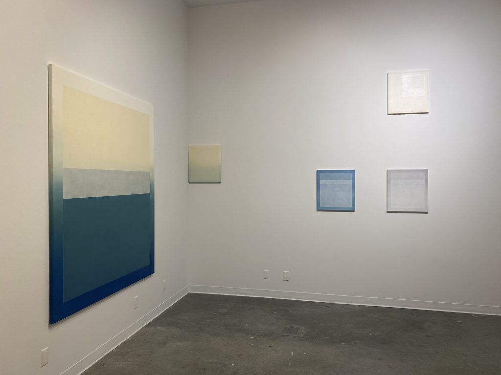
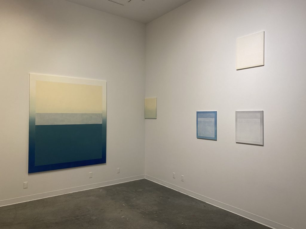
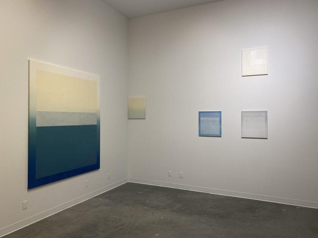
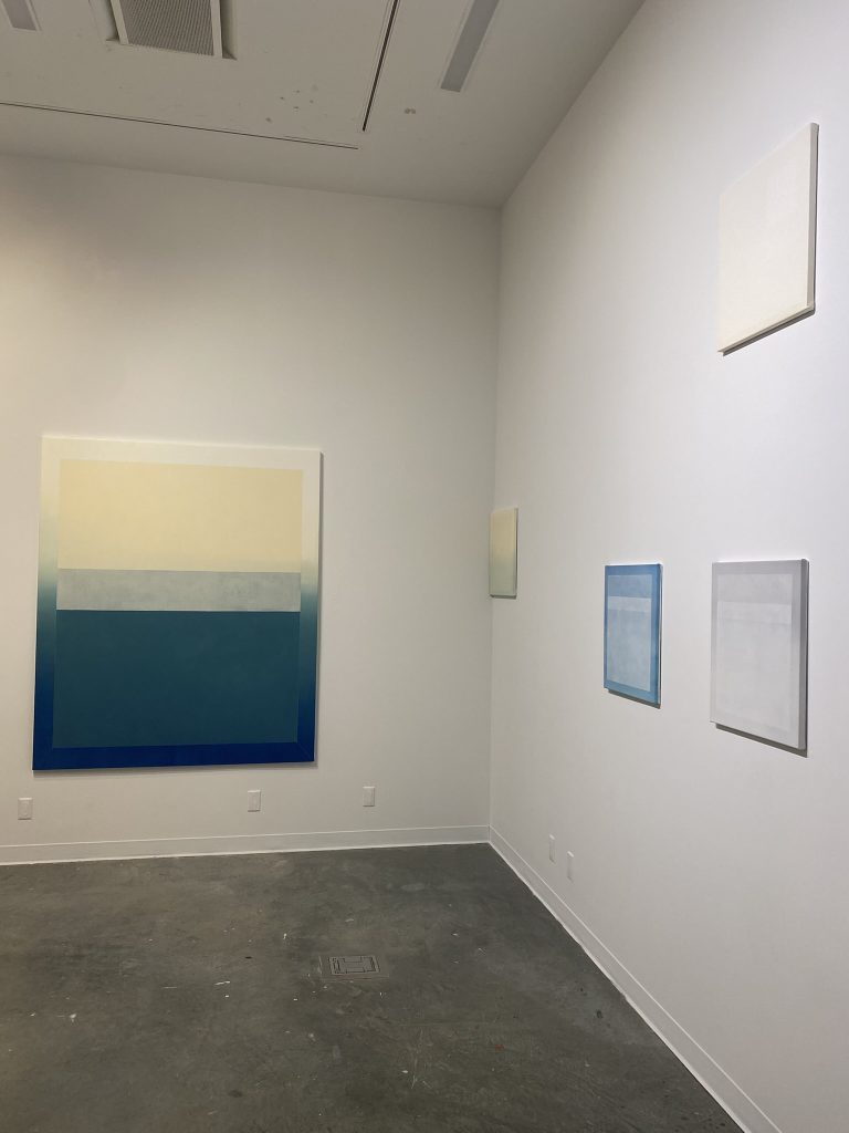
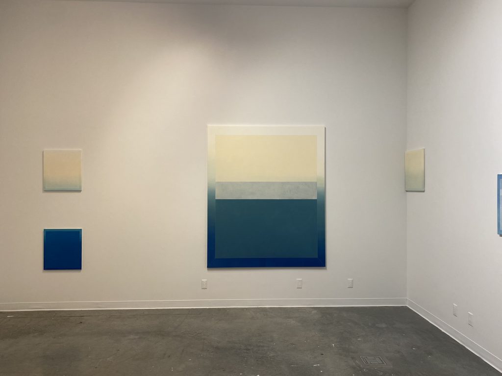
9 Elements (Towards the light)
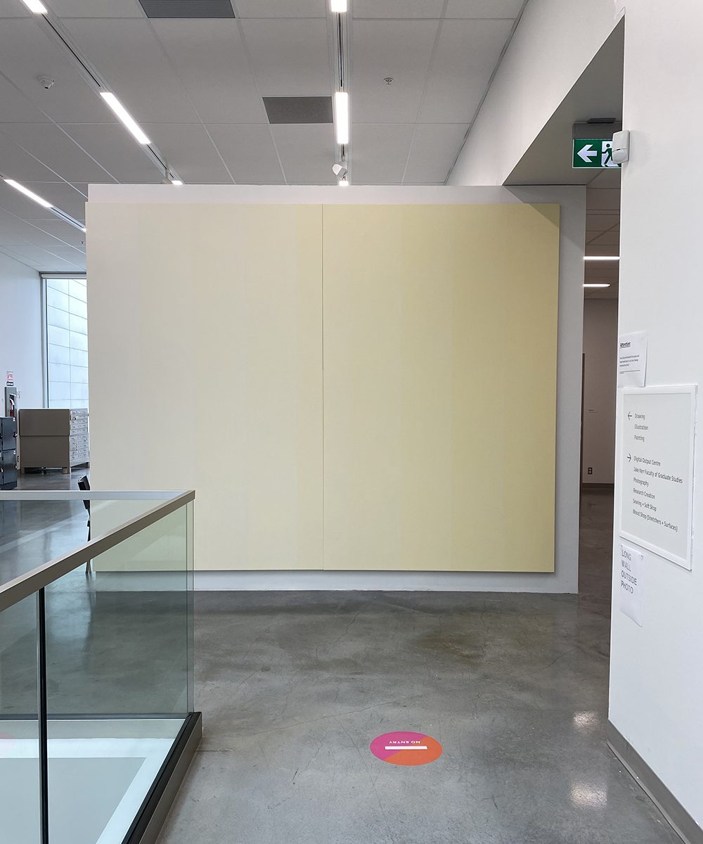
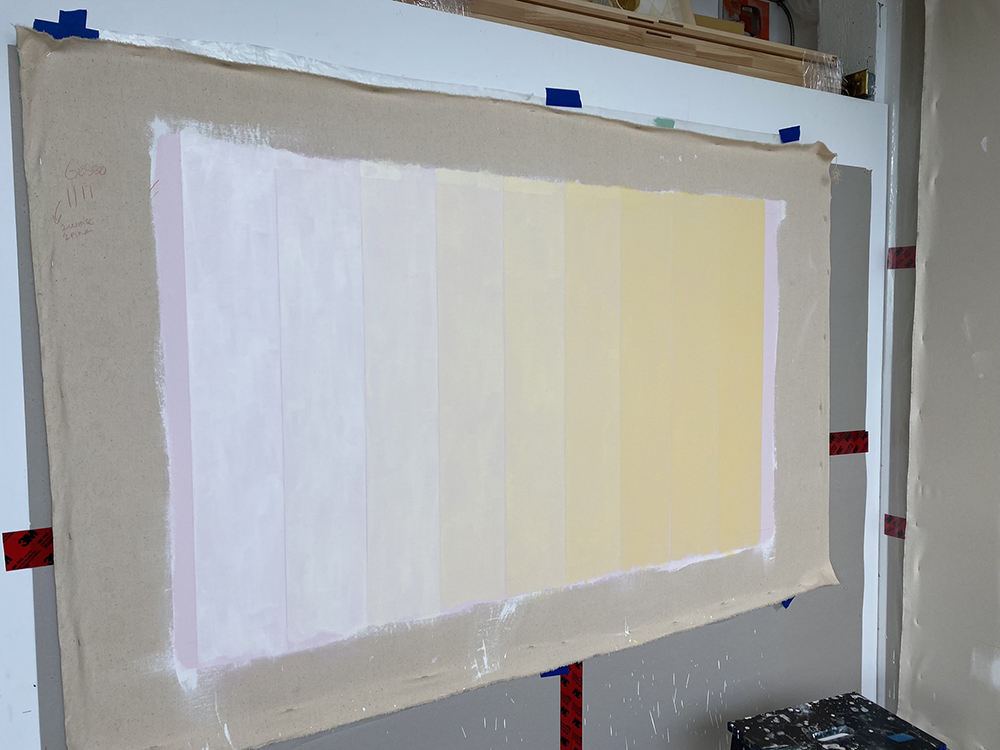
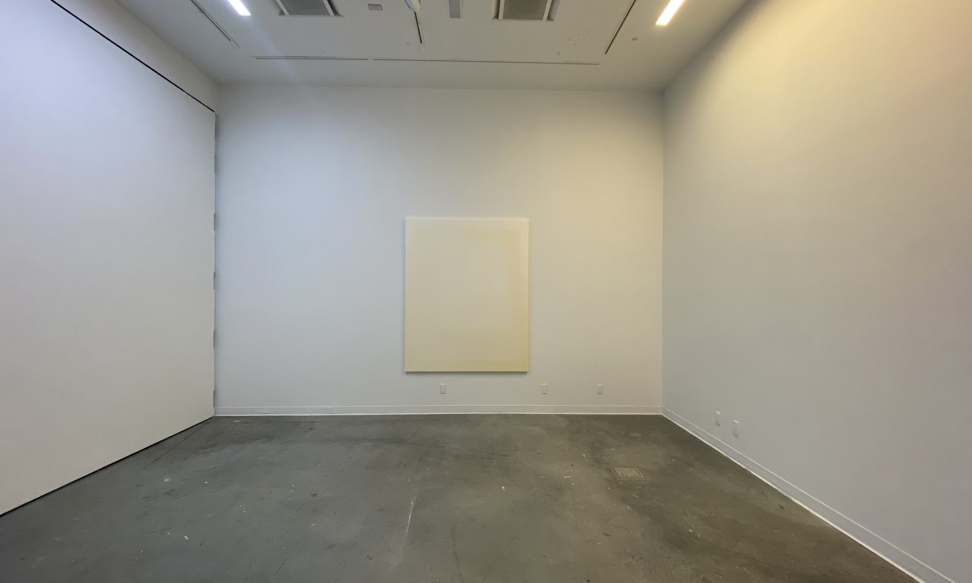
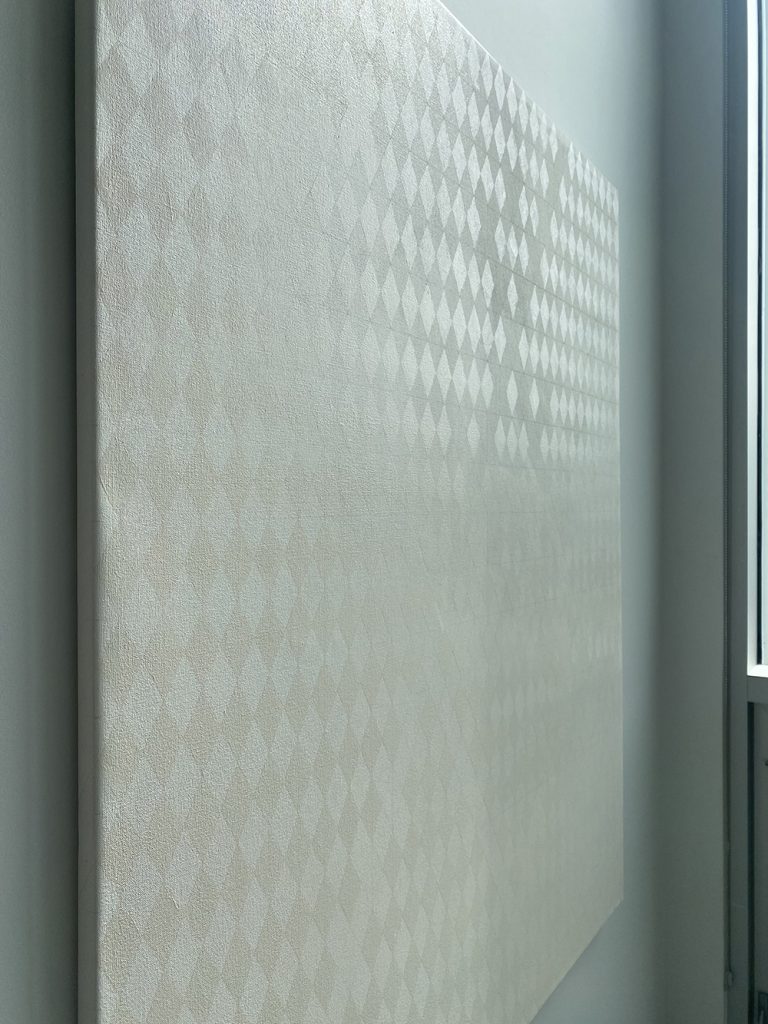
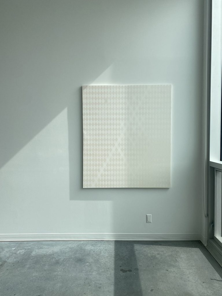
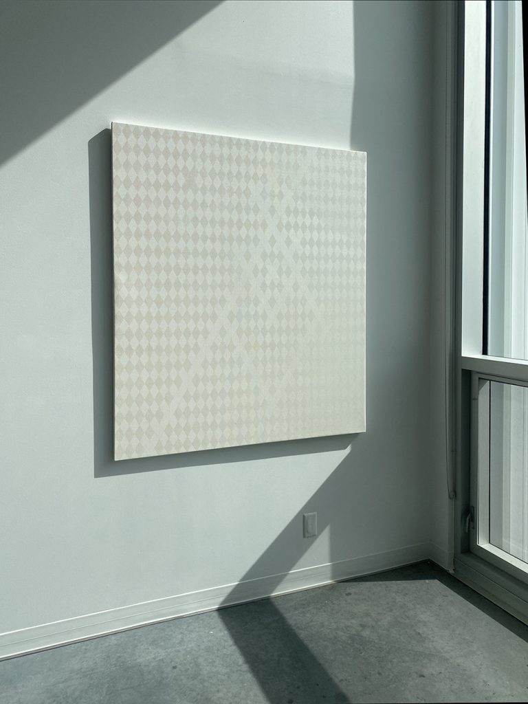
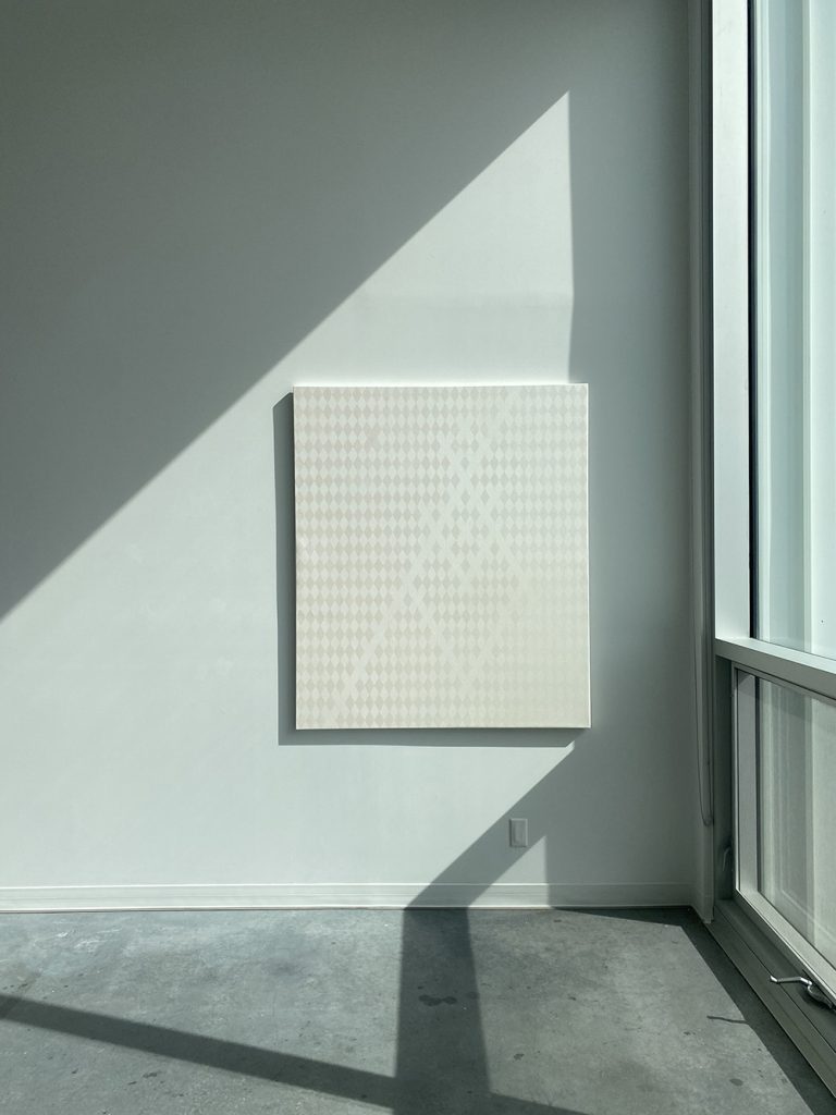
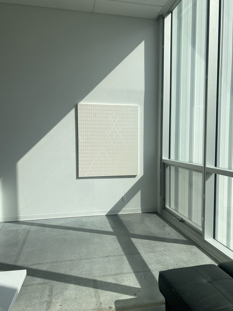
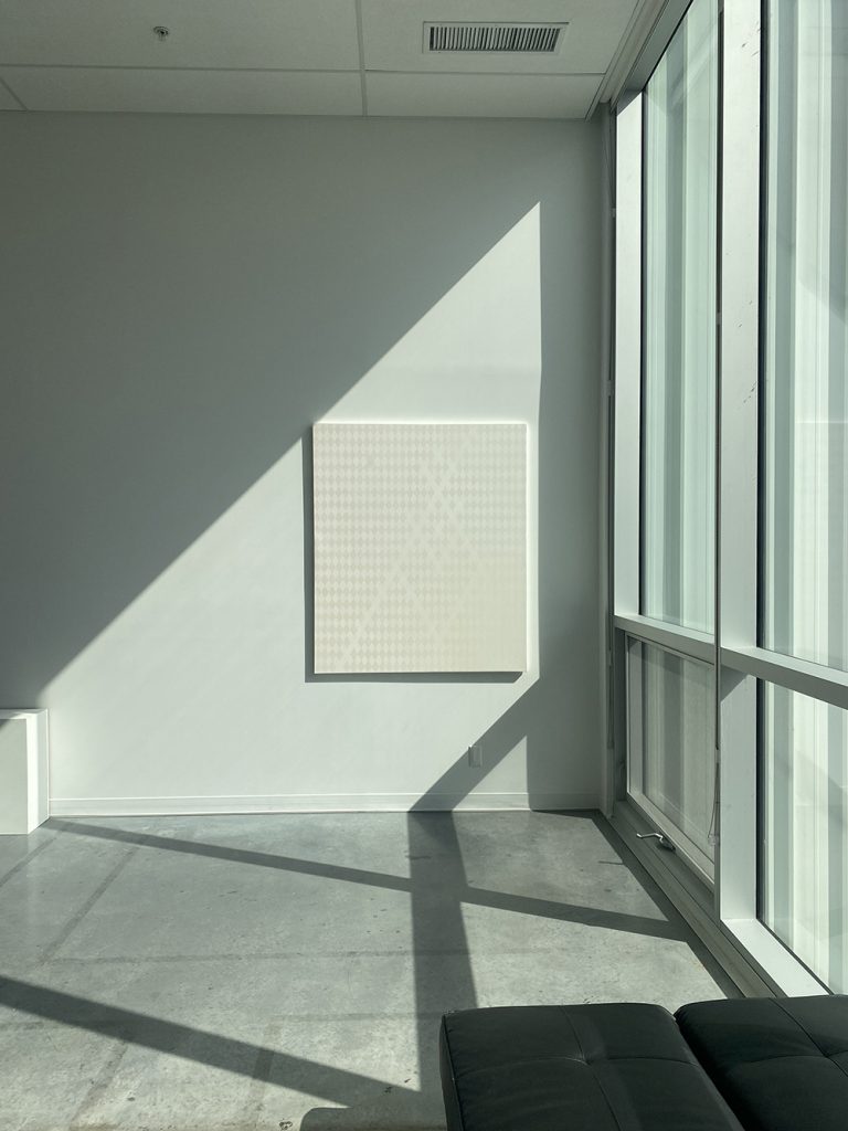
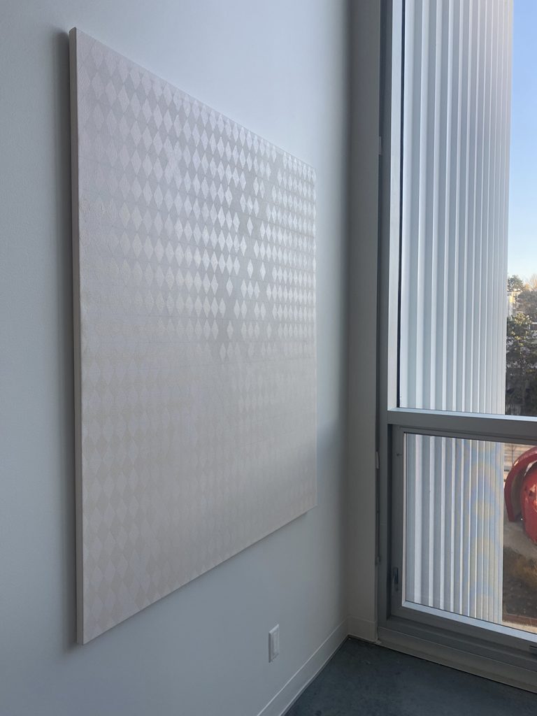
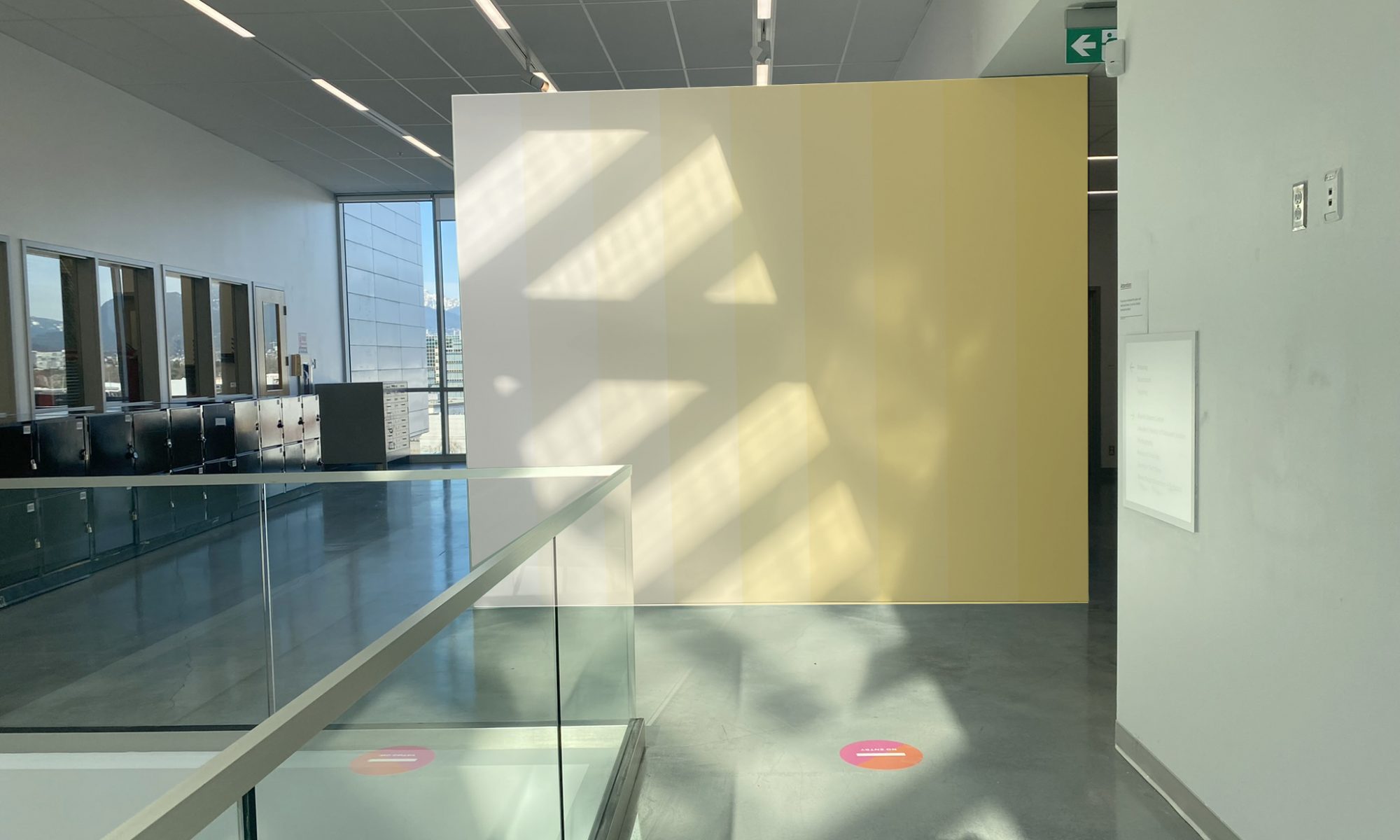
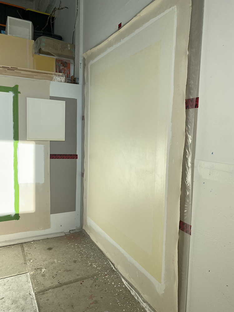
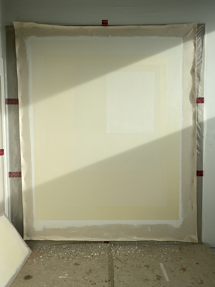
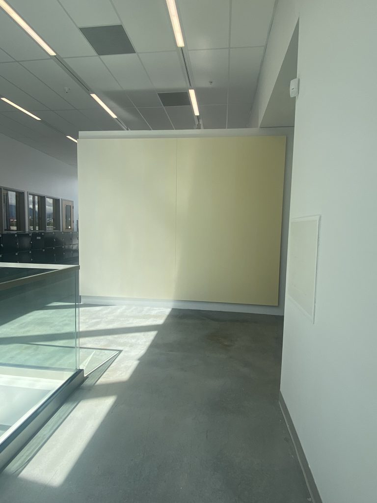
175 x 275cm, acrylic on canvas
Condition: Summer sunlight August 3-7, 2022

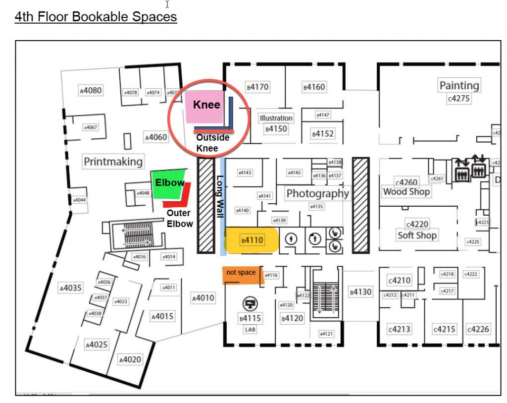
This project was initially envisioned as a conversation between a painting and the winter sun. From January to February, the sun sits low in the horizon (about 23 degrees) allowing for its rays to penetrate deep into the ECU campus. With a skylight located slightly south of the Knee Gallery, the wall becomes an obstacle to light capturing an interesting pattern – only for a few hours – on its outer wall. Having a lot to do with being there at the right time, these moments can only be noticed by a few that venture on the campus interested in observing light phenomena. Let’s not forget that light can be a rare thing in the winter months of the Pacific Northwest. On these rare occasions when light peaks through the dark clouds and shines, to me it feels majestic making me aware of time and space. My vision was to create a painting that could act as a container and perhaps capture this phenomena making it more visible.

This project was first conceptualized as a wall painting in February 2022. It was proposed as a painting project for my summer thesis research. This project will be completed when installed on the Outer Knee Gallery wall between January-February as well as documented into the similar lighting conditions that it was first envisioned in.

The research aspect of this project is an ongoing conversation and continues to question, amongst other things, it’s viability as a painting under different lighting conditions. For this reason, It will be exhibited in the upcoming State of Practice Exhibition scheduled for September 2022 in the sculpture gallery section of the the Michael O’Brian Exhibition Commons at ECU.
Watch this video to see the full passage of August Sun onto 9 Elements.
General observation and comments
I installed 9 Elements for 4 days on the Outer Knee Gallery wall from August 3rd to 7th, 2022. This allowed me to sit with the piece, document it and received critique from invited guests. Neil Wedman, Jack Jeffrey, Gwenyth Chao and Molly Burke came by and discussed the work in presence with me. Landon Mackenzie and Damian Moppett discussed the work virtually with me while reviewing digital documentation. The comments below where generated from these conversations.

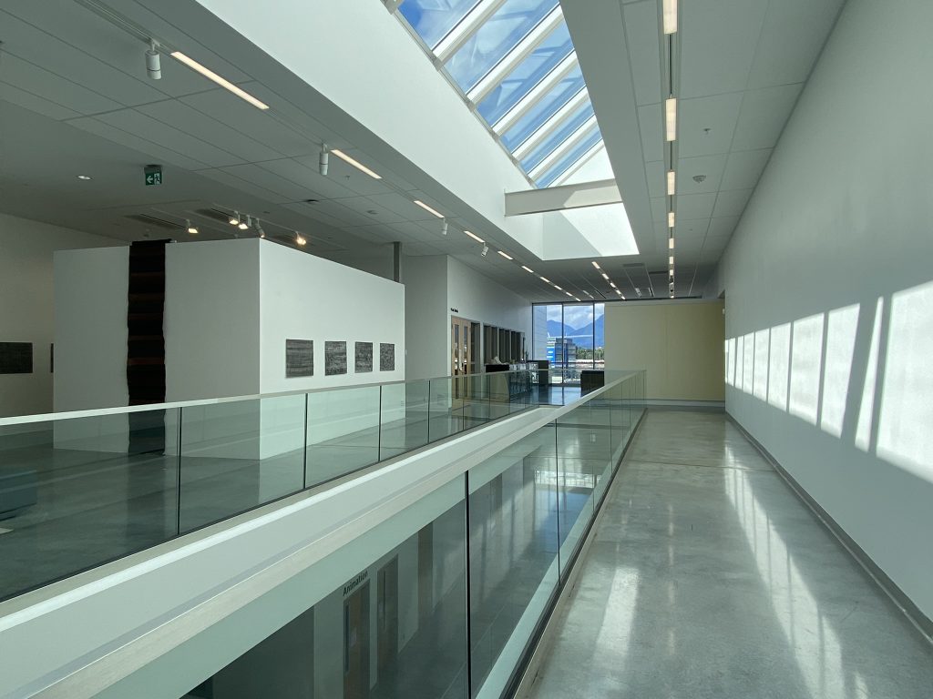
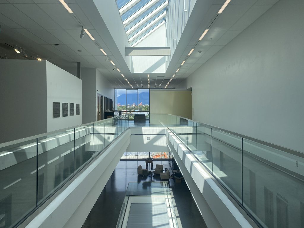
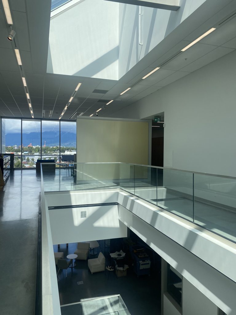
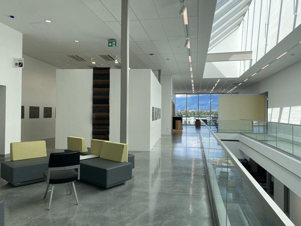
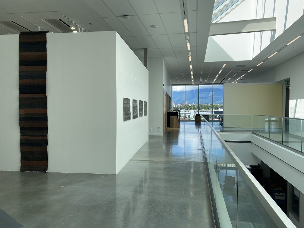
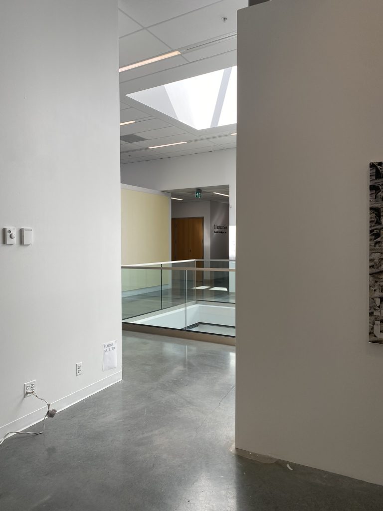
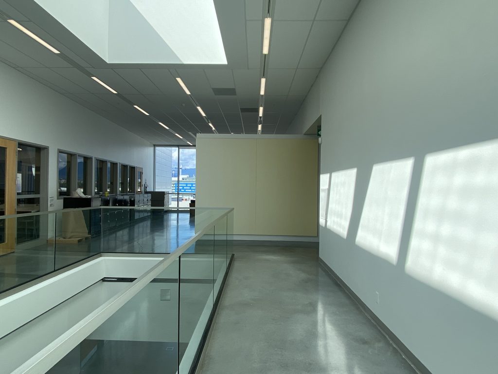
Important to note that the Outer Knee Gallery wall is a transient space used as a corridor. It is about 6 feet wide. It opens up to an skylight atrium that runs through the 3 levels below which is framed by a glass railing. This gallery space is challenging as It offers limited viewing space in front of the work and forces the viewer into narrow corridors to view the piece. As a result of this viewing conditions, the comments have pointed to note that the painting offers 3 distinct readings: at close, mid and far range.

Close range – about 2 feet from the piece:
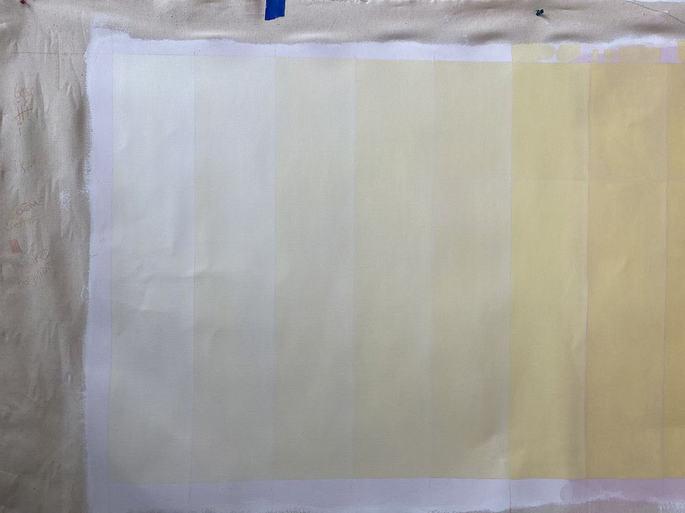
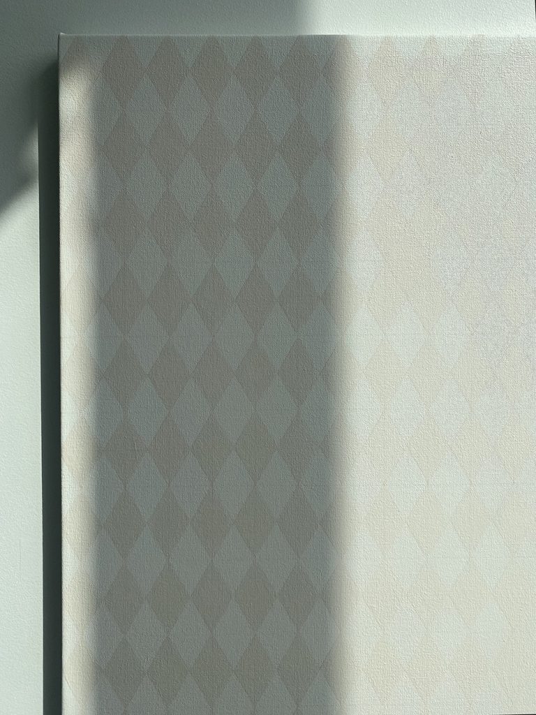
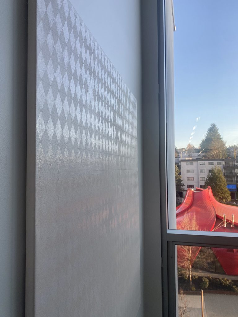
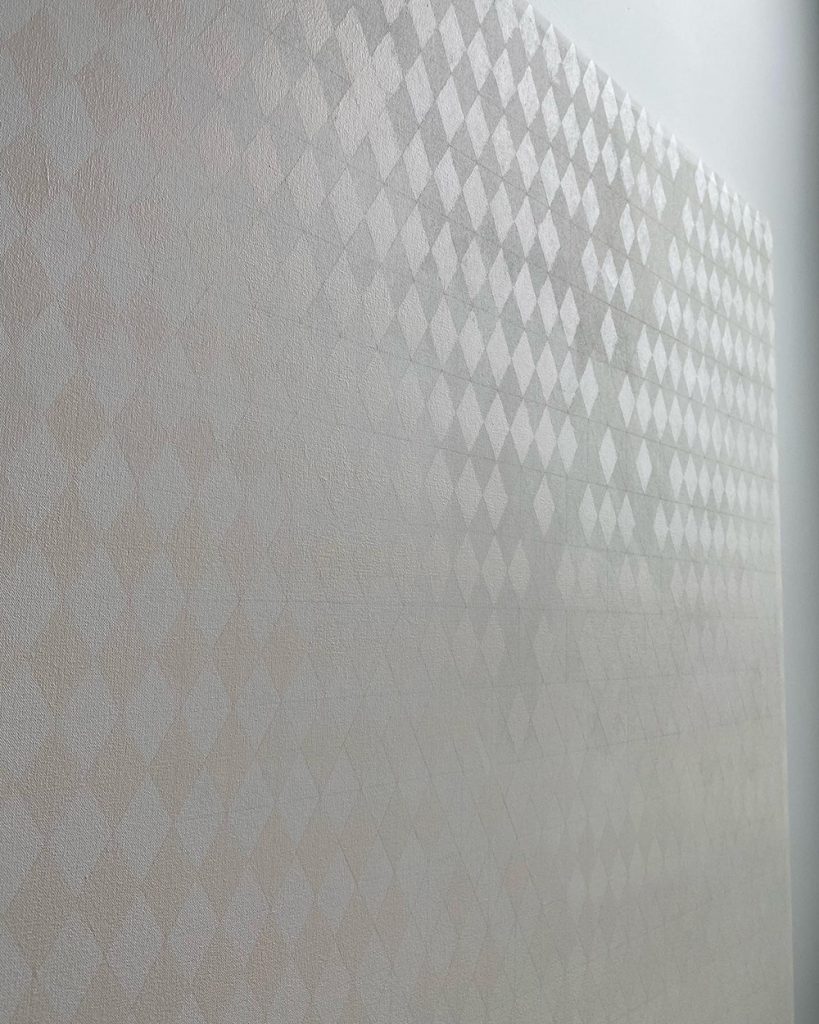
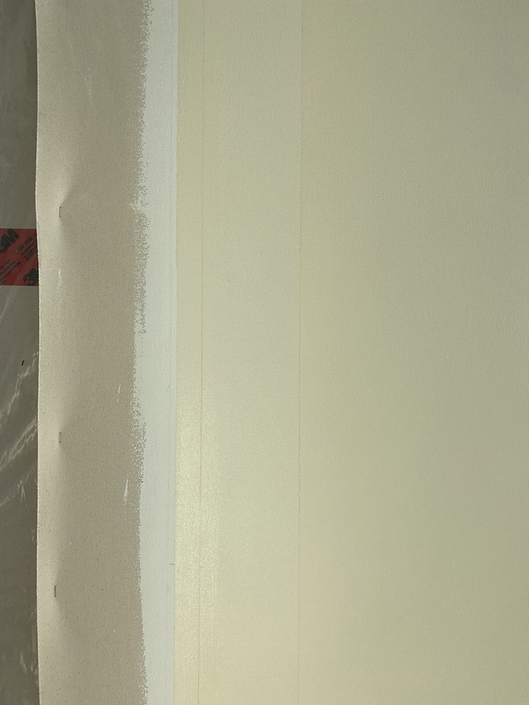
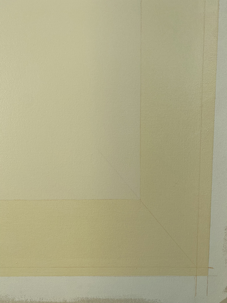
This is the range that painters or those looking for technical information about the painting are attracted too. When standing close to the piece, one feels completely immersed in the yellowness of the work. The piece covers your entire field of vision making it at times difficult to keep your balance as you feel absorbed by a vaporous field of colour. It is hard to keep your eyes focused on the very details you came to seek. The matte finish offers no reflection of light or the viewer and tend to pull you in even further. The coloured pencil line used as a guide to paint each colour band is the thing that is most visible at close range. Once you are able to focus on the line, you also start noticing the loose brush marks of the thinly painted fields. Imperfection and unevenness in the application of paint is observed and suddenly one realized that this piece was painted fairly loose. You don’t tend to stay within this range for too long as it somewhat feels uncomfortable and hard to focus on anything.

Mid range – 3-5 feet from the piece:
Most common range that viewer will stand from the work. This is an awkward position as the area in front of the work is a corridor broken by an opening in the floor surrounded by railing so the viewer only has limited options to stand in front of the piece which is standing on the right side of the work. Once you find the most convenient place to pause and really observed, a strong optic illusion occurs. Each band of colour appeared to have been painted on a vertical gradient from purple to yellow. This effect is so strong that one is convinced that it was painted that way and need to move closer again to verified this fact. And one can kind of proved it’s point by noticing that in some areas, the edges of the painted band appeared to be painted differently but upon closer observation, one will noticed that no, the unevenness of the paint is actually throughout the entire band and not just present on the edges as per the optic illusion. Moving back to a 3-5 feet range, the optic illusion starts again creating a wave with the painted band. This is so strong and hard to understand leaving the viewer puzzled with the effect. At that range, the paintings appears yellow and purple and vibrates quite a bit.

Far range – 15-20 feet from the piece:
Not a lot of people took the time to walk all the way around the floor opening to stand directly across the painting. At this range, the 9 coloured bands completely disappeared becoming one unified gradient from pale yellow to a more saturated yellow. What stands now is the painting within its context. The architecture of the space, the skylight, the corridor, the railing and mostly how the light interact with all these details. At that range, the window behind the painting on the north wall of the Knee Gallery comes into the conversation. Architecturally speaking, it is divided into vertical window panes which recall the geometrical composition of the painting, but most importantly it is overlooking the mountain range and reads has bluish purple, the complementary colour of yellow. One starts wondering if the effect of the blue next to the yellow painting is actually altering the perception of it or contributing to the optic illusion that happens at mid range. Nevertheless, at this range, the painting completely feel like it belong to the wall and its presence enhance the awareness of space.

Unresolved ideas:
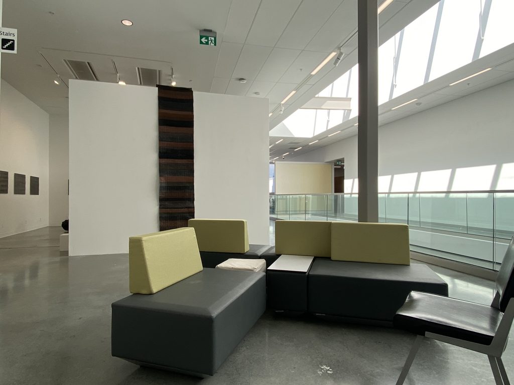
The context: This is a very difficult area to view a painting that size. The wall opens to a transient corridor for those moving along the North hallways, into the Print Studio or Elbow gallery or transitioning to the south hallways. It is not a space where one can sit and really spend the time with the painting. It makes it a really hard space to see the painting in it’s entirety without being partially block by the railing. It’s also a bit awkward to find a place to stand still has others will walk by you at all time, on their way to their business. In fact, I am not sure if most people actually notice the painting as it is so subdued and tends to melt with the context. In my opinion, It does soften the area and bringing a sense of calm. On the south side of the Elbow Gallery, there is a lounge area and I have taken the time to rearrange the orientation of the loungers to offer a more welcoming configuration where students are invited to gather. Two of the loungers are also offering a great view towards the painting but once sitting, the railing really constraint the viewing of the piece. Me and Gwenyth spend a considerable amount of time there talking about the work from those loungers and many ideas where discussed. We discuss the calmness of the piece, the context it was sitting it, the transient space, the railing but one thing that resurfaced was how the piece could provide a space to empty all content: our oversaturated world of images, news, social media, emails and general sense of lacking time. This piece is suggesting the opposite: a contemplative moment to observed time pass by, the transition of sun over a certain lapse of time, awareness of context and possibly of self.

The dependance of sunlight:

Have I gone too minimal?

The relationship to modernist abstraction, what makes this piece still relevant?
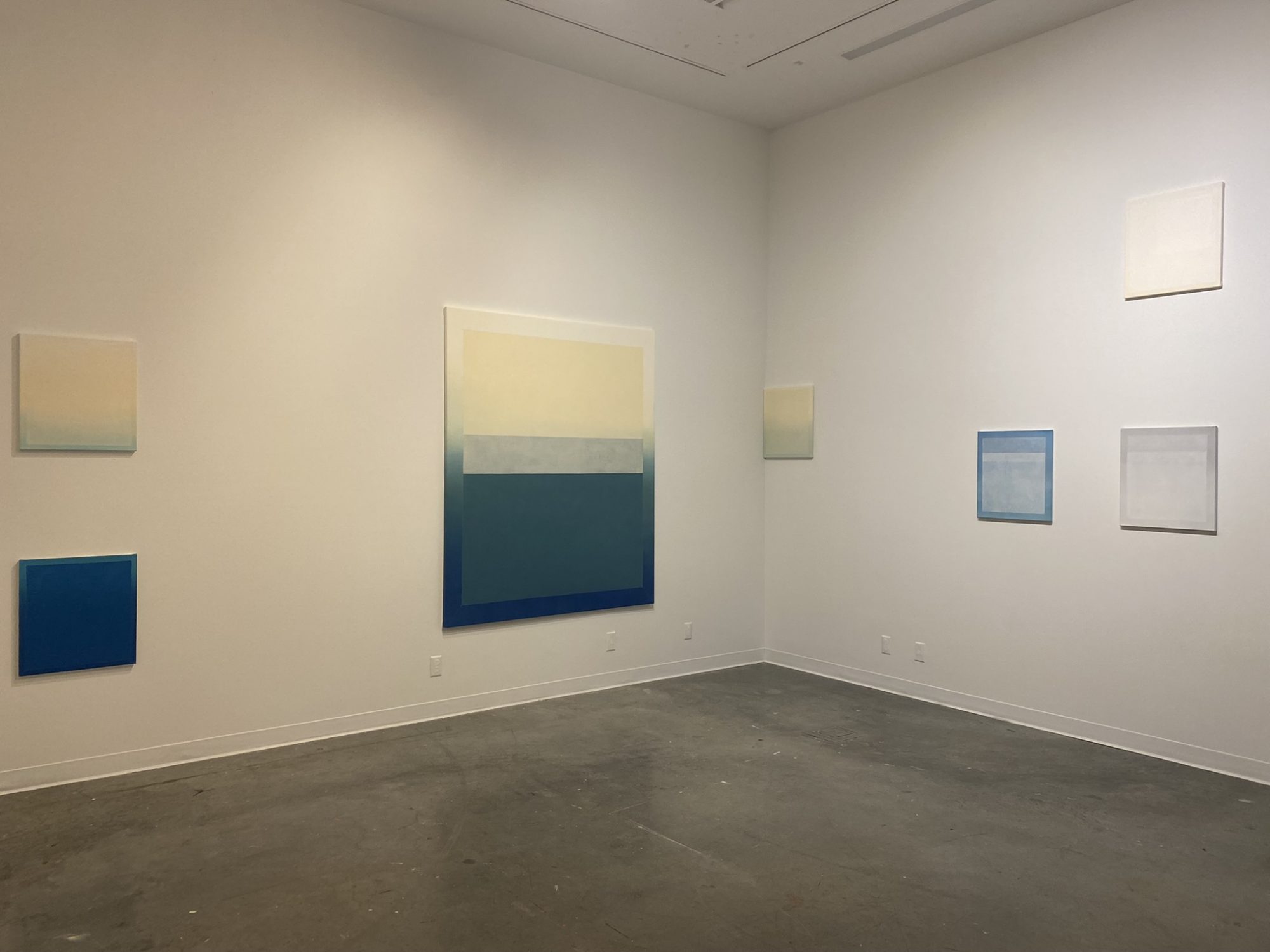
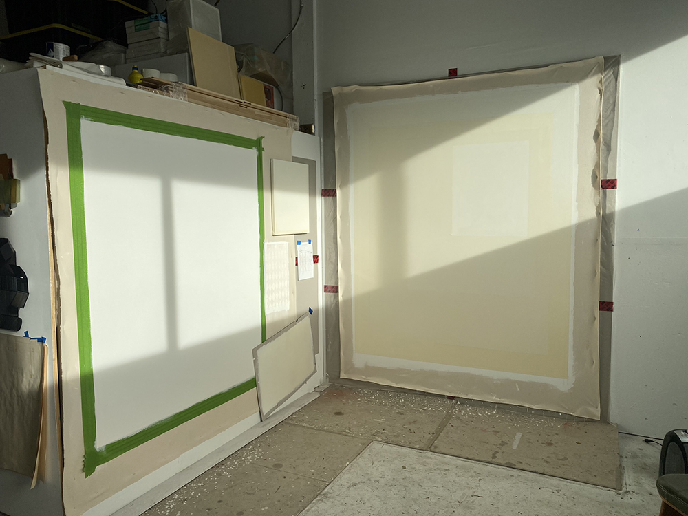
Summer Research Project 2022 | Painting process

9 Elements, 2022
175 x 275cm, acrylic on canvas
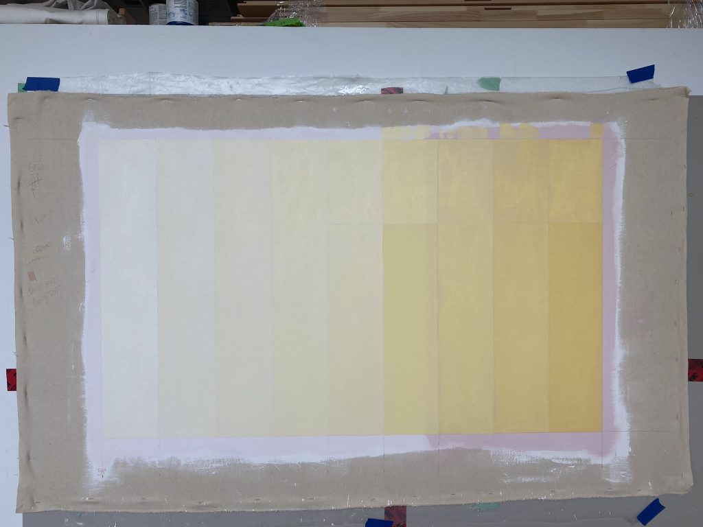
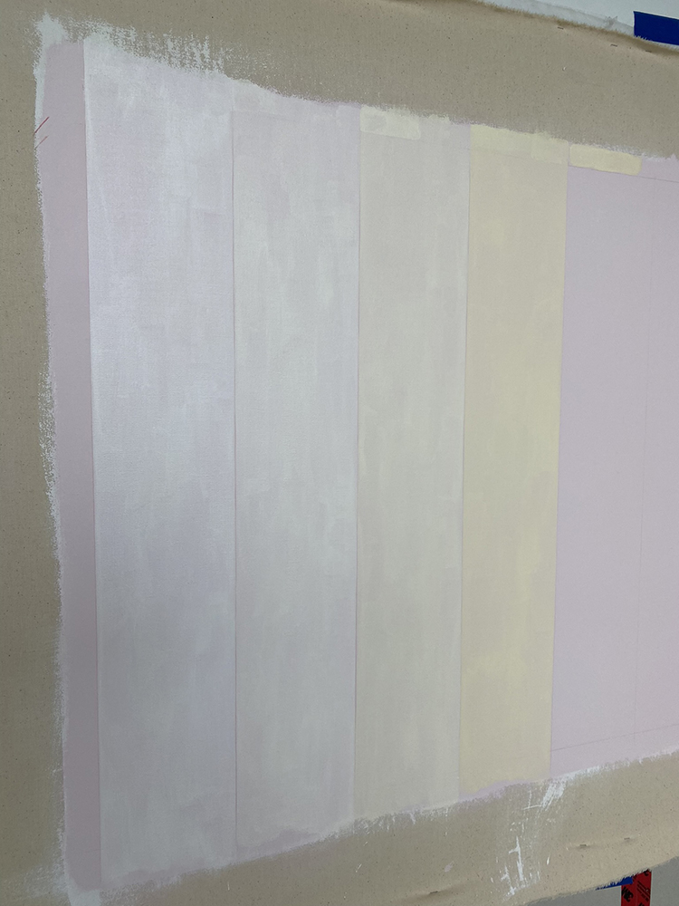
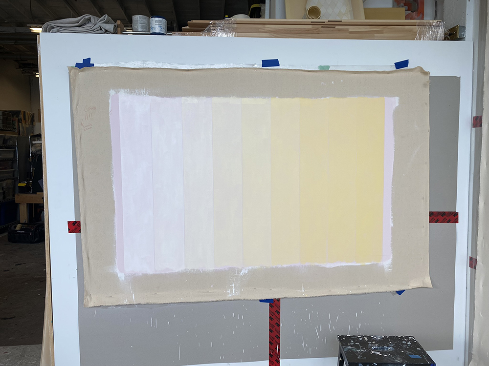
A gradient of primerose yellow composed of 9 bands of colour

Installed on Outer Knee Gallery, August 2022

What looks like a simple and minimal painting actually took a lot of material research and studies. Here are some of my comments/feedback.

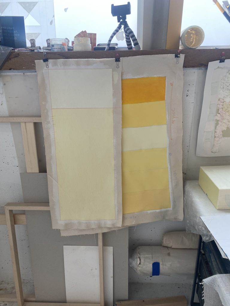
The painting test started in early May, 2022. I had not painted with acrylic in a really long time and fell out of practice and lacking techniques. May was really overcast in Vancouver and it impacted my perception of colours making me crave a higher contrast for the colour gradient. After the first series of tests, I travelled to Greece for 3 weeks which altered my perception and veered my decision towards a much more subdue gradient. You can see the difference in the study images below.

Stretchers and stretched
This painting is very large and because I am painting it in school, it has to be painted on a stretcher so I can move it around. This differs completely from my usual technique of painting with a canvas stretched directly to the wall. The wall provides a hard surface for me to trace the grid needed for my geometrical shapes. I also prefer a hard surface to paint as opposed to a stretched canvas which I found too bouncy and distracting. Painting on a stretched canvas comes with many different challenges that I will need to figure out as I go. Due to the size of the painting, I had to settled for two canvases which I ordered from Canada Upper Stretcher. They also suggested that I requests the long size to be collapsible build in two parts held by screws. This would also help with shipping cost. I have never done that either and I feel a bit nervous about it.

the two stretched canvas in the Grad Gallery, July 2022

Acrylic colour tests – early May, 2022
I visited Kroma Acrylic paints on Granville Island to test some of their acrylic colours. You have to remember that I have not work with acrylics for many years and that I will have to adapt my technique. The paint qualities that I am after are the following: Transparency, matte finish and, the proper viscosity that will allow me to paint vertical without running.

Action #1 – colour
I am first testing different yellow to figure out which one is closest to what I am after. At first I was sure that Cadmium Yellow would do but upon mixing it with titanium white, it appears to have a green tint which I don’t like. By chance I purchased another type of yellow called Azylide Yellow and that is exactly the colour I am after. What I am after is a yellow that is warm and leaning towards orange. Azylide reminds me of organic egg yoke which is perfect.

Action #2 – matte/glossy
At the store, I was suggested to mix a diatomaceous earth powder with my paint to achieved a level of matteness. I am not sure of the ratio so I start by mixing a lot of it in and the paint is drying too matte and too thick. So I slowly reduced the amount until I am happy with it. With the new found ratio, the paint stays transparent and dry totally matte.

Action #3 – line colour
To draw the lines that will divide the canvas into 9 bands, I need to use a colour pencil. I have purchase a range of colours and to my surprise, the colours I assumed the best where far from it. The final colour is picked in July when the final test is ready and it is a simple beige.

Acion #4 – The gesso colour/undercoat
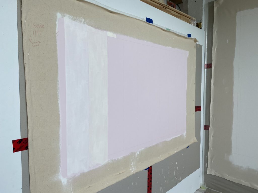
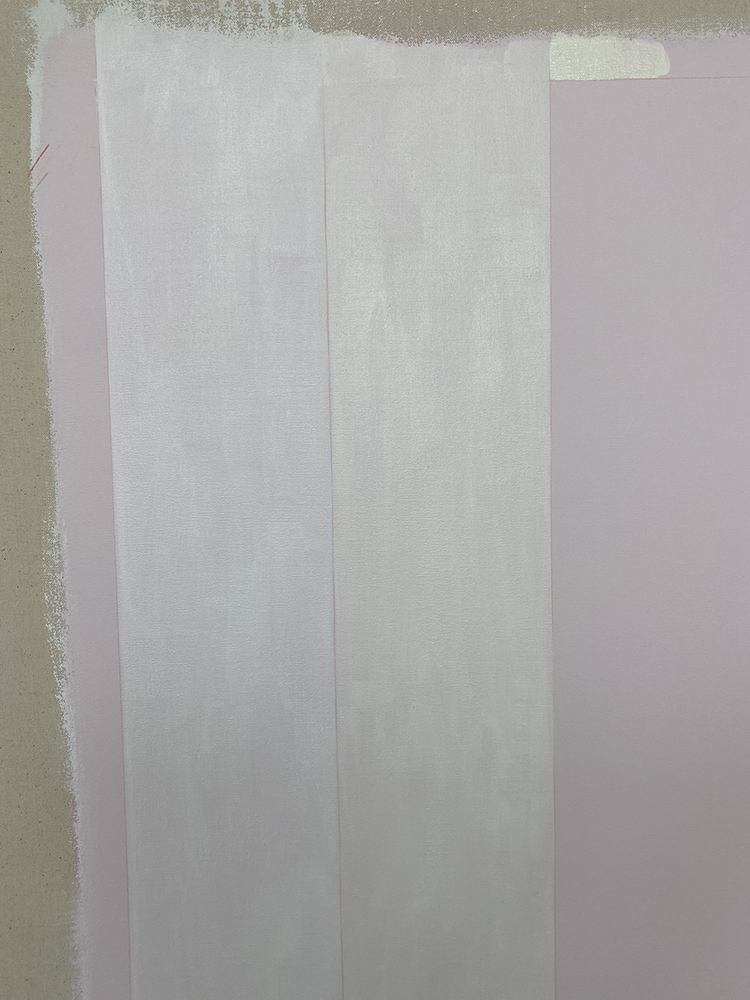
I want to have a pale yellow undercoat. This will add a pink glow to the final composition, a phenomena that is perceivable in light quality of Greece. At first I mixed a Cadmium Red with matte medium to paint a light film of red that would read as pink against the white gesso. I found that the matte medium sealed the canvas too much and didn’t like the plastic feel of it. I am now testing mixing the Cadmium red to the gesso and I am satisfied with the result. In the end, the pink is almost not perceivable to the eye but stand out once I start painting the yellow next to it.

Action #5 – The gradient
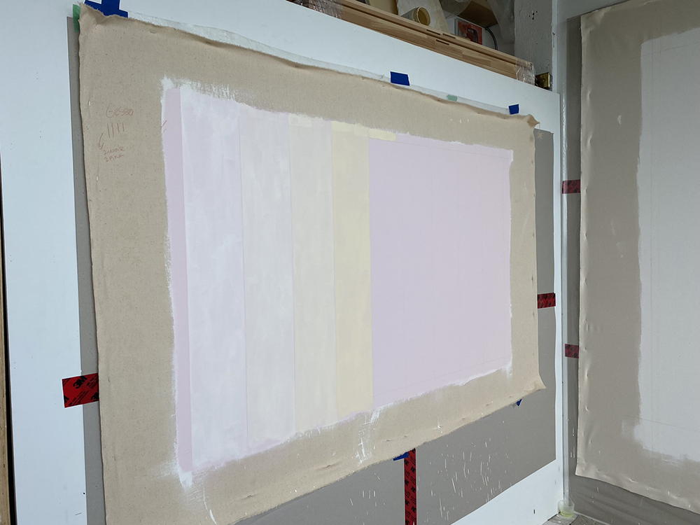
Now how do I mix all these colours and achieve the gradient I am after? At first I am thinking that mixing the more saturated yellow moving toward a brighter yellow is the way to go. But after 3 bands painted, I don’t like the effect and feels it is too saturated for what I am after. I change the order of things and mix the lightest yellow first moving towards the more saturated. This is the part I am the most nervous about and will need to take my time mixing. I am also realizing that purchasing a kitchen scale will help me with the measurements to insure consistency of matteness and viscosity throughout the process. The paint appears to be keeping better in glass jars as opposed to plastic containers.

Action #6 – Testing the method
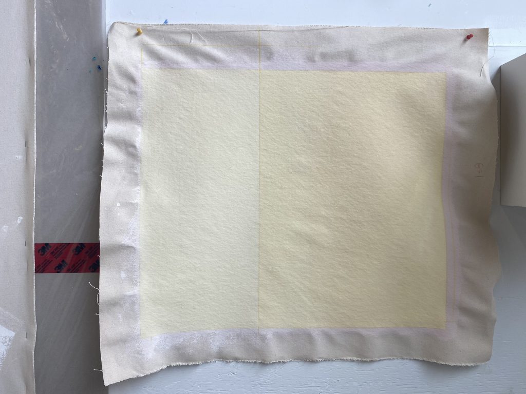
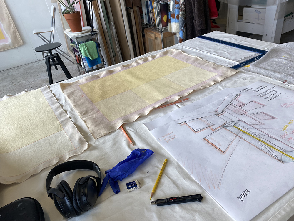
Now that I have a better idea about the necessary steps, I need to go through with it and create a small version of the gradient and really hash out the method. I am still clarifying a few steps but will give another chance and try to let go of the anxiety around it. The more I do it, the more I know, the more I know, the more confident I feel. This is a challenging process technically speaking. Many more details need to align but I feel a bit closer now.

Final tests before going to Greece on Friday May 4th. “May the 4th be with you!”

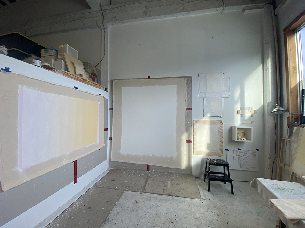
Senior Painting Studio, ECU, June 15 to End of July – Welcome to blue light
At first I was allocated the area between B4160 and the painting studio. This is great because it has a similar lighting quality as the wall where the painting will be install. I am really excited about it until I received an email a few days before the beginning of the project to inform me that I have been moved to the Painting Studio B4275. The studio has a lot of good quality: It’s quiet, it’s big enough for the project, it has a lot of window including one that opens. However, because of it being located on the north side, it offers a really blue natural tint. This is not great and will add a challenge to mixing and viewing colours. Oh well, I have to do with it.

Surprise, the evening light bring yellow tones to the Senior Painting Studio
Being a morning person, I am normally in the studio from 9am to about 5pm. With some windows on the east side, the sunshine enters the studio for a few hours in the morning before turning south and provide indirect blue light to the studio for the remaining of the day. One evening, I happened to be on campus late and upon checking the studio, I realized that the evening sunlight was also entering the studio completely changing the ambiance and light spectrum. Magical. I documented to remember the visual and psychological impact.

How many coats of gesso?
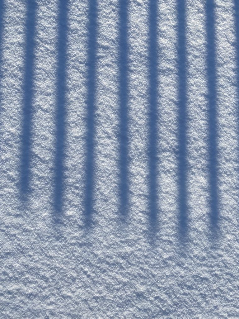
It was suggested to me to start with at least 3-5 coats of gesso with a light sand in between. This should provide a smoother surfaces increasing the vaporous effect of the subdued colour gradient. I am willing to try it. Thankfully I had help at the beginning as this process is physically taxing. Me and Kalvin Valko painted the first coat of gesso and Colin helped me with sanding and painting two more coats. By the third coat I feel happy with the smoothness but upon moving the canvas into my studio, I realized that I need another coat as the surface still appears uneven. In total, 4 coats will be applied with a light sand between each coat and at the end. Having done 2 coats and 2 sanding myself, I am off to the chiropractor, my body is feeling the physical impact. Moving forward, I make sure that I remind myself of working with an assistant for that size of painting.

Studies and more studies – moving towards the light.
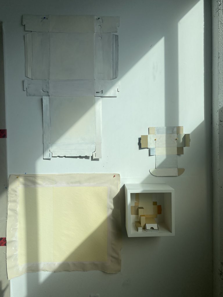
I need to be completely confident about the colour tests before I can paint to the large canvas. I make many test and keep moving them around the campus to see them in proper lighting. The studio is so blue that my perception of the yellow band is affected. In the end, I painted a colour swatch for each band and installed them in the Outer Knee Gallery wall to confirm everything. The 4 coats of gesso sanded to test the smoothness, the pink undertone adjusted, the proper level of mattness achieved with the ratio of diatomaceous earth, the vaporous effect once the band is painted thinly, the pencil colour between each band and the overall feel. I look at it for a few days.

Here is a step motion video of the July Sun going through the colour swatches

The pink glow – an odd to Greece light spectrum
When I installed Configuration #85 in the sculpture gallery, I was completely mesmerized by the pink glow that emanated from some of the boxes that had a top pink edge painted. This pink glow is a phenomena that I observed a lot in Greece where the sun is so warm that white object appears to be glowing pink at times. So I decided to paint the top edge of my canvas pink. This will never be visible to the eye but will be a nice “clin d’oeil” gratifying those who spend time observing the piece and the effect in it’s environment. A light glow will be perceivable on the wall above the painting.

3 weeks later, I am ready to paint the large size!
With a final gradient test that I am happy with, and all my colours premixed ready, I feel confident to start painting the large piece. At this point, no more thinking is needed, I can just loose myself in the action of painting.

Painting action
Each band takes about 30 minutes to paint.

French cleat and first install – Outer Knee Gallery – ECU
Yang helps me figure out the french cleat system and together we are able to move this monster on it’s final destination, the Outer Knee Gallery wall. It is not the ideal sun at the moment as this piece was envisioned to be in conversation with winter sun, but it gives me an idea of the final result in its environment. I need to get in contact with facility to close of the ceiling light, they are driving me crazy! I also need to figure out the angles that will be used to document the passage of light onto the painting for next February. The painting was install for 4 days which gave me enough time to figure out a few more things and get comments/feedback from a few mentors. Done for now until January-February 2023 where the sun will align itself and provide the lighting phenomena that I am after.

Towards the Thesis

MARION LANDRY | Graduate Seminar II | April 27th, 2022

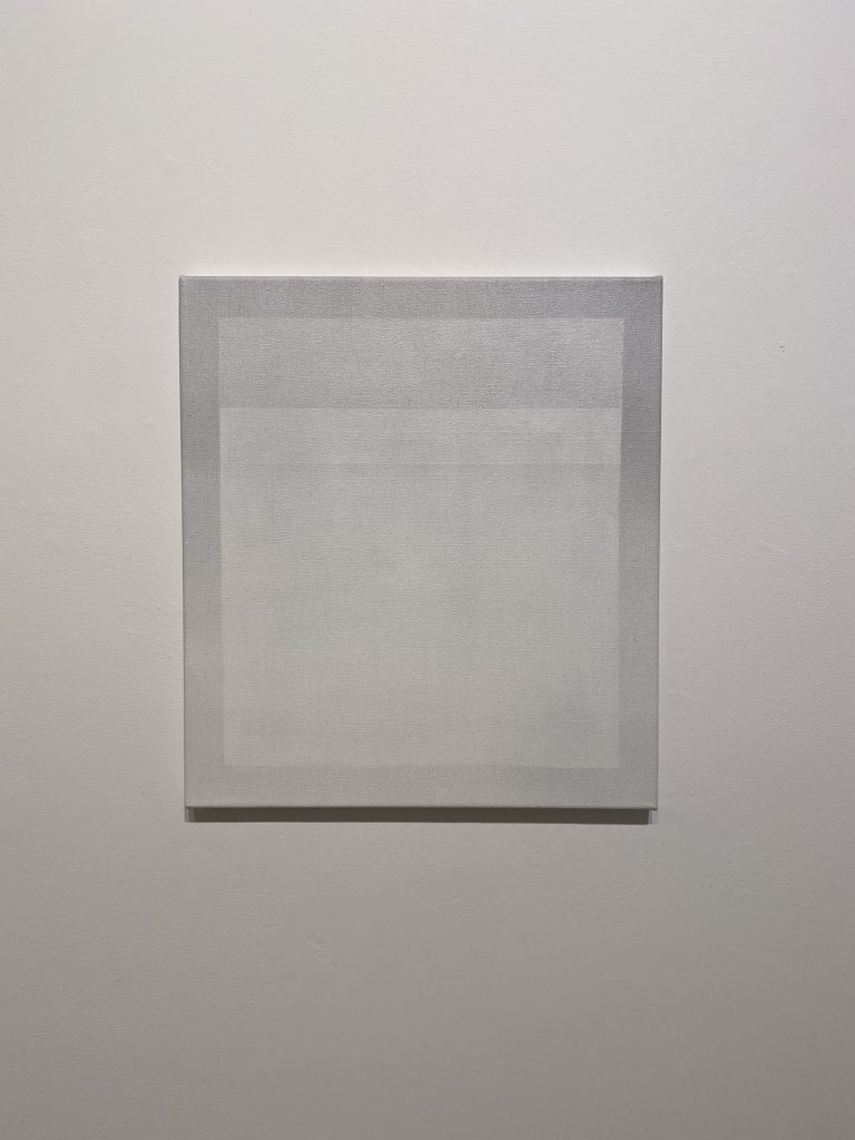
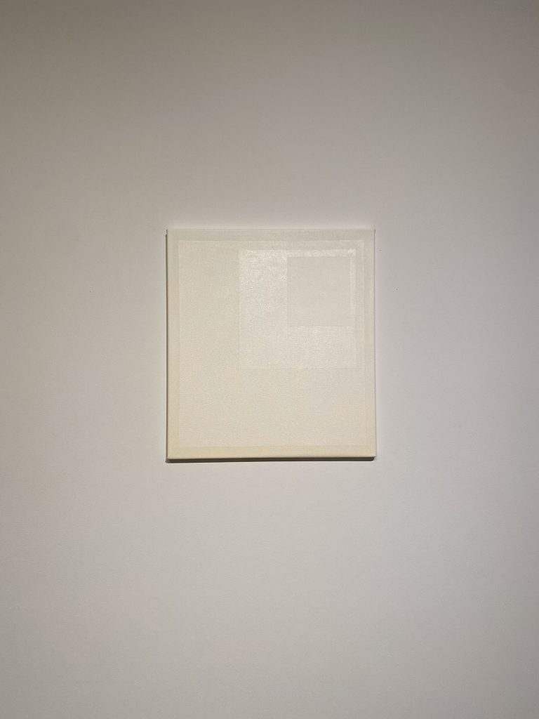
This paper seeks to address a recent shift towards a style of painting that takes in consideration the conditions of viewing and of perceiving. My thesis research initially focused on a desire to expand painting beyond the surface of the canvas to include the structural elements on which a painting is produced. At the time, I was interested in dismantling the hierarchy and unifying the elements used – such as painting studies and painted objects – as part of the painting process. To me these elements constituted the communities in which a painting had evolved, and I viewed them as equally important components. The first installation I presented for critique was assembled as a wall tableau and included a large-scale painting, six painting studies, as well as painted objects. After hours trying to adjust the tableau, I struggled to bring it to life. The gallery lighting worsened this condition by flattening the installation even more. The critiques I received from my cohort were similar, confirming that something needed to change. The lighting conditions and overall atmosphere of the gallery, I felt, needed adjustment to better support my paintings and intention. As a result, my focus began to turn towards a greater awareness of space. The physical environment of the gallery (that of Emily Carr University or Art + Design (ECU)), the pictorial space within my canvases, as well as one mental space needed to evolve and thrive.

To expand on this recent shift towards the context of viewing, I will refer to one of my latest installations titled White Element (fig. 1). To me, this installation was the most successful at illustrating my recent research on tempering the atmospheric conditions of viewing and experiencing my paintings. To help situate my practice I will use reading references that have accompanied my research.  It is also important to note that some visual references, ideas, and artistic influences that are ingrained within my practice are extensive and therefore outside of the scope of this paper.[1]  For that reason, I have limited my references to the art and writings of Agnes Martin, Joseph Albers, and Robert Irwin.

To begin, I feel the need to expand on the conditions of producing and presenting work within the ECU campus.  ECU is an institution that encourages experimentation both with our studio practice and our critical thinking and is an environment full of ideas, opinions, and points of view which are at times different than my own.  As a result, my thinking has also needed time and space to adjust. Thinking is what is being asked of me in the context of the master’s program: intellectualizing the experience of painting in particular, a mindset that is elusive and challenging as I find most of it resides beyond language. My mind is a very dangerous place to be in as it obsessively worries about the past or the future.  For me painting has always been a refuge: a pause from mental obsession and an escape that provides access to a different mode or aspect of thinking. A more present, calm, and intuitive state of mind emerges to greet me in this state. Agnes Martin refers to it as the “conscious mind”: the voice of the positive and the source of inspiration (Writings, 111-119). As my mind is being filled with new knowledge, ideas, and concepts, it begins to crave even more mental space and a kind of “unity”. It’s as if more ideas are not needed in this new environment but instead space is: space to absorb revealed concepts and allow meaning to take root within, as opposed to being consumed or used. It is not surprising to observe a shift in my work’s composition towards simpler geometrical forms such as the rectangle –as if my paintings could provide more space by offering a surface that is minimized of content.

My recent installation titled White Element is a good example of this recent shift in focus. It was installed in the grad Gallery, a generic white cube with a high ceiling and an arched doorway leading to the campus corridor. In using the space, I hung a single large-format painting on the back wall.  The painting offers a simple geometrical form and a limited colour palette. The ground colour is painted with a gradient ranging from bone white to butter yellow tones. Painted as multiple layers, using the same colour as the gradient ground, it is an arrangement of three rectangles receding in size toward the top right corner signaling an ode to Joseph Albers’ Homage to the Square paintings.[2] Using a range of glossy and matte finishes, the rectangles either reflect or absorb the light, creating an illusion of depth.  The otherwise generic ambiance of the gallery was altered using a mix of cool tones on the left side, and a warm tone on the right by affixing gels directly on the ceiling strip lights.[3] The lights cast warm and cool tones on both the painting and the walls of the gallery completely changing the space’s atmosphere.  The painting was strategically positioned on the wall at the intersection of the cool and warm light. The visual impact on the painting was that the right side appeared warmer than the left side reproducing a gradient effect already present within the pigment of the painting. Two comfortable seats were installed at the back edge of the gallery with enough distance for the viewer to capture the entirety of the space. It is important to note that the light was intentionally more saturated above the sitting area in comparison to the more subdued effects around the painting. To limit light leaking from the archway entrance of the gallery, a white blackout curtain was installed which also served as a barrier for sound. Upon entering, the viewer needed a moment of adjustment, both for the eyes and the mind, as the atmosphere of the gallery greatly differed from that of the campus sealed from view.

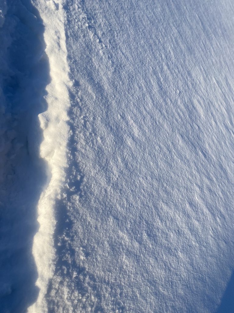
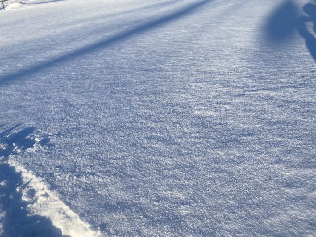
The first impression was one of gentle perplexity; the painting was very minimal and felt vaporous in the space. The painting’s warm white tones appeared to expand to the walls of the gallery. What looked like a pale lavender shadow was cast on the left side of the painting while on the right side a more yellow shadow emerged. In contrast, the top edge of the canvas appeared to be glowing, creating a strong parallel to the atmospheric effect observed when sun is reflecting on snow, which was the inspiration for this piece. A sense of calm was felt in the gallery space as the viewer was invited to sit and contemplate. The perception of the painting continually shifted between surface and space offering a sense of time, or “mise en abyme” created by the recurring rectangular shapes.[4] 

In that atmospheric context, my painting appeared completely stripped down of extra gestures and was mostly reduced to its core simplicity.  It was meticulously crafted demanding a level of precision which made it appear minimal.  I like when Martin describes her painting as being “about perfection” and not perfect.[5]  This idea of perfection is something often perceived in my work, and yet, due to the free hand process used my work is far from perfect when one takes the time to observe it more closely.  The geometrical shapes appear crisp and idealized.  As such one would assume that they are produced with the help of tape. At closer range one can see that each shape and line are instead drawn and painted free hand. Measurement marks reveal information about the hand drawing process of the grid as well as the structural work needed to render my geometrical shapes. The grid itself, which is acting as an anchor to a 2D dimensional space at close range, easily disappears with distance from the piece.[6] 

This semester my reductive palette consisted mainly of white hues, which introduced an additional challenge to my painting process. In order to truly “see” colour, contrast is needed, so when building the multiple layers of geometrical shapes that are painted with the same colours, it’s impossible to see what you are painting. To solve this challenge, I had to rely on the glossiness of the wet medium contrasting against the dried layer underneath, and the only way to see a glossy surface lies in its capacity to reflect light. My Industrial Street studio is equipped with a series of south facing windows which allow natural light to penetrate freely and abundantly.  This greatly aids in this process. It has also brought a different understanding and awareness with how it alters the perception of my painting – mainly at the colour level – but also within the atmospheric and psychological impact it has on me.  The sun tends to alter the overall tonality of the piece, but beyond that it also affects how I feel in the space and therefore perceive the work.  The atmosphere, in this sense, acts as a filter to perception. 

My sense of light and space is strongly informed by a parallel career as a 3D Architecture Visualization Specialist. I spent two decades in the virtual world bringing life to digital architecture to help tell a story about its design.  In the virtual world, I became quite efficient at using lights to produce atmospheric impact, emotion, and meaning to a world that is completely devoid of such conditions. When experiencing a room, I have an acute awareness of the conditions offered both by the architecture of the space and the atmosphere created by its lighting. The campus is a LEED Gold certificate building, so it focuses on good quality daylight penetration which is extremely satisfying on sunny days. However, the reality of Vancouver weather is that the campus is mostly experienced under artificial light conditions. In all the common areas, including most of the gallery spaces, the lights are digitally controlled to achieve cost efficiency irrelevant of their atmospheric impact or artistic merits. The LED ceiling mounted light strip installed across the campus might work well in an office, but for an art school it’s an unappealing solution. It produces a flat greenish brightness that imposes itself on every corner creating a flat brightness that is unartistic and flattens any artwork viewed in it. We can recall here my experience with my first installation in the Grad Gallery where the dull atmospheric impact flattened the work and robbed it of life and depth. As Robert Irwin describes, “Circumstance, of course, encompasses all the conditions, qualities, and consequences making up the real context of your being in the world. “(Circumstances, 181) With a sensitivity to light and extensive virtual experience manipulating such conditions, it is not surprising that I turned my attention towards lighting of the gallery and its potential impact on my work. 

What is becoming more apparent to me is my desire to alter the atmosphere for the viewer and the work to better control how my paintings are perceived. It is my intention to create an experience that involves more of the senses and leans towards haptic perception.[7] I can draw strong parallels with my experience of painting – an action that helps me transition into a state of presence and intuition – and my desire to provide a transformative experience for viewing. I believe that this style of installation offers a chance to become more aware of the conditions of the space, and perhaps to the self while perceiving, within it. Robert Irwin alludes to this idea in his work by stating that “it has the potential to make you more aware” (Circumstances, 181). This is something I also hope comes through in my installations.

The painting I will be presenting for my last critique of the term, titled Diamond Dust, attempts to do exactly that. It was created as a direct response to the architectural conditions of the Senior Studio (B4130). On sunny days the studio is completely basked by natural light entering from the floor-to-ceiling windows located on the south side of the room (note these are the same conditions found in my Industrial Street studio). As a result, the atmosphere of the room feels bright, warm, and welcoming making it the perfect context to show my work.  A beautiful dance of light and shadows is performed and projected on the walls of the room as the earth rotates, while orbiting around the sun. The painting sits in the middle of this natural performance being framed, changed, and animated by the sun. I am looking forward to learning more about the impact – both physical and psychological – it will have on the audience during my upcoming critique.  

Marion Landry


[1] Although this paper does not expand on all the artists that have influenced my work, it is important to note that the historical work of the loosely affiliated group of artists referred as the Light and Space movement has been the focus for this term. Mainly the work of Robert Irwin, James Turrell, Peter Alexander, Helen Pashgian, Larry Bell, and Marie Corse as well as Olafur Eliasson a contemporary artist inspired by this pioneer art movement. The Montreal movement referred to as the Plasticiens and post-Plasticiens have also sustained and influenced my interests with geometric abstraction and are part of the lineage from which I identify. Notably the work of Guido Molinari, Denis Juneau, Yves Gaucher and If I am permitted to include within that movement the later work of Francoise Sullivan. These artists favoured a formal vocabulary of geometric abstraction, hard-edge surfaces and compositions that tended toward a subtle balance between volumes and spaces which can be easily referenced in my work. 

[2] Albers produced about 2,000 iterations of the same square arrangement in his Homage to the Square series. The series investigates the interaction of colours with one another, adjusting hue, tone, and intensity to explore optical effects. In his writings of the period Albers also examined the psychological effect of such optical experiences on the viewer. Albers’s extensive exploration of colour and form was accompanied in 1963 by his book Interaction of Color. The book offers “an experimental way of studying color and of teaching color” in which Albers emphasises the practical exploration of colour above any theoretical concerns (Albers, 1). For Albers, working with colour was about engaging with materials in a subjective manner: “as we begin principally with the material, color itself, and its action and interaction as registered in our minds, we practice first and mainly a study of ourselves” (Albers, 52).

[3] Important to note that all my installations that involved lighting have been executed in collaboration with Alexine McLeod a Vancouver artist. Our shared interests with embodied perception and the use of atmospheric lighting in our work have sustained our interests since we both graduated from ECU with our BFA (2016). 

[4] The concept of “mise en abyme” was introduced to me by Paul Mathieu during a studio visit and one I want to research further. For now, my understanding of it is of being a formal technique of placing an image within an image, often in a way that suggests an infinitely recurring sequence such as those observed in mirror objects.

[5] Glimcher quotes Martin on perfection: “I paint about perfection that transcends what you see – the perfection that only exists in awareness” (Remembrances 71).

[6] In her article titled “Grids”, Rosalind Kraus expands on the two functions of the grid: spatial and temporal. I find insightful her statement about the grid model “The grid capacity to serve as a paradigm or model for the antidevelopmental, the antinarrative, the antihistorical.” 

[7] I was introduced to the concept of haptic perception when reading The Eyes of the Skin. In his book Juhani Pallasmaa argues for an elevated appreciation of the sense of touch. He also argues that the sense of touch is fused to visual perception when he states that “Even visual perceptions are fused and integrated into the haptic continuum of the self; my body remembers who I am and where I am located in the world.” (84)

Spring 2022 | -32 (Diamond Dust) | Final Critique + notes

Diamonds for Winter Sun, a site conditional installation for room B4130
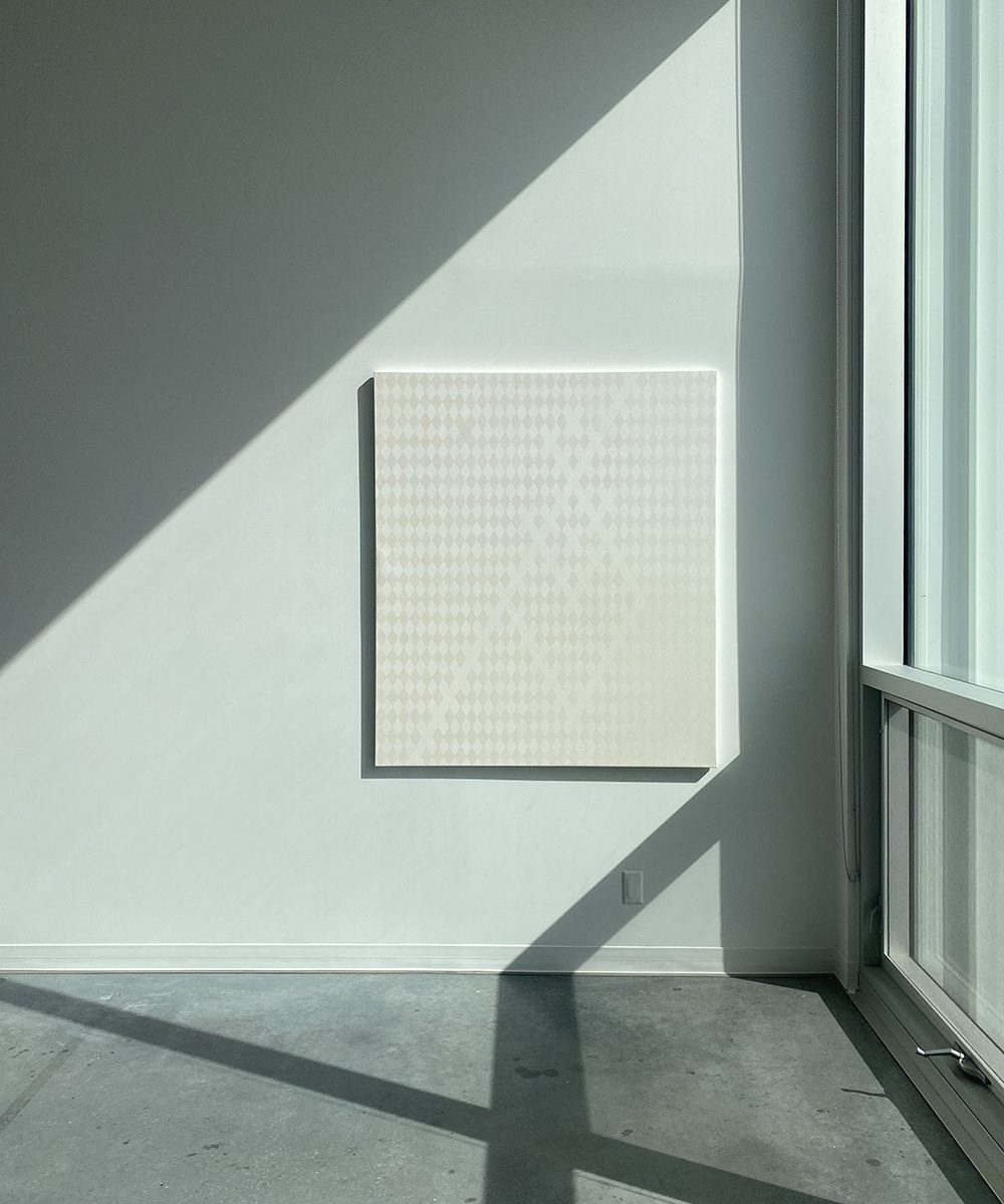
-32 (Diamond Dust)
oil on canvas, 140 x 120cm
32 (Diamond Dust) March 31st, 2022, 1pm to 5pm
1m22sec video

Emily Carr University of Art + Design
April 8th, 2022

This site conditional installation included both a painting and a video. The painting was created specifically for that room. It was meant to be installed on the West facing wall that received natural light and would therefore change the perception of the painting as well as frame it in different ways.


The painting was installed on March 24th, 2022 and documented over a period of time under different lighting conditions. Sunny, overcast, partly cloudy and so forth. The documentation process was helping me to positioned the painting within the sunny area of the West facing wall in room B4130. The challenge was that winter solstices had just come to an end and the inclination of the earth was changing quite fast reducing the sun penetration in the room. I moved the painting 3 times and by the time the critique was on, the sun no longer aligned with the painting as per the initial vision for it.

VIDEOS

This is a playlist that includes many videos. The first video titled -32 (Diamond Dust) March 31, 2022 is the one I presented as part of the installation for the final critique.

Documentation – March 24th, 2022, sunny day.

On that date, the painting aligned perfectly to the vision I had for it.

Documentation – March 29th, 2022, overcast day with sunny periods

Already 5 days later you can see that the shadow is now touching the top left corner of the painting where on the 25 there was a space of about 2 inches.

Documentation – March 31st – in the shadow of a sunny day

This is the day I did the best video documentation. It was super sunny. These picture where taken before the sun hit the wall and it was super purple at an angle and turquoise when looking at it from the front. .

Documentation – April 1st, 2022, overcast, raining and low light.

Documentation – April 5th, 2022, sunny.

By April 5th, the shadow is totally overlapping on top of the painting. Well.. this was intended for the winter sun and we are now in spring!

Critique Day– April 8th, 2022, overcast with bright moments. No documentation.

Documentation – April 12th, 2022, sunny day

Spring 2022 | Conditional Painting proposal

Site Specific / Conditional Painting
by Marion Landry

Site Specific / Conditional Painting

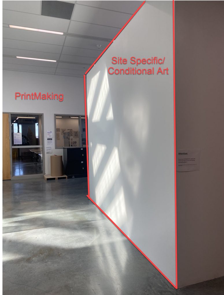
Site: South Facing wall of the Outside Knee Gallery, 4th floor. (Refer to images for wall location)

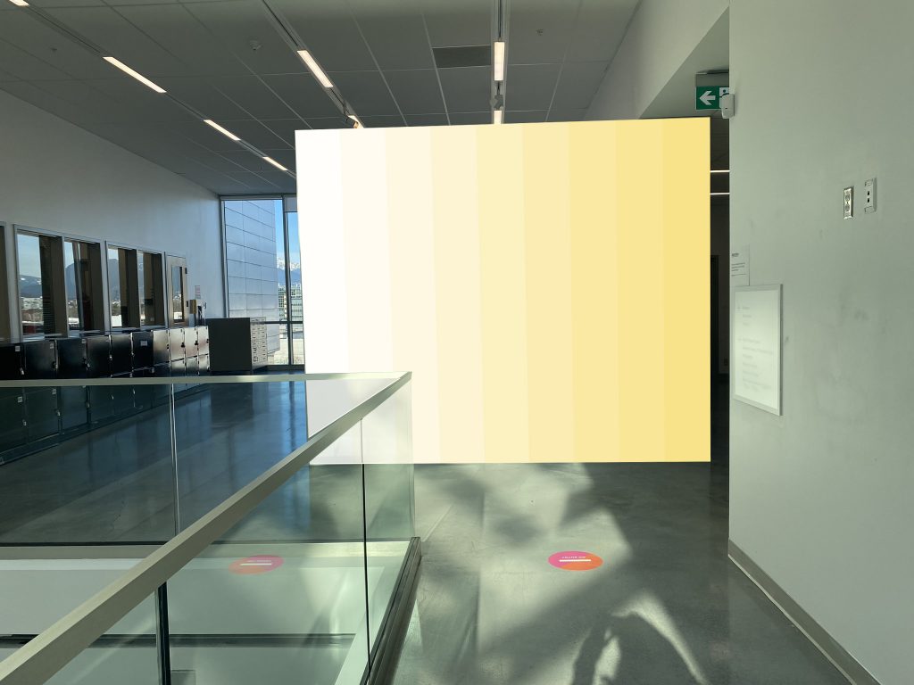
Painting action: Divide the wall into 9 vertical equal bands. Using each band, create a gradient of colour transitioning from primrose yellow to white. Use acrylic/wall paint. Leave brush stroke apparent.

Condition: Sunny day, February 2022, between noon to 1pm

Project description:

A colour gradient will be painted directly on the South facing wall of the Outside Knee Gallery using commercial paints. The choice of commercial paint is to facilitate erasure of the project once completed. The vision is for the painting to be witnessed on sunny days from noon to 1pm. During that time, the natural light enters the building through the skylight and animate the wall with a moving light pattern. The light pattern takes approximately 1 hours to transition through the entire wall. The artist will document the passing of light on her painting using a camera and a tripod installed along the corridor. During the documentation process the artist will be mindful as to create minimum impact to the common area. The piece should remain installed on the wall for a duration of 30 consecutive days. This is to ensure that the weather provides a few sunny days during the month to allow for proper documentation. The artist intends to invite the MFA cohort, professors and advisor who will be critiquing the artwork. This site specific/conditional painting is part of the artist research process which will later inform her thesis.  

Image reference

Location: 4th floor, South facing wall of the Outside Knee Gallery

Site Specific/Conditional Painting mock-up

9 bands of commercial paint colour from primrose yellow to white. (Whiteout light effect)

9 bands of commercial paint colour from primrose yellow to white. (With light effect)

APPROVAL STATUS: DECLINED – due to time constraint. The project is delayed to summer or January 2023.

Spring 2022 | WHITE ELEMENT | Atmospheric research

painting in process

First critique of spring semester 2022

KEYWORDS: Winter, monochrome, warm white and winter blues, light reflecting on snow, warm sun reflecting on ice, cold warm, blue and white, yellow whites, winter whites, néant, openness, wide, beyond perception, absence, wideness, optical phenomena.

Research

  • Cool vs warm light
  • Finding ways to capture and reflect the light from different context
  • Atmospheric ambiance
  • Meditative space/object
  • 4th dimension: Light animating object

Learning from previous research

Light vs Atmosphere
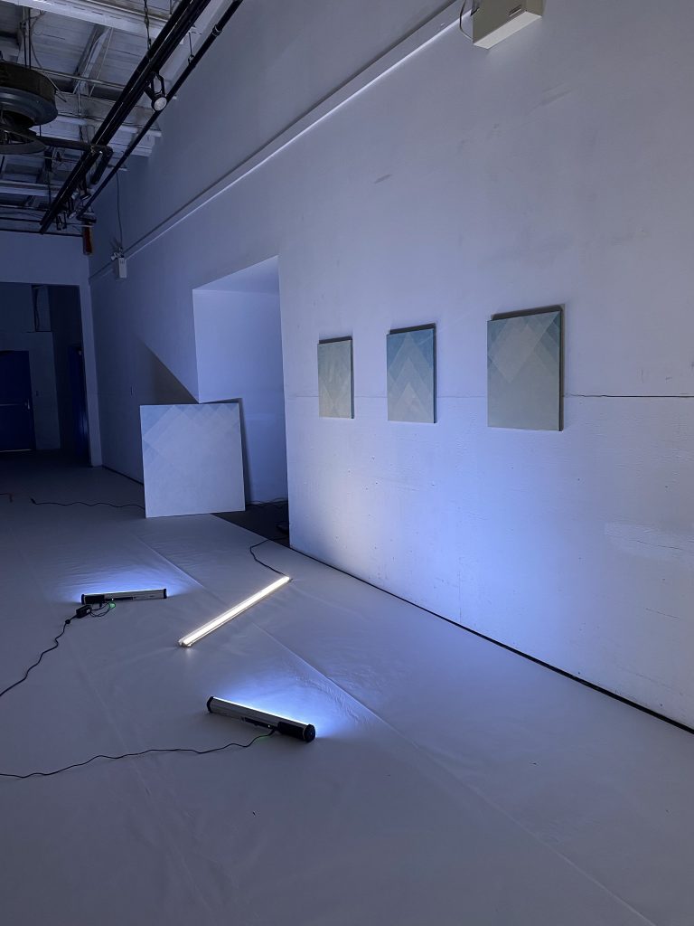
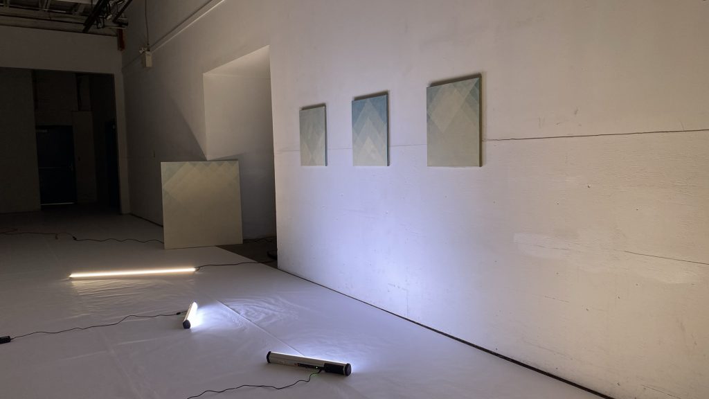
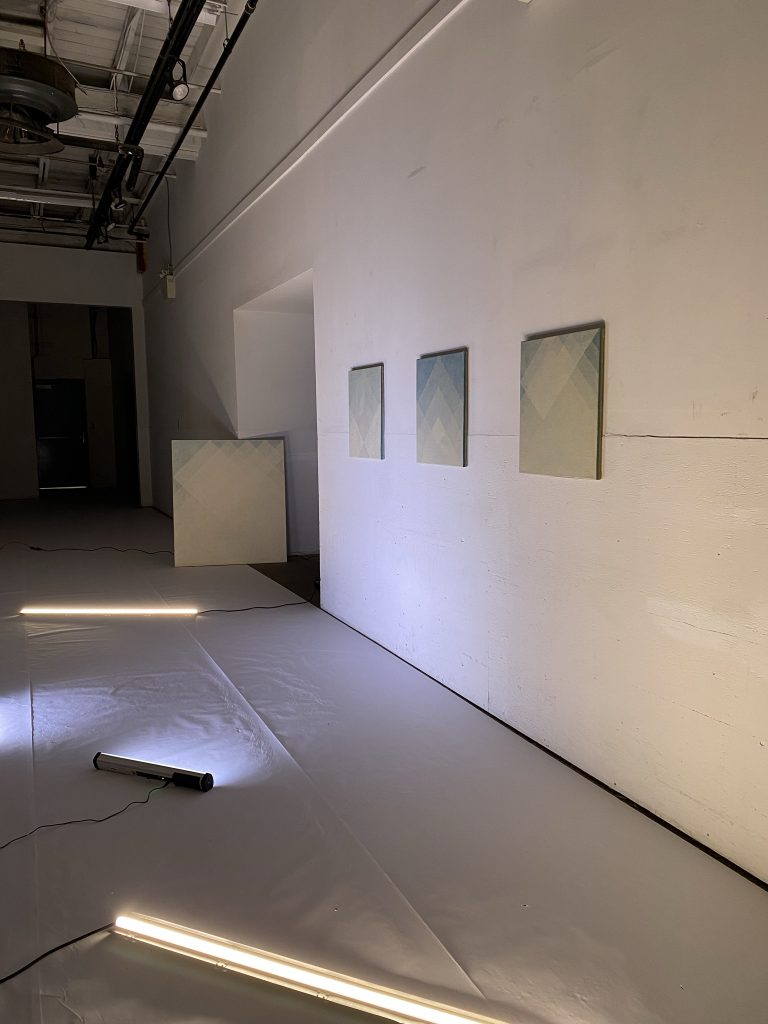
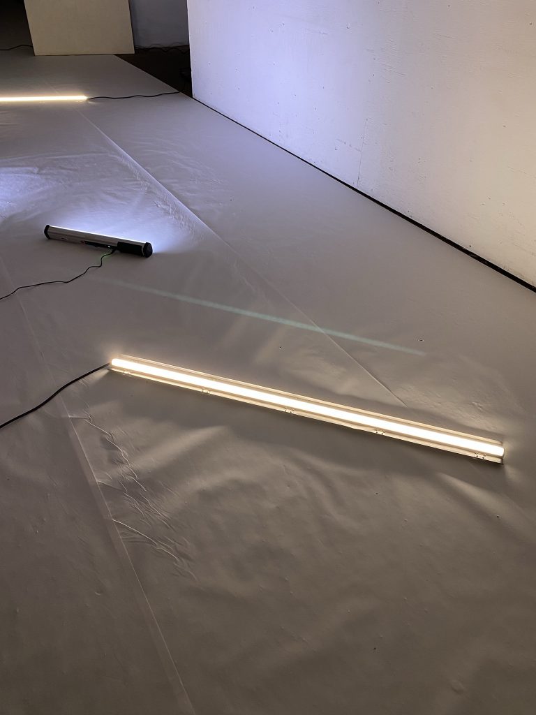
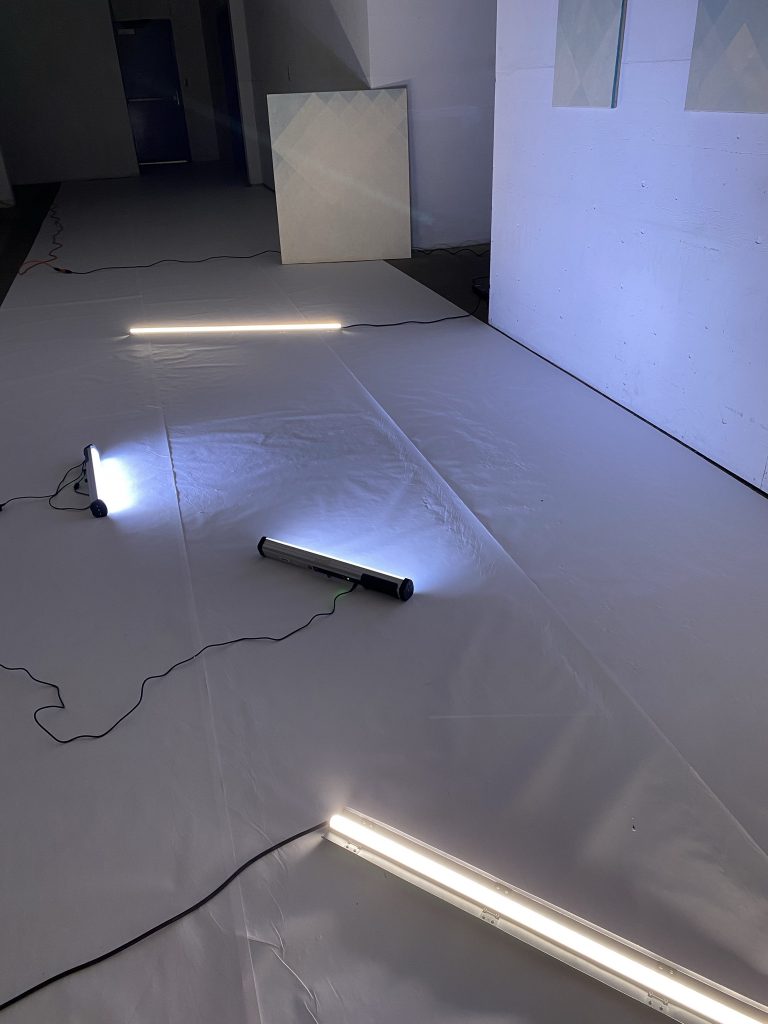
Building on my first light installation back in September 2021, I want to explore further with the combination of cool and warm lights. The first light installation used a sets of LED lights positioned on the floor. The shadow created from this light source became quite dramatic and theatrical. Although I like the visual atmosphere it created, I want to achieve something less dramatic for this new installation. Building on this previous experience, I want to make the lighting invisible to the viewer and instead focus on the atmospheric result and the impact this type of lighting has on the space and the artwork.

Materials
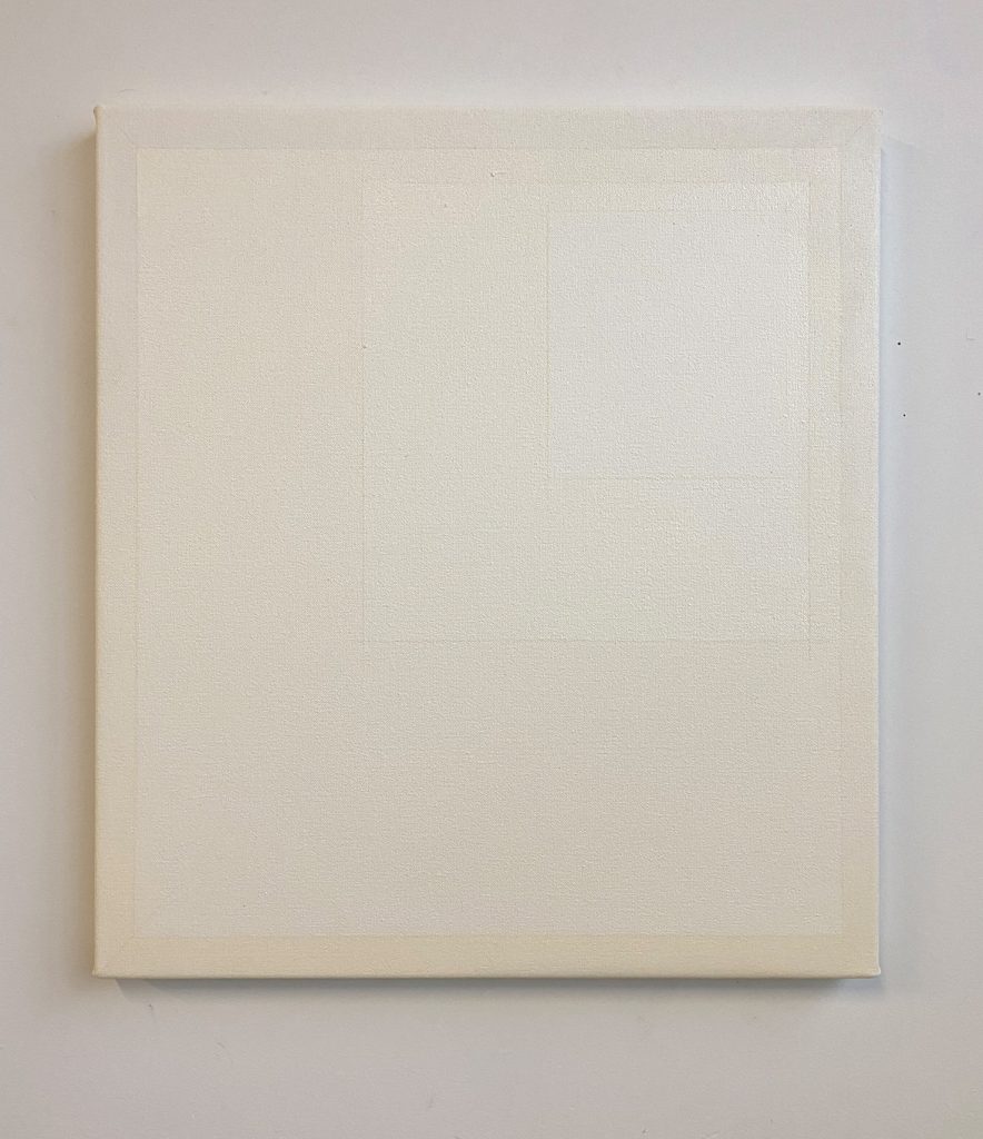
Matte and reflective oil paints will be used in order to reflect or absorb the light. The goal here is to allow for the artwork to render the light visible. The painting is a redo of Blue Element #9 from my previous installation. This time, the large scale will become almost like a portal, a size big enough for one to enter. 72″ x 58″

Reference images

Inspiration story.
Magog, January 22nd 2022. My grand mother is turning 100 today and I am here to celebrate her. We are in covid times and the province of Quebec has the most severe covid restriction of all provinces. It is impossible to see anyone, to gather, or to celebrate. All restaurants are closed and nothing is happening. My grandmother tested negative this morning, so did I and she is granted permission to have one visitor a day. And today I’m it. My emotions are raw and contradict each other . I am sad and I want to celebrate. I feel empowered and powerless. I want to scream and talk softly at the same time. Fortunately I woke up to sunshine this morning which calms me and reminds me that I only have now and that I better enjoy this moment. I need to go for a walk and bask in the sun.

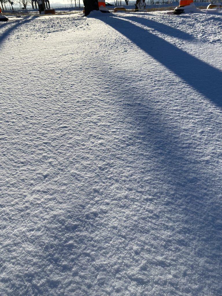
I step outside and it hits me. It’s -32. The nostrils of my nose are stuck together and breathing hurts. The sun is shining and reflecting on the snow so strongly that I can barely see and now my eyes are watering and that is never a good thing when it’s that cold. I venture a bit further and decide to walk towards the waterfront. I know from previous visits that they turn the pathway into an ice path in the winter and I want to see it. However by the time I get to the waterfront I am so cold that the only thing I am looking for is shelter. Fortunately, there is an outdoor fireplace. As I am warming my hands and body, I can relax a bit and start to appreciate my surroundings. The immensity of a snow covered landscape hits me. The lake is frozen rendering it larger than usual. Everything is so bright, cool looking and cold that it feels like the time has stopped. It is calm, peaceful, serene but it feels unnatural for a place that is normally full of people. The ice path is empty, I guess it’s covid, there are no tourists around and the locals are founding it too cold for skating. In fact, there is barely anyone which is the perfect situation for me. I like the feeling of witnessing something that no one else is seeing. I get completely disconnected from my moment cause I’m freezing. That fireplace is not enough to really warm things up. I am starting to wonder how I will make it back home in this cold and my notion of distance is totally askew by my fear of freezing. So I fight the fear and walk extremely fast back to my condo and my own fireplace which I stoke generously upon entering.

3:00pm or 15:00h in Quebec. My eyes rise from the computer and I get this impulse of being outside again. The sun is still shining and I see diamond dust from the window. Diamond dust is a type of precipitation composed of ice crystals which often seem to float in the air. (More on that later as I am creating another painting from that memory) The sun is starting to fall on the horizon and the snow quality appears completely different. It appears warm and more creamy than earlier. It must be warmer. Don’t fool yourself, my phone confirms that it’s still -28. Knowing about the outdoor fireplaces now, I make it my goal. This time the feeling is totally different. The snow is so warm looking that I am feeling somewhat warmer. Nothing has really changed and yet, I feel embraced by the warmth of the sun in a different way. I also see and understand the snow differently. The sun is leaning towards a warm yellow almost pinkish colour and as a result the snow feels and look completely different. More welcoming, more relax, more positive. The snow which had a blueish coolness earlier is now cream, yellow, pink and orange at the same time. Why I’m I seeing it that way? My shadow is a cool mauve which helps me see the yellowness of the snow, or does it make is appeared more yellow because of it’s contrast. Albers theory of colours sparked in my mind. I document. I take photos, I am trying to capture this effect, this moment, this emotion and the feeling I get. I am trying to understand logically what is happening and yet it doesn’t explain my feeling. The emotion is not capture in the photo but the contrast of warm and cool is apparent. I need to paint and I know exactly which pigment to use to reproduce this buttery effect. Few years ago, I found a tube of Michael Harding lead white replacement that has exactly the quality of that snow. Warm, buttery, welcoming and satisfying. I need to materialize this emotion, this contradiction, this relationship between cool and warm. I am obsessed. How can I render something visible that is not. It only lives in me. This contradiction.

Painting Process

The painting is now drying in the studio.

First installation test with lighting scheduled for February 24-28th, 2022

Stay tuned!

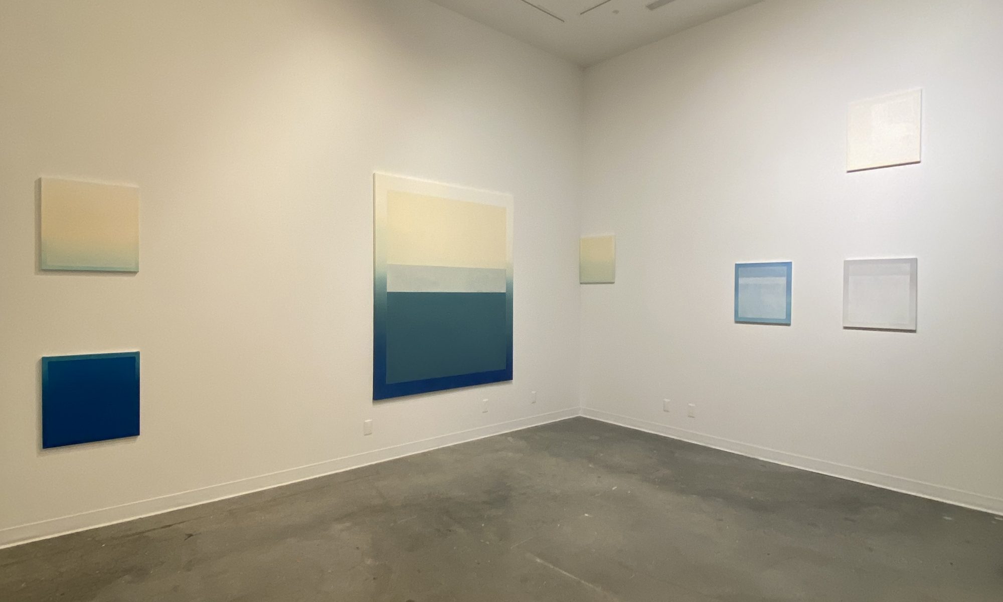
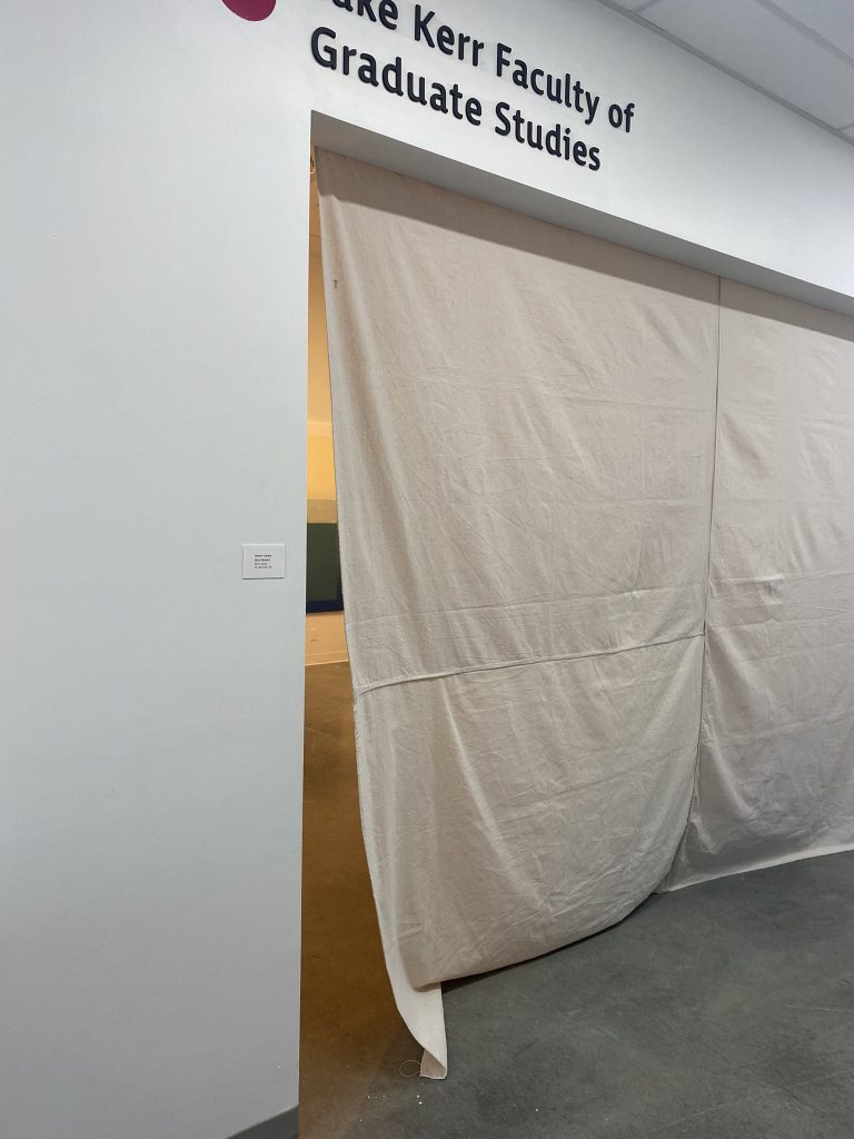
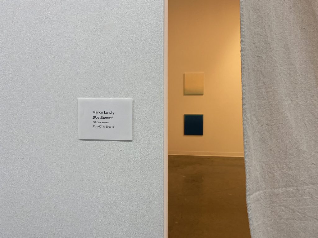
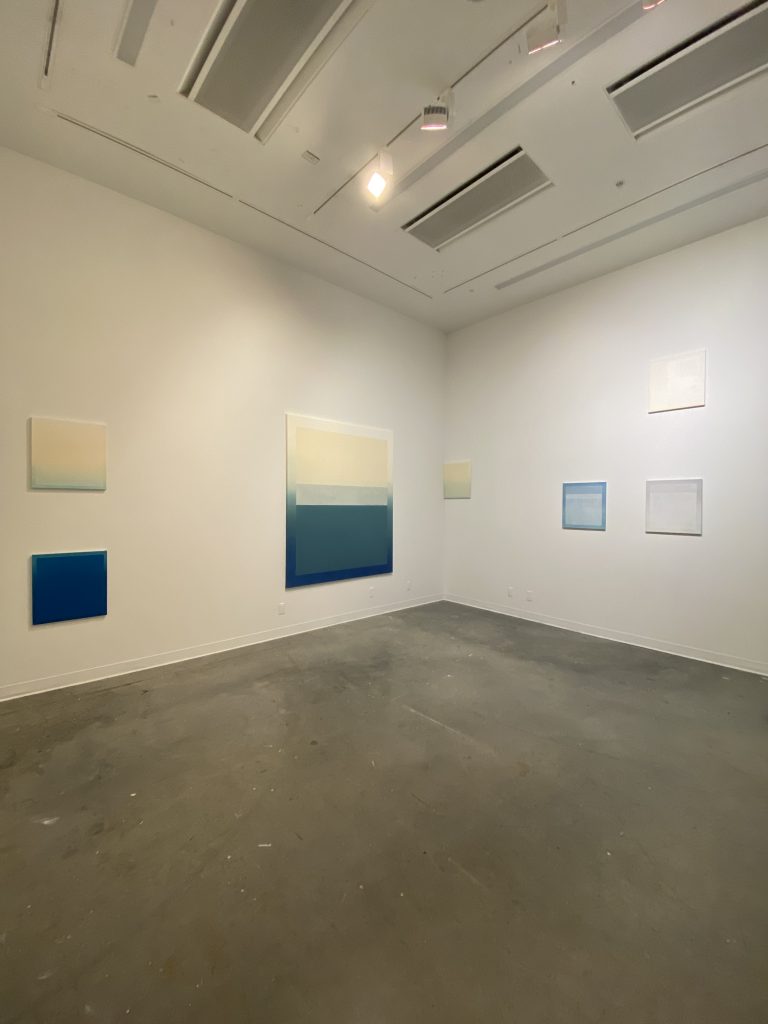
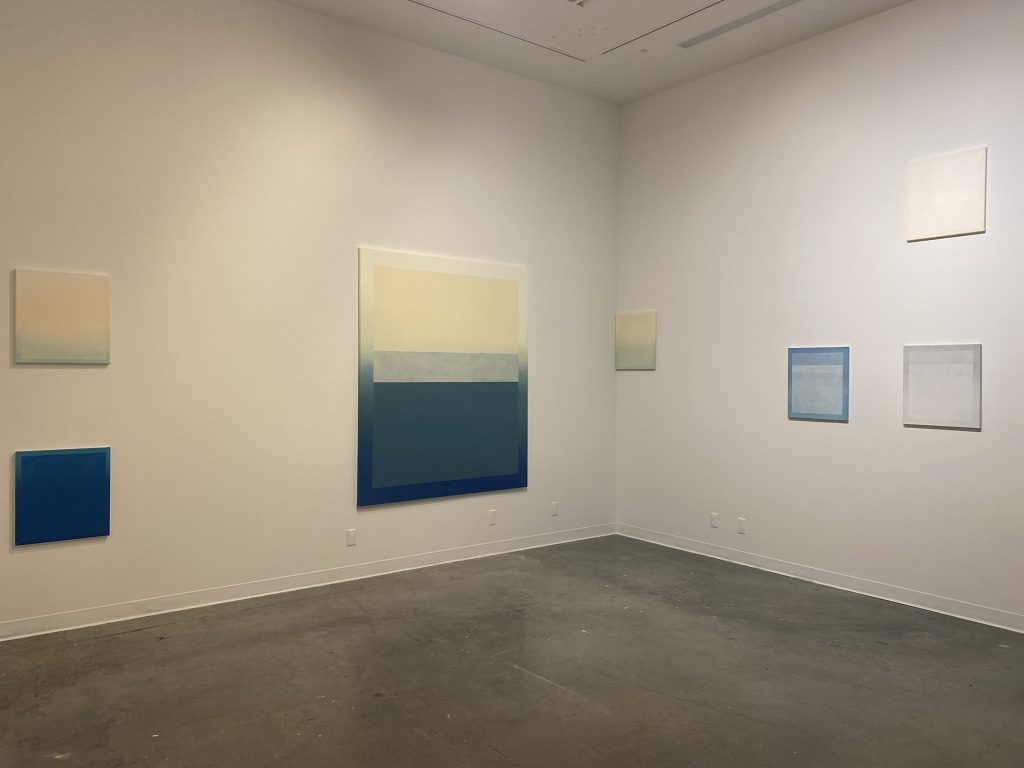
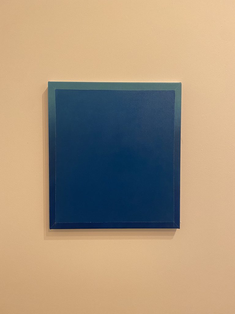
Fall 2021 Final Critique | Blue Element

Grad Gallery, ECUAD, Dec 2-4, 2021
oil on canvas, 72 x60″ & 20 x 18″

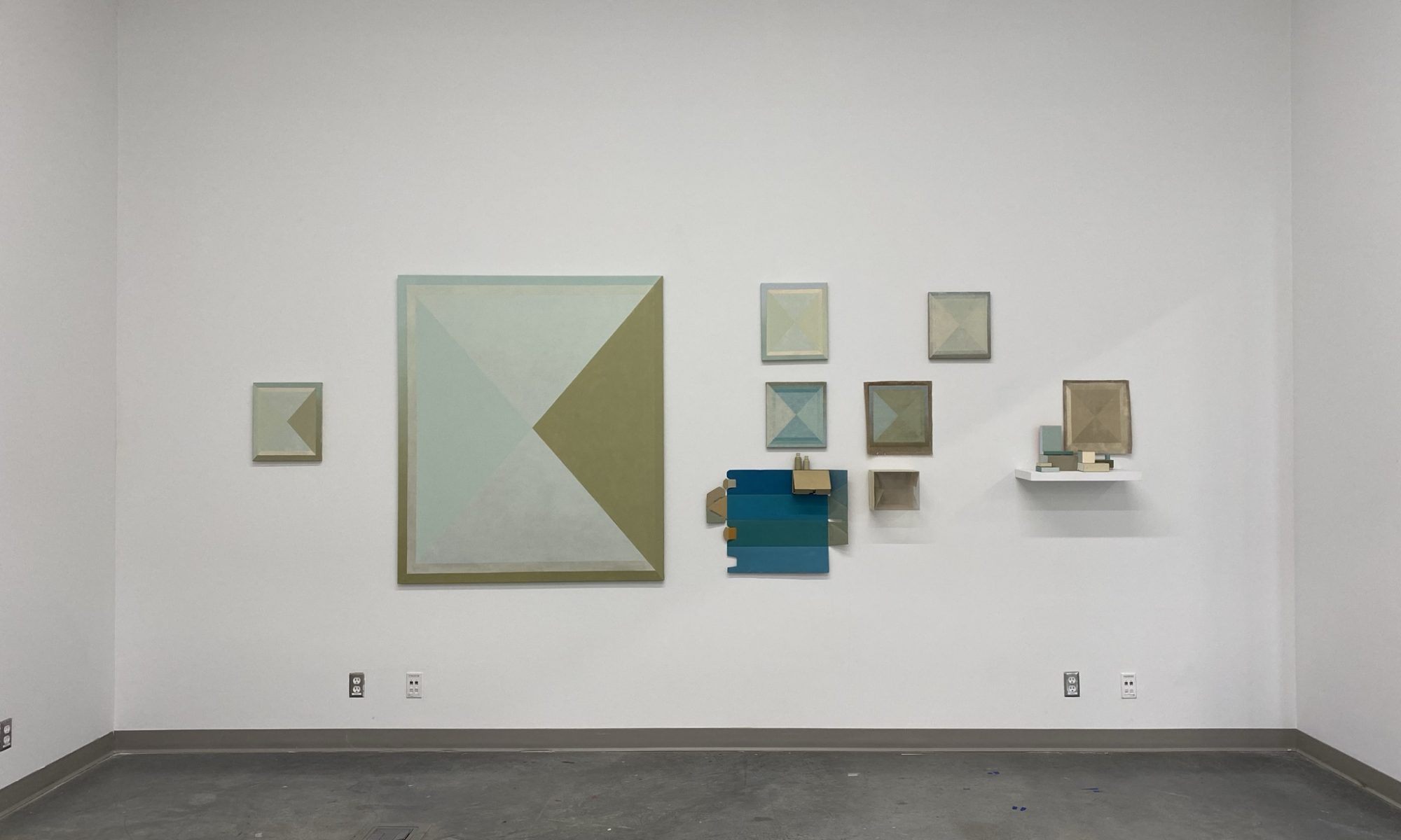
Documentation of the installation

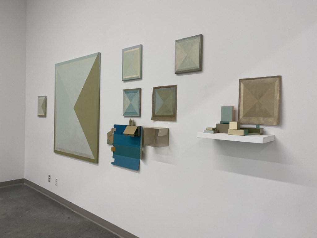
Fall 2021 Critique #1 | Wall Tableau

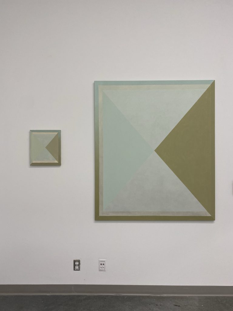
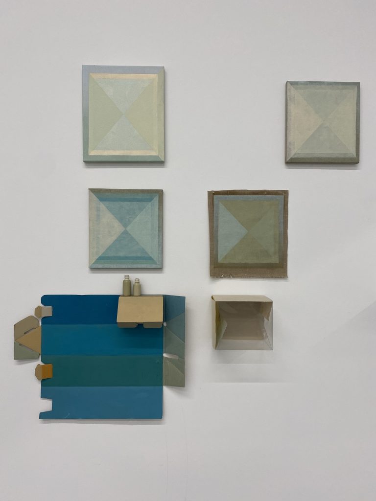
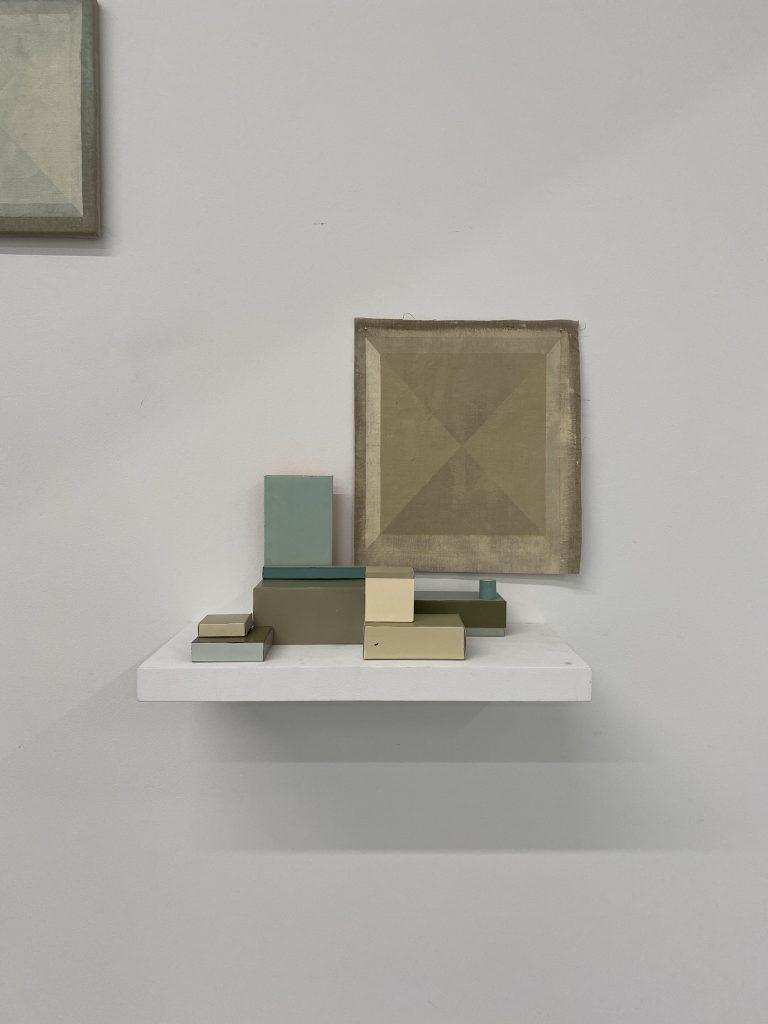
Wall Tableau, (Gem series),
September 17th, 2021, Grad Gallery at Emily Carr university of Art + Design
oil on canvas, cardboard boxes and plastic packaging.

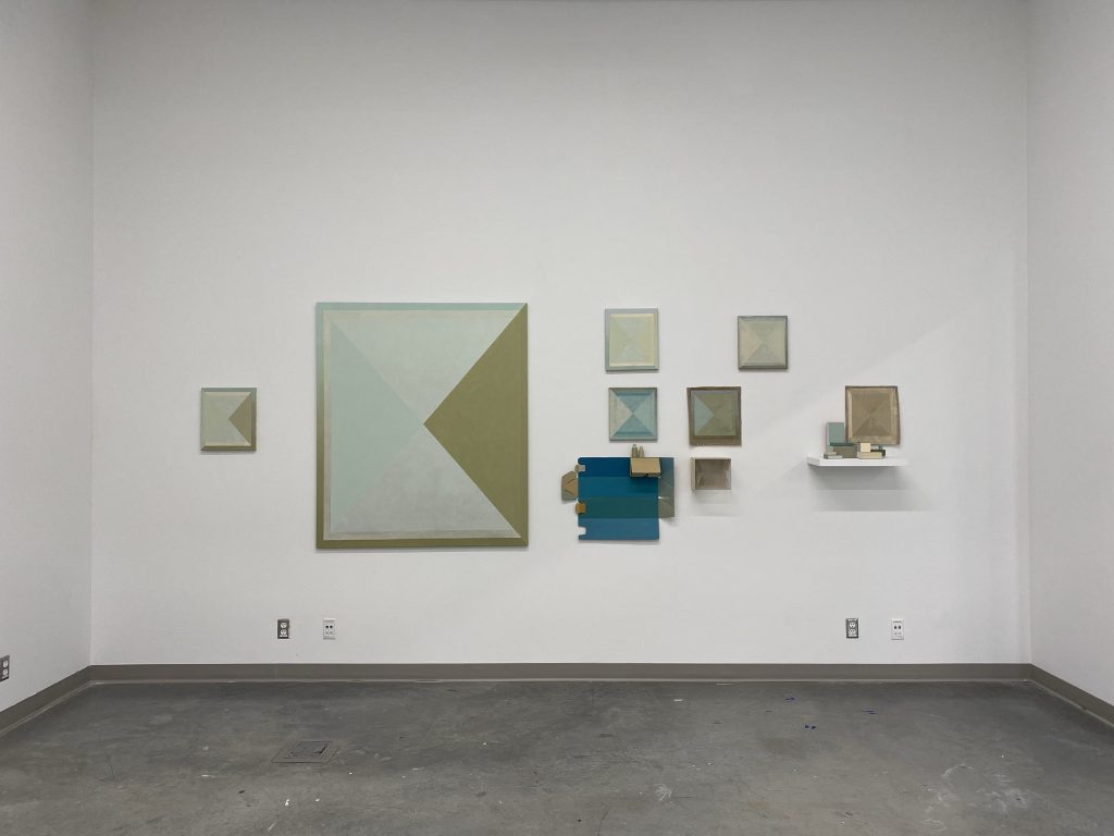
Wall Tableau (Gem series), September 17th, 2021, Grad Gallery at Emily Carr university of Art + Design
From the top left, Gem #4, oil on canvas, 14 x 12″, Gem #2, oil on canvas, 12 x 11″, Gem #1, oil on canvas, 12 x 11″, Gem study on linen.

“we recognize now that great quantities of gems are not of artistic importance, but that it is the individual stone, carefully selected, and appropriately mounted, which we rightly prize.” Read full article bellow.
http://www.palagems.com/concerning-precious-stones